codexmachina
registry/nextjs-mysql-authjs-newsletter-resend

Newsletter platform on Next.js 16 (App Router), MySQL 8 and Auth.js (NextAuth)

verified 2026-08-17clsx2.1.1next16.2.9vaul1.1.2mysql23.22.6resend6.18.1shadcn4.16.1sonner2.0.7postgres3.4.9radix-ui1.6.7recharts3.10.1next-auth5.0.0-beta.32lucide-react1.28.0tailwind-merge3.6.0tw-animate-css1.4.0@tanstack/react-table8.21.3@neondatabase/serverless1.1.0class-variance-authority0.7.1

Type-checked against the real SDKs, migration applied to a live MySQL 8, connection clients load-tested, then tracked for upstream drift and re-verified when it moves. How we verify

request path
Browserrequest
fetch
Next.js 16 (App Router)routing + proxy
verify
Auth.js (NextAuth)session
query
MySQL 8pooled

session validation runs in server components and route handlers, not at the edge

What you're getting

Next.js 16 (App Router)

Next.js 16 App Router — file-based routing, server components, and the Edge proxy (Next 16's renamed middleware).

MySQL 8

MySQL 8 via Drizzle ORM and the mysql2 driver.

Auth.js (NextAuth)

Auth.js (NextAuth v5) — self-hosted OAuth running inside your app against your database (Drizzle adapter).

Newsletter platform

Audience-scoped newsletter platform — subscribers with deliverability status, named lists, list membership, campaigns scheduled against a list, and per-subscriber send tracking.

Setup

bun add next react react-dom drizzle-orm mysql2 next-auth @auth/drizzle-adapter
DATABASE_URLMySQL connection string (mysql://…)
AUTH_SECRETgenerate with `npx auth secret` (or `openssl rand -base64 32`)
AUTH_GITHUB_IDGitHub OAuth app client id
AUTH_GITHUB_SECRETGitHub OAuth app client secret

Apply the schema with bunx drizzle-kit push

Initialization

Database client

src/lib/db.ts
import { drizzle } from "drizzle-orm/mysql2";
import mysql from "mysql2/promise";

// ponytail: single module-level pool; the runtime + mysql2's pool handle concurrency,
// so no globalThis singleton dance needed.
const pool = mysql.createPool(process.env.DATABASE_URL!);

export const db = drizzle({ client: pool });
import { int, mysqlTable, primaryKey, timestamp, varchar } from "drizzle-orm/mysql-core";
import type { AdapterAccountType } from "next-auth/adapters";

export const user = mysqlTable("user", {
  id: varchar("id", { length: 255 })
    .primaryKey()
    .$defaultFn(() => crypto.randomUUID()),
  name: varchar("name", { length: 255 }),
  email: varchar("email", { length: 255 }).notNull(),
  emailVerified: timestamp("email_verified", { mode: "date", fsp: 3 }),
  image: varchar("image", { length: 255 }),
});

export const account = mysqlTable(
  "account",
  {
    userId: varchar("user_id", { length: 255 })
      .notNull()
      .references(() => user.id, { onDelete: "cascade" }),
    type: varchar("type", { length: 255 }).$type<AdapterAccountType>().notNull(),
    provider: varchar("provider", { length: 255 }).notNull(),
    providerAccountId: varchar("provider_account_id", { length: 255 }).notNull(),
    refresh_token: varchar("refresh_token", { length: 255 }),
    access_token: varchar("access_token", { length: 255 }),
    expires_at: int("expires_at"),
    token_type: varchar("token_type", { length: 255 }),
    scope: varchar("scope", { length: 255 }),
    id_token: varchar("id_token", { length: 2048 }),
    session_state: varchar("session_state", { length: 255 }),
  },
  (account) => [primaryKey({ columns: [account.provider, account.providerAccountId] })],
);

export const session = mysqlTable("session", {
  sessionToken: varchar("session_token", { length: 255 }).primaryKey(),
  userId: varchar("user_id", { length: 255 })
    .notNull()
    .references(() => user.id, { onDelete: "cascade" }),
  expires: timestamp("expires", { mode: "date" }).notNull(),
});

export const verificationToken = mysqlTable(
  "verification_token",
  {
    identifier: varchar("identifier", { length: 255 }).notNull(),
    token: varchar("token", { length: 255 }).notNull(),
    expires: timestamp("expires", { mode: "date" }).notNull(),
  },
  (vt) => [primaryKey({ columns: [vt.identifier, vt.token] })],
);
// Auth.js (NextAuth v5) instance — self-hosted, Next.js 16 (App Router). OAuth + Drizzle adapter.
import NextAuth from "next-auth";
import GitHub from "next-auth/providers/github";
import { DrizzleAdapter } from "@auth/drizzle-adapter";
// Reuse the SAME Drizzle client the db slice exported in src/lib/db.ts.
import { db } from "./db";
import { user, account, session, verificationToken } from "@/db/auth-schema";
import { sendWelcome } from "@/lib/email";

export const { handlers, auth, signIn, signOut } = NextAuth({
  adapter: DrizzleAdapter(db, {
    usersTable: user,
    accountsTable: account,
    sessionsTable: session,
    verificationTokensTable: verificationToken,
  }),
  // ponytail: GitHub is the shortest real provider that works out of the box — set
  // AUTH_GITHUB_ID / AUTH_GITHUB_SECRET (and AUTH_SECRET). Add socialProviders here as needed.
  providers: [GitHub],
  events: {
    async createUser({ user }) {
      if (!user.email) return;
      await sendWelcome(user.email, { name: user.name ?? "there", ctaUrl: process.env.AUTH_URL ?? "/", unsubscribeUrl: process.env.AUTH_URL ?? "/" });
    },
  },
});
// Mount NextAuth's GET/POST handlers on Next's route layer (sign-in, callback, session, csrf…).
import { handlers } from "@/lib/auth";

export const { GET, POST } = handlers;
// Session-protection proxy for Next.js 16 (App Router) (Next 16 renamed middleware.ts → proxy.ts).
// ponytail: rooted at src/ (with --src-dir Next only looks for the proxy beside src/app).
// NextAuth's `auth` wrapper augments the request with `req.auth`; bounce logged-out users off
// the app surface. The real per-request check still runs in Server Components via requireUser().
import { auth } from "@/lib/auth";
import { NextResponse } from "next/server";

export const proxy = auth((req) => {
  if (!req.auth) {
    return NextResponse.redirect(new URL("/sign-in", req.url));
  }
  return NextResponse.next();
});

export const config = {
  // ponytail: guard the SaaS app surface; widen the matcher per app-type.
  matcher: ["/dashboard/:path*", "/settings/:path*"],
};

Newsletter schema: subscribers, lists, campaigns & per-subscriber sends

Subscribers & deliverability status

email addresses collected by an owner, with a status CHECK walking subscribed/unsubscribed/bounced

Lists & list_subscriptions membership

named audience segments and the join table that places a subscriber on a list at most once

Campaigns & scheduling

broadcasts targeting a list, with a status CHECK gating draft/scheduled/sent and a nullable scheduledAt timestamp

Campaign_sends & delivery tracking

one append-only row per (campaign, subscriber) tracking the queued→delivered→opened→bounced lifecycle

src/db/schema.ts
// === file: src/db/schema.ts ===
import { relations, sql } from "drizzle-orm";
import {
  check,
  index,
  mysqlTable,
  text,
  timestamp,
  unique,
  varchar,
} from "drizzle-orm/mysql-core";
// Better Auth owns identity; we only reference its `user` table by id.
import { user } from "./auth-schema";

export type SubscriberStatus = "subscribed" | "unsubscribed" | "bounced";
export type CampaignStatus = "draft" | "scheduled" | "sent";
export type CampaignSendStatus =
  | "queued"
  | "delivered"
  | "opened"
  | "bounced";

/** An email address on someone's audience. Owned by the user who collected it;
 *  status walks the deliverability lifecycle. The owner+email unique stops the
 *  same address landing on one owner's audience twice. */
export const subscribers = mysqlTable(
  "subscribers",
  {
    id: varchar("id", { length: 36 }).primaryKey(),
    // Better Auth's user.id is varchar(255) on MySQL — match it, don't recast.
    ownerId: varchar("owner_id", { length: 255 })
      .notNull()
      .references(() => user.id, { onDelete: "cascade" }),
    // Part of the owner+email unique below — MySQL can't index unbounded text.
    email: varchar("email", { length: 255 }).notNull(),
    status: varchar("status", { length: 32 })
      .$type<SubscriberStatus>()
      .notNull()
      .default("subscribed"),
    createdAt: timestamp("created_at").notNull().defaultNow(),
  },
  (t) => [
    unique("subscribers_owner_email_unique").on(t.ownerId, t.email),
    index("idx_subscriber_owner").on(t.ownerId),
    check(
      "subscribers_status_check",
      sql`${t.status} in ('subscribed','unsubscribed','bounced')`,
    ),
  ],
);

/** A named segment of an owner's audience (e.g. "Weekly digest"). */
export const lists = mysqlTable(
  "lists",
  {
    id: varchar("id", { length: 36 }).primaryKey(),
    ownerId: varchar("owner_id", { length: 255 })
      .notNull()
      .references(() => user.id, { onDelete: "cascade" }),
    name: text("name").notNull(),
    createdAt: timestamp("created_at").notNull().defaultNow(),
  },
  (t) => [index("idx_list_owner").on(t.ownerId)],
);

/** list <-> subscriber join. The composite unique is the membership identity —
 *  a subscriber is on a list at most once. */
export const listSubscriptions = mysqlTable(
  "list_subscriptions",
  {
    id: varchar("id", { length: 36 }).primaryKey(),
    listId: varchar("list_id", { length: 36 })
      .notNull()
      .references(() => lists.id, { onDelete: "cascade" }),
    subscriberId: varchar("subscriber_id", { length: 36 })
      .notNull()
      .references(() => subscribers.id, { onDelete: "cascade" }),
    createdAt: timestamp("created_at").notNull().defaultNow(),
  },
  (t) => [
    unique("list_subscriptions_list_subscriber_unique").on(
      t.listId,
      t.subscriberId,
    ),
    index("idx_list_subscription_subscriber").on(t.subscriberId),
  ],
);

/** A broadcast targeting a list. status walks the lifecycle; scheduledAt is the
 *  send time once status is 'scheduled'. */
export const campaigns = mysqlTable(
  "campaigns",
  {
    id: varchar("id", { length: 36 }).primaryKey(),
    listId: varchar("list_id", { length: 36 })
      .notNull()
      .references(() => lists.id, { onDelete: "cascade" }),
    subject: text("subject").notNull(),
    status: varchar("status", { length: 32 })
      .$type<CampaignStatus>()
      .notNull()
      .default("draft"),
    scheduledAt: timestamp("scheduled_at"),
    createdAt: timestamp("created_at").notNull().defaultNow(),
  },
  (t) => [
    index("idx_campaign_list").on(t.listId),
    check(
      "campaigns_status_check",
      sql`${t.status} in ('draft','scheduled','sent')`,
    ),
  ],
);

/** One row per (campaign, subscriber) send attempt. status walks delivery; the
 *  campaign index drives the per-campaign delivery/open rollup. */
export const campaignSends = mysqlTable(
  "campaign_sends",
  {
    id: varchar("id", { length: 36 }).primaryKey(),
    campaignId: varchar("campaign_id", { length: 36 })
      .notNull()
      .references(() => campaigns.id, { onDelete: "cascade" }),
    subscriberId: varchar("subscriber_id", { length: 36 })
      .notNull()
      .references(() => subscribers.id, { onDelete: "cascade" }),
    status: varchar("status", { length: 32 })
      .$type<CampaignSendStatus>()
      .notNull()
      .default("queued"),
    sentAt: timestamp("sent_at"),
  },
  (t) => [
    // Drives the "delivery/open stats for this campaign" rollup query.
    index("idx_send_campaign").on(t.campaignId),
    check(
      "campaign_sends_status_check",
      sql`${t.status} in ('queued','delivered','opened','bounced')`,
    ),
  ],
);

export const subscribersRelations = relations(subscribers, ({ one, many }) => ({
  owner: one(user, { fields: [subscribers.ownerId], references: [user.id] }),
  listSubscriptions: many(listSubscriptions),
  sends: many(campaignSends),
}));

export const listsRelations = relations(lists, ({ one, many }) => ({
  owner: one(user, { fields: [lists.ownerId], references: [user.id] }),
  listSubscriptions: many(listSubscriptions),
  campaigns: many(campaigns),
}));

export const listSubscriptionsRelations = relations(
  listSubscriptions,
  ({ one }) => ({
    list: one(lists, {
      fields: [listSubscriptions.listId],
      references: [lists.id],
    }),
    subscriber: one(subscribers, {
      fields: [listSubscriptions.subscriberId],
      references: [subscribers.id],
    }),
  }),
);

export const campaignsRelations = relations(campaigns, ({ one, many }) => ({
  list: one(lists, {
    fields: [campaigns.listId],
    references: [lists.id],
  }),
  sends: many(campaignSends),
}));

export const campaignSendsRelations = relations(campaignSends, ({ one }) => ({
  campaign: one(campaigns, {
    fields: [campaignSends.campaignId],
    references: [campaigns.id],
  }),
  subscriber: one(subscribers, {
    fields: [campaignSends.subscriberId],
    references: [subscribers.id],
  }),
}));

Deploy targets

✓ The right DB client for where you deploy: load-tested with concurrent queries against a live database. Edge needs the HTTP driver (no TCP); serverless needs a tiny pool.
src/lib/db.ts
import { drizzle } from "drizzle-orm/mysql2";
import mysql from "mysql2/promise";

// Serverless: a small pool per short-lived instance — many instances × a big pool exhausts MySQL.
export const pool = mysql.createPool({ uri: process.env.DATABASE_URL!, connectionLimit: 2 });
export const db = drizzle({ client: pool });
import { drizzle } from "drizzle-orm/mysql2";
import mysql from "mysql2/promise";

// Long-running process: a real, reused pool (mysql2 manages idle recycling).
export const pool = mysql.createPool({ uri: process.env.DATABASE_URL!, connectionLimit: 10 });
export const db = drizzle({ client: pool });
import { drizzle } from "drizzle-orm/planetscale-serverless";
import { Client } from "@planetscale/database";

// Edge/Workers have NO TCP sockets, so mysql2 cannot run here. PlanetScale's HTTP driver
// speaks MySQL over fetch — the client that works on Workers (the MySQL analog of Neon's HTTP driver).
const client = new Client({ url: process.env.DATABASE_URL! });
export const db = drizzle({ client });

The app UI

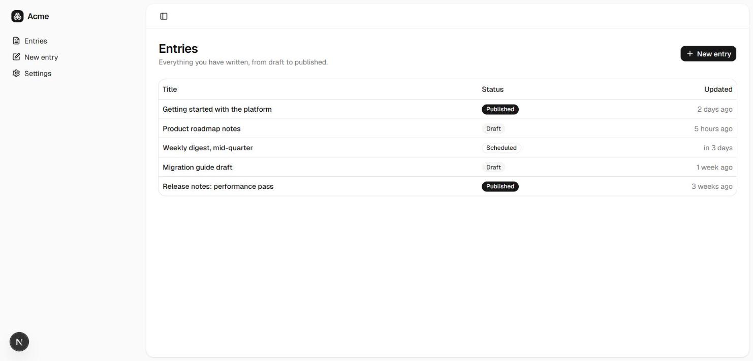
Next.js 16 (App Router) content starter — the editor, rendered from the verified UI
Rendered from the verified starter · the editor
A working auth flow and a protected app shell, type-checked against the same verified wiring above. This is what codexmachina create scaffolds on top of the official Next.js 16 (App Router) starter.
src/app/(auth)/sign-in/page.tsx
"use client";
import Link from "next/link";
import { signIn } from "next-auth/react";
import { LogInIcon } from "lucide-react";
import { Button } from "@/components/ui/button";

// login-02's split-screen shape (form column + muted brand panel). NextAuth is OAuth-first, so the
// baseline provider is GitHub — one button, no email/password form. Add providers in src/lib/auth.ts.
export default function SignInPage() {
  return (
    <div className="grid min-h-svh lg:grid-cols-2">
      <main className="flex flex-col items-center justify-center gap-4 p-6 md:p-10">
        <div className="flex w-full max-w-sm flex-col gap-6">
          <div className="flex flex-col gap-2 text-center">
            <h1 className="text-2xl font-semibold tracking-tight">Sign in</h1>
            <p className="text-sm text-muted-foreground">Continue to your account</p>
          </div>
          <Button className="w-full" onClick={() => signIn("github", { redirectTo: "/dashboard" })}>
            <LogInIcon />
            Continue with GitHub
          </Button>
          <p className="text-center text-sm text-muted-foreground">
            Don&apos;t have an account?{" "}
            <Link href="/sign-up" className="underline underline-offset-4">
              Sign up
            </Link>
          </p>
        </div>
      </main>
      <div className="hidden bg-muted lg:block" />
    </div>
  );
}
"use client";
import Link from "next/link";
import { signIn } from "next-auth/react";
import { LogInIcon } from "lucide-react";
import { Button } from "@/components/ui/button";

// login-02's split-screen shape. OAuth unifies sign-up and sign-in (the first GitHub sign-in creates
// the account), so this mirrors the sign-in page with sign-up copy — no separate password step.
export default function SignUpPage() {
  return (
    <div className="grid min-h-svh lg:grid-cols-2">
      <main className="flex flex-col items-center justify-center gap-4 p-6 md:p-10">
        <div className="flex w-full max-w-sm flex-col gap-6">
          <div className="flex flex-col gap-2 text-center">
            <h1 className="text-2xl font-semibold tracking-tight">Create your account</h1>
            <p className="text-sm text-muted-foreground">Sign up with GitHubone click, no password.</p>
          </div>
          <Button className="w-full" onClick={() => signIn("github", { redirectTo: "/dashboard" })}>
            <LogInIcon />
            Continue with GitHub
          </Button>
          <p className="text-center text-sm text-muted-foreground">
            Already have an account?{" "}
            <Link href="/sign-in" className="underline underline-offset-4">
              Sign in
            </Link>
          </p>
        </div>
      </main>
      <div className="hidden bg-muted lg:block" />
    </div>
  );
}
{
  "$schema": "https://ui.shadcn.com/schema.json",
  "style": "radix-nova",
  "rsc": true,
  "tsx": true,
  "tailwind": {
    "config": "",
    "css": "src/app/globals.css",
    "baseColor": "neutral",
    "cssVariables": true,
    "prefix": ""
  },
  "iconLibrary": "lucide",
  "rtl": false,
  "aliases": {
    "components": "@/components",
    "utils": "@/lib/utils",
    "ui": "@/components/ui",
    "lib": "@/lib",
    "hooks": "@/hooks"
  },
  "menuColor": "default",
  "menuAccent": "subtle",
  "registries": {}
}
import { Toaster } from "sonner"

import { AppSidebar } from "@/components/app-sidebar"
import { SiteHeader } from "@/components/site-header"
import { SidebarInset, SidebarProvider } from "@/components/ui/sidebar"
import { TooltipProvider } from "@/components/ui/tooltip"

// dashboard-01's shell: SidebarProvider + AppSidebar + SiteHeader wrapping the route's children.

// TooltipProvider wraps it too — the sidebar's collapsed-icon state renders per-item tooltips

// (SidebarMenuButton's `tooltip` prop) which throw at runtime without an ancestor Provider.

export default function AppLayout({ children }: { children: React.ReactNode }) {
  return (
    <TooltipProvider>
      <SidebarProvider
        style={
          {
            "--sidebar-width": "calc(var(--spacing) * 72)",
            "--header-height": "calc(var(--spacing) * 12)",
          } as React.CSSProperties
        }
      >
        <AppSidebar variant="inset" />
        <SidebarInset>
          <SiteHeader />
          <div className="flex flex-1 flex-col">
            <div className="@container/main flex flex-1 flex-col gap-2">
              {children}
            </div>
          </div>
        </SidebarInset>
        {/* Raw sonner Toaster (NOT the ui/sonner wrapper, which pulls next-themes). Mounted once
            here so data-table.tsx's toast.promise(...) calls actually render. */}
        <Toaster />
      </SidebarProvider>
    </TooltipProvider>
  )
}
import { Footer } from "@/components/marketing/footer";
import { SiteNav } from "@/components/marketing/site-nav";

// Public marketing shell: sticky nav + page content + footer. Static, no auth.

export default function MarketingLayout({
  children,
}: {
  children: React.ReactNode;
}) {
  return (
    <div className="flex min-h-svh flex-col">
      <SiteNav />
      <div className="flex-1">{children}</div>
      <Footer />
    </div>
  );
}
@import "tailwindcss";
@import "tw-animate-css";
@import "shadcn/tailwind.css";

@custom-variant dark (&:is(.dark *));

@theme inline {
  --color-background: var(--background);

  --color-foreground: var(--foreground);

  --font-sans: var(--font-sans);

  --font-mono: var(--font-mono);

  --font-heading: var(--font-sans);

  --color-sidebar-ring: var(--sidebar-ring);

  --color-sidebar-border: var(--sidebar-border);

  --color-sidebar-accent-foreground: var(--sidebar-accent-foreground);

  --color-sidebar-accent: var(--sidebar-accent);

  --color-sidebar-primary-foreground: var(--sidebar-primary-foreground);

  --color-sidebar-primary: var(--sidebar-primary);

  --color-sidebar-foreground: var(--sidebar-foreground);

  --color-sidebar: var(--sidebar);

  --color-chart-5: var(--chart-5);

  --color-chart-4: var(--chart-4);

  --color-chart-3: var(--chart-3);

  --color-chart-2: var(--chart-2);

  --color-chart-1: var(--chart-1);

  --color-ring: var(--ring);

  --color-input: var(--input);

  --color-border: var(--border);

  --color-destructive: var(--destructive);

  --color-accent-foreground: var(--accent-foreground);

  --color-accent: var(--accent);

  --color-muted-foreground: var(--muted-foreground);

  --color-muted: var(--muted);

  --color-secondary-foreground: var(--secondary-foreground);

  --color-secondary: var(--secondary);

  --color-primary-foreground: var(--primary-foreground);

  --color-primary: var(--primary);

  --color-popover-foreground: var(--popover-foreground);

  --color-popover: var(--popover);

  --color-card-foreground: var(--card-foreground);

  --color-card: var(--card);

  --radius-sm: calc(var(--radius) * 0.6);

  --radius-md: calc(var(--radius) * 0.8);

  --radius-lg: var(--radius);

  --radius-xl: calc(var(--radius) * 1.4);

  --radius-2xl: calc(var(--radius) * 1.8);

  --radius-3xl: calc(var(--radius) * 2.2);

  --radius-4xl: calc(var(--radius) * 2.6);

}

:root {
  --background: oklch(1 0 0);

  --foreground: oklch(0.145 0 0);

  --card: oklch(1 0 0);

  --card-foreground: oklch(0.145 0 0);

  --popover: oklch(1 0 0);

  --popover-foreground: oklch(0.145 0 0);

  --primary: oklch(0.205 0 0);

  --primary-foreground: oklch(0.985 0 0);

  --secondary: oklch(0.97 0 0);

  --secondary-foreground: oklch(0.205 0 0);

  --muted: oklch(0.97 0 0);

  --muted-foreground: oklch(0.556 0 0);

  --accent: oklch(0.97 0 0);

  --accent-foreground: oklch(0.205 0 0);

  --destructive: oklch(0.577 0.245 27.325);

  --border: oklch(0.922 0 0);

  --input: oklch(0.922 0 0);

  --ring: oklch(0.708 0 0);

  --chart-1: oklch(0.87 0 0);

  --chart-2: oklch(0.556 0 0);

  --chart-3: oklch(0.439 0 0);

  --chart-4: oklch(0.371 0 0);

  --chart-5: oklch(0.269 0 0);

  --radius: 0.625rem;

  --sidebar: oklch(0.985 0 0);

  --sidebar-foreground: oklch(0.145 0 0);

  --sidebar-primary: oklch(0.205 0 0);

  --sidebar-primary-foreground: oklch(0.985 0 0);

  --sidebar-accent: oklch(0.97 0 0);

  --sidebar-accent-foreground: oklch(0.205 0 0);

  --sidebar-border: oklch(0.922 0 0);

  --sidebar-ring: oklch(0.708 0 0);

}

.dark {
  --background: oklch(0.145 0 0);

  --foreground: oklch(0.985 0 0);

  --card: oklch(0.205 0 0);

  --card-foreground: oklch(0.985 0 0);

  --popover: oklch(0.205 0 0);

  --popover-foreground: oklch(0.985 0 0);

  --primary: oklch(0.922 0 0);

  --primary-foreground: oklch(0.205 0 0);

  --secondary: oklch(0.269 0 0);

  --secondary-foreground: oklch(0.985 0 0);

  --muted: oklch(0.269 0 0);

  --muted-foreground: oklch(0.708 0 0);

  --accent: oklch(0.269 0 0);

  --accent-foreground: oklch(0.985 0 0);

  --destructive: oklch(0.704 0.191 22.216);

  --border: oklch(1 0 0 / 10%);

  --input: oklch(1 0 0 / 15%);

  --ring: oklch(0.556 0 0);

  --chart-1: oklch(0.87 0 0);

  --chart-2: oklch(0.556 0 0);

  --chart-3: oklch(0.439 0 0);

  --chart-4: oklch(0.371 0 0);

  --chart-5: oklch(0.269 0 0);

  --sidebar: oklch(0.205 0 0);

  --sidebar-foreground: oklch(0.985 0 0);

  --sidebar-primary: oklch(0.488 0.243 264.376);

  --sidebar-primary-foreground: oklch(0.985 0 0);

  --sidebar-accent: oklch(0.269 0 0);

  --sidebar-accent-foreground: oklch(0.985 0 0);

  --sidebar-border: oklch(1 0 0 / 10%);

  --sidebar-ring: oklch(0.556 0 0);

}

@layer base {
  * {
    @apply border-border outline-ring/50;
  }
  body {
    @apply bg-background text-foreground;
  }
  html {
    @apply font-sans;
  }
}
import { Boxes } from "lucide-react";

import { cn } from "@/lib/utils";

// Reusable wordmark: a token-filled icon chip + the "Acme" wordmark. Used by the marketing

// nav/footer and the app sidebar header so the brand has a single source of truth.

export function Logo({ className }: { className?: string }) {
  return (
    <span
      className={cn(
        "inline-flex items-center gap-2 font-semibold tracking-tight",
        className,
      )}
    >
      <span className="flex size-6 items-center justify-center rounded-md bg-primary text-primary-foreground">
        <Boxes className="size-4" aria-hidden />
      </span>
      <span className="text-base">Acme</span>
    </span>
  );
}
import Link from "next/link";

import { Logo } from "@/components/logo";

// ponytail: Product links point at real routes/anchors; the Company/Legal "#" hrefs are

// deliberate scaffold stubs — wire them to real pages when the generated app grows them.

// This footer is SHARED across every archetype, so "Pricing" (a dashboard-only #pricing section)

// is intentionally absent — it would dead-end on content/listing/feed/chat landings.

const columns = [
  {
    title: "Product",
    links: [
      { label: "Features", href: "#features" },
      { label: "Sign in", href: "/sign-in" },
    ],
  },
  {
    title: "Company",
    links: [
      { label: "About", href: "#" },
      { label: "Blog", href: "#" },
      { label: "Careers", href: "#" },
    ],
  },
  {
    title: "Legal",
    links: [
      { label: "Privacy", href: "#" },
      { label: "Terms", href: "#" },
      { label: "Security", href: "#" },
    ],
  },
];

export function Footer() {
  return (
    <footer className="border-t">
      <div className="mx-auto max-w-6xl px-4 py-12 sm:px-6 lg:px-8 lg:py-16">
        <div className="grid gap-10 lg:grid-cols-[1.5fr_1fr_1fr_1fr]">
          <div className="flex flex-col gap-4">
            <Logo />
            <p className="max-w-xs text-sm text-muted-foreground text-pretty">
              One workspace for your projects, analytics, and team.
            </p>
          </div>

          {columns.map((column) => (
            <div key={column.title}>
              <h3 className="text-sm font-medium">{column.title}</h3>
              <ul className="mt-3 flex flex-col gap-2 text-sm text-muted-foreground">
                {column.links.map((link) => (
                  <li key={link.label}>
                    <Link
                      href={link.href}
                      className="transition-colors hover:text-foreground"
                    >
                      {link.label}
                    </Link>
                  </li>
                ))}
              </ul>
            </div>
          ))}
        </div>

        <div className="mt-10 flex flex-col items-center justify-between gap-4 border-t pt-6 text-sm text-muted-foreground sm:flex-row">
          <p>&copy; {new Date().getFullYear()} Acme, Inc. All rights reserved.</p>
          <p>Built with CodexMachina.</p>
        </div>
      </div>
    </footer>
  );
}
import Link from "next/link";

import { Logo } from "@/components/logo";
import { Button } from "@/components/ui/button";

// Static, server-rendered marketing nav (SHARED across every archetype). Only universally-true links

// belong here: every archetype's landing renders an #features section, but #pricing exists on the

// dashboard landing alone — so a shared "Pricing" link dead-ended on 4 of 5 archetypes. Dropped it;

// the dashboard landing still reaches its pricing section by scroll + the hero CTA. "Start building"

// is the single sign-up label used across the whole page.

const links = [{ label: "Features", href: "#features" }];

export function SiteNav() {
  return (
    <header className="sticky top-0 z-50 border-b bg-background/80 backdrop-blur">
      <nav className="mx-auto flex h-16 max-w-6xl items-center justify-between gap-6 px-4 sm:px-6 lg:px-8">
        <Link href="/" aria-label="Acme home">
          <Logo />
        </Link>

        <div className="hidden items-center gap-1 md:flex">
          {links.map((link) => (
            <Button key={link.href} asChild variant="ghost" size="sm">
              <Link href={link.href}>{link.label}</Link>
            </Button>
          ))}
        </div>

        <div className="flex items-center gap-2">
          <Button asChild variant="ghost" size="sm" className="hidden sm:inline-flex">
            <Link href="/sign-in">Sign in</Link>
          </Button>
          <Button asChild size="sm">
            <Link href="/sign-up">Start building</Link>
          </Button>
        </div>
      </nav>
    </header>
  );
}
import { SidebarTrigger } from "@/components/ui/sidebar"

// Shared app-shell header — archetype-neutral on purpose. It carries only the sidebar toggle; the

// current section is conveyed by the sidebar nav, not a hardcoded title. (It used to hardcode

// "Documents", which is dashboard-01 terminology and read wrong on content/listing/feed/chat.)

export function SiteHeader() {
  return (
    <header className="flex h-(--header-height) shrink-0 items-center gap-2 border-b transition-[width,height] ease-linear group-has-data-[collapsible=icon]/sidebar-wrapper:h-(--header-height)">
      <div className="flex w-full items-center gap-1 px-4 lg:gap-2 lg:px-6">
        <SidebarTrigger className="-ml-1" />
      </div>
    </header>
  )
}
"use client"

import * as React from "react"
import { Avatar as AvatarPrimitive } from "radix-ui"

import { cn } from "@/lib/utils"

function Avatar({
  className,
  size = "default",
  ...props
}: React.ComponentProps<typeof AvatarPrimitive.Root> & {
  size?: "default" | "sm" | "lg"
}) {
  return (
    <AvatarPrimitive.Root
      data-slot="avatar"
      data-size={size}
      className={cn(
        "group/avatar relative flex size-8 shrink-0 rounded-full select-none after:absolute after:inset-0 after:rounded-full after:border after:border-border after:mix-blend-darken data-[size=lg]:size-10 data-[size=sm]:size-6 dark:after:mix-blend-lighten",
        className
      )}
      {...props}
    />
  )
}

function AvatarImage({
  className,
  ...props
}: React.ComponentProps<typeof AvatarPrimitive.Image>) {
  return (
    <AvatarPrimitive.Image
      data-slot="avatar-image"
      className={cn(
        "aspect-square size-full rounded-full object-cover",
        className
      )}
      {...props}
    />
  )
}

function AvatarFallback({
  className,
  ...props
}: React.ComponentProps<typeof AvatarPrimitive.Fallback>) {
  return (
    <AvatarPrimitive.Fallback
      data-slot="avatar-fallback"
      className={cn(
        "flex size-full items-center justify-center rounded-full bg-muted text-sm text-muted-foreground group-data-[size=sm]/avatar:text-xs",
        className
      )}
      {...props}
    />
  )
}

function AvatarBadge({ className, ...props }: React.ComponentProps<"span">) {
  return (
    <span
      data-slot="avatar-badge"
      className={cn(
        "absolute right-0 bottom-0 z-10 inline-flex items-center justify-center rounded-full bg-primary text-primary-foreground bg-blend-color ring-2 ring-background select-none",
        "group-data-[size=sm]/avatar:size-2 group-data-[size=sm]/avatar:[&>svg]:hidden",
        "group-data-[size=default]/avatar:size-2.5 group-data-[size=default]/avatar:[&>svg]:size-2",
        "group-data-[size=lg]/avatar:size-3 group-data-[size=lg]/avatar:[&>svg]:size-2",
        className
      )}
      {...props}
    />
  )
}

function AvatarGroup({ className, ...props }: React.ComponentProps<"div">) {
  return (
    <div
      data-slot="avatar-group"
      className={cn(
        "group/avatar-group flex -space-x-2 *:data-[slot=avatar]:ring-2 *:data-[slot=avatar]:ring-background",
        className
      )}
      {...props}
    />
  )
}

function AvatarGroupCount({
  className,
  ...props
}: React.ComponentProps<"div">) {
  return (
    <div
      data-slot="avatar-group-count"
      className={cn(
        "relative flex size-8 shrink-0 items-center justify-center rounded-full bg-muted text-sm text-muted-foreground ring-2 ring-background group-has-data-[size=lg]/avatar-group:size-10 group-has-data-[size=sm]/avatar-group:size-6 [&>svg]:size-4 group-has-data-[size=lg]/avatar-group:[&>svg]:size-5 group-has-data-[size=sm]/avatar-group:[&>svg]:size-3",
        className
      )}
      {...props}
    />
  )
}

export {
  Avatar,
  AvatarImage,
  AvatarFallback,
  AvatarGroup,
  AvatarGroupCount,
  AvatarBadge,
}
import * as React from "react"
import { cva, type VariantProps } from "class-variance-authority"
import { Slot } from "radix-ui"

import { cn } from "@/lib/utils"

const badgeVariants = cva(
  "group/badge inline-flex h-5 w-fit shrink-0 items-center justify-center gap-1 overflow-hidden rounded-4xl border border-transparent px-2 py-0.5 text-xs font-medium whitespace-nowrap transition-all focus-visible:border-ring focus-visible:ring-[3px] focus-visible:ring-ring/50 has-data-[icon=inline-end]:pr-1.5 has-data-[icon=inline-start]:pl-1.5 aria-invalid:border-destructive aria-invalid:ring-destructive/20 dark:aria-invalid:ring-destructive/40 [&>svg]:pointer-events-none [&>svg]:size-3!",
  {
    variants: {
      variant: {
        default: "bg-primary text-primary-foreground [a]:hover:bg-primary/80",
        secondary:
          "bg-secondary text-secondary-foreground [a]:hover:bg-secondary/80",
        destructive:
          "bg-destructive/10 text-destructive focus-visible:ring-destructive/20 dark:bg-destructive/20 dark:focus-visible:ring-destructive/40 [a]:hover:bg-destructive/20",
        outline:
          "border-border text-foreground [a]:hover:bg-muted [a]:hover:text-muted-foreground",
        ghost:
          "hover:bg-muted hover:text-muted-foreground dark:hover:bg-muted/50",
        link: "text-primary underline-offset-4 hover:underline",
      },
    },
    defaultVariants: {
      variant: "default",
    },
  }
)

function Badge({
  className,
  variant = "default",
  asChild = false,
  ...props
}: React.ComponentProps<"span"> &
  VariantProps<typeof badgeVariants> & { asChild?: boolean }) {
  const Comp = asChild ? Slot.Root : "span"

  return (
    <Comp
      data-slot="badge"
      data-variant={variant}
      className={cn(badgeVariants({ variant }), className)}
      {...props}
    />
  )
}

export { Badge, badgeVariants }
import * as React from "react"
import { cva, type VariantProps } from "class-variance-authority"
import { Slot } from "radix-ui"

import { cn } from "@/lib/utils"

const buttonVariants = cva(
  "group/button inline-flex shrink-0 items-center justify-center rounded-lg border border-transparent bg-clip-padding text-sm font-medium whitespace-nowrap transition-all outline-none select-none focus-visible:border-ring focus-visible:ring-3 focus-visible:ring-ring/50 active:not-aria-[haspopup]:translate-y-px disabled:pointer-events-none disabled:opacity-50 aria-invalid:border-destructive aria-invalid:ring-3 aria-invalid:ring-destructive/20 dark:aria-invalid:border-destructive/50 dark:aria-invalid:ring-destructive/40 [&_svg]:pointer-events-none [&_svg]:shrink-0 [&_svg:not([class*='size-'])]:size-4",
  {
    variants: {
      variant: {
        default: "bg-primary text-primary-foreground hover:bg-primary/80",
        outline:
          "border-border bg-background hover:bg-muted hover:text-foreground aria-expanded:bg-muted aria-expanded:text-foreground dark:border-input dark:bg-input/30 dark:hover:bg-input/50",
        secondary:
          "bg-secondary text-secondary-foreground hover:bg-[color-mix(in_oklch,var(--secondary),var(--foreground)_5%)] aria-expanded:bg-secondary aria-expanded:text-secondary-foreground",
        ghost:
          "hover:bg-muted hover:text-foreground aria-expanded:bg-muted aria-expanded:text-foreground dark:hover:bg-muted/50",
        destructive:
          "bg-destructive/10 text-destructive hover:bg-destructive/20 focus-visible:border-destructive/40 focus-visible:ring-destructive/20 dark:bg-destructive/20 dark:hover:bg-destructive/30 dark:focus-visible:ring-destructive/40",
        link: "text-primary underline-offset-4 hover:underline",
      },
      size: {
        default:
          "h-8 gap-1.5 px-2.5 has-data-[icon=inline-end]:pr-2 has-data-[icon=inline-start]:pl-2",
        xs: "h-6 gap-1 rounded-[min(var(--radius-md),10px)] px-2 text-xs in-data-[slot=button-group]:rounded-lg has-data-[icon=inline-end]:pr-1.5 has-data-[icon=inline-start]:pl-1.5 [&_svg:not([class*='size-'])]:size-3",
        sm: "h-7 gap-1 rounded-[min(var(--radius-md),12px)] px-2.5 text-[0.8rem] in-data-[slot=button-group]:rounded-lg has-data-[icon=inline-end]:pr-1.5 has-data-[icon=inline-start]:pl-1.5 [&_svg:not([class*='size-'])]:size-3.5",
        lg: "h-9 gap-1.5 px-2.5 has-data-[icon=inline-end]:pr-2 has-data-[icon=inline-start]:pl-2",
        icon: "size-8",
        "icon-xs":
          "size-6 rounded-[min(var(--radius-md),10px)] in-data-[slot=button-group]:rounded-lg [&_svg:not([class*='size-'])]:size-3",
        "icon-sm":
          "size-7 rounded-[min(var(--radius-md),12px)] in-data-[slot=button-group]:rounded-lg",
        "icon-lg": "size-9",
      },
    },
    defaultVariants: {
      variant: "default",
      size: "default",
    },
  }
)

function Button({
  className,
  variant = "default",
  size = "default",
  asChild = false,
  ...props
}: React.ComponentProps<"button"> &
  VariantProps<typeof buttonVariants> & {
    asChild?: boolean
  }) {
  const Comp = asChild ? Slot.Root : "button"

  return (
    <Comp
      data-slot="button"
      data-variant={variant}
      data-size={size}
      className={cn(buttonVariants({ variant, size, className }))}
      {...props}
    />
  )
}

export { Button, buttonVariants }
import * as React from "react"

import { cn } from "@/lib/utils"

function Card({
  className,
  size = "default",
  ...props
}: React.ComponentProps<"div"> & { size?: "default" | "sm" }) {
  return (
    <div
      data-slot="card"
      data-size={size}
      className={cn(
        "group/card flex flex-col gap-(--card-spacing) overflow-hidden rounded-xl bg-card py-(--card-spacing) text-sm text-card-foreground ring-1 ring-foreground/10 [--card-spacing:--spacing(4)] has-data-[slot=card-footer]:pb-0 has-[>img:first-child]:pt-0 data-[size=sm]:[--card-spacing:--spacing(3)] data-[size=sm]:has-data-[slot=card-footer]:pb-0 *:[img:first-child]:rounded-t-xl *:[img:last-child]:rounded-b-xl",
        className
      )}
      {...props}
    />
  )
}

function CardHeader({ className, ...props }: React.ComponentProps<"div">) {
  return (
    <div
      data-slot="card-header"
      className={cn(
        "group/card-header @container/card-header grid auto-rows-min items-start gap-1 rounded-t-xl px-(--card-spacing) has-data-[slot=card-action]:grid-cols-[1fr_auto] has-data-[slot=card-description]:grid-rows-[auto_auto] [.border-b]:pb-(--card-spacing)",
        className
      )}
      {...props}
    />
  )
}

function CardTitle({ className, ...props }: React.ComponentProps<"div">) {
  return (
    <div
      data-slot="card-title"
      className={cn(
        "font-heading text-base leading-snug font-medium group-data-[size=sm]/card:text-sm",
        className
      )}
      {...props}
    />
  )
}

function CardDescription({ className, ...props }: React.ComponentProps<"div">) {
  return (
    <div
      data-slot="card-description"
      className={cn("text-sm text-muted-foreground", className)}
      {...props}
    />
  )
}

function CardAction({ className, ...props }: React.ComponentProps<"div">) {
  return (
    <div
      data-slot="card-action"
      className={cn(
        "col-start-2 row-span-2 row-start-1 self-start justify-self-end",
        className
      )}
      {...props}
    />
  )
}

function CardContent({ className, ...props }: React.ComponentProps<"div">) {
  return (
    <div
      data-slot="card-content"
      className={cn("px-(--card-spacing)", className)}
      {...props}
    />
  )
}

function CardFooter({ className, ...props }: React.ComponentProps<"div">) {
  return (
    <div
      data-slot="card-footer"
      className={cn(
        "flex items-center rounded-b-xl border-t bg-muted/50 p-(--card-spacing)",
        className
      )}
      {...props}
    />
  )
}

export {
  Card,
  CardHeader,
  CardFooter,
  CardTitle,
  CardAction,
  CardDescription,
  CardContent,
}
"use client"

import * as React from "react"
import * as RechartsPrimitive from "recharts"
import type { TooltipValueType } from "recharts"

import { cn } from "@/lib/utils"

// Format: { THEME_NAME: CSS_SELECTOR }

const THEMES = { light: "", dark: ".dark" } as const

const INITIAL_DIMENSION = { width: 320, height: 200 } as const
type TooltipNameType = number | string

export type ChartConfig = Record<
  string,
  {
    label?: React.ReactNode
    icon?: React.ComponentType
  } & (
    | { color?: string; theme?: never }
    | { color?: never; theme: Record<keyof typeof THEMES, string> }
  )
>

type ChartContextProps = {
  config: ChartConfig
}

const ChartContext = React.createContext<ChartContextProps | null>(null)

function useChart() {
  const context = React.useContext(ChartContext)

  if (!context) {
    throw new Error("useChart must be used within a <ChartContainer />")
  }

  return context
}

function ChartContainer({
  id,
  className,
  children,
  config,
  initialDimension = INITIAL_DIMENSION,
  ...props
}: React.ComponentProps<"div"> & {
  config: ChartConfig
  children: React.ComponentProps<
    typeof RechartsPrimitive.ResponsiveContainer
  >["children"]
  initialDimension?: {
    width: number
    height: number
  }
}) {
  const uniqueId = React.useId()
  const chartId = `chart-${id ?? uniqueId.replace(/:/g, "")}`

  return (
    <ChartContext.Provider value={{ config }}>
      <div
        data-slot="chart"
        data-chart={chartId}
        className={cn(
          "flex aspect-video justify-center text-xs [&_.recharts-cartesian-axis-tick_text]:fill-muted-foreground [&_.recharts-cartesian-grid_line[stroke='#ccc']]:stroke-border/50 [&_.recharts-curve.recharts-tooltip-cursor]:stroke-border [&_.recharts-dot[stroke='#fff']]:stroke-transparent [&_.recharts-layer]:outline-hidden [&_.recharts-polar-grid_[stroke='#ccc']]:stroke-border [&_.recharts-radial-bar-background-sector]:fill-muted [&_.recharts-rectangle.recharts-tooltip-cursor]:fill-muted [&_.recharts-reference-line_[stroke='#ccc']]:stroke-border [&_.recharts-sector]:outline-hidden [&_.recharts-sector[stroke='#fff']]:stroke-transparent [&_.recharts-surface]:outline-hidden",
          className
        )}
        {...props}
      >
        <ChartStyle id={chartId} config={config} />
        <RechartsPrimitive.ResponsiveContainer
          initialDimension={initialDimension}
        >
          {children}
        </RechartsPrimitive.ResponsiveContainer>
      </div>
    </ChartContext.Provider>
  )
}

const ChartStyle = ({ id, config }: { id: string; config: ChartConfig }) => {
  const colorConfig = Object.entries(config).filter(
    ([, config]) => config.theme ?? config.color
  )

  if (!colorConfig.length) {
    return null
  }

  return (
    <style
      dangerouslySetInnerHTML={{
        __html: Object.entries(THEMES)
          .map(
            ([theme, prefix]) => `
${prefix} [data-chart=${id}] {
${colorConfig
  .map(([key, itemConfig]) => {
    const color =
      itemConfig.theme?.[theme as keyof typeof itemConfig.theme] ??
      itemConfig.color
    return color ? `  --color-${key}: ${color};` : null

  })
  .join("\n")}
}
`
          )
          .join("\n"),
      }}
    />
  )
}

const ChartTooltip = RechartsPrimitive.Tooltip

function ChartTooltipContent({
  active,
  payload,
  className,
  indicator = "dot",
  hideLabel = false,
  hideIndicator = false,
  label,
  labelFormatter,
  labelClassName,
  formatter,
  color,
  nameKey,
  labelKey,
}: React.ComponentProps<typeof RechartsPrimitive.Tooltip> &
  React.ComponentProps<"div"> & {
    hideLabel?: boolean
    hideIndicator?: boolean
    indicator?: "line" | "dot" | "dashed"
    nameKey?: string
    labelKey?: string
  } & Omit<
    RechartsPrimitive.DefaultTooltipContentProps<
      TooltipValueType,
      TooltipNameType
    >,
    "accessibilityLayer"
  >) {
  const { config } = useChart()

  const tooltipLabel = React.useMemo(() => {
    if (hideLabel || !payload?.length) {
      return null
    }

    const [item] = payload
    const key = `${labelKey ?? item?.dataKey ?? item?.name ?? "value"}`
    const itemConfig = getPayloadConfigFromPayload(config, item, key)
    const value =
      !labelKey && typeof label === "string"
        ? (config[label]?.label ?? label)
        : itemConfig?.label

    if (labelFormatter) {
      return (
        <div className={cn("font-medium", labelClassName)}>
          {labelFormatter(value, payload)}
        </div>
      )
    }

    if (!value) {
      return null
    }

    return <div className={cn("font-medium", labelClassName)}>{value}</div>
  }, [
    label,
    labelFormatter,
    payload,
    hideLabel,
    labelClassName,
    config,
    labelKey,
  ])

  if (!active || !payload?.length) {
    return null
  }

  const nestLabel = payload.length === 1 && indicator !== "dot"

  return (
    <div
      className={cn(
        "grid min-w-32 items-start gap-1.5 rounded-lg border border-border/50 bg-background px-2.5 py-1.5 text-xs shadow-xl",
        className
      )}
    >
      {!nestLabel ? tooltipLabel : null}
      <div className="grid gap-1.5">
        {payload
          .filter((item) => item.type !== "none")
          .map((item, index) => {
            const key = `${nameKey ?? item.name ?? item.dataKey ?? "value"}`
            const itemConfig = getPayloadConfigFromPayload(config, item, key)
            const indicatorColor = color ?? item.payload?.fill ?? item.color

            return (
              <div
                key={index}
                className={cn(
                  "flex w-full flex-wrap items-stretch gap-2 [&>svg]:h-2.5 [&>svg]:w-2.5 [&>svg]:text-muted-foreground",
                  indicator === "dot" && "items-center"
                )}
              >
                {formatter && item?.value !== undefined && item.name ? (
                  formatter(item.value, item.name, item, index, item.payload)
                ) : (
                  <>
                    {itemConfig?.icon ? (
                      <itemConfig.icon />
                    ) : (
                      !hideIndicator && (
                        <div
                          className={cn(
                            "shrink-0 rounded-[2px] border-(--color-border) bg-(--color-bg)",
                            {
                              "h-2.5 w-2.5": indicator === "dot",
                              "w-1": indicator === "line",
                              "w-0 border-[1.5px] border-dashed bg-transparent":
                                indicator === "dashed",
                              "my-0.5": nestLabel && indicator === "dashed",
                            }
                          )}
                          style={
                            {
                              "--color-bg": indicatorColor,
                              "--color-border": indicatorColor,
                            } as React.CSSProperties
                          }
                        />
                      )
                    )}
                    <div
                      className={cn(
                        "flex flex-1 justify-between leading-none",
                        nestLabel ? "items-end" : "items-center"
                      )}
                    >
                      <div className="grid gap-1.5">
                        {nestLabel ? tooltipLabel : null}
                        <span className="text-muted-foreground">
                          {itemConfig?.label ?? item.name}
                        </span>
                      </div>
                      {item.value != null && (
                        <span className="font-mono font-medium text-foreground tabular-nums">
                          {typeof item.value === "number"
                            ? item.value.toLocaleString()
                            : String(item.value)}
                        </span>
                      )}
                    </div>
                  </>
                )}
              </div>
            )
          })}
      </div>
    </div>
  )
}

const ChartLegend = RechartsPrimitive.Legend

function ChartLegendContent({
  className,
  hideIcon = false,
  payload,
  verticalAlign = "bottom",
  nameKey,
}: React.ComponentProps<"div"> & {
  hideIcon?: boolean
  nameKey?: string
} & RechartsPrimitive.DefaultLegendContentProps) {
  const { config } = useChart()

  if (!payload?.length) {
    return null
  }

  return (
    <div
      className={cn(
        "flex items-center justify-center gap-4",
        verticalAlign === "top" ? "pb-3" : "pt-3",
        className
      )}
    >
      {payload
        .filter((item) => item.type !== "none")
        .map((item, index) => {
          const key = `${nameKey ?? item.dataKey ?? "value"}`
          const itemConfig = getPayloadConfigFromPayload(config, item, key)

          return (
            <div
              key={index}
              className={cn(
                "flex items-center gap-1.5 [&>svg]:h-3 [&>svg]:w-3 [&>svg]:text-muted-foreground"
              )}
            >
              {itemConfig?.icon && !hideIcon ? (
                <itemConfig.icon />
              ) : (
                <div
                  className="h-2 w-2 shrink-0 rounded-[2px]"
                  style={{
                    backgroundColor: item.color,
                  }}
                />
              )}
              {itemConfig?.label}
            </div>
          )
        })}
    </div>
  )
}

function getPayloadConfigFromPayload(
  config: ChartConfig,
  payload: unknown,
  key: string
) {
  if (typeof payload !== "object" || payload === null) {
    return undefined
  }

  const payloadPayload =
    "payload" in payload &&
    typeof payload.payload === "object" &&
    payload.payload !== null
      ? payload.payload
      : undefined

  let configLabelKey: string = key

  if (
    key in payload &&
    typeof payload[key as keyof typeof payload] === "string"
  ) {
    configLabelKey = payload[key as keyof typeof payload] as string
  } else if (
    payloadPayload &&
    key in payloadPayload &&
    typeof payloadPayload[key as keyof typeof payloadPayload] === "string"
  ) {
    configLabelKey = payloadPayload[
      key as keyof typeof payloadPayload
    ] as string
  }

  return configLabelKey in config ? config[configLabelKey] : config[key]
}

export {
  ChartContainer,
  ChartTooltip,
  ChartTooltipContent,
  ChartLegend,
  ChartLegendContent,
  ChartStyle,
}
"use client"

import * as React from "react"
import { Checkbox as CheckboxPrimitive } from "radix-ui"

import { cn } from "@/lib/utils"
import { CheckIcon } from "lucide-react"

function Checkbox({
  className,
  ...props
}: React.ComponentProps<typeof CheckboxPrimitive.Root>) {
  return (
    <CheckboxPrimitive.Root
      data-slot="checkbox"
      className={cn(
        "peer relative flex size-4 shrink-0 items-center justify-center rounded-[4px] border border-input transition-colors outline-none group-has-disabled/field:opacity-50 after:absolute after:-inset-x-3 after:-inset-y-2 focus-visible:border-ring focus-visible:ring-3 focus-visible:ring-ring/50 disabled:cursor-not-allowed disabled:opacity-50 aria-invalid:border-destructive aria-invalid:ring-3 aria-invalid:ring-destructive/20 aria-invalid:aria-checked:border-primary dark:bg-input/30 dark:aria-invalid:border-destructive/50 dark:aria-invalid:ring-destructive/40 data-checked:border-primary data-checked:bg-primary data-checked:text-primary-foreground dark:data-checked:bg-primary",
        className
      )}
      {...props}
    >
      <CheckboxPrimitive.Indicator
        data-slot="checkbox-indicator"
        className="grid place-content-center text-current transition-none [&>svg]:size-3.5"
      >
        <CheckIcon
        />
      </CheckboxPrimitive.Indicator>
    </CheckboxPrimitive.Root>
  )
}

export { Checkbox }
"use client"

import * as React from "react"
import { Drawer as DrawerPrimitive } from "vaul"

import { cn } from "@/lib/utils"

function Drawer({
  ...props
}: React.ComponentProps<typeof DrawerPrimitive.Root>) {
  return <DrawerPrimitive.Root data-slot="drawer" {...props} />
}

function DrawerTrigger({
  ...props
}: React.ComponentProps<typeof DrawerPrimitive.Trigger>) {
  return <DrawerPrimitive.Trigger data-slot="drawer-trigger" {...props} />
}

function DrawerPortal({
  ...props
}: React.ComponentProps<typeof DrawerPrimitive.Portal>) {
  return <DrawerPrimitive.Portal data-slot="drawer-portal" {...props} />
}

function DrawerClose({
  ...props
}: React.ComponentProps<typeof DrawerPrimitive.Close>) {
  return <DrawerPrimitive.Close data-slot="drawer-close" {...props} />
}

function DrawerOverlay({
  className,
  ...props
}: React.ComponentProps<typeof DrawerPrimitive.Overlay>) {
  return (
    <DrawerPrimitive.Overlay
      data-slot="drawer-overlay"
      className={cn(
        "fixed inset-0 z-50 bg-black/10 supports-backdrop-filter:backdrop-blur-xs data-open:animate-in data-open:fade-in-0 data-closed:animate-out data-closed:fade-out-0",
        className
      )}
      {...props}
    />
  )
}

function DrawerContent({
  className,
  children,
  ...props
}: React.ComponentProps<typeof DrawerPrimitive.Content>) {
  return (
    <DrawerPortal data-slot="drawer-portal">
      <DrawerOverlay />
      <DrawerPrimitive.Content
        data-slot="drawer-content"
        className={cn(
          "group/drawer-content fixed z-50 flex h-auto flex-col bg-popover text-sm text-popover-foreground data-[vaul-drawer-direction=bottom]:inset-x-0 data-[vaul-drawer-direction=bottom]:bottom-0 data-[vaul-drawer-direction=bottom]:mt-24 data-[vaul-drawer-direction=bottom]:max-h-[80vh] data-[vaul-drawer-direction=bottom]:rounded-t-xl data-[vaul-drawer-direction=bottom]:border-t data-[vaul-drawer-direction=left]:inset-y-0 data-[vaul-drawer-direction=left]:left-0 data-[vaul-drawer-direction=left]:w-3/4 data-[vaul-drawer-direction=left]:rounded-r-xl data-[vaul-drawer-direction=left]:border-r data-[vaul-drawer-direction=right]:inset-y-0 data-[vaul-drawer-direction=right]:right-0 data-[vaul-drawer-direction=right]:w-3/4 data-[vaul-drawer-direction=right]:rounded-l-xl data-[vaul-drawer-direction=right]:border-l data-[vaul-drawer-direction=top]:inset-x-0 data-[vaul-drawer-direction=top]:top-0 data-[vaul-drawer-direction=top]:mb-24 data-[vaul-drawer-direction=top]:max-h-[80vh] data-[vaul-drawer-direction=top]:rounded-b-xl data-[vaul-drawer-direction=top]:border-b data-[vaul-drawer-direction=left]:sm:max-w-sm data-[vaul-drawer-direction=right]:sm:max-w-sm",
          className
        )}
        {...props}
      >
        <div className="mx-auto mt-4 hidden h-1 w-[100px] shrink-0 rounded-full bg-muted group-data-[vaul-drawer-direction=bottom]/drawer-content:block" />
        {children}
      </DrawerPrimitive.Content>
    </DrawerPortal>
  )
}

function DrawerHeader({ className, ...props }: React.ComponentProps<"div">) {
  return (
    <div
      data-slot="drawer-header"
      className={cn(
        "flex flex-col gap-0.5 p-4 group-data-[vaul-drawer-direction=bottom]/drawer-content:text-center group-data-[vaul-drawer-direction=top]/drawer-content:text-center md:gap-0.5 md:text-left",
        className
      )}
      {...props}
    />
  )
}

function DrawerFooter({ className, ...props }: React.ComponentProps<"div">) {
  return (
    <div
      data-slot="drawer-footer"
      className={cn("mt-auto flex flex-col gap-2 p-4", className)}
      {...props}
    />
  )
}

function DrawerTitle({
  className,
  ...props
}: React.ComponentProps<typeof DrawerPrimitive.Title>) {
  return (
    <DrawerPrimitive.Title
      data-slot="drawer-title"
      className={cn(
        "font-heading text-base font-medium text-foreground",
        className
      )}
      {...props}
    />
  )
}

function DrawerDescription({
  className,
  ...props
}: React.ComponentProps<typeof DrawerPrimitive.Description>) {
  return (
    <DrawerPrimitive.Description
      data-slot="drawer-description"
      className={cn("text-sm text-muted-foreground", className)}
      {...props}
    />
  )
}

export {
  Drawer,
  DrawerPortal,
  DrawerOverlay,
  DrawerTrigger,
  DrawerClose,
  DrawerContent,
  DrawerHeader,
  DrawerFooter,
  DrawerTitle,
  DrawerDescription,
}
"use client"

import * as React from "react"
import { DropdownMenu as DropdownMenuPrimitive } from "radix-ui"

import { cn } from "@/lib/utils"
import { CheckIcon, ChevronRightIcon } from "lucide-react"

function DropdownMenu({
  ...props
}: React.ComponentProps<typeof DropdownMenuPrimitive.Root>) {
  return <DropdownMenuPrimitive.Root data-slot="dropdown-menu" {...props} />
}

function DropdownMenuPortal({
  ...props
}: React.ComponentProps<typeof DropdownMenuPrimitive.Portal>) {
  return (
    <DropdownMenuPrimitive.Portal data-slot="dropdown-menu-portal" {...props} />
  )
}

function DropdownMenuTrigger({
  ...props
}: React.ComponentProps<typeof DropdownMenuPrimitive.Trigger>) {
  return (
    <DropdownMenuPrimitive.Trigger
      data-slot="dropdown-menu-trigger"
      {...props}
    />
  )
}

function DropdownMenuContent({
  className,
  align = "start",
  sideOffset = 4,
  ...props
}: React.ComponentProps<typeof DropdownMenuPrimitive.Content>) {
  return (
    <DropdownMenuPrimitive.Portal>
      <DropdownMenuPrimitive.Content
        data-slot="dropdown-menu-content"
        sideOffset={sideOffset}
        align={align}
        className={cn("z-50 max-h-(--radix-dropdown-menu-content-available-height) w-(--radix-dropdown-menu-trigger-width) min-w-32 origin-(--radix-dropdown-menu-content-transform-origin) overflow-x-hidden overflow-y-auto rounded-lg bg-popover p-1 text-popover-foreground shadow-md ring-1 ring-foreground/10 duration-100 data-[side=bottom]:slide-in-from-top-2 data-[side=left]:slide-in-from-right-2 data-[side=right]:slide-in-from-left-2 data-[side=top]:slide-in-from-bottom-2 data-[state=closed]:overflow-hidden data-open:animate-in data-open:fade-in-0 data-open:zoom-in-95 data-closed:animate-out data-closed:fade-out-0 data-closed:zoom-out-95", className )}
        {...props}
      />
    </DropdownMenuPrimitive.Portal>
  )
}

function DropdownMenuGroup({
  ...props
}: React.ComponentProps<typeof DropdownMenuPrimitive.Group>) {
  return (
    <DropdownMenuPrimitive.Group data-slot="dropdown-menu-group" {...props} />
  )
}

function DropdownMenuItem({
  className,
  inset,
  variant = "default",
  ...props
}: React.ComponentProps<typeof DropdownMenuPrimitive.Item> & {
  inset?: boolean
  variant?: "default" | "destructive"
}) {
  return (
    <DropdownMenuPrimitive.Item
      data-slot="dropdown-menu-item"
      data-inset={inset}
      data-variant={variant}
      className={cn(
        "group/dropdown-menu-item relative flex cursor-default items-center gap-1.5 rounded-md px-1.5 py-1 text-sm outline-hidden select-none focus:bg-accent focus:text-accent-foreground not-data-[variant=destructive]:focus:**:text-accent-foreground data-inset:pl-7 data-[variant=destructive]:text-destructive data-[variant=destructive]:focus:bg-destructive/10 data-[variant=destructive]:focus:text-destructive dark:data-[variant=destructive]:focus:bg-destructive/20 data-disabled:pointer-events-none data-disabled:opacity-50 [&_svg]:pointer-events-none [&_svg]:shrink-0 [&_svg:not([class*='size-'])]:size-4 data-[variant=destructive]:*:[svg]:text-destructive",
        className
      )}
      {...props}
    />
  )
}

function DropdownMenuCheckboxItem({
  className,
  children,
  checked,
  inset,
  ...props
}: React.ComponentProps<typeof DropdownMenuPrimitive.CheckboxItem> & {
  inset?: boolean
}) {
  return (
    <DropdownMenuPrimitive.CheckboxItem
      data-slot="dropdown-menu-checkbox-item"
      data-inset={inset}
      className={cn(
        "relative flex cursor-default items-center gap-1.5 rounded-md py-1 pr-8 pl-1.5 text-sm outline-hidden select-none focus:bg-accent focus:text-accent-foreground focus:**:text-accent-foreground data-inset:pl-7 data-disabled:pointer-events-none data-disabled:opacity-50 [&_svg]:pointer-events-none [&_svg]:shrink-0 [&_svg:not([class*='size-'])]:size-4",
        className
      )}
      checked={checked}
      {...props}
    >
      <span
        className="pointer-events-none absolute right-2 flex items-center justify-center"
        data-slot="dropdown-menu-checkbox-item-indicator"
      >
        <DropdownMenuPrimitive.ItemIndicator>
          <CheckIcon
          />
        </DropdownMenuPrimitive.ItemIndicator>
      </span>
      {children}
    </DropdownMenuPrimitive.CheckboxItem>
  )
}

function DropdownMenuRadioGroup({
  ...props
}: React.ComponentProps<typeof DropdownMenuPrimitive.RadioGroup>) {
  return (
    <DropdownMenuPrimitive.RadioGroup
      data-slot="dropdown-menu-radio-group"
      {...props}
    />
  )
}

function DropdownMenuRadioItem({
  className,
  children,
  inset,
  ...props
}: React.ComponentProps<typeof DropdownMenuPrimitive.RadioItem> & {
  inset?: boolean
}) {
  return (
    <DropdownMenuPrimitive.RadioItem
      data-slot="dropdown-menu-radio-item"
      data-inset={inset}
      className={cn(
        "relative flex cursor-default items-center gap-1.5 rounded-md py-1 pr-8 pl-1.5 text-sm outline-hidden select-none focus:bg-accent focus:text-accent-foreground focus:**:text-accent-foreground data-inset:pl-7 data-disabled:pointer-events-none data-disabled:opacity-50 [&_svg]:pointer-events-none [&_svg]:shrink-0 [&_svg:not([class*='size-'])]:size-4",
        className
      )}
      {...props}
    >
      <span
        className="pointer-events-none absolute right-2 flex items-center justify-center"
        data-slot="dropdown-menu-radio-item-indicator"
      >
        <DropdownMenuPrimitive.ItemIndicator>
          <CheckIcon
          />
        </DropdownMenuPrimitive.ItemIndicator>
      </span>
      {children}
    </DropdownMenuPrimitive.RadioItem>
  )
}

function DropdownMenuLabel({
  className,
  inset,
  ...props
}: React.ComponentProps<typeof DropdownMenuPrimitive.Label> & {
  inset?: boolean
}) {
  return (
    <DropdownMenuPrimitive.Label
      data-slot="dropdown-menu-label"
      data-inset={inset}
      className={cn(
        "px-1.5 py-1 text-xs font-medium text-muted-foreground data-inset:pl-7",
        className
      )}
      {...props}
    />
  )
}

function DropdownMenuSeparator({
  className,
  ...props
}: React.ComponentProps<typeof DropdownMenuPrimitive.Separator>) {
  return (
    <DropdownMenuPrimitive.Separator
      data-slot="dropdown-menu-separator"
      className={cn("-mx-1 my-1 h-px bg-border", className)}
      {...props}
    />
  )
}

function DropdownMenuShortcut({
  className,
  ...props
}: React.ComponentProps<"span">) {
  return (
    <span
      data-slot="dropdown-menu-shortcut"
      className={cn(
        "ml-auto text-xs tracking-widest text-muted-foreground group-focus/dropdown-menu-item:text-accent-foreground",
        className
      )}
      {...props}
    />
  )
}

function DropdownMenuSub({
  ...props
}: React.ComponentProps<typeof DropdownMenuPrimitive.Sub>) {
  return <DropdownMenuPrimitive.Sub data-slot="dropdown-menu-sub" {...props} />
}

function DropdownMenuSubTrigger({
  className,
  inset,
  children,
  ...props
}: React.ComponentProps<typeof DropdownMenuPrimitive.SubTrigger> & {
  inset?: boolean
}) {
  return (
    <DropdownMenuPrimitive.SubTrigger
      data-slot="dropdown-menu-sub-trigger"
      data-inset={inset}
      className={cn(
        "flex cursor-default items-center gap-1.5 rounded-md px-1.5 py-1 text-sm outline-hidden select-none focus:bg-accent focus:text-accent-foreground not-data-[variant=destructive]:focus:**:text-accent-foreground data-inset:pl-7 data-open:bg-accent data-open:text-accent-foreground [&_svg]:pointer-events-none [&_svg]:shrink-0 [&_svg:not([class*='size-'])]:size-4",
        className
      )}
      {...props}
    >
      {children}
      <ChevronRightIcon className="ml-auto" />
    </DropdownMenuPrimitive.SubTrigger>
  )
}

function DropdownMenuSubContent({
  className,
  ...props
}: React.ComponentProps<typeof DropdownMenuPrimitive.SubContent>) {
  return (
    <DropdownMenuPrimitive.SubContent
      data-slot="dropdown-menu-sub-content"
      className={cn("z-50 min-w-[96px] origin-(--radix-dropdown-menu-content-transform-origin) overflow-hidden rounded-lg bg-popover p-1 text-popover-foreground shadow-lg ring-1 ring-foreground/10 duration-100 data-[side=bottom]:slide-in-from-top-2 data-[side=left]:slide-in-from-right-2 data-[side=right]:slide-in-from-left-2 data-[side=top]:slide-in-from-bottom-2 data-open:animate-in data-open:fade-in-0 data-open:zoom-in-95 data-closed:animate-out data-closed:fade-out-0 data-closed:zoom-out-95", className )}
      {...props}
    />
  )
}

export {
  DropdownMenu,
  DropdownMenuPortal,
  DropdownMenuTrigger,
  DropdownMenuContent,
  DropdownMenuGroup,
  DropdownMenuLabel,
  DropdownMenuItem,
  DropdownMenuCheckboxItem,
  DropdownMenuRadioGroup,
  DropdownMenuRadioItem,
  DropdownMenuSeparator,
  DropdownMenuShortcut,
  DropdownMenuSub,
  DropdownMenuSubTrigger,
  DropdownMenuSubContent,
}
import * as React from "react"

import { cn } from "@/lib/utils"

function Input({ className, type, ...props }: React.ComponentProps<"input">) {
  return (
    <input
      type={type}
      data-slot="input"
      className={cn(
        "h-8 w-full min-w-0 rounded-lg border border-input bg-transparent px-2.5 py-1 text-base transition-colors outline-none file:inline-flex file:h-6 file:border-0 file:bg-transparent file:text-sm file:font-medium file:text-foreground placeholder:text-muted-foreground focus-visible:border-ring focus-visible:ring-3 focus-visible:ring-ring/50 disabled:pointer-events-none disabled:cursor-not-allowed disabled:bg-input/50 disabled:opacity-50 aria-invalid:border-destructive aria-invalid:ring-3 aria-invalid:ring-destructive/20 md:text-sm dark:bg-input/30 dark:disabled:bg-input/80 dark:aria-invalid:border-destructive/50 dark:aria-invalid:ring-destructive/40",
        className
      )}
      {...props}
    />
  )
}

export { Input }
"use client"

import * as React from "react"
import { Label as LabelPrimitive } from "radix-ui"

import { cn } from "@/lib/utils"

function Label({
  className,
  ...props
}: React.ComponentProps<typeof LabelPrimitive.Root>) {
  return (
    <LabelPrimitive.Root
      data-slot="label"
      className={cn(
        "flex items-center gap-2 text-sm leading-none font-medium select-none group-data-[disabled=true]:pointer-events-none group-data-[disabled=true]:opacity-50 peer-disabled:cursor-not-allowed peer-disabled:opacity-50",
        className
      )}
      {...props}
    />
  )
}

export { Label }
"use client"

import * as React from "react"
import { Select as SelectPrimitive } from "radix-ui"

import { cn } from "@/lib/utils"
import { ChevronDownIcon, CheckIcon, ChevronUpIcon } from "lucide-react"

function Select({
  ...props
}: React.ComponentProps<typeof SelectPrimitive.Root>) {
  return <SelectPrimitive.Root data-slot="select" {...props} />
}

function SelectGroup({
  className,
  ...props
}: React.ComponentProps<typeof SelectPrimitive.Group>) {
  return (
    <SelectPrimitive.Group
      data-slot="select-group"
      className={cn("scroll-my-1 p-1", className)}
      {...props}
    />
  )
}

function SelectValue({
  ...props
}: React.ComponentProps<typeof SelectPrimitive.Value>) {
  return <SelectPrimitive.Value data-slot="select-value" {...props} />
}

function SelectTrigger({
  className,
  size = "default",
  children,
  ...props
}: React.ComponentProps<typeof SelectPrimitive.Trigger> & {
  size?: "sm" | "default"
}) {
  return (
    <SelectPrimitive.Trigger
      data-slot="select-trigger"
      data-size={size}
      className={cn(
        "flex w-fit items-center justify-between gap-1.5 rounded-lg border border-input bg-transparent py-2 pr-2 pl-2.5 text-sm whitespace-nowrap transition-colors outline-none select-none focus-visible:border-ring focus-visible:ring-3 focus-visible:ring-ring/50 disabled:cursor-not-allowed disabled:opacity-50 aria-invalid:border-destructive aria-invalid:ring-3 aria-invalid:ring-destructive/20 data-placeholder:text-muted-foreground data-[size=default]:h-8 data-[size=sm]:h-7 data-[size=sm]:rounded-[min(var(--radius-md),10px)] *:data-[slot=select-value]:line-clamp-1 *:data-[slot=select-value]:flex *:data-[slot=select-value]:items-center *:data-[slot=select-value]:gap-1.5 dark:bg-input/30 dark:hover:bg-input/50 dark:aria-invalid:border-destructive/50 dark:aria-invalid:ring-destructive/40 [&_svg]:pointer-events-none [&_svg]:shrink-0 [&_svg:not([class*='size-'])]:size-4",
        className
      )}
      {...props}
    >
      {children}
      <SelectPrimitive.Icon asChild>
        <ChevronDownIcon className="pointer-events-none size-4 text-muted-foreground" />
      </SelectPrimitive.Icon>
    </SelectPrimitive.Trigger>
  )
}

function SelectContent({
  className,
  children,
  position = "item-aligned",
  align = "center",
  ...props
}: React.ComponentProps<typeof SelectPrimitive.Content>) {
  return (
    <SelectPrimitive.Portal>
      <SelectPrimitive.Content
        data-slot="select-content"
        data-align-trigger={position === "item-aligned"}
        className={cn("relative z-50 max-h-(--radix-select-content-available-height) min-w-36 origin-(--radix-select-content-transform-origin) overflow-x-hidden overflow-y-auto rounded-lg bg-popover text-popover-foreground shadow-md ring-1 ring-foreground/10 duration-100 data-[align-trigger=true]:animate-none data-[side=bottom]:slide-in-from-top-2 data-[side=left]:slide-in-from-right-2 data-[side=right]:slide-in-from-left-2 data-[side=top]:slide-in-from-bottom-2 data-open:animate-in data-open:fade-in-0 data-open:zoom-in-95 data-closed:animate-out data-closed:fade-out-0 data-closed:zoom-out-95", position ==="popper"&&"data-[side=bottom]:translate-y-1 data-[side=left]:-translate-x-1 data-[side=right]:translate-x-1 data-[side=top]:-translate-y-1", className )}
        position={position}
        align={align}
        {...props}
      >
        <SelectScrollUpButton />
        <SelectPrimitive.Viewport
          data-position={position}
          className={cn(
            "data-[position=popper]:h-(--radix-select-trigger-height) data-[position=popper]:w-full data-[position=popper]:min-w-(--radix-select-trigger-width)",
            position === "popper" && ""
          )}
        >
          {children}
        </SelectPrimitive.Viewport>
        <SelectScrollDownButton />
      </SelectPrimitive.Content>
    </SelectPrimitive.Portal>
  )
}

function SelectLabel({
  className,
  ...props
}: React.ComponentProps<typeof SelectPrimitive.Label>) {
  return (
    <SelectPrimitive.Label
      data-slot="select-label"
      className={cn("px-1.5 py-1 text-xs text-muted-foreground", className)}
      {...props}
    />
  )
}

function SelectItem({
  className,
  children,
  ...props
}: React.ComponentProps<typeof SelectPrimitive.Item>) {
  return (
    <SelectPrimitive.Item
      data-slot="select-item"
      className={cn(
        "relative flex w-full cursor-default items-center gap-1.5 rounded-md py-1 pr-8 pl-1.5 text-sm outline-hidden select-none focus:bg-accent focus:text-accent-foreground not-data-[variant=destructive]:focus:**:text-accent-foreground data-disabled:pointer-events-none data-disabled:opacity-50 [&_svg]:pointer-events-none [&_svg]:shrink-0 [&_svg:not([class*='size-'])]:size-4 *:[span]:last:flex *:[span]:last:items-center *:[span]:last:gap-2",
        className
      )}
      {...props}
    >
      <span className="pointer-events-none absolute right-2 flex size-4 items-center justify-center">
        <SelectPrimitive.ItemIndicator>
          <CheckIcon className="pointer-events-none" />
        </SelectPrimitive.ItemIndicator>
      </span>
      <SelectPrimitive.ItemText>{children}</SelectPrimitive.ItemText>
    </SelectPrimitive.Item>
  )
}

function SelectSeparator({
  className,
  ...props
}: React.ComponentProps<typeof SelectPrimitive.Separator>) {
  return (
    <SelectPrimitive.Separator
      data-slot="select-separator"
      className={cn("pointer-events-none -mx-1 my-1 h-px bg-border", className)}
      {...props}
    />
  )
}

function SelectScrollUpButton({
  className,
  ...props
}: React.ComponentProps<typeof SelectPrimitive.ScrollUpButton>) {
  return (
    <SelectPrimitive.ScrollUpButton
      data-slot="select-scroll-up-button"
      className={cn(
        "z-10 flex cursor-default items-center justify-center bg-popover py-1 [&_svg:not([class*='size-'])]:size-4",
        className
      )}
      {...props}
    >
      <ChevronUpIcon
      />
    </SelectPrimitive.ScrollUpButton>
  )
}

function SelectScrollDownButton({
  className,
  ...props
}: React.ComponentProps<typeof SelectPrimitive.ScrollDownButton>) {
  return (
    <SelectPrimitive.ScrollDownButton
      data-slot="select-scroll-down-button"
      className={cn(
        "z-10 flex cursor-default items-center justify-center bg-popover py-1 [&_svg:not([class*='size-'])]:size-4",
        className
      )}
      {...props}
    >
      <ChevronDownIcon
      />
    </SelectPrimitive.ScrollDownButton>
  )
}

export {
  Select,
  SelectContent,
  SelectGroup,
  SelectItem,
  SelectLabel,
  SelectScrollDownButton,
  SelectScrollUpButton,
  SelectSeparator,
  SelectTrigger,
  SelectValue,
}
"use client"

import * as React from "react"
import { Separator as SeparatorPrimitive } from "radix-ui"

import { cn } from "@/lib/utils"

function Separator({
  className,
  orientation = "horizontal",
  decorative = true,
  ...props
}: React.ComponentProps<typeof SeparatorPrimitive.Root>) {
  return (
    <SeparatorPrimitive.Root
      data-slot="separator"
      decorative={decorative}
      orientation={orientation}
      className={cn(
        "shrink-0 bg-border data-horizontal:h-px data-horizontal:w-full data-vertical:w-px data-vertical:self-stretch",
        className
      )}
      {...props}
    />
  )
}

export { Separator }
"use client"

import * as React from "react"
import { Dialog as SheetPrimitive } from "radix-ui"

import { cn } from "@/lib/utils"
import { Button } from "@/components/ui/button"
import { XIcon } from "lucide-react"

function Sheet({ ...props }: React.ComponentProps<typeof SheetPrimitive.Root>) {
  return <SheetPrimitive.Root data-slot="sheet" {...props} />
}

function SheetTrigger({
  ...props
}: React.ComponentProps<typeof SheetPrimitive.Trigger>) {
  return <SheetPrimitive.Trigger data-slot="sheet-trigger" {...props} />
}

function SheetClose({
  ...props
}: React.ComponentProps<typeof SheetPrimitive.Close>) {
  return <SheetPrimitive.Close data-slot="sheet-close" {...props} />
}

function SheetPortal({
  ...props
}: React.ComponentProps<typeof SheetPrimitive.Portal>) {
  return <SheetPrimitive.Portal data-slot="sheet-portal" {...props} />
}

function SheetOverlay({
  className,
  ...props
}: React.ComponentProps<typeof SheetPrimitive.Overlay>) {
  return (
    <SheetPrimitive.Overlay
      data-slot="sheet-overlay"
      className={cn(
        "fixed inset-0 z-50 bg-black/10 duration-100 supports-backdrop-filter:backdrop-blur-xs data-open:animate-in data-open:fade-in-0 data-closed:animate-out data-closed:fade-out-0",
        className
      )}
      {...props}
    />
  )
}

function SheetContent({
  className,
  children,
  side = "right",
  showCloseButton = true,
  ...props
}: React.ComponentProps<typeof SheetPrimitive.Content> & {
  side?: "top" | "right" | "bottom" | "left"
  showCloseButton?: boolean
}) {
  return (
    <SheetPortal>
      <SheetOverlay />
      <SheetPrimitive.Content
        data-slot="sheet-content"
        data-side={side}
        className={cn(
          "fixed z-50 flex flex-col gap-4 bg-popover bg-clip-padding text-sm text-popover-foreground shadow-lg transition duration-200 ease-in-out data-[side=bottom]:inset-x-0 data-[side=bottom]:bottom-0 data-[side=bottom]:h-auto data-[side=bottom]:border-t data-[side=left]:inset-y-0 data-[side=left]:left-0 data-[side=left]:h-full data-[side=left]:w-3/4 data-[side=left]:border-r data-[side=right]:inset-y-0 data-[side=right]:right-0 data-[side=right]:h-full data-[side=right]:w-3/4 data-[side=right]:border-l data-[side=top]:inset-x-0 data-[side=top]:top-0 data-[side=top]:h-auto data-[side=top]:border-b data-[side=left]:sm:max-w-sm data-[side=right]:sm:max-w-sm data-open:animate-in data-open:fade-in-0 data-[side=bottom]:data-open:slide-in-from-bottom-10 data-[side=left]:data-open:slide-in-from-left-10 data-[side=right]:data-open:slide-in-from-right-10 data-[side=top]:data-open:slide-in-from-top-10 data-closed:animate-out data-closed:fade-out-0 data-[side=bottom]:data-closed:slide-out-to-bottom-10 data-[side=left]:data-closed:slide-out-to-left-10 data-[side=right]:data-closed:slide-out-to-right-10 data-[side=top]:data-closed:slide-out-to-top-10",
          className
        )}
        {...props}
      >
        {children}
        {showCloseButton && (
          <SheetPrimitive.Close data-slot="sheet-close" asChild>
            <Button
              variant="ghost"
              className="absolute top-3 right-3"
              size="icon-sm"
            >
              <XIcon
              />
              <span className="sr-only">Close</span>
            </Button>
          </SheetPrimitive.Close>
        )}
      </SheetPrimitive.Content>
    </SheetPortal>
  )
}

function SheetHeader({ className, ...props }: React.ComponentProps<"div">) {
  return (
    <div
      data-slot="sheet-header"
      className={cn("flex flex-col gap-0.5 p-4", className)}
      {...props}
    />
  )
}

function SheetFooter({ className, ...props }: React.ComponentProps<"div">) {
  return (
    <div
      data-slot="sheet-footer"
      className={cn("mt-auto flex flex-col gap-2 p-4", className)}
      {...props}
    />
  )
}

function SheetTitle({
  className,
  ...props
}: React.ComponentProps<typeof SheetPrimitive.Title>) {
  return (
    <SheetPrimitive.Title
      data-slot="sheet-title"
      className={cn(
        "font-heading text-base font-medium text-foreground",
        className
      )}
      {...props}
    />
  )
}

function SheetDescription({
  className,
  ...props
}: React.ComponentProps<typeof SheetPrimitive.Description>) {
  return (
    <SheetPrimitive.Description
      data-slot="sheet-description"
      className={cn("text-sm text-muted-foreground", className)}
      {...props}
    />
  )
}

export {
  Sheet,
  SheetTrigger,
  SheetClose,
  SheetContent,
  SheetHeader,
  SheetFooter,
  SheetTitle,
  SheetDescription,
}
"use client"

import * as React from "react"
import { cva, type VariantProps } from "class-variance-authority"
import { Slot } from "radix-ui"

import { useIsMobile } from "@/hooks/use-mobile"
import { cn } from "@/lib/utils"
import { Button } from "@/components/ui/button"
import { Input } from "@/components/ui/input"
import { Separator } from "@/components/ui/separator"
import {
  Sheet,
  SheetContent,
  SheetDescription,
  SheetHeader,
  SheetTitle,
} from "@/components/ui/sheet"
import { Skeleton } from "@/components/ui/skeleton"
import {
  Tooltip,
  TooltipContent,
  TooltipTrigger,
} from "@/components/ui/tooltip"
import { PanelLeftIcon } from "lucide-react"

const SIDEBAR_COOKIE_NAME = "sidebar_state"
const SIDEBAR_COOKIE_MAX_AGE = 60 * 60 * 24 * 7
const SIDEBAR_WIDTH = "16rem"
const SIDEBAR_WIDTH_MOBILE = "18rem"
const SIDEBAR_WIDTH_ICON = "3rem"
const SIDEBAR_KEYBOARD_SHORTCUT = "b"

type SidebarContextProps = {
  state: "expanded" | "collapsed"
  open: boolean
  setOpen: (open: boolean) => void
  openMobile: boolean
  setOpenMobile: (open: boolean) => void
  isMobile: boolean
  toggleSidebar: () => void
}

const SidebarContext = React.createContext<SidebarContextProps | null>(null)

function useSidebar() {
  const context = React.useContext(SidebarContext)
  if (!context) {
    throw new Error("useSidebar must be used within a SidebarProvider.")
  }

  return context
}

function SidebarProvider({
  defaultOpen = true,
  open: openProp,
  onOpenChange: setOpenProp,
  className,
  style,
  children,
  ...props
}: React.ComponentProps<"div"> & {
  defaultOpen?: boolean
  open?: boolean
  onOpenChange?: (open: boolean) => void
}) {
  const isMobile = useIsMobile()
  const [openMobile, setOpenMobile] = React.useState(false)

  // This is the internal state of the sidebar.

  // We use openProp and setOpenProp for control from outside the component.

  const [_open, _setOpen] = React.useState(defaultOpen)
  const open = openProp ?? _open
  const setOpen = React.useCallback(
    (value: boolean | ((value: boolean) => boolean)) => {
      const openState = typeof value === "function" ? value(open) : value
      if (setOpenProp) {
        setOpenProp(openState)
      } else {
        _setOpen(openState)
      }

      // This sets the cookie to keep the sidebar state.

      document.cookie = `${SIDEBAR_COOKIE_NAME}=${openState}; path=/; max-age=${SIDEBAR_COOKIE_MAX_AGE}`
    },
    [setOpenProp, open]
  )

  // Helper to toggle the sidebar.

  const toggleSidebar = React.useCallback(() => {
    return isMobile ? setOpenMobile((open) => !open) : setOpen((open) => !open)
  }, [isMobile, setOpen, setOpenMobile])

  // Adds a keyboard shortcut to toggle the sidebar.

  React.useEffect(() => {
    const handleKeyDown = (event: KeyboardEvent) => {
      if (
        event.key === SIDEBAR_KEYBOARD_SHORTCUT &&
        (event.metaKey || event.ctrlKey)
      ) {
        event.preventDefault()
        toggleSidebar()
      }
    }

    window.addEventListener("keydown", handleKeyDown)
    return () => window.removeEventListener("keydown", handleKeyDown)
  }, [toggleSidebar])

  // We add a state so that we can do data-state="expanded" or "collapsed".

  // This makes it easier to style the sidebar with Tailwind classes.

  const state = open ? "expanded" : "collapsed"

  const contextValue = React.useMemo<SidebarContextProps>(
    () => ({
      state,
      open,
      setOpen,
      isMobile,
      openMobile,
      setOpenMobile,
      toggleSidebar,
    }),
    [state, open, setOpen, isMobile, openMobile, setOpenMobile, toggleSidebar]
  )

  return (
    <SidebarContext.Provider value={contextValue}>
      <div
        data-slot="sidebar-wrapper"
        style={
          {
            "--sidebar-width": SIDEBAR_WIDTH,
            "--sidebar-width-icon": SIDEBAR_WIDTH_ICON,
            ...style,
          } as React.CSSProperties
        }
        className={cn(
          "group/sidebar-wrapper flex min-h-svh w-full has-data-[variant=inset]:bg-sidebar",
          className
        )}
        {...props}
      >
        {children}
      </div>
    </SidebarContext.Provider>
  )
}

function Sidebar({
  side = "left",
  variant = "sidebar",
  collapsible = "offcanvas",
  className,
  children,
  dir,
  ...props
}: React.ComponentProps<"div"> & {
  side?: "left" | "right"
  variant?: "sidebar" | "floating" | "inset"
  collapsible?: "offcanvas" | "icon" | "none"
}) {
  const { isMobile, state, openMobile, setOpenMobile } = useSidebar()

  if (collapsible === "none") {
    return (
      <div
        data-slot="sidebar"
        className={cn(
          "flex h-full w-(--sidebar-width) flex-col bg-sidebar text-sidebar-foreground",
          className
        )}
        {...props}
      >
        {children}
      </div>
    )
  }

  if (isMobile) {
    return (
      <Sheet open={openMobile} onOpenChange={setOpenMobile} {...props}>
        <SheetContent
          dir={dir}
          data-sidebar="sidebar"
          data-slot="sidebar"
          data-mobile="true"
          className="w-(--sidebar-width) bg-sidebar p-0 text-sidebar-foreground [&>button]:hidden"
          style={
            {
              "--sidebar-width": SIDEBAR_WIDTH_MOBILE,
            } as React.CSSProperties
          }
          side={side}
        >
          <SheetHeader className="sr-only">
            <SheetTitle>Sidebar</SheetTitle>
            <SheetDescription>Displays the mobile sidebar.</SheetDescription>
          </SheetHeader>
          <div className="flex h-full w-full flex-col">{children}</div>
        </SheetContent>
      </Sheet>
    )
  }

  return (
    <div
      className="group peer hidden text-sidebar-foreground md:block"
      data-state={state}
      data-collapsible={state === "collapsed" ? collapsible : ""}
      data-variant={variant}
      data-side={side}
      data-slot="sidebar"
    >
      {/* This is what handles the sidebar gap on desktop */}
      <div
        data-slot="sidebar-gap"
        className={cn(
          "relative w-(--sidebar-width) bg-transparent transition-[width] duration-200 ease-linear",
          "group-data-[collapsible=offcanvas]:w-0",
          "group-data-[side=right]:rotate-180",
          variant === "floating" || variant === "inset"
            ? "group-data-[collapsible=icon]:w-[calc(var(--sidebar-width-icon)+(--spacing(4)))]"
            : "group-data-[collapsible=icon]:w-(--sidebar-width-icon)"
        )}
      />
      <div
        data-slot="sidebar-container"
        data-side={side}
        className={cn(
          "fixed inset-y-0 z-10 hidden h-svh w-(--sidebar-width) transition-[left,right,width] duration-200 ease-linear data-[side=left]:left-0 data-[side=left]:group-data-[collapsible=offcanvas]:left-[calc(var(--sidebar-width)*-1)] data-[side=right]:right-0 data-[side=right]:group-data-[collapsible=offcanvas]:right-[calc(var(--sidebar-width)*-1)] md:flex",
          // Adjust the padding for floating and inset variants.

          variant === "floating" || variant === "inset"
            ? "p-2 group-data-[collapsible=icon]:w-[calc(var(--sidebar-width-icon)+(--spacing(4))+2px)]"
            : "group-data-[collapsible=icon]:w-(--sidebar-width-icon) group-data-[side=left]:border-r group-data-[side=right]:border-l",
          className
        )}
        {...props}
      >
        <div
          data-sidebar="sidebar"
          data-slot="sidebar-inner"
          className="flex size-full flex-col bg-sidebar group-data-[variant=floating]:rounded-lg group-data-[variant=floating]:shadow-sm group-data-[variant=floating]:ring-1 group-data-[variant=floating]:ring-sidebar-border"
        >
          {children}
        </div>
      </div>
    </div>
  )
}

function SidebarTrigger({
  className,
  onClick,
  ...props
}: React.ComponentProps<typeof Button>) {
  const { toggleSidebar } = useSidebar()

  return (
    <Button
      data-sidebar="trigger"
      data-slot="sidebar-trigger"
      variant="ghost"
      size="icon-sm"
      className={cn(className)}
      onClick={(event) => {
        onClick?.(event)
        toggleSidebar()
      }}
      {...props}
    >
      <PanelLeftIcon />
      <span className="sr-only">Toggle Sidebar</span>
    </Button>
  )
}

function SidebarRail({ className, ...props }: React.ComponentProps<"button">) {
  const { toggleSidebar } = useSidebar()

  return (
    <button
      data-sidebar="rail"
      data-slot="sidebar-rail"
      aria-label="Toggle Sidebar"
      tabIndex={-1}
      onClick={toggleSidebar}
      title="Toggle Sidebar"
      className={cn(
        "absolute inset-y-0 z-20 hidden w-4 transition-all ease-linear group-data-[side=left]:-right-4 group-data-[side=right]:left-0 after:absolute after:inset-y-0 after:start-1/2 after:w-[2px] hover:after:bg-sidebar-border sm:flex ltr:-translate-x-1/2 rtl:-translate-x-1/2",
        "in-data-[side=left]:cursor-w-resize in-data-[side=right]:cursor-e-resize",
        "[[data-side=left][data-state=collapsed]_&]:cursor-e-resize [[data-side=right][data-state=collapsed]_&]:cursor-w-resize",
        "group-data-[collapsible=offcanvas]:translate-x-0 group-data-[collapsible=offcanvas]:after:left-full hover:group-data-[collapsible=offcanvas]:bg-sidebar",
        "[[data-side=left][data-collapsible=offcanvas]_&]:-right-2",
        "[[data-side=right][data-collapsible=offcanvas]_&]:-left-2",
        className
      )}
      {...props}
    />
  )
}

function SidebarInset({ className, ...props }: React.ComponentProps<"main">) {
  return (
    <main
      data-slot="sidebar-inset"
      className={cn(
        "relative flex w-full flex-1 flex-col bg-background md:peer-data-[variant=inset]:m-2 md:peer-data-[variant=inset]:ml-0 md:peer-data-[variant=inset]:rounded-xl md:peer-data-[variant=inset]:shadow-sm md:peer-data-[variant=inset]:peer-data-[state=collapsed]:ml-2",
        className
      )}
      {...props}
    />
  )
}

function SidebarInput({
  className,
  ...props
}: React.ComponentProps<typeof Input>) {
  return (
    <Input
      data-slot="sidebar-input"
      data-sidebar="input"
      className={cn("h-8 w-full bg-background shadow-none", className)}
      {...props}
    />
  )
}

function SidebarHeader({ className, ...props }: React.ComponentProps<"div">) {
  return (
    <div
      data-slot="sidebar-header"
      data-sidebar="header"
      className={cn("flex flex-col gap-2 p-2", className)}
      {...props}
    />
  )
}

function SidebarFooter({ className, ...props }: React.ComponentProps<"div">) {
  return (
    <div
      data-slot="sidebar-footer"
      data-sidebar="footer"
      className={cn("flex flex-col gap-2 p-2", className)}
      {...props}
    />
  )
}

function SidebarSeparator({
  className,
  ...props
}: React.ComponentProps<typeof Separator>) {
  return (
    <Separator
      data-slot="sidebar-separator"
      data-sidebar="separator"
      className={cn("mx-2 w-auto bg-sidebar-border", className)}
      {...props}
    />
  )
}

function SidebarContent({ className, ...props }: React.ComponentProps<"div">) {
  return (
    <div
      data-slot="sidebar-content"
      data-sidebar="content"
      className={cn(
        "no-scrollbar flex min-h-0 flex-1 flex-col gap-0 overflow-auto group-data-[collapsible=icon]:overflow-hidden",
        className
      )}
      {...props}
    />
  )
}

function SidebarGroup({ className, ...props }: React.ComponentProps<"div">) {
  return (
    <div
      data-slot="sidebar-group"
      data-sidebar="group"
      className={cn("relative flex w-full min-w-0 flex-col p-2", className)}
      {...props}
    />
  )
}

function SidebarGroupLabel({
  className,
  asChild = false,
  ...props
}: React.ComponentProps<"div"> & { asChild?: boolean }) {
  const Comp = asChild ? Slot.Root : "div"

  return (
    <Comp
      data-slot="sidebar-group-label"
      data-sidebar="group-label"
      className={cn(
        "flex h-8 shrink-0 items-center rounded-md px-2 text-xs font-medium text-sidebar-foreground/70 ring-sidebar-ring outline-hidden transition-[margin,opacity] duration-200 ease-linear group-data-[collapsible=icon]:-mt-8 group-data-[collapsible=icon]:opacity-0 focus-visible:ring-2 [&>svg]:size-4 [&>svg]:shrink-0",
        className
      )}
      {...props}
    />
  )
}

function SidebarGroupAction({
  className,
  asChild = false,
  ...props
}: React.ComponentProps<"button"> & { asChild?: boolean }) {
  const Comp = asChild ? Slot.Root : "button"

  return (
    <Comp
      data-slot="sidebar-group-action"
      data-sidebar="group-action"
      className={cn(
        "absolute top-3.5 right-3 flex aspect-square w-5 items-center justify-center rounded-md p-0 text-sidebar-foreground ring-sidebar-ring outline-hidden transition-transform group-data-[collapsible=icon]:hidden after:absolute after:-inset-2 hover:bg-sidebar-accent hover:text-sidebar-accent-foreground focus-visible:ring-2 md:after:hidden [&>svg]:size-4 [&>svg]:shrink-0",
        className
      )}
      {...props}
    />
  )
}

function SidebarGroupContent({
  className,
  ...props
}: React.ComponentProps<"div">) {
  return (
    <div
      data-slot="sidebar-group-content"
      data-sidebar="group-content"
      className={cn("w-full text-sm", className)}
      {...props}
    />
  )
}

function SidebarMenu({ className, ...props }: React.ComponentProps<"ul">) {
  return (
    <ul
      data-slot="sidebar-menu"
      data-sidebar="menu"
      className={cn("flex w-full min-w-0 flex-col gap-0", className)}
      {...props}
    />
  )
}

function SidebarMenuItem({ className, ...props }: React.ComponentProps<"li">) {
  return (
    <li
      data-slot="sidebar-menu-item"
      data-sidebar="menu-item"
      className={cn("group/menu-item relative", className)}
      {...props}
    />
  )
}

const sidebarMenuButtonVariants = cva(
  "peer/menu-button group/menu-button flex w-full items-center gap-2 overflow-hidden rounded-md p-2 text-left text-sm ring-sidebar-ring outline-hidden transition-[width,height,padding] group-has-data-[sidebar=menu-action]/menu-item:pr-8 group-data-[collapsible=icon]:size-8! group-data-[collapsible=icon]:p-2! hover:bg-sidebar-accent hover:text-sidebar-accent-foreground focus-visible:ring-2 active:bg-sidebar-accent active:text-sidebar-accent-foreground disabled:pointer-events-none disabled:opacity-50 aria-disabled:pointer-events-none aria-disabled:opacity-50 data-open:hover:bg-sidebar-accent data-open:hover:text-sidebar-accent-foreground data-active:bg-sidebar-accent data-active:font-medium data-active:text-sidebar-accent-foreground [&_svg]:size-4 [&_svg]:shrink-0 [&>span:last-child]:truncate",
  {
    variants: {
      variant: {
        default: "hover:bg-sidebar-accent hover:text-sidebar-accent-foreground",
        outline:
          "bg-background shadow-[0_0_0_1px_var(--sidebar-border)] hover:bg-sidebar-accent hover:text-sidebar-accent-foreground hover:shadow-[0_0_0_1px_var(--sidebar-accent)]",
      },
      size: {
        default: "h-8 text-sm",
        sm: "h-7 text-xs",
        lg: "h-12 text-sm group-data-[collapsible=icon]:p-0!",
      },
    },
    defaultVariants: {
      variant: "default",
      size: "default",
    },
  }
)

function SidebarMenuButton({
  asChild = false,
  isActive = false,
  variant = "default",
  size = "default",
  tooltip,
  className,
  ...props
}: React.ComponentProps<"button"> & {
  asChild?: boolean
  isActive?: boolean
  tooltip?: string | React.ComponentProps<typeof TooltipContent>
} & VariantProps<typeof sidebarMenuButtonVariants>) {
  const Comp = asChild ? Slot.Root : "button"
  const { isMobile, state } = useSidebar()

  const button = (
    <Comp
      data-slot="sidebar-menu-button"
      data-sidebar="menu-button"
      data-size={size}
      data-active={isActive}
      className={cn(sidebarMenuButtonVariants({ variant, size }), className)}
      {...props}
    />
  )

  if (!tooltip) {
    return button
  }

  if (typeof tooltip === "string") {
    tooltip = {
      children: tooltip,
    }
  }

  return (
    <Tooltip>
      <TooltipTrigger asChild>{button}</TooltipTrigger>
      <TooltipContent
        side="right"
        align="center"
        hidden={state !== "collapsed" || isMobile}
        {...tooltip}
      />
    </Tooltip>
  )
}

function SidebarMenuAction({
  className,
  asChild = false,
  showOnHover = false,
  ...props
}: React.ComponentProps<"button"> & {
  asChild?: boolean
  showOnHover?: boolean
}) {
  const Comp = asChild ? Slot.Root : "button"

  return (
    <Comp
      data-slot="sidebar-menu-action"
      data-sidebar="menu-action"
      className={cn(
        "absolute top-1.5 right-1 flex aspect-square w-5 items-center justify-center rounded-md p-0 text-sidebar-foreground ring-sidebar-ring outline-hidden transition-transform group-data-[collapsible=icon]:hidden peer-hover/menu-button:text-sidebar-accent-foreground peer-data-[size=default]/menu-button:top-1.5 peer-data-[size=lg]/menu-button:top-2.5 peer-data-[size=sm]/menu-button:top-1 after:absolute after:-inset-2 hover:bg-sidebar-accent hover:text-sidebar-accent-foreground focus-visible:ring-2 md:after:hidden [&>svg]:size-4 [&>svg]:shrink-0",
        showOnHover &&
          "group-focus-within/menu-item:opacity-100 group-hover/menu-item:opacity-100 peer-data-active/menu-button:text-sidebar-accent-foreground aria-expanded:opacity-100 md:opacity-0",
        className
      )}
      {...props}
    />
  )
}

function SidebarMenuBadge({
  className,
  ...props
}: React.ComponentProps<"div">) {
  return (
    <div
      data-slot="sidebar-menu-badge"
      data-sidebar="menu-badge"
      className={cn(
        "pointer-events-none absolute right-1 flex h-5 min-w-5 items-center justify-center rounded-md px-1 text-xs font-medium text-sidebar-foreground tabular-nums select-none group-data-[collapsible=icon]:hidden peer-hover/menu-button:text-sidebar-accent-foreground peer-data-[size=default]/menu-button:top-1.5 peer-data-[size=lg]/menu-button:top-2.5 peer-data-[size=sm]/menu-button:top-1 peer-data-active/menu-button:text-sidebar-accent-foreground",
        className
      )}
      {...props}
    />
  )
}

function SidebarMenuSkeleton({
  className,
  showIcon = false,
  ...props
}: React.ComponentProps<"div"> & {
  showIcon?: boolean
}) {
  // Random width between 50 to 90%.

  const [width] = React.useState(() => {
    return `${Math.floor(Math.random() * 40) + 50}%`
  })

  return (
    <div
      data-slot="sidebar-menu-skeleton"
      data-sidebar="menu-skeleton"
      className={cn("flex h-8 items-center gap-2 rounded-md px-2", className)}
      {...props}
    >
      {showIcon && (
        <Skeleton
          className="size-4 rounded-md"
          data-sidebar="menu-skeleton-icon"
        />
      )}
      <Skeleton
        className="h-4 max-w-(--skeleton-width) flex-1"
        data-sidebar="menu-skeleton-text"
        style={
          {
            "--skeleton-width": width,
          } as React.CSSProperties
        }
      />
    </div>
  )
}

function SidebarMenuSub({ className, ...props }: React.ComponentProps<"ul">) {
  return (
    <ul
      data-slot="sidebar-menu-sub"
      data-sidebar="menu-sub"
      className={cn(
        "mx-3.5 flex min-w-0 translate-x-px flex-col gap-1 border-l border-sidebar-border px-2.5 py-0.5 group-data-[collapsible=icon]:hidden",
        className
      )}
      {...props}
    />
  )
}

function SidebarMenuSubItem({
  className,
  ...props
}: React.ComponentProps<"li">) {
  return (
    <li
      data-slot="sidebar-menu-sub-item"
      data-sidebar="menu-sub-item"
      className={cn("group/menu-sub-item relative", className)}
      {...props}
    />
  )
}

function SidebarMenuSubButton({
  asChild = false,
  size = "md",
  isActive = false,
  className,
  ...props
}: React.ComponentProps<"a"> & {
  asChild?: boolean
  size?: "sm" | "md"
  isActive?: boolean
}) {
  const Comp = asChild ? Slot.Root : "a"

  return (
    <Comp
      data-slot="sidebar-menu-sub-button"
      data-sidebar="menu-sub-button"
      data-size={size}
      data-active={isActive}
      className={cn(
        "flex h-7 min-w-0 -translate-x-px items-center gap-2 overflow-hidden rounded-md px-2 text-sidebar-foreground ring-sidebar-ring outline-hidden group-data-[collapsible=icon]:hidden hover:bg-sidebar-accent hover:text-sidebar-accent-foreground focus-visible:ring-2 active:bg-sidebar-accent active:text-sidebar-accent-foreground disabled:pointer-events-none disabled:opacity-50 aria-disabled:pointer-events-none aria-disabled:opacity-50 data-[size=md]:text-sm data-[size=sm]:text-xs data-active:bg-sidebar-accent data-active:text-sidebar-accent-foreground [&>span:last-child]:truncate [&>svg]:size-4 [&>svg]:shrink-0 [&>svg]:text-sidebar-accent-foreground",
        className
      )}
      {...props}
    />
  )
}

export {
  Sidebar,
  SidebarContent,
  SidebarFooter,
  SidebarGroup,
  SidebarGroupAction,
  SidebarGroupContent,
  SidebarGroupLabel,
  SidebarHeader,
  SidebarInput,
  SidebarInset,
  SidebarMenu,
  SidebarMenuAction,
  SidebarMenuBadge,
  SidebarMenuButton,
  SidebarMenuItem,
  SidebarMenuSkeleton,
  SidebarMenuSub,
  SidebarMenuSubButton,
  SidebarMenuSubItem,
  SidebarProvider,
  SidebarRail,
  SidebarSeparator,
  SidebarTrigger,
  useSidebar,
}
import { cn } from "@/lib/utils"

function Skeleton({ className, ...props }: React.ComponentProps<"div">) {
  return (
    <div
      data-slot="skeleton"
      className={cn("animate-pulse rounded-md bg-muted", className)}
      {...props}
    />
  )
}

export { Skeleton }
"use client"

import * as React from "react"

import { cn } from "@/lib/utils"

function Table({ className, ...props }: React.ComponentProps<"table">) {
  return (
    <div
      data-slot="table-container"
      className="relative w-full overflow-x-auto"
    >
      <table
        data-slot="table"
        className={cn("w-full caption-bottom text-sm", className)}
        {...props}
      />
    </div>
  )
}

function TableHeader({ className, ...props }: React.ComponentProps<"thead">) {
  return (
    <thead
      data-slot="table-header"
      className={cn("[&_tr]:border-b", className)}
      {...props}
    />
  )
}

function TableBody({ className, ...props }: React.ComponentProps<"tbody">) {
  return (
    <tbody
      data-slot="table-body"
      className={cn("[&_tr:last-child]:border-0", className)}
      {...props}
    />
  )
}

function TableFooter({ className, ...props }: React.ComponentProps<"tfoot">) {
  return (
    <tfoot
      data-slot="table-footer"
      className={cn(
        "border-t bg-muted/50 font-medium [&>tr]:last:border-b-0",
        className
      )}
      {...props}
    />
  )
}

function TableRow({ className, ...props }: React.ComponentProps<"tr">) {
  return (
    <tr
      data-slot="table-row"
      className={cn(
        "border-b transition-colors hover:bg-muted/50 has-aria-expanded:bg-muted/50 data-[state=selected]:bg-muted",
        className
      )}
      {...props}
    />
  )
}

function TableHead({ className, ...props }: React.ComponentProps<"th">) {
  return (
    <th
      data-slot="table-head"
      className={cn(
        "h-10 px-2 text-left align-middle font-medium whitespace-nowrap text-foreground [&:has([role=checkbox])]:pr-0",
        className
      )}
      {...props}
    />
  )
}

function TableCell({ className, ...props }: React.ComponentProps<"td">) {
  return (
    <td
      data-slot="table-cell"
      className={cn(
        "p-2 align-middle whitespace-nowrap [&:has([role=checkbox])]:pr-0",
        className
      )}
      {...props}
    />
  )
}

function TableCaption({
  className,
  ...props
}: React.ComponentProps<"caption">) {
  return (
    <caption
      data-slot="table-caption"
      className={cn("mt-4 text-sm text-muted-foreground", className)}
      {...props}
    />
  )
}

export {
  Table,
  TableHeader,
  TableBody,
  TableFooter,
  TableHead,
  TableRow,
  TableCell,
  TableCaption,
}
"use client"

import * as React from "react"
import { cva, type VariantProps } from "class-variance-authority"
import { Tabs as TabsPrimitive } from "radix-ui"

import { cn } from "@/lib/utils"

function Tabs({
  className,
  orientation = "horizontal",
  ...props
}: React.ComponentProps<typeof TabsPrimitive.Root>) {
  return (
    <TabsPrimitive.Root
      data-slot="tabs"
      data-orientation={orientation}
      className={cn(
        "group/tabs flex gap-2 data-horizontal:flex-col",
        className
      )}
      {...props}
    />
  )
}

const tabsListVariants = cva(
  "group/tabs-list inline-flex w-fit items-center justify-center rounded-lg p-[3px] text-muted-foreground group-data-horizontal/tabs:h-8 group-data-vertical/tabs:h-fit group-data-vertical/tabs:flex-col data-[variant=line]:rounded-none",
  {
    variants: {
      variant: {
        default: "bg-muted",
        line: "gap-1 bg-transparent",
      },
    },
    defaultVariants: {
      variant: "default",
    },
  }
)

function TabsList({
  className,
  variant = "default",
  ...props
}: React.ComponentProps<typeof TabsPrimitive.List> &
  VariantProps<typeof tabsListVariants>) {
  return (
    <TabsPrimitive.List
      data-slot="tabs-list"
      data-variant={variant}
      className={cn(tabsListVariants({ variant }), className)}
      {...props}
    />
  )
}

function TabsTrigger({
  className,
  ...props
}: React.ComponentProps<typeof TabsPrimitive.Trigger>) {
  return (
    <TabsPrimitive.Trigger
      data-slot="tabs-trigger"
      className={cn(
        "relative inline-flex h-[calc(100%-1px)] flex-1 items-center justify-center gap-1.5 rounded-md border border-transparent px-1.5 py-0.5 text-sm font-medium whitespace-nowrap text-foreground/60 transition-all group-data-vertical/tabs:w-full group-data-vertical/tabs:justify-start hover:text-foreground focus-visible:border-ring focus-visible:ring-[3px] focus-visible:ring-ring/50 focus-visible:outline-1 focus-visible:outline-ring disabled:pointer-events-none disabled:opacity-50 has-data-[icon=inline-end]:pr-1 has-data-[icon=inline-start]:pl-1 dark:text-muted-foreground dark:hover:text-foreground group-data-[variant=default]/tabs-list:data-active:shadow-sm group-data-[variant=line]/tabs-list:data-active:shadow-none [&_svg]:pointer-events-none [&_svg]:shrink-0 [&_svg:not([class*='size-'])]:size-4",
        "group-data-[variant=line]/tabs-list:bg-transparent group-data-[variant=line]/tabs-list:data-active:bg-transparent dark:group-data-[variant=line]/tabs-list:data-active:border-transparent dark:group-data-[variant=line]/tabs-list:data-active:bg-transparent",
        "data-active:bg-background data-active:text-foreground dark:data-active:border-input dark:data-active:bg-input/30 dark:data-active:text-foreground",
        "after:absolute after:bg-foreground after:opacity-0 after:transition-opacity group-data-horizontal/tabs:after:inset-x-0 group-data-horizontal/tabs:after:bottom-[-5px] group-data-horizontal/tabs:after:h-0.5 group-data-vertical/tabs:after:inset-y-0 group-data-vertical/tabs:after:-right-1 group-data-vertical/tabs:after:w-0.5 group-data-[variant=line]/tabs-list:data-active:after:opacity-100",
        className
      )}
      {...props}
    />
  )
}

function TabsContent({
  className,
  ...props
}: React.ComponentProps<typeof TabsPrimitive.Content>) {
  return (
    <TabsPrimitive.Content
      data-slot="tabs-content"
      className={cn("flex-1 text-sm outline-none", className)}
      {...props}
    />
  )
}

export { Tabs, TabsList, TabsTrigger, TabsContent, tabsListVariants }
import * as React from "react"

import { cn } from "@/lib/utils"

function Textarea({ className, ...props }: React.ComponentProps<"textarea">) {
  return (
    <textarea
      data-slot="textarea"
      className={cn(
        "flex field-sizing-content min-h-16 w-full rounded-lg border border-input bg-transparent px-2.5 py-2 text-base transition-colors outline-none placeholder:text-muted-foreground focus-visible:border-ring focus-visible:ring-3 focus-visible:ring-ring/50 disabled:cursor-not-allowed disabled:bg-input/50 disabled:opacity-50 aria-invalid:border-destructive aria-invalid:ring-3 aria-invalid:ring-destructive/20 md:text-sm dark:bg-input/30 dark:disabled:bg-input/80 dark:aria-invalid:border-destructive/50 dark:aria-invalid:ring-destructive/40",
        className
      )}
      {...props}
    />
  )
}

export { Textarea }
"use client"

import * as React from "react"
import { type VariantProps } from "class-variance-authority"
import { ToggleGroup as ToggleGroupPrimitive } from "radix-ui"

import { cn } from "@/lib/utils"
import { toggleVariants } from "@/components/ui/toggle"

const ToggleGroupContext = React.createContext<
  VariantProps<typeof toggleVariants> & {
    spacing?: number
    orientation?: "horizontal" | "vertical"
  }
>({
  size: "default",
  variant: "default",
  spacing: 2,
  orientation: "horizontal",
})

function ToggleGroup({
  className,
  variant,
  size,
  spacing = 2,
  orientation = "horizontal",
  children,
  ...props
}: React.ComponentProps<typeof ToggleGroupPrimitive.Root> &
  VariantProps<typeof toggleVariants> & {
    spacing?: number
    orientation?: "horizontal" | "vertical"
  }) {
  return (
    <ToggleGroupPrimitive.Root
      data-slot="toggle-group"
      data-variant={variant}
      data-size={size}
      data-spacing={spacing}
      data-orientation={orientation}
      style={{ "--gap": spacing } as React.CSSProperties}
      className={cn(
        "group/toggle-group flex w-fit flex-row items-center gap-[--spacing(var(--gap))] rounded-lg data-[size=sm]:rounded-[min(var(--radius-md),10px)] data-vertical:flex-col data-vertical:items-stretch",
        className
      )}
      {...props}
    >
      <ToggleGroupContext.Provider
        value={{ variant, size, spacing, orientation }}
      >
        {children}
      </ToggleGroupContext.Provider>
    </ToggleGroupPrimitive.Root>
  )
}

function ToggleGroupItem({
  className,
  children,
  variant = "default",
  size = "default",
  ...props
}: React.ComponentProps<typeof ToggleGroupPrimitive.Item> &
  VariantProps<typeof toggleVariants>) {
  const context = React.useContext(ToggleGroupContext)

  return (
    <ToggleGroupPrimitive.Item
      data-slot="toggle-group-item"
      data-variant={context.variant || variant}
      data-size={context.size || size}
      data-spacing={context.spacing}
      className={cn(
        "shrink-0 group-data-[spacing=0]/toggle-group:rounded-none group-data-[spacing=0]/toggle-group:px-2 focus:z-10 focus-visible:z-10 group-data-[spacing=0]/toggle-group:has-data-[icon=inline-end]:pr-1.5 group-data-[spacing=0]/toggle-group:has-data-[icon=inline-start]:pl-1.5 group-data-horizontal/toggle-group:data-[spacing=0]:first:rounded-l-lg group-data-vertical/toggle-group:data-[spacing=0]:first:rounded-t-lg group-data-horizontal/toggle-group:data-[spacing=0]:last:rounded-r-lg group-data-vertical/toggle-group:data-[spacing=0]:last:rounded-b-lg group-data-horizontal/toggle-group:data-[spacing=0]:data-[variant=outline]:border-l-0 group-data-vertical/toggle-group:data-[spacing=0]:data-[variant=outline]:border-t-0 group-data-horizontal/toggle-group:data-[spacing=0]:data-[variant=outline]:first:border-l group-data-vertical/toggle-group:data-[spacing=0]:data-[variant=outline]:first:border-t",
        toggleVariants({
          variant: context.variant || variant,
          size: context.size || size,
        }),
        className
      )}
      {...props}
    >
      {children}
    </ToggleGroupPrimitive.Item>
  )
}

export { ToggleGroup, ToggleGroupItem }
"use client"

import * as React from "react"
import { cva, type VariantProps } from "class-variance-authority"
import { Toggle as TogglePrimitive } from "radix-ui"

import { cn } from "@/lib/utils"

const toggleVariants = cva(
  "group/toggle inline-flex items-center justify-center gap-1 rounded-lg text-sm font-medium whitespace-nowrap transition-all outline-none hover:bg-muted hover:text-foreground focus-visible:border-ring focus-visible:ring-[3px] focus-visible:ring-ring/50 disabled:pointer-events-none disabled:opacity-50 aria-invalid:border-destructive aria-invalid:ring-destructive/20 aria-pressed:bg-muted data-[state=on]:bg-muted dark:aria-invalid:ring-destructive/40 [&_svg]:pointer-events-none [&_svg]:shrink-0 [&_svg:not([class*='size-'])]:size-4",
  {
    variants: {
      variant: {
        default: "bg-transparent",
        outline: "border border-input bg-transparent hover:bg-muted",
      },
      size: {
        default:
          "h-8 min-w-8 px-2.5 has-data-[icon=inline-end]:pr-2 has-data-[icon=inline-start]:pl-2",
        sm: "h-7 min-w-7 rounded-[min(var(--radius-md),12px)] px-2.5 text-[0.8rem] has-data-[icon=inline-end]:pr-1.5 has-data-[icon=inline-start]:pl-1.5 [&_svg:not([class*='size-'])]:size-3.5",
        lg: "h-9 min-w-9 px-2.5 has-data-[icon=inline-end]:pr-2 has-data-[icon=inline-start]:pl-2",
      },
    },
    defaultVariants: {
      variant: "default",
      size: "default",
    },
  }
)

function Toggle({
  className,
  variant = "default",
  size = "default",
  ...props
}: React.ComponentProps<typeof TogglePrimitive.Root> &
  VariantProps<typeof toggleVariants>) {
  return (
    <TogglePrimitive.Root
      data-slot="toggle"
      className={cn(toggleVariants({ variant, size, className }))}
      {...props}
    />
  )
}

export { Toggle, toggleVariants }
"use client"

import * as React from "react"
import { Tooltip as TooltipPrimitive } from "radix-ui"

import { cn } from "@/lib/utils"

function TooltipProvider({
  delayDuration = 0,
  ...props
}: React.ComponentProps<typeof TooltipPrimitive.Provider>) {
  return (
    <TooltipPrimitive.Provider
      data-slot="tooltip-provider"
      delayDuration={delayDuration}
      {...props}
    />
  )
}

function Tooltip({
  ...props
}: React.ComponentProps<typeof TooltipPrimitive.Root>) {
  return <TooltipPrimitive.Root data-slot="tooltip" {...props} />
}

function TooltipTrigger({
  ...props
}: React.ComponentProps<typeof TooltipPrimitive.Trigger>) {
  return <TooltipPrimitive.Trigger data-slot="tooltip-trigger" {...props} />
}

function TooltipContent({
  className,
  sideOffset = 0,
  children,
  ...props
}: React.ComponentProps<typeof TooltipPrimitive.Content>) {
  return (
    <TooltipPrimitive.Portal>
      <TooltipPrimitive.Content
        data-slot="tooltip-content"
        sideOffset={sideOffset}
        className={cn(
          "z-50 inline-flex w-fit max-w-xs origin-(--radix-tooltip-content-transform-origin) items-center gap-1.5 rounded-md bg-foreground px-3 py-1.5 text-xs text-background has-data-[slot=kbd]:pr-1.5 data-[side=bottom]:slide-in-from-top-2 data-[side=left]:slide-in-from-right-2 data-[side=right]:slide-in-from-left-2 data-[side=top]:slide-in-from-bottom-2 **:data-[slot=kbd]:relative **:data-[slot=kbd]:isolate **:data-[slot=kbd]:z-50 **:data-[slot=kbd]:rounded-sm data-[state=delayed-open]:animate-in data-[state=delayed-open]:fade-in-0 data-[state=delayed-open]:zoom-in-95 data-open:animate-in data-open:fade-in-0 data-open:zoom-in-95 data-closed:animate-out data-closed:fade-out-0 data-closed:zoom-out-95",
          className
        )}
        {...props}
      >
        {children}
        <TooltipPrimitive.Arrow className="z-50 size-2.5 translate-y-[calc(-50%_-_2px)] rotate-45 rounded-[2px] bg-foreground fill-foreground" />
      </TooltipPrimitive.Content>
    </TooltipPrimitive.Portal>
  )
}

export { Tooltip, TooltipContent, TooltipProvider, TooltipTrigger }
import * as React from "react"

const MOBILE_BREAKPOINT = 768

export function useIsMobile() {
  const [isMobile, setIsMobile] = React.useState<boolean | undefined>(undefined)

  React.useEffect(() => {
    const mql = window.matchMedia(`(max-width: ${MOBILE_BREAKPOINT - 1}px)`)
    const onChange = () => {
      setIsMobile(window.innerWidth < MOBILE_BREAKPOINT)
    }
    mql.addEventListener("change", onChange)
    setIsMobile(window.innerWidth < MOBILE_BREAKPOINT)
    return () => mql.removeEventListener("change", onChange)
  }, [])

  return !!isMobile
}
import { clsx, type ClassValue } from "clsx"
import { twMerge } from "tailwind-merge"

export function cn(...inputs: ClassValue[]) {
  return twMerge(clsx(inputs))
}
// The harness runs plain `tsc` (no Next plugin), which reds a bare CSS import. This ambient shim

// declares the CSS module so those bare stylesheet imports resolve. Harmless in the real app

// (Next already declares CSS). NB: no literal import-with-quotes in this comment on purpose — the

// harness layout-check extracts imports comment-blind and would read it as a real dangling import.

declare module "*.css";
import type { Metadata } from "next";

import { Features } from "@/components/marketing/features";
import { Hero } from "@/components/marketing/hero";

export const metadata: Metadata = {
  title: "Acme: a calmer place to write and publish",
  description:
    "Draft, schedule, and publish every entry from one focused workspace.",
};

export default function LandingPage() {
  return (
    <main>
      <Hero />
      <Features />
    </main>
  );
}
"use client"

import * as React from "react"
import Link from "next/link"

import { Logo } from "@/components/logo"
import { NavMain } from "@/components/nav-main"
import { NavUser } from "@/components/nav-user"
import {
  Sidebar,
  SidebarContent,
  SidebarFooter,
  SidebarHeader,
  SidebarMenu,
  SidebarMenuButton,
  SidebarMenuItem,
} from "@/components/ui/sidebar"
import { FileTextIcon, SettingsIcon, SquarePenIcon } from "lucide-react"

// ponytail: a flat nav, no secondary/document groups (dashboard-01's extra sidebar sections

// don't fit a content app). "Settings" has no page yet, a "#" scaffold stub like dashboard-01's

// own unimplemented nav items (Team, Projects, ...).

const data = {
  navMain: [
    { title: "Entries", url: "/dashboard", icon: <FileTextIcon /> },
    { title: "New entry", url: "/dashboard/new", icon: <SquarePenIcon /> },
    { title: "Settings", url: "#", icon: <SettingsIcon /> },
  ],
}

export function AppSidebar({ ...props }: React.ComponentProps<typeof Sidebar>) {
  return (
    <Sidebar collapsible="offcanvas" {...props}>
      <SidebarHeader>
        <SidebarMenu>
          <SidebarMenuItem>
            <SidebarMenuButton
              asChild
              className="data-[slot=sidebar-menu-button]:p-1.5!"
            >
              <Link href="/">
                <Logo />
              </Link>
            </SidebarMenuButton>
          </SidebarMenuItem>
        </SidebarMenu>
      </SidebarHeader>
      <SidebarContent>
        <NavMain items={data.navMain} />
      </SidebarContent>
      <SidebarFooter>
        <NavUser />
      </SidebarFooter>
    </Sidebar>
  )
}
import {
  Layers,
  PenLine,
  ShieldCheck,
  Users,
  Zap,
  type LucideIcon,
} from "lucide-react";

import {
  Card,
  CardDescription,
  CardHeader,
  CardTitle,
} from "@/components/ui/card";
import { cn } from "@/lib/utils";

type Feature = {
  icon: LucideIcon;
  title: string;
  body: string;
  // Bento rhythm: the lead feature spans two columns and carries a tinted background so the

  // grid does not read as N identical cards (matches the dashboard archetype's feature grid).

  className?: string;
};

const features: Feature[] = [
  {
    icon: PenLine,
    title: "A calm place to write",
    body: "Draft new entries in a focused editor that autosaves as you type, so nothing gets lost between sessions.",
    className: "bg-gradient-to-br from-primary/5 to-card sm:col-span-2",
  },
  {
    icon: Layers,
    title: "Draft, scheduled, published",
    body: "Every entry carries a clear status, so you always know what is live and what is still in progress.",
    className: "bg-muted/40",
  },
  {
    icon: ShieldCheck,
    title: "Authentication that just works",
    body: "Email and session auth wired end to end with Better Auth, so signed-in writers reach their entries on the first run.",
  },
  {
    icon: Users,
    title: "Built for a team of writers",
    body: "Invite editors, share drafts, and keep everyone working from the same list of entries.",
  },
  {
    icon: Zap,
    title: "Fast by default",
    body: "Server components and edge-ready queries keep the entry list quick, however many you publish.",
  },
];

export function Features() {
  return (
    <section id="features" className="border-b py-20 lg:py-28">
      <div className="mx-auto max-w-6xl px-4 sm:px-6 lg:px-8">
        <div className="max-w-2xl">
          <h2 className="text-3xl font-semibold tracking-tight text-balance sm:text-4xl">
            Everything you need to keep entries moving.
          </h2>
          <p className="mt-4 text-lg text-muted-foreground text-pretty">
            Writing, review, and publishing come wired together, so you can
            focus on the words instead of the plumbing.
          </p>
        </div>

        <div className="mt-12 grid gap-4 sm:grid-cols-2 lg:grid-cols-3">
          {features.map(({ icon: Icon, title, body, className }) => (
            <Card key={title} className={cn("gap-0", className)}>
              <CardHeader>
                <div className="mb-3 flex size-10 items-center justify-center rounded-lg bg-background text-foreground ring-1 ring-foreground/10">
                  <Icon className="size-5" aria-hidden />
                </div>
                <CardTitle className="text-base">{title}</CardTitle>
                <CardDescription className="text-sm leading-relaxed">
                  {body}
                </CardDescription>
              </CardHeader>
            </Card>
          ))}
        </div>
      </div>
    </section>
  );
}
import Link from "next/link";
import { ArrowRight, FileText, PenLine } from "lucide-react";

import { Badge } from "@/components/ui/badge";
import { Button } from "@/components/ui/button";

// Asymmetric split hero (matches the dashboard archetype's hero pattern for cross-archetype

// consistency). No image asset (vendored tree ships no /public); the right panel is pure

// token-driven brand art (gradients + a glyph chip), not a simulated editor screenshot.

export function Hero() {
  return (
    <section className="relative isolate overflow-hidden border-b">
      <div
        aria-hidden
        className="pointer-events-none absolute left-1/2 top-0 -z-10 h-72 w-[48rem] -translate-x-1/2 rounded-full bg-primary/5 blur-3xl"
      />
      <div className="mx-auto grid max-w-6xl items-center gap-12 px-4 py-16 sm:px-6 lg:grid-cols-2 lg:px-8 lg:py-24">
        <div>
          <Badge variant="secondary" className="gap-1.5">
            <PenLine className="size-3.5" aria-hidden />
            Write, then publish
          </Badge>

          <h1 className="mt-6 text-4xl font-semibold leading-[1.05] tracking-tight text-balance sm:text-5xl lg:text-6xl">
            Draft fast. Publish with{" "}
            <span className="italic">confidence.</span>
          </h1>

          <p className="mt-6 max-w-xl text-lg text-muted-foreground text-pretty">
            One calm place to write, organize, and publish every entry, with
            drafts, scheduling, and a distraction-free editor built in.
          </p>

          <div className="mt-8 flex flex-col gap-3 sm:flex-row">
            <Button asChild size="lg" className="h-11 px-6 text-base">
              <Link href="/sign-up">
                Start building
                <ArrowRight className="size-4" aria-hidden />
              </Link>
            </Button>
            <Button
              asChild
              variant="outline"
              size="lg"
              className="h-11 px-6 text-base"
            >
              <Link href="#features">Explore features</Link>
            </Button>
          </div>
        </div>

        <div className="relative mx-auto hidden w-full max-w-md lg:block">
          <div className="relative aspect-[4/5] overflow-hidden rounded-3xl bg-gradient-to-b from-muted/80 to-background ring-1 ring-foreground/10">
            <div
              aria-hidden
              className="absolute -left-20 top-8 size-64 rounded-full bg-primary/10 blur-3xl"
            />
            <div
              aria-hidden
              className="absolute -right-16 bottom-0 size-72 rounded-full bg-primary/[0.06] blur-3xl"
            />
            <FileText
              aria-hidden
              strokeWidth={0.75}
              className="absolute -bottom-10 -right-10 size-72 text-foreground/[0.06]"
            />
            <div className="absolute inset-0 flex flex-col items-center justify-center gap-4 p-8 text-center">
              <span className="flex size-16 items-center justify-center rounded-2xl bg-primary text-primary-foreground shadow-sm">
                <FileText className="size-8" aria-hidden />
              </span>
              <div className="text-lg font-semibold tracking-tight">
                Every entry, one place
              </div>
              <p className="max-w-[15rem] text-sm text-muted-foreground text-pretty">
                Drafts, schedules, and published entries, always in view.
              </p>
            </div>
          </div>
        </div>
      </div>
    </section>
  );
}
"use client"

import Link from "next/link"

import {
  SidebarGroup,
  SidebarGroupContent,
  SidebarMenu,
  SidebarMenuButton,
  SidebarMenuItem,
} from "@/components/ui/sidebar"

export function NavMain({
  items,
}: {
  items: {
    title: string
    url: string
    icon?: React.ReactNode
  }[]
}) {
  return (
    <SidebarGroup>
      <SidebarGroupContent className="flex flex-col gap-2">
        <SidebarMenu>
          {items.map((item) => (
            <SidebarMenuItem key={item.title}>
              <SidebarMenuButton asChild tooltip={item.title}>
                <Link href={item.url}>
                  {item.icon}
                  <span>{item.title}</span>
                </Link>
              </SidebarMenuButton>
            </SidebarMenuItem>
          ))}
        </SidebarMenu>
      </SidebarGroupContent>
    </SidebarGroup>
  )
}
import type { Metadata, Viewport } from "next";
import { Geist, Geist_Mono } from "next/font/google";
import { SessionProvider } from "next-auth/react";
import "./globals.css";

const geistSans = Geist({ variable: "--font-sans", subsets: ["latin"] });
const geistMono = Geist_Mono({ variable: "--font-mono", subsets: ["latin"] });

export const metadata: Metadata = { title: "App", description: "Built with CodexMachina" };
export const viewport: Viewport = { themeColor: "#ffffff" };

// Root layout — same fonts + globals as the other auth variants, with <SessionProvider> inside <body>
// so client components (nav-user's useSession) can read auth state. next-auth/react's provider is a
// client component but renders fine from this server layout.
export default function RootLayout({ children }: { children: React.ReactNode }) {
  return (
    <html lang="en">
      <body className={`${geistSans.variable} ${geistMono.variable} font-sans antialiased`}>
        <SessionProvider>{children}</SessionProvider>
      </body>
    </html>
  );
}
"use client"

import { useRouter } from "next/navigation"
import { useSession, signOut } from "next-auth/react"

import {
  Avatar,
  AvatarFallback,
  AvatarImage,
} from "@/components/ui/avatar"
import {
  DropdownMenu,
  DropdownMenuContent,
  DropdownMenuGroup,
  DropdownMenuItem,
  DropdownMenuLabel,
  DropdownMenuSeparator,
  DropdownMenuTrigger,
} from "@/components/ui/dropdown-menu"
import {
  SidebarMenu,
  SidebarMenuButton,
  SidebarMenuItem,
  useSidebar,
} from "@/components/ui/sidebar"
import { Skeleton } from "@/components/ui/skeleton"
import { EllipsisVerticalIcon, CircleUserRoundIcon, CreditCardIcon, BellIcon, LogOutIcon } from "lucide-react"

// Auth.js variant of the sidebar-footer user menu — the SAME DropdownMenu/SidebarMenu/Avatar shell as
// the other auths, wired to NextAuth's client session (useSession) + sign-out (next-auth/react).
export function NavUser() {
  const { isMobile } = useSidebar()
  const router = useRouter()
  const { data: session, status } = useSession()

  // Loading state: a skeleton shaped like the user row, so the sidebar footer doesn't pop in.
  if (status === "loading") {
    return (
      <SidebarMenu>
        <SidebarMenuItem>
          <div className="flex items-center gap-2 p-2">
            <Skeleton className="size-8 rounded-lg" />
            <Skeleton className="h-4 w-28 rounded-md" />
          </div>
        </SidebarMenuItem>
      </SidebarMenu>
    )
  }
  if (!session?.user) return null

  const email = session.user.email ?? ""
  const initials = email.slice(0, 2).toUpperCase()

  async function handleSignOut() {
    await signOut({ redirect: false })
    router.push("/sign-in")
  }

  return (
    <SidebarMenu>
      <SidebarMenuItem>
        <DropdownMenu>
          <DropdownMenuTrigger asChild>
            <SidebarMenuButton
              size="lg"
              className="data-[state=open]:bg-sidebar-accent data-[state=open]:text-sidebar-accent-foreground"
            >
              <Avatar className="h-8 w-8 rounded-lg grayscale">
                <AvatarImage src={session.user.image ?? undefined} alt={email} />
                <AvatarFallback className="rounded-lg">{initials}</AvatarFallback>
              </Avatar>
              <div className="grid flex-1 text-left text-sm leading-tight">
                <span className="truncate font-medium">{email}</span>
              </div>
              <EllipsisVerticalIcon className="ml-auto size-4" />
            </SidebarMenuButton>
          </DropdownMenuTrigger>
          <DropdownMenuContent
            className="w-(--radix-dropdown-menu-trigger-width) min-w-56 rounded-lg"
            side={isMobile ? "bottom" : "right"}
            align="end"
            sideOffset={4}
          >
            <DropdownMenuLabel className="p-0 font-normal">
              <div className="flex items-center gap-2 px-1 py-1.5 text-left text-sm">
                <Avatar className="h-8 w-8 rounded-lg">
                  <AvatarImage src={session.user.image ?? undefined} alt={email} />
                  <AvatarFallback className="rounded-lg">{initials}</AvatarFallback>
                </Avatar>
                <div className="grid flex-1 text-left text-sm leading-tight">
                  <span className="truncate font-medium">{email}</span>
                </div>
              </div>
            </DropdownMenuLabel>
            <DropdownMenuSeparator />
            <DropdownMenuGroup>
              <DropdownMenuItem>
                <CircleUserRoundIcon />
                Account
              </DropdownMenuItem>
              <DropdownMenuItem>
                <CreditCardIcon />
                Billing
              </DropdownMenuItem>
              <DropdownMenuItem>
                <BellIcon />
                Notifications
              </DropdownMenuItem>
            </DropdownMenuGroup>
            <DropdownMenuSeparator />
            <DropdownMenuItem onClick={handleSignOut}>
              <LogOutIcon />
              Log out
            </DropdownMenuItem>
          </DropdownMenuContent>
        </DropdownMenu>
      </SidebarMenuItem>
    </SidebarMenu>
  )
}
import { redirect } from "next/navigation";
import { auth } from "@/lib/auth";

// Server-side auth guard — called at the top of every protected page. NextAuth's auth() reads the
// session from the request on the server; no session bounces to /sign-in (defence in depth behind the
// proxy). Returns nothing: the pages only need the guard. Mirror of Better Auth's / Clerk's
// src/lib/session.ts — same signature, NextAuth's real API.
export async function requireUser() {
  const session = await auth();
  if (!session) redirect("/sign-in");
}
"use client"

import Link from "next/link"
import { useState } from "react"
import { toast } from "sonner"

import { Button } from "@/components/ui/button"
import { Input } from "@/components/ui/input"
import { Label } from "@/components/ui/label"
import { Textarea } from "@/components/ui/textarea"
import { ArrowLeftIcon } from "lucide-react"

export default function NewEntryPage() {
  const [title, setTitle] = useState("")
  const [body, setBody] = useState("")

  return (
    <div className="flex flex-col gap-6 p-6">
      <div className="flex items-center gap-3">
        <Button asChild variant="ghost" size="icon">
          <Link href="/dashboard" aria-label="Back to entries">
            <ArrowLeftIcon />
          </Link>
        </Button>
        <div>
          <h1 className="text-2xl font-semibold tracking-tight">New entry</h1>
          <p className="text-sm text-muted-foreground">
            Draft it here, publish when it is ready.
          </p>
        </div>
      </div>

      <form
        onSubmit={(event) => {
          event.preventDefault()
          // ponytail: scaffold submit, no persistence layer wired yet (no entries table /

          // mutation). It proves the form's shape (title + body + publish) but does NOT persist —

          // so it must not claim success or navigate away as if saved. A real app-type wires this to

          // its own create mutation and only then toasts success + redirects.

          toast(`Demo only — "${title || "Untitled entry"}" was not saved (no persistence wired).`)
        }}
        className="flex max-w-2xl flex-col gap-6"
      >
        <div className="flex flex-col gap-2">
          <Label htmlFor="entry-title">Title</Label>
          <Input
            id="entry-title"
            value={title}
            onChange={(event) => setTitle(event.target.value)}
            placeholder="Give it a title"
            required
          />
        </div>

        <div className="flex flex-col gap-2">
          <Label htmlFor="entry-body">Body</Label>
          <Textarea
            id="entry-body"
            value={body}
            onChange={(event) => setBody(event.target.value)}
            placeholder="Write the entry"
            className="min-h-48"
          />
        </div>

        <div className="flex items-center gap-2">
          <Button type="submit">Publish</Button>
          <Button type="button" variant="outline" asChild>
            <Link href="/dashboard">Cancel</Link>
          </Button>
        </div>
      </form>
    </div>
  )
}
import Link from "next/link";

import { requireUser } from "@/lib/session";
import { Badge } from "@/components/ui/badge";
import { Button } from "@/components/ui/button";
import {
  Table,
  TableBody,
  TableCell,
  TableHead,
  TableHeader,
  TableRow,
} from "@/components/ui/table";
import { PlusIcon } from "lucide-react";

// ponytail: scaffold data, not persisted (no entries table wired yet). The shape

// (title/status/updated) is what every content app-type (blog-cms/newsletter/notes) shares;

// a real app-type points this query at its own table.

type EntryStatus = "published" | "draft" | "scheduled";

const entries: { title: string; status: EntryStatus; updated: string }[] = [
  { title: "Getting started with the platform", status: "published", updated: "2 days ago" },
  { title: "Product roadmap notes", status: "draft", updated: "5 hours ago" },
  { title: "Weekly digest, mid-quarter", status: "scheduled", updated: "in 3 days" },
  { title: "Migration guide draft", status: "draft", updated: "1 week ago" },
  { title: "Release notes: performance pass", status: "published", updated: "3 weeks ago" },
];

const statusLabel: Record<EntryStatus, string> = {
  published: "Published",
  draft: "Draft",
  scheduled: "Scheduled",
};

const statusVariant: Record<EntryStatus, "default" | "secondary" | "outline"> = {
  published: "default",
  draft: "secondary",
  scheduled: "outline",
};

export default async function DashboardPage() {
  await requireUser();

  return (
    <div className="flex flex-col gap-6 p-6">
      <div className="flex flex-col gap-1 sm:flex-row sm:items-center sm:justify-between">
        <div>
          <h1 className="text-2xl font-semibold tracking-tight">Entries</h1>
          <p className="text-sm text-muted-foreground">
            Everything you have written, from draft to published.
          </p>
        </div>
        <Button asChild>
          <Link href="/dashboard/new">
            <PlusIcon />
            New entry
          </Link>
        </Button>
      </div>

      <div className="overflow-hidden rounded-xl bg-card ring-1 ring-foreground/10">
        <Table>
          <TableHeader>
            <TableRow>
              <TableHead>Title</TableHead>
              <TableHead>Status</TableHead>
              <TableHead className="text-right">Updated</TableHead>
            </TableRow>
          </TableHeader>
          <TableBody>
            {entries.map((entry) => (
              <TableRow key={entry.title}>
                <TableCell className="font-medium">{entry.title}</TableCell>
                <TableCell>
                  <Badge variant={statusVariant[entry.status]}>{statusLabel[entry.status]}</Badge>
                </TableCell>
                <TableCell className="text-right text-muted-foreground">{entry.updated}</TableCell>
              </TableRow>
            ))}
          </TableBody>
        </Table>
      </div>
    </div>
  );
}

Email — verified (Resend)

Audited with emailens — above our disclosed compatibility threshold across 21 email clients. Every template ships an unsubscribe link, a physical mailing address, and explicit lang/charset/contrast — the concrete set the audit checks for.
src/emails/welcome.tsx
import { Body, Button, Container, Head, Heading, Hr, Html, Link, Preview, Section, Text } from "@react-email/components";

interface WelcomeEmailProps {
  name: string;
  ctaUrl: string;
  unsubscribeUrl: string;
}

export default function WelcomeEmail({ name, ctaUrl, unsubscribeUrl }: WelcomeEmailProps) {
  return (
    <Html lang="en">
      <Head>
        <title>Welcome aboard</title>
        <meta charSet="utf-8" />
      </Head>
      <Preview>You're in — here's how to get started.</Preview>
      <Body style={main}>
        <Container style={container}>
          <Heading style={heading}>Welcome, {name}!</Heading>
          <Text style={paragraph}>Thanks for signing up. Your account is ready to go.</Text>
          <Text style={paragraph}>If you have any questions, just reply to this emaila real person reads it.</Text>
          <Section style={buttonWrap}>
            <Button href={ctaUrl} style={button}>Go to your dashboard</Button>
          </Section>
          <Hr style={hr} />
          <Text style={footer}>Acme Inc, 548 Market St PMB 12345, San Francisco, CA 94104</Text>
          <Text style={footer}>
            <Link href={unsubscribeUrl} style={footerLink}>Unsubscribe</Link>
          </Text>
        </Container>
      </Body>
    </Html>
  );
}

WelcomeEmail.PreviewProps = { name: "Ada", ctaUrl: "https://example.com/action", unsubscribeUrl: "https://example.com/unsubscribe" } satisfies WelcomeEmailProps;

const main = { backgroundColor: "#f4f4f5", fontFamily: "-apple-system, BlinkMacSystemFont, 'Segoe UI', Roboto, sans-serif", padding: "32px 0" };
const container = { backgroundColor: "#ffffff", margin: "0 auto", padding: "32px", maxWidth: "480px", borderRadius: "8px" };
const heading = { color: "#111827", fontSize: "22px", fontWeight: 700, margin: "0 0 16px" };
const paragraph = { color: "#374151", fontSize: "15px", lineHeight: "24px", margin: "0 0 16px" };
const buttonWrap = { margin: "24px 0" };
const button = { backgroundColor: "#111827", color: "#ffffff", borderRadius: "6px", padding: "12px 20px", fontSize: "15px", fontWeight: 600, textDecoration: "none", display: "inline-block" };
const hr = { borderColor: "#e5e7eb", margin: "24px 0" };
const footer = { color: "#4b5563", fontSize: "12px", lineHeight: "18px", margin: "0 0 4px" };
const footerLink = { color: "#4b5563", textDecoration: "underline" };
import { Body, Button, Container, Head, Heading, Hr, Html, Link, Preview, Section, Text } from "@react-email/components";

interface NotificationEmailProps {
  name: string;
  title: string;
  message: string;
  ctaUrl: string;
  unsubscribeUrl: string;
}

export default function NotificationEmail({ name, title, message, ctaUrl, unsubscribeUrl }: NotificationEmailProps) {
  return (
    <Html lang="en">
      <Head>
        <title>You have a new notification</title>
        <meta charSet="utf-8" />
      </Head>
      <Preview>Something happened in your account.</Preview>
      <Body style={main}>
        <Container style={container}>
          <Heading style={heading}>{title}</Heading>
          <Text style={paragraph}>Hi {name},</Text>
          <Text style={paragraph}>{message}</Text>
          <Section style={buttonWrap}>
            <Button href={ctaUrl} style={button}>View details</Button>
          </Section>
          <Hr style={hr} />
          <Text style={footer}>Acme Inc, 548 Market St PMB 12345, San Francisco, CA 94104</Text>
          <Text style={footer}>
            <Link href={unsubscribeUrl} style={footerLink}>Unsubscribe</Link>
          </Text>
        </Container>
      </Body>
    </Html>
  );
}

NotificationEmail.PreviewProps = { name: "Ada", title: "New notification", message: "Something happened in your account.", ctaUrl: "https://example.com/action", unsubscribeUrl: "https://example.com/unsubscribe" } satisfies NotificationEmailProps;

const main = { backgroundColor: "#f4f4f5", fontFamily: "-apple-system, BlinkMacSystemFont, 'Segoe UI', Roboto, sans-serif", padding: "32px 0" };
const container = { backgroundColor: "#ffffff", margin: "0 auto", padding: "32px", maxWidth: "480px", borderRadius: "8px" };
const heading = { color: "#111827", fontSize: "22px", fontWeight: 700, margin: "0 0 16px" };
const paragraph = { color: "#374151", fontSize: "15px", lineHeight: "24px", margin: "0 0 16px" };
const buttonWrap = { margin: "24px 0" };
const button = { backgroundColor: "#111827", color: "#ffffff", borderRadius: "6px", padding: "12px 20px", fontSize: "15px", fontWeight: 600, textDecoration: "none", display: "inline-block" };
const hr = { borderColor: "#e5e7eb", margin: "24px 0" };
const footer = { color: "#4b5563", fontSize: "12px", lineHeight: "18px", margin: "0 0 4px" };
const footerLink = { color: "#4b5563", textDecoration: "underline" };
import { Body, Button, Container, Head, Heading, Hr, Html, Link, Preview, Section, Text } from "@react-email/components";

interface VerifyEmailProps {
  name: string;
  ctaUrl: string;
  unsubscribeUrl: string;
}

export default function VerifyEmail({ name, ctaUrl, unsubscribeUrl }: VerifyEmailProps) {
  return (
    <Html lang="en">
      <Head>
        <title>Verify your email address</title>
        <meta charSet="utf-8" />
      </Head>
      <Preview>Confirm your email to finish setting up your account.</Preview>
      <Body style={main}>
        <Container style={container}>
          <Heading style={heading}>Verify your email</Heading>
          <Text style={paragraph}>Hi {name},</Text>
          <Text style={paragraph}>Click the button below to confirm this is your email address. This link expires in 24 hours.</Text>
          <Text style={paragraph}>If you didn't create an account, you can safely ignore this email.</Text>
          <Section style={buttonWrap}>
            <Button href={ctaUrl} style={button}>Verify email</Button>
          </Section>
          <Hr style={hr} />
          <Text style={footer}>Acme Inc, 548 Market St PMB 12345, San Francisco, CA 94104</Text>
          <Text style={footer}>
            <Link href={unsubscribeUrl} style={footerLink}>Unsubscribe</Link>
          </Text>
        </Container>
      </Body>
    </Html>
  );
}

VerifyEmail.PreviewProps = { name: "Ada", ctaUrl: "https://example.com/action", unsubscribeUrl: "https://example.com/unsubscribe" } satisfies VerifyEmailProps;

const main = { backgroundColor: "#f4f4f5", fontFamily: "-apple-system, BlinkMacSystemFont, 'Segoe UI', Roboto, sans-serif", padding: "32px 0" };
const container = { backgroundColor: "#ffffff", margin: "0 auto", padding: "32px", maxWidth: "480px", borderRadius: "8px" };
const heading = { color: "#111827", fontSize: "22px", fontWeight: 700, margin: "0 0 16px" };
const paragraph = { color: "#374151", fontSize: "15px", lineHeight: "24px", margin: "0 0 16px" };
const buttonWrap = { margin: "24px 0" };
const button = { backgroundColor: "#111827", color: "#ffffff", borderRadius: "6px", padding: "12px 20px", fontSize: "15px", fontWeight: 600, textDecoration: "none", display: "inline-block" };
const hr = { borderColor: "#e5e7eb", margin: "24px 0" };
const footer = { color: "#4b5563", fontSize: "12px", lineHeight: "18px", margin: "0 0 4px" };
const footerLink = { color: "#4b5563", textDecoration: "underline" };
import { Body, Button, Container, Head, Heading, Hr, Html, Link, Preview, Section, Text } from "@react-email/components";

interface ResetPasswordEmailProps {
  name: string;
  ctaUrl: string;
  unsubscribeUrl: string;
}

export default function ResetPasswordEmail({ name, ctaUrl, unsubscribeUrl }: ResetPasswordEmailProps) {
  return (
    <Html lang="en">
      <Head>
        <title>Reset your password</title>
        <meta charSet="utf-8" />
      </Head>
      <Preview>Reset your passwordthis link expires soon.</Preview>
      <Body style={main}>
        <Container style={container}>
          <Heading style={heading}>Reset your password</Heading>
          <Text style={paragraph}>Hi {name},</Text>
          <Text style={paragraph}>We received a request to reset your password. Click the button below to choose a new one. This link expires in 1 hour.</Text>
          <Text style={paragraph}>If you didn't request this, you can safely ignore this email — your password will not change.</Text>
          <Section style={buttonWrap}>
            <Button href={ctaUrl} style={button}>Reset password</Button>
          </Section>
          <Hr style={hr} />
          <Text style={footer}>Acme Inc, 548 Market St PMB 12345, San Francisco, CA 94104</Text>
          <Text style={footer}>
            <Link href={unsubscribeUrl} style={footerLink}>Unsubscribe</Link>
          </Text>
        </Container>
      </Body>
    </Html>
  );
}

ResetPasswordEmail.PreviewProps = { name: "Ada", ctaUrl: "https://example.com/action", unsubscribeUrl: "https://example.com/unsubscribe" } satisfies ResetPasswordEmailProps;

const main = { backgroundColor: "#f4f4f5", fontFamily: "-apple-system, BlinkMacSystemFont, 'Segoe UI', Roboto, sans-serif", padding: "32px 0" };
const container = { backgroundColor: "#ffffff", margin: "0 auto", padding: "32px", maxWidth: "480px", borderRadius: "8px" };
const heading = { color: "#111827", fontSize: "22px", fontWeight: 700, margin: "0 0 16px" };
const paragraph = { color: "#374151", fontSize: "15px", lineHeight: "24px", margin: "0 0 16px" };
const buttonWrap = { margin: "24px 0" };
const button = { backgroundColor: "#111827", color: "#ffffff", borderRadius: "6px", padding: "12px 20px", fontSize: "15px", fontWeight: 600, textDecoration: "none", display: "inline-block" };
const hr = { borderColor: "#e5e7eb", margin: "24px 0" };
const footer = { color: "#4b5563", fontSize: "12px", lineHeight: "18px", margin: "0 0 4px" };
const footerLink = { color: "#4b5563", textDecoration: "underline" };
import { Resend } from "resend";
import { render } from "@react-email/render";
import WelcomeEmail from "../emails/welcome";
import NotificationEmail from "../emails/notification";
import VerifyEmail from "../emails/verify-email";
import ResetPasswordEmail from "../emails/reset-password";

// Constructed LAZILY, on first send. `new Resend(undefined)` THROWS ("Missing API key"),
// and a module-scope client makes that throw fire at IMPORT time — which is exactly when a
// framework build imports this file to collect page data. The result is that `next build`
// fails outright on any machine without RESEND_API_KEY set (CI, a fresh clone, a preview
// deploy that only holds runtime secrets). Deferring it means importing lib/email is always
// safe and a missing key fails at the send, where it is actionable.
let client: Resend | undefined;
function resendClient(): Resend {
  return (client ??= new Resend(process.env.RESEND_API_KEY));
}
const FROM = process.env.EMAIL_FROM ?? "onboarding@resend.dev";

export async function sendWelcome(to: string, props: { name: string; ctaUrl: string; unsubscribeUrl: string }) {
  const html = await render(WelcomeEmail(props));
  return resendClient().emails.send({ from: FROM, to, subject: "Welcome aboard", html });
}

export async function sendNotification(to: string, props: { name: string; title: string; message: string; ctaUrl: string; unsubscribeUrl: string }) {
  const html = await render(NotificationEmail(props));
  return resendClient().emails.send({ from: FROM, to, subject: props.title, html });
}

export async function sendVerifyEmail(to: string, props: { name: string; ctaUrl: string; unsubscribeUrl: string }) {
  const html = await render(VerifyEmail(props));
  return resendClient().emails.send({ from: FROM, to, subject: "Verify your email address", html });
}

export async function sendResetPassword(to: string, props: { name: string; ctaUrl: string; unsubscribeUrl: string }) {
  const html = await render(ResetPasswordEmail(props));
  return resendClient().emails.send({ from: FROM, to, subject: "Reset your password", html });
}

Decisions and compatibility

note

Auth runs in proxy.ts (Next 16's renamed middleware) on the Edge runtime: it gates on the session cookie's presence only — full session validation happens in Server Components and route handlers, not in the proxy.

note

mysql2's pool multiplexes connections; drizzle-orm/mysql2 wraps it. One module-level pool is right for a serverless/edge app — the runtime and the pool handle concurrency.

note

MySQL has no row-level security: multi-tenant isolation is enforced in application code via the forOrg helper (src/lib/tenant.ts), not by the database. See the tenant-scoping section on SaaS pages.

note

Self-hosted + OAuth-first: NextAuth owns the user/account/session/verificationToken tables (Auth.js Drizzle schema). This stack emits them (db/auth-schema.ts) and hands them to the Drizzle adapter, so app-type schemas can foreign-key `user` directly.

note

OAuth (GitHub) is wired by default — sign-in creates the account, so there is no separate email-signup step. Swap or add providers in src/lib/auth.ts.

note

The (ownerId, email) unique constraint on subscribers prevents the same address appearing twice on one owner's audience — deduplication is enforced at the DB level, not application code.

note

campaign_sends is append-only per (campaign, subscriber): each row walks queued → delivered → opened → bounced via a text CHECK, making delivery/open rollups a straight aggregate over the idx_send_campaign index rather than a mutable counter.

caveat

MySQL provides no row-level security. On MySQL, multi-tenant isolation is APP-ENFORCED via the forOrg helper (src/lib/tenant.ts), not database-enforced like Postgres RLS. Every org-scoped query MUST go through forOrg — a missed query leaks across tenants. Postgres cells enforce this in the database itself (RLS), so it holds even for a query that forgets to scope.