codexmachina
registry/nextjs-mysql-clerk-blog-cms-resend

Blog / CMS on Next.js 16 (App Router), MySQL 8 and Clerk

verified 2026-08-22clsx2.1.1next16.2.9vaul1.1.2mysql23.22.6resend6.18.1shadcn4.16.1sonner2.0.7postgres3.4.9radix-ui1.6.7recharts3.10.1lucide-react1.28.0@clerk/nextjs7.7.6tailwind-merge3.6.0tw-animate-css1.4.0@tanstack/react-table8.21.3@neondatabase/serverless1.1.0class-variance-authority0.7.1

Type-checked against the real SDKs, migration applied to a live MySQL 8, connection clients load-tested, then tracked for upstream drift and re-verified when it moves. How we verify

request path
Browserrequest
fetch
Next.js 16 (App Router)routing + proxy
verify
Clerksession
query
MySQL 8pooled

session validation runs in server components and route handlers, not at the edge

What you're getting

Next.js 16 (App Router)

Next.js 16 App Router — file-based routing, server components, and the Edge proxy (Next 16's renamed middleware).

MySQL 8

MySQL 8 via Drizzle ORM and the mysql2 driver.

Clerk

Clerk — hosted identity (sign-in UI, sessions, user management) mounted via middleware + provider.

Blog / CMS

Blog / CMS — authored posts with a draft→published→archived workflow, slug-keyed taxonomy (categories + tags via join), and moderated reader comments.

Setup

bun add next react react-dom drizzle-orm mysql2 @clerk/nextjs
DATABASE_URLMySQL connection string (mysql://…)
NEXT_PUBLIC_CLERK_PUBLISHABLE_KEY
CLERK_SECRET_KEY
CLERK_WEBHOOK_SECRETsvix secret that verifies Clerk webhook signatures

Apply the schema with bunx drizzle-kit push

Initialization

Database client

src/lib/db.ts
import { drizzle } from "drizzle-orm/mysql2";
import mysql from "mysql2/promise";

// ponytail: single module-level pool; the runtime + mysql2's pool handle concurrency,
// so no globalThis singleton dance needed.
const pool = mysql.createPool(process.env.DATABASE_URL!);

export const db = drizzle({ client: pool });

// ponytail: Clerk is hosted — set NEXT_PUBLIC_CLERK_PUBLISHABLE_KEY and
// CLERK_SECRET_KEY in the env. The publishable key is read client-side by
// <ClerkProvider>; the secret key is read server-side by clerkMiddleware().
// Both are picked up from the environment automatically — no wiring needed.
// Clerk proxy for Next.js 16 (App Router) (Next 16 renamed middleware.ts → proxy.ts; clerkMiddleware is still the helper).
import { clerkMiddleware, createRouteMatcher } from "@clerk/nextjs/server";

// ponytail: guard the SaaS app surface; widen the matcher per app-type.
const isProtectedRoute = createRouteMatcher([
  "/dashboard(.*)",
  "/settings(.*)",
]);

export default clerkMiddleware(async (auth, request) => {
  // auth.protect() bounces logged-out users to Clerk's hosted sign-in.
  if (isProtectedRoute(request)) {
    await auth.protect();
  }
});

export const config = {
  // Clerk's documented matcher: skip Next internals + static files unless
  // referenced in search params, and always run on API/tRPC routes.
  matcher: [
    "/((?!_next|[^?]*\\.(?:html?|css|js(?!on)|jpe?g|webp|png|gif|svg|ttf|woff2?|ico|csv|docx?|xlsx?|zip|webmanifest)).*)",
    "/(api|trpc)(.*)",
  ],
};

Blog / CMS schema: posts, taxonomy & moderated comments

Posts & publishing workflow

the posts table with slug-unique constraint, author FK into Better Auth's user, and a status/publishedAt pair that drives the published feed index

Taxonomy: categories & tags

the slug-keyed categories and tags tables plus the post_tags join that attaches many tags to many posts

Comments & moderation

the comments table hanging off posts with a pending→approved→spam moderation status and per-post thread index

src/db/schema.ts
// === file: src/db/schema.ts ===
import { relations, sql } from "drizzle-orm";
import {
  check,
  index,
  mysqlTable,
  primaryKey,
  text,
  timestamp,
  varchar,
} from "drizzle-orm/mysql-core";
// Better Auth owns identity; we only reference its `user` table by id.
import { user } from "./auth-schema";

export type PostStatus = "draft" | "published" | "archived";
export type CommentStatus = "pending" | "approved" | "spam";

/** Authored content with a draft -> published -> archived workflow. */
export const posts = mysqlTable(
  "posts",
  {
    id: varchar("id", { length: 36 }).primaryKey(),
    slug: varchar("slug", { length: 255 }).notNull().unique(),
    title: text("title").notNull(),
    body: text("body").notNull(),
    // Better Auth's user.id is text — match it as varchar(255).
    authorId: varchar("author_id", { length: 255 })
      .notNull()
      .references(() => user.id, { onDelete: "cascade" }),
    status: varchar("status", { length: 32 }).$type<PostStatus>().notNull().default("draft"),
    // Set when status flips to 'published'; null while draft/archived.
    publishedAt: timestamp("published_at"),
    createdAt: timestamp("created_at").notNull().defaultNow(),
  },
  (t) => [
    index("idx_post_author").on(t.authorId),
    // Drives the public "latest published posts" feed query.
    index("idx_post_status_published").on(t.status, t.publishedAt),
    check(
      "posts_status_check",
      sql`${t.status} in ('draft','published','archived')`,
    ),
  ],
);

/** Editorial taxonomy: one category per post grouping (seed/editor-managed). */
export const categories = mysqlTable(
  "categories",
  {
    id: varchar("id", { length: 36 }).primaryKey(),
    slug: varchar("slug", { length: 255 }).notNull().unique(),
    name: text("name").notNull(),
    createdAt: timestamp("created_at").notNull().defaultNow(),
  },
  (t) => [index("idx_category_slug").on(t.slug)],
);

/** Free-form taxonomy attached to posts many-to-many via post_tags. */
export const tags = mysqlTable(
  "tags",
  {
    id: varchar("id", { length: 36 }).primaryKey(),
    slug: varchar("slug", { length: 255 }).notNull().unique(),
    name: text("name").notNull(),
    createdAt: timestamp("created_at").notNull().defaultNow(),
  },
  (t) => [index("idx_tag_slug").on(t.slug)],
);

/** post <-> tag join. The composite unique is the tagging identity. */
export const postTags = mysqlTable(
  "post_tags",
  {
    postId: varchar("post_id", { length: 36 })
      .notNull()
      .references(() => posts.id, { onDelete: "cascade" }),
    tagId: varchar("tag_id", { length: 36 })
      .notNull()
      .references(() => tags.id, { onDelete: "cascade" }),
  },
  (t) => [
    primaryKey({ columns: [t.postId, t.tagId] }),
    index("idx_post_tags_tag").on(t.tagId),
  ],
);

/** Reader comments on posts with a moderation workflow. */
export const comments = mysqlTable(
  "comments",
  {
    id: varchar("id", { length: 36 }).primaryKey(),
    postId: varchar("post_id", { length: 36 })
      .notNull()
      .references(() => posts.id, { onDelete: "cascade" }),
    // Better Auth's user.id is text — match it as varchar(255).
    authorId: varchar("author_id", { length: 255 })
      .notNull()
      .references(() => user.id, { onDelete: "cascade" }),
    body: text("body").notNull(),
    status: varchar("status", { length: 32 }).$type<CommentStatus>().notNull().default("pending"),
    createdAt: timestamp("created_at").notNull().defaultNow(),
  },
  (t) => [
    // Drives the per-post comment thread query.
    index("idx_comment_post").on(t.postId),
    check(
      "comments_status_check",
      sql`${t.status} in ('pending','approved','spam')`,
    ),
  ],
);

export const postsRelations = relations(posts, ({ one, many }) => ({
  author: one(user, { fields: [posts.authorId], references: [user.id] }),
  postTags: many(postTags),
  comments: many(comments),
}));

export const categoriesRelations = relations(categories, ({ many }) => ({
  posts: many(posts),
}));

export const tagsRelations = relations(tags, ({ many }) => ({
  postTags: many(postTags),
}));

export const postTagsRelations = relations(postTags, ({ one }) => ({
  post: one(posts, {
    fields: [postTags.postId],
    references: [posts.id],
  }),
  tag: one(tags, {
    fields: [postTags.tagId],
    references: [tags.id],
  }),
}));

export const commentsRelations = relations(comments, ({ one }) => ({
  post: one(posts, {
    fields: [comments.postId],
    references: [posts.id],
  }),
  author: one(user, { fields: [comments.authorId], references: [user.id] }),
}));

Verified identity sync (Clerk)

Clerk users sync into a local user table idempotently: duplicate, out-of-order, and concurrent webhooks converge to one correct row. Replayed against a live database.
src/db/auth-schema.ts
// === file: src/db/auth-schema.ts ===
import { mysqlTable, text, timestamp, varchar } from "drizzle-orm/mysql-core";

// Local mirror of Clerk identity — the FK target app-type schemas reference as user.
// id = Clerk's user id (varchar(255), matching the app-type user_id FKs), so existing
// user_id foreign keys resolve once the sync runs. This IS the auth-schema slot for Clerk cells.
export const user = mysqlTable("user", {
  id: varchar("id", { length: 255 }).primaryKey(), // = Clerk user id
  email: text("email"),
  firstName: text("first_name"),
  lastName: text("last_name"),
  imageUrl: text("image_url"),
  updatedAt: timestamp("updated_at"), // staleness key (Clerk updated_at)
  createdAt: timestamp("created_at").notNull().defaultNow(),
});
import { and, eq, isNull, lt, or } from "drizzle-orm";
import { user } from "@/db/auth-schema";

export type ClerkUserEvent = {
  type: string;
  data: {
    id: string;
    email_addresses?: { email_address: string }[];
    first_name?: string | null;
    last_name?: string | null;
    image_url?: string | null;
    updated_at?: number;
  };
};

// Idempotent + concurrency-safe sync of a Clerk user into the local user table (MySQL).
// Keyed on id (= Clerk id, the PK); the staleness guard lives in the UPDATE WHERE. MySQL has no
// RETURNING — affectedRows tells us what happened. The insert path catches the unique-key race (a
// concurrent delivery of the same NEW user) as an idempotent no-op, rethrowing every other error.
// user.deleted removes the row.
export async function recordClerkEvent(
  // ponytail: loosely typed Drizzle client so the emitted core stays portable.
  db: any,
  event: ClerkUserEvent,
): Promise<{ changed: boolean }> {
  const d = event.data;
  if (event.type === "user.deleted") {
    const deleted = await db.delete(user).where(eq(user.id, d.id));
    return { changed: deleted[0].affectedRows > 0 };
  }

  const email = d.email_addresses?.[0]?.email_address ?? null;
  const eventAt = new Date(d.updated_at ?? 0);
  const fields = {
    email,
    firstName: d.first_name ?? null,
    lastName: d.last_name ?? null,
    imageUrl: d.image_url ?? null,
    updatedAt: eventAt,
  };

  const updated = await db
    .update(user)
    .set(fields)
    .where(and(eq(user.id, d.id), or(isNull(user.updatedAt), lt(user.updatedAt, eventAt))));
  if (updated[0].affectedRows > 0) return { changed: true };

  const [existing] = await db.select({ id: user.id }).from(user).where(eq(user.id, d.id)).limit(1);
  if (existing) return { changed: false };

  // The row doesn't exist yet — insert it. A concurrent delivery of the SAME new user can win the
  // race between our SELECT and this INSERT; the PK then rejects ours (ER_DUP_ENTRY) — an idempotent
  // no-op, NOT a change. Any other error is real: rethrow so the webhook fails loud and Clerk retries.
  try {
    await db.insert(user).values({ id: d.id, ...fields });
    return { changed: true };
  } catch (err: any) {
    if ((err?.cause?.code ?? err?.code) === "ER_DUP_ENTRY") return { changed: false };
    throw err;
  }
}
// Clerk identity webhook for Next.js 16 (App Router). Clerk webhooks are svix — verify the
// signature, then hand the event to the idempotent recordClerkEvent.
import { Webhook } from "svix";
import { db } from "@/lib/db";
import { recordClerkEvent, type ClerkUserEvent } from "@/lib/identity/record";

const USER_EVENTS = new Set(["user.created", "user.updated", "user.deleted"]);

export async function POST(request: Request): Promise<Response> {
  const secret = process.env.CLERK_WEBHOOK_SECRET;
  if (!secret) return Response.json({ error: "Server misconfigured" }, { status: 500 });

  const raw = await request.text();
  const headers = Object.fromEntries(request.headers.entries());

  let event: ClerkUserEvent;
  try {
    event = new Webhook(secret).verify(raw, headers) as ClerkUserEvent;
  } catch {
    return Response.json({ error: "Invalid signature" }, { status: 403 });
  }

  if (USER_EVENTS.has(event.type)) await recordClerkEvent(db, event);
  return Response.json({ ok: true });
}

Deploy targets

✓ The right DB client for where you deploy: load-tested with concurrent queries against a live database. Edge needs the HTTP driver (no TCP); serverless needs a tiny pool.
src/lib/db.ts
import { drizzle } from "drizzle-orm/mysql2";
import mysql from "mysql2/promise";

// Serverless: a small pool per short-lived instance — many instances × a big pool exhausts MySQL.
export const pool = mysql.createPool({ uri: process.env.DATABASE_URL!, connectionLimit: 2 });
export const db = drizzle({ client: pool });
import { drizzle } from "drizzle-orm/mysql2";
import mysql from "mysql2/promise";

// Long-running process: a real, reused pool (mysql2 manages idle recycling).
export const pool = mysql.createPool({ uri: process.env.DATABASE_URL!, connectionLimit: 10 });
export const db = drizzle({ client: pool });
import { drizzle } from "drizzle-orm/planetscale-serverless";
import { Client } from "@planetscale/database";

// Edge/Workers have NO TCP sockets, so mysql2 cannot run here. PlanetScale's HTTP driver
// speaks MySQL over fetch — the client that works on Workers (the MySQL analog of Neon's HTTP driver).
const client = new Client({ url: process.env.DATABASE_URL! });
export const db = drizzle({ client });

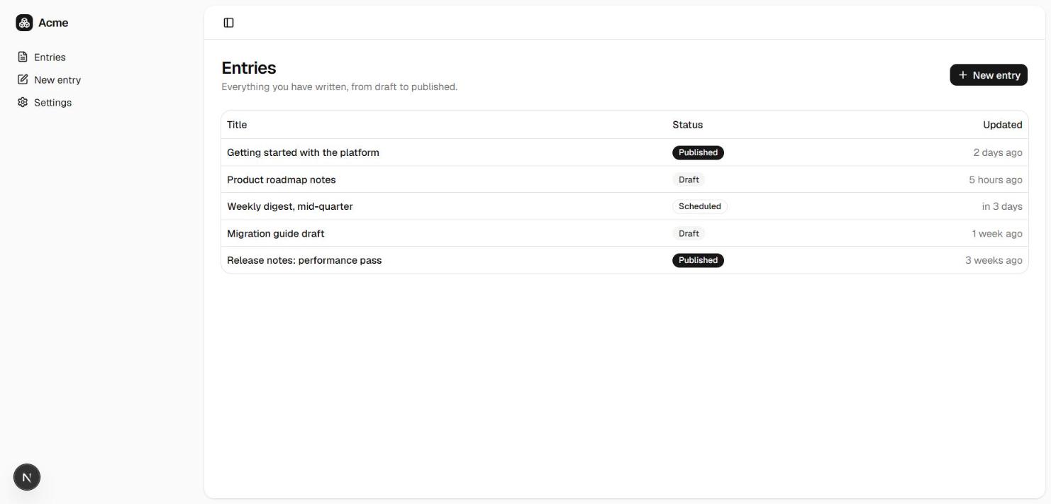
The app UI

Next.js 16 (App Router) content starter — the editor, rendered from the verified UI
Rendered from the verified starter · the editor
A working auth flow and a protected app shell, type-checked against the same verified wiring above. This is what codexmachina create scaffolds on top of the official Next.js 16 (App Router) starter.
src/app/(auth)/sign-in/[[...sign-in]]/page.tsx
import { SignIn } from "@clerk/nextjs";

// login-02's split-screen shape (form column + muted brand panel), with Clerk's hosted sign-in card
// dropped in. The catch-all segment [[...sign-in]] lets Clerk mount its own sub-routes (verification,
// SSO callback) under /sign-in. redirect targets match Better Auth's variant (/dashboard, /sign-up).
export default function SignInPage() {
  return (
    <div className="grid min-h-svh lg:grid-cols-2">
      <main className="flex flex-col items-center justify-center gap-4 p-6 md:p-10">
        <SignIn signUpUrl="/sign-up" forceRedirectUrl="/dashboard" />
      </main>
      <div className="hidden bg-muted lg:block" />
    </div>
  );
}
import { SignUp } from "@clerk/nextjs";

// login-02's split-screen shape (form column + muted brand panel), with Clerk's hosted sign-up card.
// The catch-all segment [[...sign-up]] lets Clerk mount its own sub-routes (email verification) under
// /sign-up. redirect targets match Better Auth's variant (/dashboard, /sign-in).
export default function SignUpPage() {
  return (
    <div className="grid min-h-svh lg:grid-cols-2">
      <main className="flex flex-col items-center justify-center gap-4 p-6 md:p-10">
        <SignUp signInUrl="/sign-in" forceRedirectUrl="/dashboard" />
      </main>
      <div className="hidden bg-muted lg:block" />
    </div>
  );
}
{
  "$schema": "https://ui.shadcn.com/schema.json",
  "style": "radix-nova",
  "rsc": true,
  "tsx": true,
  "tailwind": {
    "config": "",
    "css": "src/app/globals.css",
    "baseColor": "neutral",
    "cssVariables": true,
    "prefix": ""
  },
  "iconLibrary": "lucide",
  "rtl": false,
  "aliases": {
    "components": "@/components",
    "utils": "@/lib/utils",
    "ui": "@/components/ui",
    "lib": "@/lib",
    "hooks": "@/hooks"
  },
  "menuColor": "default",
  "menuAccent": "subtle",
  "registries": {}
}
import { Toaster } from "sonner"

import { AppSidebar } from "@/components/app-sidebar"
import { SiteHeader } from "@/components/site-header"
import { SidebarInset, SidebarProvider } from "@/components/ui/sidebar"
import { TooltipProvider } from "@/components/ui/tooltip"

// dashboard-01's shell: SidebarProvider + AppSidebar + SiteHeader wrapping the route's children.
// TooltipProvider wraps it too — the sidebar's collapsed-icon state renders per-item tooltips
// (SidebarMenuButton's `tooltip` prop) which throw at runtime without an ancestor Provider.
export default function AppLayout({ children }: { children: React.ReactNode }) {
  return (
    <TooltipProvider>
      <SidebarProvider
        style={
          {
            "--sidebar-width": "calc(var(--spacing) * 72)",
            "--header-height": "calc(var(--spacing) * 12)",
          } as React.CSSProperties
        }
      >
        <AppSidebar variant="inset" />
        <SidebarInset>
          <SiteHeader />
          <div className="flex flex-1 flex-col">
            <div className="@container/main flex flex-1 flex-col gap-2">
              {children}
            </div>
          </div>
        </SidebarInset>
        {/* Raw sonner Toaster (NOT the ui/sonner wrapper, which pulls next-themes). Mounted once
            here so toast()/toast.promise(...) calls anywhere under this layout actually render.
            Named no single caller on purpose: the paid kit replaces the demo table that used to be
            the only one, and a comment pointing at a file that is not in the tree is worse than no
            comment. */}
        <Toaster />
      </SidebarProvider>
    </TooltipProvider>
  )
}
import { Footer } from "@/components/marketing/footer";
import { SiteNav } from "@/components/marketing/site-nav";

// Public marketing shell: sticky nav + page content + footer. Static, no auth.

export default function MarketingLayout({
  children,
}: {
  children: React.ReactNode;
}) {
  return (
    <div className="flex min-h-svh flex-col">
      <SiteNav />
      <div className="flex-1">{children}</div>
      <Footer />
    </div>
  );
}
@import "tailwindcss";
@import "tw-animate-css";
@import "shadcn/tailwind.css";

@custom-variant dark (&:is(.dark *));

@theme inline {
  --color-background: var(--background);

  --color-foreground: var(--foreground);

  --font-sans: var(--font-sans);

  --font-mono: var(--font-mono);

  --font-heading: var(--font-sans);

  --color-sidebar-ring: var(--sidebar-ring);

  --color-sidebar-border: var(--sidebar-border);

  --color-sidebar-accent-foreground: var(--sidebar-accent-foreground);

  --color-sidebar-accent: var(--sidebar-accent);

  --color-sidebar-primary-foreground: var(--sidebar-primary-foreground);

  --color-sidebar-primary: var(--sidebar-primary);

  --color-sidebar-foreground: var(--sidebar-foreground);

  --color-sidebar: var(--sidebar);

  --color-chart-5: var(--chart-5);

  --color-chart-4: var(--chart-4);

  --color-chart-3: var(--chart-3);

  --color-chart-2: var(--chart-2);

  --color-chart-1: var(--chart-1);

  --color-ring: var(--ring);

  --color-input: var(--input);

  --color-border: var(--border);

  --color-destructive: var(--destructive);

  --color-accent-foreground: var(--accent-foreground);

  --color-accent: var(--accent);

  --color-muted-foreground: var(--muted-foreground);

  --color-muted: var(--muted);

  --color-secondary-foreground: var(--secondary-foreground);

  --color-secondary: var(--secondary);

  --color-primary-foreground: var(--primary-foreground);

  --color-primary: var(--primary);

  --color-popover-foreground: var(--popover-foreground);

  --color-popover: var(--popover);

  --color-card-foreground: var(--card-foreground);

  --color-card: var(--card);

  --radius-sm: calc(var(--radius) * 0.6);

  --radius-md: calc(var(--radius) * 0.8);

  --radius-lg: var(--radius);

  --radius-xl: calc(var(--radius) * 1.4);

  --radius-2xl: calc(var(--radius) * 1.8);

  --radius-3xl: calc(var(--radius) * 2.2);

  --radius-4xl: calc(var(--radius) * 2.6);

}

:root {
  --background: oklch(1 0 0);

  --foreground: oklch(0.145 0 0);

  --card: oklch(1 0 0);

  --card-foreground: oklch(0.145 0 0);

  --popover: oklch(1 0 0);

  --popover-foreground: oklch(0.145 0 0);

  --primary: oklch(0.205 0 0);

  --primary-foreground: oklch(0.985 0 0);

  --secondary: oklch(0.97 0 0);

  --secondary-foreground: oklch(0.205 0 0);

  --muted: oklch(0.97 0 0);

  --muted-foreground: oklch(0.556 0 0);

  --accent: oklch(0.97 0 0);

  --accent-foreground: oklch(0.205 0 0);

  --destructive: oklch(0.577 0.245 27.325);

  --border: oklch(0.922 0 0);

  --input: oklch(0.922 0 0);

  --ring: oklch(0.708 0 0);

  --chart-1: oklch(0.87 0 0);

  --chart-2: oklch(0.556 0 0);

  --chart-3: oklch(0.439 0 0);

  --chart-4: oklch(0.371 0 0);

  --chart-5: oklch(0.269 0 0);

  --radius: 0.625rem;

  --sidebar: oklch(0.985 0 0);

  --sidebar-foreground: oklch(0.145 0 0);

  --sidebar-primary: oklch(0.205 0 0);

  --sidebar-primary-foreground: oklch(0.985 0 0);

  --sidebar-accent: oklch(0.97 0 0);

  --sidebar-accent-foreground: oklch(0.205 0 0);

  --sidebar-border: oklch(0.922 0 0);

  --sidebar-ring: oklch(0.708 0 0);

}

.dark {
  --background: oklch(0.145 0 0);

  --foreground: oklch(0.985 0 0);

  --card: oklch(0.205 0 0);

  --card-foreground: oklch(0.985 0 0);

  --popover: oklch(0.205 0 0);

  --popover-foreground: oklch(0.985 0 0);

  --primary: oklch(0.922 0 0);

  --primary-foreground: oklch(0.205 0 0);

  --secondary: oklch(0.269 0 0);

  --secondary-foreground: oklch(0.985 0 0);

  --muted: oklch(0.269 0 0);

  --muted-foreground: oklch(0.708 0 0);

  --accent: oklch(0.269 0 0);

  --accent-foreground: oklch(0.985 0 0);

  --destructive: oklch(0.704 0.191 22.216);

  --border: oklch(1 0 0 / 10%);

  --input: oklch(1 0 0 / 15%);

  --ring: oklch(0.556 0 0);

  --chart-1: oklch(0.87 0 0);

  --chart-2: oklch(0.556 0 0);

  --chart-3: oklch(0.439 0 0);

  --chart-4: oklch(0.371 0 0);

  --chart-5: oklch(0.269 0 0);

  --sidebar: oklch(0.205 0 0);

  --sidebar-foreground: oklch(0.985 0 0);

  --sidebar-primary: oklch(0.488 0.243 264.376);

  --sidebar-primary-foreground: oklch(0.985 0 0);

  --sidebar-accent: oklch(0.269 0 0);

  --sidebar-accent-foreground: oklch(0.985 0 0);

  --sidebar-border: oklch(1 0 0 / 10%);

  --sidebar-ring: oklch(0.556 0 0);

}

@layer base {
  * {
    @apply border-border outline-ring/50;
  }
  body {
    @apply bg-background text-foreground;
  }
  html {
    @apply font-sans;
  }
}
import { Boxes } from "lucide-react";

import { cn } from "@/lib/utils";

// Reusable wordmark: a token-filled icon chip + the "Acme" wordmark. Used by the marketing

// nav/footer and the app sidebar header so the brand has a single source of truth.

export function Logo({ className }: { className?: string }) {
  return (
    <span
      className={cn(
        "inline-flex items-center gap-2 font-semibold tracking-tight",
        className,
      )}
    >
      <span className="flex size-6 items-center justify-center rounded-md bg-primary text-primary-foreground">
        <Boxes className="size-4" aria-hidden />
      </span>
      <span className="text-base">Acme</span>
    </span>
  );
}
import Link from "next/link";

import { Logo } from "@/components/logo";

// ponytail: Product links point at real routes/anchors; the Company/Legal "#" hrefs are

// deliberate scaffold stubs — wire them to real pages when the generated app grows them.

// This footer is SHARED across every archetype, so "Pricing" (a dashboard-only #pricing section)

// is intentionally absent — it would dead-end on content/listing/feed/chat landings.

const columns = [
  {
    title: "Product",
    links: [
      { label: "Features", href: "#features" },
      { label: "Sign in", href: "/sign-in" },
    ],
  },
  {
    title: "Company",
    links: [
      { label: "About", href: "#" },
      { label: "Blog", href: "#" },
      { label: "Careers", href: "#" },
    ],
  },
  {
    title: "Legal",
    links: [
      { label: "Privacy", href: "#" },
      { label: "Terms", href: "#" },
      { label: "Security", href: "#" },
    ],
  },
];

export function Footer() {
  return (
    <footer className="border-t">
      <div className="mx-auto max-w-6xl px-4 py-12 sm:px-6 lg:px-8 lg:py-16">
        <div className="grid gap-10 lg:grid-cols-[1.5fr_1fr_1fr_1fr]">
          <div className="flex flex-col gap-4">
            <Logo />
            <p className="max-w-xs text-sm text-muted-foreground text-pretty">
              One workspace for your projects, analytics, and team.
            </p>
          </div>

          {columns.map((column) => (
            <div key={column.title}>
              <h3 className="text-sm font-medium">{column.title}</h3>
              <ul className="mt-3 flex flex-col gap-2 text-sm text-muted-foreground">
                {column.links.map((link) => (
                  <li key={link.label}>
                    <Link
                      href={link.href}
                      className="transition-colors hover:text-foreground"
                    >
                      {link.label}
                    </Link>
                  </li>
                ))}
              </ul>
            </div>
          ))}
        </div>

        <div className="mt-10 flex flex-col items-center justify-between gap-4 border-t pt-6 text-sm text-muted-foreground sm:flex-row">
          <p>&copy; {new Date().getFullYear()} Acme, Inc. All rights reserved.</p>
          <p>Built with CodexMachina.</p>
        </div>
      </div>
    </footer>
  );
}
import Link from "next/link";

import { Logo } from "@/components/logo";
import { Button } from "@/components/ui/button";

// Static, server-rendered marketing nav (SHARED across every archetype). Only universally-true links

// belong here: every archetype's landing renders an #features section, but #pricing exists on the

// dashboard landing alone — so a shared "Pricing" link dead-ended on 4 of 5 archetypes. Dropped it;

// the dashboard landing still reaches its pricing section by scroll + the hero CTA. "Start building"

// is the single sign-up label used across the whole page.

const links = [{ label: "Features", href: "#features" }];

export function SiteNav() {
  return (
    <header className="sticky top-0 z-50 border-b bg-background/80 backdrop-blur">
      <nav className="mx-auto flex h-16 max-w-6xl items-center justify-between gap-6 px-4 sm:px-6 lg:px-8">
        <Link href="/" aria-label="Acme home">
          <Logo />
        </Link>

        <div className="hidden items-center gap-1 md:flex">
          {links.map((link) => (
            <Button key={link.href} asChild variant="ghost" size="sm">
              <Link href={link.href}>{link.label}</Link>
            </Button>
          ))}
        </div>

        <div className="flex items-center gap-2">
          <Button asChild variant="ghost" size="sm" className="hidden sm:inline-flex">
            <Link href="/sign-in">Sign in</Link>
          </Button>
          <Button asChild size="sm">
            <Link href="/sign-up">Start building</Link>
          </Button>
        </div>
      </nav>
    </header>
  );
}
import { SidebarTrigger } from "@/components/ui/sidebar"

// Shared app-shell header — archetype-neutral on purpose. It carries only the sidebar toggle; the

// current section is conveyed by the sidebar nav, not a hardcoded title. (It used to hardcode

// "Documents", which is dashboard-01 terminology and read wrong on content/listing/feed/chat.)

export function SiteHeader() {
  return (
    <header className="flex h-(--header-height) shrink-0 items-center gap-2 border-b transition-[width,height] ease-linear group-has-data-[collapsible=icon]/sidebar-wrapper:h-(--header-height)">
      <div className="flex w-full items-center gap-1 px-4 lg:gap-2 lg:px-6">
        <SidebarTrigger className="-ml-1" />
      </div>
    </header>
  )
}
"use client"

import * as React from "react"
import { Avatar as AvatarPrimitive } from "radix-ui"

import { cn } from "@/lib/utils"

function Avatar({
  className,
  size = "default",
  ...props
}: React.ComponentProps<typeof AvatarPrimitive.Root> & {
  size?: "default" | "sm" | "lg"
}) {
  return (
    <AvatarPrimitive.Root
      data-slot="avatar"
      data-size={size}
      className={cn(
        "group/avatar relative flex size-8 shrink-0 rounded-full select-none after:absolute after:inset-0 after:rounded-full after:border after:border-border after:mix-blend-darken data-[size=lg]:size-10 data-[size=sm]:size-6 dark:after:mix-blend-lighten",
        className
      )}
      {...props}
    />
  )
}

function AvatarImage({
  className,
  ...props
}: React.ComponentProps<typeof AvatarPrimitive.Image>) {
  return (
    <AvatarPrimitive.Image
      data-slot="avatar-image"
      className={cn(
        "aspect-square size-full rounded-full object-cover",
        className
      )}
      {...props}
    />
  )
}

function AvatarFallback({
  className,
  ...props
}: React.ComponentProps<typeof AvatarPrimitive.Fallback>) {
  return (
    <AvatarPrimitive.Fallback
      data-slot="avatar-fallback"
      className={cn(
        "flex size-full items-center justify-center rounded-full bg-muted text-sm text-muted-foreground group-data-[size=sm]/avatar:text-xs",
        className
      )}
      {...props}
    />
  )
}

function AvatarBadge({ className, ...props }: React.ComponentProps<"span">) {
  return (
    <span
      data-slot="avatar-badge"
      className={cn(
        "absolute right-0 bottom-0 z-10 inline-flex items-center justify-center rounded-full bg-primary text-primary-foreground bg-blend-color ring-2 ring-background select-none",
        "group-data-[size=sm]/avatar:size-2 group-data-[size=sm]/avatar:[&>svg]:hidden",
        "group-data-[size=default]/avatar:size-2.5 group-data-[size=default]/avatar:[&>svg]:size-2",
        "group-data-[size=lg]/avatar:size-3 group-data-[size=lg]/avatar:[&>svg]:size-2",
        className
      )}
      {...props}
    />
  )
}

function AvatarGroup({ className, ...props }: React.ComponentProps<"div">) {
  return (
    <div
      data-slot="avatar-group"
      className={cn(
        "group/avatar-group flex -space-x-2 *:data-[slot=avatar]:ring-2 *:data-[slot=avatar]:ring-background",
        className
      )}
      {...props}
    />
  )
}

function AvatarGroupCount({
  className,
  ...props
}: React.ComponentProps<"div">) {
  return (
    <div
      data-slot="avatar-group-count"
      className={cn(
        "relative flex size-8 shrink-0 items-center justify-center rounded-full bg-muted text-sm text-muted-foreground ring-2 ring-background group-has-data-[size=lg]/avatar-group:size-10 group-has-data-[size=sm]/avatar-group:size-6 [&>svg]:size-4 group-has-data-[size=lg]/avatar-group:[&>svg]:size-5 group-has-data-[size=sm]/avatar-group:[&>svg]:size-3",
        className
      )}
      {...props}
    />
  )
}

export {
  Avatar,
  AvatarImage,
  AvatarFallback,
  AvatarGroup,
  AvatarGroupCount,
  AvatarBadge,
}
import * as React from "react"
import { cva, type VariantProps } from "class-variance-authority"
import { Slot } from "radix-ui"

import { cn } from "@/lib/utils"

const badgeVariants = cva(
  "group/badge inline-flex h-5 w-fit shrink-0 items-center justify-center gap-1 overflow-hidden rounded-4xl border border-transparent px-2 py-0.5 text-xs font-medium whitespace-nowrap transition-all focus-visible:border-ring focus-visible:ring-[3px] focus-visible:ring-ring/50 has-data-[icon=inline-end]:pr-1.5 has-data-[icon=inline-start]:pl-1.5 aria-invalid:border-destructive aria-invalid:ring-destructive/20 dark:aria-invalid:ring-destructive/40 [&>svg]:pointer-events-none [&>svg]:size-3!",
  {
    variants: {
      variant: {
        default: "bg-primary text-primary-foreground [a]:hover:bg-primary/80",
        secondary:
          "bg-secondary text-secondary-foreground [a]:hover:bg-secondary/80",
        destructive:
          "bg-destructive/10 text-destructive focus-visible:ring-destructive/20 dark:bg-destructive/20 dark:focus-visible:ring-destructive/40 [a]:hover:bg-destructive/20",
        outline:
          "border-border text-foreground [a]:hover:bg-muted [a]:hover:text-muted-foreground",
        ghost:
          "hover:bg-muted hover:text-muted-foreground dark:hover:bg-muted/50",
        link: "text-primary underline-offset-4 hover:underline",
      },
    },
    defaultVariants: {
      variant: "default",
    },
  }
)

function Badge({
  className,
  variant = "default",
  asChild = false,
  ...props
}: React.ComponentProps<"span"> &
  VariantProps<typeof badgeVariants> & { asChild?: boolean }) {
  const Comp = asChild ? Slot.Root : "span"

  return (
    <Comp
      data-slot="badge"
      data-variant={variant}
      className={cn(badgeVariants({ variant }), className)}
      {...props}
    />
  )
}

export { Badge, badgeVariants }
import * as React from "react"
import { cva, type VariantProps } from "class-variance-authority"
import { Slot } from "radix-ui"

import { cn } from "@/lib/utils"

const buttonVariants = cva(
  "group/button inline-flex shrink-0 items-center justify-center rounded-lg border border-transparent bg-clip-padding text-sm font-medium whitespace-nowrap transition-all outline-none select-none focus-visible:border-ring focus-visible:ring-3 focus-visible:ring-ring/50 active:not-aria-[haspopup]:translate-y-px disabled:pointer-events-none disabled:opacity-50 aria-invalid:border-destructive aria-invalid:ring-3 aria-invalid:ring-destructive/20 dark:aria-invalid:border-destructive/50 dark:aria-invalid:ring-destructive/40 [&_svg]:pointer-events-none [&_svg]:shrink-0 [&_svg:not([class*='size-'])]:size-4",
  {
    variants: {
      variant: {
        default: "bg-primary text-primary-foreground hover:bg-primary/80",
        outline:
          "border-border bg-background hover:bg-muted hover:text-foreground aria-expanded:bg-muted aria-expanded:text-foreground dark:border-input dark:bg-input/30 dark:hover:bg-input/50",
        secondary:
          "bg-secondary text-secondary-foreground hover:bg-[color-mix(in_oklch,var(--secondary),var(--foreground)_5%)] aria-expanded:bg-secondary aria-expanded:text-secondary-foreground",
        ghost:
          "hover:bg-muted hover:text-foreground aria-expanded:bg-muted aria-expanded:text-foreground dark:hover:bg-muted/50",
        destructive:
          "bg-destructive/10 text-destructive hover:bg-destructive/20 focus-visible:border-destructive/40 focus-visible:ring-destructive/20 dark:bg-destructive/20 dark:hover:bg-destructive/30 dark:focus-visible:ring-destructive/40",
        link: "text-primary underline-offset-4 hover:underline",
      },
      size: {
        default:
          "h-8 gap-1.5 px-2.5 has-data-[icon=inline-end]:pr-2 has-data-[icon=inline-start]:pl-2",
        xs: "h-6 gap-1 rounded-[min(var(--radius-md),10px)] px-2 text-xs in-data-[slot=button-group]:rounded-lg has-data-[icon=inline-end]:pr-1.5 has-data-[icon=inline-start]:pl-1.5 [&_svg:not([class*='size-'])]:size-3",
        sm: "h-7 gap-1 rounded-[min(var(--radius-md),12px)] px-2.5 text-[0.8rem] in-data-[slot=button-group]:rounded-lg has-data-[icon=inline-end]:pr-1.5 has-data-[icon=inline-start]:pl-1.5 [&_svg:not([class*='size-'])]:size-3.5",
        lg: "h-9 gap-1.5 px-2.5 has-data-[icon=inline-end]:pr-2 has-data-[icon=inline-start]:pl-2",
        icon: "size-8",
        "icon-xs":
          "size-6 rounded-[min(var(--radius-md),10px)] in-data-[slot=button-group]:rounded-lg [&_svg:not([class*='size-'])]:size-3",
        "icon-sm":
          "size-7 rounded-[min(var(--radius-md),12px)] in-data-[slot=button-group]:rounded-lg",
        "icon-lg": "size-9",
      },
    },
    defaultVariants: {
      variant: "default",
      size: "default",
    },
  }
)

function Button({
  className,
  variant = "default",
  size = "default",
  asChild = false,
  ...props
}: React.ComponentProps<"button"> &
  VariantProps<typeof buttonVariants> & {
    asChild?: boolean
  }) {
  const Comp = asChild ? Slot.Root : "button"

  return (
    <Comp
      data-slot="button"
      data-variant={variant}
      data-size={size}
      className={cn(buttonVariants({ variant, size, className }))}
      {...props}
    />
  )
}

export { Button, buttonVariants }
import * as React from "react"

import { cn } from "@/lib/utils"

function Card({
  className,
  size = "default",
  ...props
}: React.ComponentProps<"div"> & { size?: "default" | "sm" }) {
  return (
    <div
      data-slot="card"
      data-size={size}
      className={cn(
        "group/card flex flex-col gap-(--card-spacing) overflow-hidden rounded-xl bg-card py-(--card-spacing) text-sm text-card-foreground ring-1 ring-foreground/10 [--card-spacing:--spacing(4)] has-data-[slot=card-footer]:pb-0 has-[>img:first-child]:pt-0 data-[size=sm]:[--card-spacing:--spacing(3)] data-[size=sm]:has-data-[slot=card-footer]:pb-0 *:[img:first-child]:rounded-t-xl *:[img:last-child]:rounded-b-xl",
        className
      )}
      {...props}
    />
  )
}

function CardHeader({ className, ...props }: React.ComponentProps<"div">) {
  return (
    <div
      data-slot="card-header"
      className={cn(
        "group/card-header @container/card-header grid auto-rows-min items-start gap-1 rounded-t-xl px-(--card-spacing) has-data-[slot=card-action]:grid-cols-[1fr_auto] has-data-[slot=card-description]:grid-rows-[auto_auto] [.border-b]:pb-(--card-spacing)",
        className
      )}
      {...props}
    />
  )
}

function CardTitle({ className, ...props }: React.ComponentProps<"div">) {
  return (
    <div
      data-slot="card-title"
      className={cn(
        "font-heading text-base leading-snug font-medium group-data-[size=sm]/card:text-sm",
        className
      )}
      {...props}
    />
  )
}

function CardDescription({ className, ...props }: React.ComponentProps<"div">) {
  return (
    <div
      data-slot="card-description"
      className={cn("text-sm text-muted-foreground", className)}
      {...props}
    />
  )
}

function CardAction({ className, ...props }: React.ComponentProps<"div">) {
  return (
    <div
      data-slot="card-action"
      className={cn(
        "col-start-2 row-span-2 row-start-1 self-start justify-self-end",
        className
      )}
      {...props}
    />
  )
}

function CardContent({ className, ...props }: React.ComponentProps<"div">) {
  return (
    <div
      data-slot="card-content"
      className={cn("px-(--card-spacing)", className)}
      {...props}
    />
  )
}

function CardFooter({ className, ...props }: React.ComponentProps<"div">) {
  return (
    <div
      data-slot="card-footer"
      className={cn(
        "flex items-center rounded-b-xl border-t bg-muted/50 p-(--card-spacing)",
        className
      )}
      {...props}
    />
  )
}

export {
  Card,
  CardHeader,
  CardFooter,
  CardTitle,
  CardAction,
  CardDescription,
  CardContent,
}
"use client"

import * as React from "react"
import * as RechartsPrimitive from "recharts"
import type { TooltipValueType } from "recharts"

import { cn } from "@/lib/utils"

// Format: { THEME_NAME: CSS_SELECTOR }

const THEMES = { light: "", dark: ".dark" } as const

const INITIAL_DIMENSION = { width: 320, height: 200 } as const
type TooltipNameType = number | string

export type ChartConfig = Record<
  string,
  {
    label?: React.ReactNode
    icon?: React.ComponentType
  } & (
    | { color?: string; theme?: never }
    | { color?: never; theme: Record<keyof typeof THEMES, string> }
  )
>

type ChartContextProps = {
  config: ChartConfig
}

const ChartContext = React.createContext<ChartContextProps | null>(null)

function useChart() {
  const context = React.useContext(ChartContext)

  if (!context) {
    throw new Error("useChart must be used within a <ChartContainer />")
  }

  return context
}

function ChartContainer({
  id,
  className,
  children,
  config,
  initialDimension = INITIAL_DIMENSION,
  ...props
}: React.ComponentProps<"div"> & {
  config: ChartConfig
  children: React.ComponentProps<
    typeof RechartsPrimitive.ResponsiveContainer
  >["children"]
  initialDimension?: {
    width: number
    height: number
  }
}) {
  const uniqueId = React.useId()
  const chartId = `chart-${id ?? uniqueId.replace(/:/g, "")}`

  return (
    <ChartContext.Provider value={{ config }}>
      <div
        data-slot="chart"
        data-chart={chartId}
        className={cn(
          "flex aspect-video justify-center text-xs [&_.recharts-cartesian-axis-tick_text]:fill-muted-foreground [&_.recharts-cartesian-grid_line[stroke='#ccc']]:stroke-border/50 [&_.recharts-curve.recharts-tooltip-cursor]:stroke-border [&_.recharts-dot[stroke='#fff']]:stroke-transparent [&_.recharts-layer]:outline-hidden [&_.recharts-polar-grid_[stroke='#ccc']]:stroke-border [&_.recharts-radial-bar-background-sector]:fill-muted [&_.recharts-rectangle.recharts-tooltip-cursor]:fill-muted [&_.recharts-reference-line_[stroke='#ccc']]:stroke-border [&_.recharts-sector]:outline-hidden [&_.recharts-sector[stroke='#fff']]:stroke-transparent [&_.recharts-surface]:outline-hidden",
          className
        )}
        {...props}
      >
        <ChartStyle id={chartId} config={config} />
        <RechartsPrimitive.ResponsiveContainer
          initialDimension={initialDimension}
        >
          {children}
        </RechartsPrimitive.ResponsiveContainer>
      </div>
    </ChartContext.Provider>
  )
}

const ChartStyle = ({ id, config }: { id: string; config: ChartConfig }) => {
  const colorConfig = Object.entries(config).filter(
    ([, config]) => config.theme ?? config.color
  )

  if (!colorConfig.length) {
    return null
  }

  return (
    <style
      dangerouslySetInnerHTML={{
        __html: Object.entries(THEMES)
          .map(
            ([theme, prefix]) => `
${prefix} [data-chart=${id}] {
${colorConfig
  .map(([key, itemConfig]) => {
    const color =
      itemConfig.theme?.[theme as keyof typeof itemConfig.theme] ??
      itemConfig.color
    return color ? `  --color-${key}: ${color};` : null

  })
  .join("\n")}
}
`
          )
          .join("\n"),
      }}
    />
  )
}

const ChartTooltip = RechartsPrimitive.Tooltip

function ChartTooltipContent({
  active,
  payload,
  className,
  indicator = "dot",
  hideLabel = false,
  hideIndicator = false,
  label,
  labelFormatter,
  labelClassName,
  formatter,
  color,
  nameKey,
  labelKey,
}: React.ComponentProps<typeof RechartsPrimitive.Tooltip> &
  React.ComponentProps<"div"> & {
    hideLabel?: boolean
    hideIndicator?: boolean
    indicator?: "line" | "dot" | "dashed"
    nameKey?: string
    labelKey?: string
  } & Omit<
    RechartsPrimitive.DefaultTooltipContentProps<
      TooltipValueType,
      TooltipNameType
    >,
    "accessibilityLayer"
  >) {
  const { config } = useChart()

  const tooltipLabel = React.useMemo(() => {
    if (hideLabel || !payload?.length) {
      return null
    }

    const [item] = payload
    const key = `${labelKey ?? item?.dataKey ?? item?.name ?? "value"}`
    const itemConfig = getPayloadConfigFromPayload(config, item, key)
    const value =
      !labelKey && typeof label === "string"
        ? (config[label]?.label ?? label)
        : itemConfig?.label

    if (labelFormatter) {
      return (
        <div className={cn("font-medium", labelClassName)}>
          {labelFormatter(value, payload)}
        </div>
      )
    }

    if (!value) {
      return null
    }

    return <div className={cn("font-medium", labelClassName)}>{value}</div>
  }, [
    label,
    labelFormatter,
    payload,
    hideLabel,
    labelClassName,
    config,
    labelKey,
  ])

  if (!active || !payload?.length) {
    return null
  }

  const nestLabel = payload.length === 1 && indicator !== "dot"

  return (
    <div
      className={cn(
        "grid min-w-32 items-start gap-1.5 rounded-lg border border-border/50 bg-background px-2.5 py-1.5 text-xs shadow-xl",
        className
      )}
    >
      {!nestLabel ? tooltipLabel : null}
      <div className="grid gap-1.5">
        {payload
          .filter((item) => item.type !== "none")
          .map((item, index) => {
            const key = `${nameKey ?? item.name ?? item.dataKey ?? "value"}`
            const itemConfig = getPayloadConfigFromPayload(config, item, key)
            const indicatorColor = color ?? item.payload?.fill ?? item.color

            return (
              <div
                key={index}
                className={cn(
                  "flex w-full flex-wrap items-stretch gap-2 [&>svg]:h-2.5 [&>svg]:w-2.5 [&>svg]:text-muted-foreground",
                  indicator === "dot" && "items-center"
                )}
              >
                {formatter && item?.value !== undefined && item.name ? (
                  formatter(item.value, item.name, item, index, item.payload)
                ) : (
                  <>
                    {itemConfig?.icon ? (
                      <itemConfig.icon />
                    ) : (
                      !hideIndicator && (
                        <div
                          className={cn(
                            "shrink-0 rounded-[2px] border-(--color-border) bg-(--color-bg)",
                            {
                              "h-2.5 w-2.5": indicator === "dot",
                              "w-1": indicator === "line",
                              "w-0 border-[1.5px] border-dashed bg-transparent":
                                indicator === "dashed",
                              "my-0.5": nestLabel && indicator === "dashed",
                            }
                          )}
                          style={
                            {
                              "--color-bg": indicatorColor,
                              "--color-border": indicatorColor,
                            } as React.CSSProperties
                          }
                        />
                      )
                    )}
                    <div
                      className={cn(
                        "flex flex-1 justify-between leading-none",
                        nestLabel ? "items-end" : "items-center"
                      )}
                    >
                      <div className="grid gap-1.5">
                        {nestLabel ? tooltipLabel : null}
                        <span className="text-muted-foreground">
                          {itemConfig?.label ?? item.name}
                        </span>
                      </div>
                      {item.value != null && (
                        <span className="font-mono font-medium text-foreground tabular-nums">
                          {typeof item.value === "number"
                            ? item.value.toLocaleString()
                            : String(item.value)}
                        </span>
                      )}
                    </div>
                  </>
                )}
              </div>
            )
          })}
      </div>
    </div>
  )
}

const ChartLegend = RechartsPrimitive.Legend

function ChartLegendContent({
  className,
  hideIcon = false,
  payload,
  verticalAlign = "bottom",
  nameKey,
}: React.ComponentProps<"div"> & {
  hideIcon?: boolean
  nameKey?: string
} & RechartsPrimitive.DefaultLegendContentProps) {
  const { config } = useChart()

  if (!payload?.length) {
    return null
  }

  return (
    <div
      className={cn(
        "flex items-center justify-center gap-4",
        verticalAlign === "top" ? "pb-3" : "pt-3",
        className
      )}
    >
      {payload
        .filter((item) => item.type !== "none")
        .map((item, index) => {
          const key = `${nameKey ?? item.dataKey ?? "value"}`
          const itemConfig = getPayloadConfigFromPayload(config, item, key)

          return (
            <div
              key={index}
              className={cn(
                "flex items-center gap-1.5 [&>svg]:h-3 [&>svg]:w-3 [&>svg]:text-muted-foreground"
              )}
            >
              {itemConfig?.icon && !hideIcon ? (
                <itemConfig.icon />
              ) : (
                <div
                  className="h-2 w-2 shrink-0 rounded-[2px]"
                  style={{
                    backgroundColor: item.color,
                  }}
                />
              )}
              {itemConfig?.label}
            </div>
          )
        })}
    </div>
  )
}

function getPayloadConfigFromPayload(
  config: ChartConfig,
  payload: unknown,
  key: string
) {
  if (typeof payload !== "object" || payload === null) {
    return undefined
  }

  const payloadPayload =
    "payload" in payload &&
    typeof payload.payload === "object" &&
    payload.payload !== null
      ? payload.payload
      : undefined

  let configLabelKey: string = key

  if (
    key in payload &&
    typeof payload[key as keyof typeof payload] === "string"
  ) {
    configLabelKey = payload[key as keyof typeof payload] as string
  } else if (
    payloadPayload &&
    key in payloadPayload &&
    typeof payloadPayload[key as keyof typeof payloadPayload] === "string"
  ) {
    configLabelKey = payloadPayload[
      key as keyof typeof payloadPayload
    ] as string
  }

  return configLabelKey in config ? config[configLabelKey] : config[key]
}

export {
  ChartContainer,
  ChartTooltip,
  ChartTooltipContent,
  ChartLegend,
  ChartLegendContent,
  ChartStyle,
}
"use client"

import * as React from "react"
import { Checkbox as CheckboxPrimitive } from "radix-ui"

import { cn } from "@/lib/utils"
import { CheckIcon } from "lucide-react"

function Checkbox({
  className,
  ...props
}: React.ComponentProps<typeof CheckboxPrimitive.Root>) {
  return (
    <CheckboxPrimitive.Root
      data-slot="checkbox"
      className={cn(
        "peer relative flex size-4 shrink-0 items-center justify-center rounded-[4px] border border-input transition-colors outline-none group-has-disabled/field:opacity-50 after:absolute after:-inset-x-3 after:-inset-y-2 focus-visible:border-ring focus-visible:ring-3 focus-visible:ring-ring/50 disabled:cursor-not-allowed disabled:opacity-50 aria-invalid:border-destructive aria-invalid:ring-3 aria-invalid:ring-destructive/20 aria-invalid:aria-checked:border-primary dark:bg-input/30 dark:aria-invalid:border-destructive/50 dark:aria-invalid:ring-destructive/40 data-checked:border-primary data-checked:bg-primary data-checked:text-primary-foreground dark:data-checked:bg-primary",
        className
      )}
      {...props}
    >
      <CheckboxPrimitive.Indicator
        data-slot="checkbox-indicator"
        className="grid place-content-center text-current transition-none [&>svg]:size-3.5"
      >
        <CheckIcon
        />
      </CheckboxPrimitive.Indicator>
    </CheckboxPrimitive.Root>
  )
}

export { Checkbox }
"use client"

import * as React from "react"
import { Drawer as DrawerPrimitive } from "vaul"

import { cn } from "@/lib/utils"

function Drawer({
  ...props
}: React.ComponentProps<typeof DrawerPrimitive.Root>) {
  return <DrawerPrimitive.Root data-slot="drawer" {...props} />
}

function DrawerTrigger({
  ...props
}: React.ComponentProps<typeof DrawerPrimitive.Trigger>) {
  return <DrawerPrimitive.Trigger data-slot="drawer-trigger" {...props} />
}

function DrawerPortal({
  ...props
}: React.ComponentProps<typeof DrawerPrimitive.Portal>) {
  return <DrawerPrimitive.Portal data-slot="drawer-portal" {...props} />
}

function DrawerClose({
  ...props
}: React.ComponentProps<typeof DrawerPrimitive.Close>) {
  return <DrawerPrimitive.Close data-slot="drawer-close" {...props} />
}

function DrawerOverlay({
  className,
  ...props
}: React.ComponentProps<typeof DrawerPrimitive.Overlay>) {
  return (
    <DrawerPrimitive.Overlay
      data-slot="drawer-overlay"
      className={cn(
        "fixed inset-0 z-50 bg-black/10 supports-backdrop-filter:backdrop-blur-xs data-open:animate-in data-open:fade-in-0 data-closed:animate-out data-closed:fade-out-0",
        className
      )}
      {...props}
    />
  )
}

function DrawerContent({
  className,
  children,
  ...props
}: React.ComponentProps<typeof DrawerPrimitive.Content>) {
  return (
    <DrawerPortal data-slot="drawer-portal">
      <DrawerOverlay />
      <DrawerPrimitive.Content
        data-slot="drawer-content"
        className={cn(
          "group/drawer-content fixed z-50 flex h-auto flex-col bg-popover text-sm text-popover-foreground data-[vaul-drawer-direction=bottom]:inset-x-0 data-[vaul-drawer-direction=bottom]:bottom-0 data-[vaul-drawer-direction=bottom]:mt-24 data-[vaul-drawer-direction=bottom]:max-h-[80vh] data-[vaul-drawer-direction=bottom]:rounded-t-xl data-[vaul-drawer-direction=bottom]:border-t data-[vaul-drawer-direction=left]:inset-y-0 data-[vaul-drawer-direction=left]:left-0 data-[vaul-drawer-direction=left]:w-3/4 data-[vaul-drawer-direction=left]:rounded-r-xl data-[vaul-drawer-direction=left]:border-r data-[vaul-drawer-direction=right]:inset-y-0 data-[vaul-drawer-direction=right]:right-0 data-[vaul-drawer-direction=right]:w-3/4 data-[vaul-drawer-direction=right]:rounded-l-xl data-[vaul-drawer-direction=right]:border-l data-[vaul-drawer-direction=top]:inset-x-0 data-[vaul-drawer-direction=top]:top-0 data-[vaul-drawer-direction=top]:mb-24 data-[vaul-drawer-direction=top]:max-h-[80vh] data-[vaul-drawer-direction=top]:rounded-b-xl data-[vaul-drawer-direction=top]:border-b data-[vaul-drawer-direction=left]:sm:max-w-sm data-[vaul-drawer-direction=right]:sm:max-w-sm",
          className
        )}
        {...props}
      >
        <div className="mx-auto mt-4 hidden h-1 w-[100px] shrink-0 rounded-full bg-muted group-data-[vaul-drawer-direction=bottom]/drawer-content:block" />
        {children}
      </DrawerPrimitive.Content>
    </DrawerPortal>
  )
}

function DrawerHeader({ className, ...props }: React.ComponentProps<"div">) {
  return (
    <div
      data-slot="drawer-header"
      className={cn(
        "flex flex-col gap-0.5 p-4 group-data-[vaul-drawer-direction=bottom]/drawer-content:text-center group-data-[vaul-drawer-direction=top]/drawer-content:text-center md:gap-0.5 md:text-left",
        className
      )}
      {...props}
    />
  )
}

function DrawerFooter({ className, ...props }: React.ComponentProps<"div">) {
  return (
    <div
      data-slot="drawer-footer"
      className={cn("mt-auto flex flex-col gap-2 p-4", className)}
      {...props}
    />
  )
}

function DrawerTitle({
  className,
  ...props
}: React.ComponentProps<typeof DrawerPrimitive.Title>) {
  return (
    <DrawerPrimitive.Title
      data-slot="drawer-title"
      className={cn(
        "font-heading text-base font-medium text-foreground",
        className
      )}
      {...props}
    />
  )
}

function DrawerDescription({
  className,
  ...props
}: React.ComponentProps<typeof DrawerPrimitive.Description>) {
  return (
    <DrawerPrimitive.Description
      data-slot="drawer-description"
      className={cn("text-sm text-muted-foreground", className)}
      {...props}
    />
  )
}

export {
  Drawer,
  DrawerPortal,
  DrawerOverlay,
  DrawerTrigger,
  DrawerClose,
  DrawerContent,
  DrawerHeader,
  DrawerFooter,
  DrawerTitle,
  DrawerDescription,
}
"use client"

import * as React from "react"
import { DropdownMenu as DropdownMenuPrimitive } from "radix-ui"

import { cn } from "@/lib/utils"
import { CheckIcon, ChevronRightIcon } from "lucide-react"

function DropdownMenu({
  ...props
}: React.ComponentProps<typeof DropdownMenuPrimitive.Root>) {
  return <DropdownMenuPrimitive.Root data-slot="dropdown-menu" {...props} />
}

function DropdownMenuPortal({
  ...props
}: React.ComponentProps<typeof DropdownMenuPrimitive.Portal>) {
  return (
    <DropdownMenuPrimitive.Portal data-slot="dropdown-menu-portal" {...props} />
  )
}

function DropdownMenuTrigger({
  ...props
}: React.ComponentProps<typeof DropdownMenuPrimitive.Trigger>) {
  return (
    <DropdownMenuPrimitive.Trigger
      data-slot="dropdown-menu-trigger"
      {...props}
    />
  )
}

function DropdownMenuContent({
  className,
  align = "start",
  sideOffset = 4,
  ...props
}: React.ComponentProps<typeof DropdownMenuPrimitive.Content>) {
  return (
    <DropdownMenuPrimitive.Portal>
      <DropdownMenuPrimitive.Content
        data-slot="dropdown-menu-content"
        sideOffset={sideOffset}
        align={align}
        className={cn("z-50 max-h-(--radix-dropdown-menu-content-available-height) w-(--radix-dropdown-menu-trigger-width) min-w-32 origin-(--radix-dropdown-menu-content-transform-origin) overflow-x-hidden overflow-y-auto rounded-lg bg-popover p-1 text-popover-foreground shadow-md ring-1 ring-foreground/10 duration-100 data-[side=bottom]:slide-in-from-top-2 data-[side=left]:slide-in-from-right-2 data-[side=right]:slide-in-from-left-2 data-[side=top]:slide-in-from-bottom-2 data-[state=closed]:overflow-hidden data-open:animate-in data-open:fade-in-0 data-open:zoom-in-95 data-closed:animate-out data-closed:fade-out-0 data-closed:zoom-out-95", className )}
        {...props}
      />
    </DropdownMenuPrimitive.Portal>
  )
}

function DropdownMenuGroup({
  ...props
}: React.ComponentProps<typeof DropdownMenuPrimitive.Group>) {
  return (
    <DropdownMenuPrimitive.Group data-slot="dropdown-menu-group" {...props} />
  )
}

function DropdownMenuItem({
  className,
  inset,
  variant = "default",
  ...props
}: React.ComponentProps<typeof DropdownMenuPrimitive.Item> & {
  inset?: boolean
  variant?: "default" | "destructive"
}) {
  return (
    <DropdownMenuPrimitive.Item
      data-slot="dropdown-menu-item"
      data-inset={inset}
      data-variant={variant}
      className={cn(
        "group/dropdown-menu-item relative flex cursor-default items-center gap-1.5 rounded-md px-1.5 py-1 text-sm outline-hidden select-none focus:bg-accent focus:text-accent-foreground not-data-[variant=destructive]:focus:**:text-accent-foreground data-inset:pl-7 data-[variant=destructive]:text-destructive data-[variant=destructive]:focus:bg-destructive/10 data-[variant=destructive]:focus:text-destructive dark:data-[variant=destructive]:focus:bg-destructive/20 data-disabled:pointer-events-none data-disabled:opacity-50 [&_svg]:pointer-events-none [&_svg]:shrink-0 [&_svg:not([class*='size-'])]:size-4 data-[variant=destructive]:*:[svg]:text-destructive",
        className
      )}
      {...props}
    />
  )
}

function DropdownMenuCheckboxItem({
  className,
  children,
  checked,
  inset,
  ...props
}: React.ComponentProps<typeof DropdownMenuPrimitive.CheckboxItem> & {
  inset?: boolean
}) {
  return (
    <DropdownMenuPrimitive.CheckboxItem
      data-slot="dropdown-menu-checkbox-item"
      data-inset={inset}
      className={cn(
        "relative flex cursor-default items-center gap-1.5 rounded-md py-1 pr-8 pl-1.5 text-sm outline-hidden select-none focus:bg-accent focus:text-accent-foreground focus:**:text-accent-foreground data-inset:pl-7 data-disabled:pointer-events-none data-disabled:opacity-50 [&_svg]:pointer-events-none [&_svg]:shrink-0 [&_svg:not([class*='size-'])]:size-4",
        className
      )}
      checked={checked}
      {...props}
    >
      <span
        className="pointer-events-none absolute right-2 flex items-center justify-center"
        data-slot="dropdown-menu-checkbox-item-indicator"
      >
        <DropdownMenuPrimitive.ItemIndicator>
          <CheckIcon
          />
        </DropdownMenuPrimitive.ItemIndicator>
      </span>
      {children}
    </DropdownMenuPrimitive.CheckboxItem>
  )
}

function DropdownMenuRadioGroup({
  ...props
}: React.ComponentProps<typeof DropdownMenuPrimitive.RadioGroup>) {
  return (
    <DropdownMenuPrimitive.RadioGroup
      data-slot="dropdown-menu-radio-group"
      {...props}
    />
  )
}

function DropdownMenuRadioItem({
  className,
  children,
  inset,
  ...props
}: React.ComponentProps<typeof DropdownMenuPrimitive.RadioItem> & {
  inset?: boolean
}) {
  return (
    <DropdownMenuPrimitive.RadioItem
      data-slot="dropdown-menu-radio-item"
      data-inset={inset}
      className={cn(
        "relative flex cursor-default items-center gap-1.5 rounded-md py-1 pr-8 pl-1.5 text-sm outline-hidden select-none focus:bg-accent focus:text-accent-foreground focus:**:text-accent-foreground data-inset:pl-7 data-disabled:pointer-events-none data-disabled:opacity-50 [&_svg]:pointer-events-none [&_svg]:shrink-0 [&_svg:not([class*='size-'])]:size-4",
        className
      )}
      {...props}
    >
      <span
        className="pointer-events-none absolute right-2 flex items-center justify-center"
        data-slot="dropdown-menu-radio-item-indicator"
      >
        <DropdownMenuPrimitive.ItemIndicator>
          <CheckIcon
          />
        </DropdownMenuPrimitive.ItemIndicator>
      </span>
      {children}
    </DropdownMenuPrimitive.RadioItem>
  )
}

function DropdownMenuLabel({
  className,
  inset,
  ...props
}: React.ComponentProps<typeof DropdownMenuPrimitive.Label> & {
  inset?: boolean
}) {
  return (
    <DropdownMenuPrimitive.Label
      data-slot="dropdown-menu-label"
      data-inset={inset}
      className={cn(
        "px-1.5 py-1 text-xs font-medium text-muted-foreground data-inset:pl-7",
        className
      )}
      {...props}
    />
  )
}

function DropdownMenuSeparator({
  className,
  ...props
}: React.ComponentProps<typeof DropdownMenuPrimitive.Separator>) {
  return (
    <DropdownMenuPrimitive.Separator
      data-slot="dropdown-menu-separator"
      className={cn("-mx-1 my-1 h-px bg-border", className)}
      {...props}
    />
  )
}

function DropdownMenuShortcut({
  className,
  ...props
}: React.ComponentProps<"span">) {
  return (
    <span
      data-slot="dropdown-menu-shortcut"
      className={cn(
        "ml-auto text-xs tracking-widest text-muted-foreground group-focus/dropdown-menu-item:text-accent-foreground",
        className
      )}
      {...props}
    />
  )
}

function DropdownMenuSub({
  ...props
}: React.ComponentProps<typeof DropdownMenuPrimitive.Sub>) {
  return <DropdownMenuPrimitive.Sub data-slot="dropdown-menu-sub" {...props} />
}

function DropdownMenuSubTrigger({
  className,
  inset,
  children,
  ...props
}: React.ComponentProps<typeof DropdownMenuPrimitive.SubTrigger> & {
  inset?: boolean
}) {
  return (
    <DropdownMenuPrimitive.SubTrigger
      data-slot="dropdown-menu-sub-trigger"
      data-inset={inset}
      className={cn(
        "flex cursor-default items-center gap-1.5 rounded-md px-1.5 py-1 text-sm outline-hidden select-none focus:bg-accent focus:text-accent-foreground not-data-[variant=destructive]:focus:**:text-accent-foreground data-inset:pl-7 data-open:bg-accent data-open:text-accent-foreground [&_svg]:pointer-events-none [&_svg]:shrink-0 [&_svg:not([class*='size-'])]:size-4",
        className
      )}
      {...props}
    >
      {children}
      <ChevronRightIcon className="ml-auto" />
    </DropdownMenuPrimitive.SubTrigger>
  )
}

function DropdownMenuSubContent({
  className,
  ...props
}: React.ComponentProps<typeof DropdownMenuPrimitive.SubContent>) {
  return (
    <DropdownMenuPrimitive.SubContent
      data-slot="dropdown-menu-sub-content"
      className={cn("z-50 min-w-[96px] origin-(--radix-dropdown-menu-content-transform-origin) overflow-hidden rounded-lg bg-popover p-1 text-popover-foreground shadow-lg ring-1 ring-foreground/10 duration-100 data-[side=bottom]:slide-in-from-top-2 data-[side=left]:slide-in-from-right-2 data-[side=right]:slide-in-from-left-2 data-[side=top]:slide-in-from-bottom-2 data-open:animate-in data-open:fade-in-0 data-open:zoom-in-95 data-closed:animate-out data-closed:fade-out-0 data-closed:zoom-out-95", className )}
      {...props}
    />
  )
}

export {
  DropdownMenu,
  DropdownMenuPortal,
  DropdownMenuTrigger,
  DropdownMenuContent,
  DropdownMenuGroup,
  DropdownMenuLabel,
  DropdownMenuItem,
  DropdownMenuCheckboxItem,
  DropdownMenuRadioGroup,
  DropdownMenuRadioItem,
  DropdownMenuSeparator,
  DropdownMenuShortcut,
  DropdownMenuSub,
  DropdownMenuSubTrigger,
  DropdownMenuSubContent,
}
import * as React from "react"

import { cn } from "@/lib/utils"

function Input({ className, type, ...props }: React.ComponentProps<"input">) {
  return (
    <input
      type={type}
      data-slot="input"
      className={cn(
        "h-8 w-full min-w-0 rounded-lg border border-input bg-transparent px-2.5 py-1 text-base transition-colors outline-none file:inline-flex file:h-6 file:border-0 file:bg-transparent file:text-sm file:font-medium file:text-foreground placeholder:text-muted-foreground focus-visible:border-ring focus-visible:ring-3 focus-visible:ring-ring/50 disabled:pointer-events-none disabled:cursor-not-allowed disabled:bg-input/50 disabled:opacity-50 aria-invalid:border-destructive aria-invalid:ring-3 aria-invalid:ring-destructive/20 md:text-sm dark:bg-input/30 dark:disabled:bg-input/80 dark:aria-invalid:border-destructive/50 dark:aria-invalid:ring-destructive/40",
        className
      )}
      {...props}
    />
  )
}

export { Input }
"use client"

import * as React from "react"
import { Label as LabelPrimitive } from "radix-ui"

import { cn } from "@/lib/utils"

function Label({
  className,
  ...props
}: React.ComponentProps<typeof LabelPrimitive.Root>) {
  return (
    <LabelPrimitive.Root
      data-slot="label"
      className={cn(
        "flex items-center gap-2 text-sm leading-none font-medium select-none group-data-[disabled=true]:pointer-events-none group-data-[disabled=true]:opacity-50 peer-disabled:cursor-not-allowed peer-disabled:opacity-50",
        className
      )}
      {...props}
    />
  )
}

export { Label }
"use client"

import * as React from "react"
import { Select as SelectPrimitive } from "radix-ui"

import { cn } from "@/lib/utils"
import { ChevronDownIcon, CheckIcon, ChevronUpIcon } from "lucide-react"

function Select({
  ...props
}: React.ComponentProps<typeof SelectPrimitive.Root>) {
  return <SelectPrimitive.Root data-slot="select" {...props} />
}

function SelectGroup({
  className,
  ...props
}: React.ComponentProps<typeof SelectPrimitive.Group>) {
  return (
    <SelectPrimitive.Group
      data-slot="select-group"
      className={cn("scroll-my-1 p-1", className)}
      {...props}
    />
  )
}

function SelectValue({
  ...props
}: React.ComponentProps<typeof SelectPrimitive.Value>) {
  return <SelectPrimitive.Value data-slot="select-value" {...props} />
}

function SelectTrigger({
  className,
  size = "default",
  children,
  ...props
}: React.ComponentProps<typeof SelectPrimitive.Trigger> & {
  size?: "sm" | "default"
}) {
  return (
    <SelectPrimitive.Trigger
      data-slot="select-trigger"
      data-size={size}
      className={cn(
        "flex w-fit items-center justify-between gap-1.5 rounded-lg border border-input bg-transparent py-2 pr-2 pl-2.5 text-sm whitespace-nowrap transition-colors outline-none select-none focus-visible:border-ring focus-visible:ring-3 focus-visible:ring-ring/50 disabled:cursor-not-allowed disabled:opacity-50 aria-invalid:border-destructive aria-invalid:ring-3 aria-invalid:ring-destructive/20 data-placeholder:text-muted-foreground data-[size=default]:h-8 data-[size=sm]:h-7 data-[size=sm]:rounded-[min(var(--radius-md),10px)] *:data-[slot=select-value]:line-clamp-1 *:data-[slot=select-value]:flex *:data-[slot=select-value]:items-center *:data-[slot=select-value]:gap-1.5 dark:bg-input/30 dark:hover:bg-input/50 dark:aria-invalid:border-destructive/50 dark:aria-invalid:ring-destructive/40 [&_svg]:pointer-events-none [&_svg]:shrink-0 [&_svg:not([class*='size-'])]:size-4",
        className
      )}
      {...props}
    >
      {children}
      <SelectPrimitive.Icon asChild>
        <ChevronDownIcon className="pointer-events-none size-4 text-muted-foreground" />
      </SelectPrimitive.Icon>
    </SelectPrimitive.Trigger>
  )
}

function SelectContent({
  className,
  children,
  position = "item-aligned",
  align = "center",
  ...props
}: React.ComponentProps<typeof SelectPrimitive.Content>) {
  return (
    <SelectPrimitive.Portal>
      <SelectPrimitive.Content
        data-slot="select-content"
        data-align-trigger={position === "item-aligned"}
        className={cn("relative z-50 max-h-(--radix-select-content-available-height) min-w-36 origin-(--radix-select-content-transform-origin) overflow-x-hidden overflow-y-auto rounded-lg bg-popover text-popover-foreground shadow-md ring-1 ring-foreground/10 duration-100 data-[align-trigger=true]:animate-none data-[side=bottom]:slide-in-from-top-2 data-[side=left]:slide-in-from-right-2 data-[side=right]:slide-in-from-left-2 data-[side=top]:slide-in-from-bottom-2 data-open:animate-in data-open:fade-in-0 data-open:zoom-in-95 data-closed:animate-out data-closed:fade-out-0 data-closed:zoom-out-95", position ==="popper"&&"data-[side=bottom]:translate-y-1 data-[side=left]:-translate-x-1 data-[side=right]:translate-x-1 data-[side=top]:-translate-y-1", className )}
        position={position}
        align={align}
        {...props}
      >
        <SelectScrollUpButton />
        <SelectPrimitive.Viewport
          data-position={position}
          className={cn(
            "data-[position=popper]:h-(--radix-select-trigger-height) data-[position=popper]:w-full data-[position=popper]:min-w-(--radix-select-trigger-width)",
            position === "popper" && ""
          )}
        >
          {children}
        </SelectPrimitive.Viewport>
        <SelectScrollDownButton />
      </SelectPrimitive.Content>
    </SelectPrimitive.Portal>
  )
}

function SelectLabel({
  className,
  ...props
}: React.ComponentProps<typeof SelectPrimitive.Label>) {
  return (
    <SelectPrimitive.Label
      data-slot="select-label"
      className={cn("px-1.5 py-1 text-xs text-muted-foreground", className)}
      {...props}
    />
  )
}

function SelectItem({
  className,
  children,
  ...props
}: React.ComponentProps<typeof SelectPrimitive.Item>) {
  return (
    <SelectPrimitive.Item
      data-slot="select-item"
      className={cn(
        "relative flex w-full cursor-default items-center gap-1.5 rounded-md py-1 pr-8 pl-1.5 text-sm outline-hidden select-none focus:bg-accent focus:text-accent-foreground not-data-[variant=destructive]:focus:**:text-accent-foreground data-disabled:pointer-events-none data-disabled:opacity-50 [&_svg]:pointer-events-none [&_svg]:shrink-0 [&_svg:not([class*='size-'])]:size-4 *:[span]:last:flex *:[span]:last:items-center *:[span]:last:gap-2",
        className
      )}
      {...props}
    >
      <span className="pointer-events-none absolute right-2 flex size-4 items-center justify-center">
        <SelectPrimitive.ItemIndicator>
          <CheckIcon className="pointer-events-none" />
        </SelectPrimitive.ItemIndicator>
      </span>
      <SelectPrimitive.ItemText>{children}</SelectPrimitive.ItemText>
    </SelectPrimitive.Item>
  )
}

function SelectSeparator({
  className,
  ...props
}: React.ComponentProps<typeof SelectPrimitive.Separator>) {
  return (
    <SelectPrimitive.Separator
      data-slot="select-separator"
      className={cn("pointer-events-none -mx-1 my-1 h-px bg-border", className)}
      {...props}
    />
  )
}

function SelectScrollUpButton({
  className,
  ...props
}: React.ComponentProps<typeof SelectPrimitive.ScrollUpButton>) {
  return (
    <SelectPrimitive.ScrollUpButton
      data-slot="select-scroll-up-button"
      className={cn(
        "z-10 flex cursor-default items-center justify-center bg-popover py-1 [&_svg:not([class*='size-'])]:size-4",
        className
      )}
      {...props}
    >
      <ChevronUpIcon
      />
    </SelectPrimitive.ScrollUpButton>
  )
}

function SelectScrollDownButton({
  className,
  ...props
}: React.ComponentProps<typeof SelectPrimitive.ScrollDownButton>) {
  return (
    <SelectPrimitive.ScrollDownButton
      data-slot="select-scroll-down-button"
      className={cn(
        "z-10 flex cursor-default items-center justify-center bg-popover py-1 [&_svg:not([class*='size-'])]:size-4",
        className
      )}
      {...props}
    >
      <ChevronDownIcon
      />
    </SelectPrimitive.ScrollDownButton>
  )
}

export {
  Select,
  SelectContent,
  SelectGroup,
  SelectItem,
  SelectLabel,
  SelectScrollDownButton,
  SelectScrollUpButton,
  SelectSeparator,
  SelectTrigger,
  SelectValue,
}
"use client"

import * as React from "react"
import { Separator as SeparatorPrimitive } from "radix-ui"

import { cn } from "@/lib/utils"

function Separator({
  className,
  orientation = "horizontal",
  decorative = true,
  ...props
}: React.ComponentProps<typeof SeparatorPrimitive.Root>) {
  return (
    <SeparatorPrimitive.Root
      data-slot="separator"
      decorative={decorative}
      orientation={orientation}
      className={cn(
        "shrink-0 bg-border data-horizontal:h-px data-horizontal:w-full data-vertical:w-px data-vertical:self-stretch",
        className
      )}
      {...props}
    />
  )
}

export { Separator }
"use client"

import * as React from "react"
import { Dialog as SheetPrimitive } from "radix-ui"

import { cn } from "@/lib/utils"
import { Button } from "@/components/ui/button"
import { XIcon } from "lucide-react"

function Sheet({ ...props }: React.ComponentProps<typeof SheetPrimitive.Root>) {
  return <SheetPrimitive.Root data-slot="sheet" {...props} />
}

function SheetTrigger({
  ...props
}: React.ComponentProps<typeof SheetPrimitive.Trigger>) {
  return <SheetPrimitive.Trigger data-slot="sheet-trigger" {...props} />
}

function SheetClose({
  ...props
}: React.ComponentProps<typeof SheetPrimitive.Close>) {
  return <SheetPrimitive.Close data-slot="sheet-close" {...props} />
}

function SheetPortal({
  ...props
}: React.ComponentProps<typeof SheetPrimitive.Portal>) {
  return <SheetPrimitive.Portal data-slot="sheet-portal" {...props} />
}

function SheetOverlay({
  className,
  ...props
}: React.ComponentProps<typeof SheetPrimitive.Overlay>) {
  return (
    <SheetPrimitive.Overlay
      data-slot="sheet-overlay"
      className={cn(
        "fixed inset-0 z-50 bg-black/10 duration-100 supports-backdrop-filter:backdrop-blur-xs data-open:animate-in data-open:fade-in-0 data-closed:animate-out data-closed:fade-out-0",
        className
      )}
      {...props}
    />
  )
}

function SheetContent({
  className,
  children,
  side = "right",
  showCloseButton = true,
  ...props
}: React.ComponentProps<typeof SheetPrimitive.Content> & {
  side?: "top" | "right" | "bottom" | "left"
  showCloseButton?: boolean
}) {
  return (
    <SheetPortal>
      <SheetOverlay />
      <SheetPrimitive.Content
        data-slot="sheet-content"
        data-side={side}
        className={cn(
          "fixed z-50 flex flex-col gap-4 bg-popover bg-clip-padding text-sm text-popover-foreground shadow-lg transition duration-200 ease-in-out data-[side=bottom]:inset-x-0 data-[side=bottom]:bottom-0 data-[side=bottom]:h-auto data-[side=bottom]:border-t data-[side=left]:inset-y-0 data-[side=left]:left-0 data-[side=left]:h-full data-[side=left]:w-3/4 data-[side=left]:border-r data-[side=right]:inset-y-0 data-[side=right]:right-0 data-[side=right]:h-full data-[side=right]:w-3/4 data-[side=right]:border-l data-[side=top]:inset-x-0 data-[side=top]:top-0 data-[side=top]:h-auto data-[side=top]:border-b data-[side=left]:sm:max-w-sm data-[side=right]:sm:max-w-sm data-open:animate-in data-open:fade-in-0 data-[side=bottom]:data-open:slide-in-from-bottom-10 data-[side=left]:data-open:slide-in-from-left-10 data-[side=right]:data-open:slide-in-from-right-10 data-[side=top]:data-open:slide-in-from-top-10 data-closed:animate-out data-closed:fade-out-0 data-[side=bottom]:data-closed:slide-out-to-bottom-10 data-[side=left]:data-closed:slide-out-to-left-10 data-[side=right]:data-closed:slide-out-to-right-10 data-[side=top]:data-closed:slide-out-to-top-10",
          className
        )}
        {...props}
      >
        {children}
        {showCloseButton && (
          <SheetPrimitive.Close data-slot="sheet-close" asChild>
            <Button
              variant="ghost"
              className="absolute top-3 right-3"
              size="icon-sm"
            >
              <XIcon
              />
              <span className="sr-only">Close</span>
            </Button>
          </SheetPrimitive.Close>
        )}
      </SheetPrimitive.Content>
    </SheetPortal>
  )
}

function SheetHeader({ className, ...props }: React.ComponentProps<"div">) {
  return (
    <div
      data-slot="sheet-header"
      className={cn("flex flex-col gap-0.5 p-4", className)}
      {...props}
    />
  )
}

function SheetFooter({ className, ...props }: React.ComponentProps<"div">) {
  return (
    <div
      data-slot="sheet-footer"
      className={cn("mt-auto flex flex-col gap-2 p-4", className)}
      {...props}
    />
  )
}

function SheetTitle({
  className,
  ...props
}: React.ComponentProps<typeof SheetPrimitive.Title>) {
  return (
    <SheetPrimitive.Title
      data-slot="sheet-title"
      className={cn(
        "font-heading text-base font-medium text-foreground",
        className
      )}
      {...props}
    />
  )
}

function SheetDescription({
  className,
  ...props
}: React.ComponentProps<typeof SheetPrimitive.Description>) {
  return (
    <SheetPrimitive.Description
      data-slot="sheet-description"
      className={cn("text-sm text-muted-foreground", className)}
      {...props}
    />
  )
}

export {
  Sheet,
  SheetTrigger,
  SheetClose,
  SheetContent,
  SheetHeader,
  SheetFooter,
  SheetTitle,
  SheetDescription,
}
"use client"

import * as React from "react"
import { cva, type VariantProps } from "class-variance-authority"
import { Slot } from "radix-ui"

import { useIsMobile } from "@/hooks/use-mobile"
import { cn } from "@/lib/utils"
import { Button } from "@/components/ui/button"
import { Input } from "@/components/ui/input"
import { Separator } from "@/components/ui/separator"
import {
  Sheet,
  SheetContent,
  SheetDescription,
  SheetHeader,
  SheetTitle,
} from "@/components/ui/sheet"
import { Skeleton } from "@/components/ui/skeleton"
import {
  Tooltip,
  TooltipContent,
  TooltipTrigger,
} from "@/components/ui/tooltip"
import { PanelLeftIcon } from "lucide-react"

const SIDEBAR_COOKIE_NAME = "sidebar_state"
const SIDEBAR_COOKIE_MAX_AGE = 60 * 60 * 24 * 7
const SIDEBAR_WIDTH = "16rem"
const SIDEBAR_WIDTH_MOBILE = "18rem"
const SIDEBAR_WIDTH_ICON = "3rem"
const SIDEBAR_KEYBOARD_SHORTCUT = "b"

type SidebarContextProps = {
  state: "expanded" | "collapsed"
  open: boolean
  setOpen: (open: boolean) => void
  openMobile: boolean
  setOpenMobile: (open: boolean) => void
  isMobile: boolean
  toggleSidebar: () => void
}

const SidebarContext = React.createContext<SidebarContextProps | null>(null)

function useSidebar() {
  const context = React.useContext(SidebarContext)
  if (!context) {
    throw new Error("useSidebar must be used within a SidebarProvider.")
  }

  return context
}

function SidebarProvider({
  defaultOpen = true,
  open: openProp,
  onOpenChange: setOpenProp,
  className,
  style,
  children,
  ...props
}: React.ComponentProps<"div"> & {
  defaultOpen?: boolean
  open?: boolean
  onOpenChange?: (open: boolean) => void
}) {
  const isMobile = useIsMobile()
  const [openMobile, setOpenMobile] = React.useState(false)

  // This is the internal state of the sidebar.

  // We use openProp and setOpenProp for control from outside the component.

  const [_open, _setOpen] = React.useState(defaultOpen)
  const open = openProp ?? _open
  const setOpen = React.useCallback(
    (value: boolean | ((value: boolean) => boolean)) => {
      const openState = typeof value === "function" ? value(open) : value
      if (setOpenProp) {
        setOpenProp(openState)
      } else {
        _setOpen(openState)
      }

      // This sets the cookie to keep the sidebar state.

      document.cookie = `${SIDEBAR_COOKIE_NAME}=${openState}; path=/; max-age=${SIDEBAR_COOKIE_MAX_AGE}`
    },
    [setOpenProp, open]
  )

  // Helper to toggle the sidebar.

  const toggleSidebar = React.useCallback(() => {
    return isMobile ? setOpenMobile((open) => !open) : setOpen((open) => !open)
  }, [isMobile, setOpen, setOpenMobile])

  // Adds a keyboard shortcut to toggle the sidebar.

  React.useEffect(() => {
    const handleKeyDown = (event: KeyboardEvent) => {
      if (
        event.key === SIDEBAR_KEYBOARD_SHORTCUT &&
        (event.metaKey || event.ctrlKey)
      ) {
        event.preventDefault()
        toggleSidebar()
      }
    }

    window.addEventListener("keydown", handleKeyDown)
    return () => window.removeEventListener("keydown", handleKeyDown)
  }, [toggleSidebar])

  // We add a state so that we can do data-state="expanded" or "collapsed".

  // This makes it easier to style the sidebar with Tailwind classes.

  const state = open ? "expanded" : "collapsed"

  const contextValue = React.useMemo<SidebarContextProps>(
    () => ({
      state,
      open,
      setOpen,
      isMobile,
      openMobile,
      setOpenMobile,
      toggleSidebar,
    }),
    [state, open, setOpen, isMobile, openMobile, setOpenMobile, toggleSidebar]
  )

  return (
    <SidebarContext.Provider value={contextValue}>
      <div
        data-slot="sidebar-wrapper"
        style={
          {
            "--sidebar-width": SIDEBAR_WIDTH,
            "--sidebar-width-icon": SIDEBAR_WIDTH_ICON,
            ...style,
          } as React.CSSProperties
        }
        className={cn(
          "group/sidebar-wrapper flex min-h-svh w-full has-data-[variant=inset]:bg-sidebar",
          className
        )}
        {...props}
      >
        {children}
      </div>
    </SidebarContext.Provider>
  )
}

function Sidebar({
  side = "left",
  variant = "sidebar",
  collapsible = "offcanvas",
  className,
  children,
  dir,
  ...props
}: React.ComponentProps<"div"> & {
  side?: "left" | "right"
  variant?: "sidebar" | "floating" | "inset"
  collapsible?: "offcanvas" | "icon" | "none"
}) {
  const { isMobile, state, openMobile, setOpenMobile } = useSidebar()

  if (collapsible === "none") {
    return (
      <div
        data-slot="sidebar"
        className={cn(
          "flex h-full w-(--sidebar-width) flex-col bg-sidebar text-sidebar-foreground",
          className
        )}
        {...props}
      >
        {children}
      </div>
    )
  }

  if (isMobile) {
    return (
      <Sheet open={openMobile} onOpenChange={setOpenMobile} {...props}>
        <SheetContent
          dir={dir}
          data-sidebar="sidebar"
          data-slot="sidebar"
          data-mobile="true"
          className="w-(--sidebar-width) bg-sidebar p-0 text-sidebar-foreground [&>button]:hidden"
          style={
            {
              "--sidebar-width": SIDEBAR_WIDTH_MOBILE,
            } as React.CSSProperties
          }
          side={side}
        >
          <SheetHeader className="sr-only">
            <SheetTitle>Sidebar</SheetTitle>
            <SheetDescription>Displays the mobile sidebar.</SheetDescription>
          </SheetHeader>
          <div className="flex h-full w-full flex-col">{children}</div>
        </SheetContent>
      </Sheet>
    )
  }

  return (
    <div
      className="group peer hidden text-sidebar-foreground md:block"
      data-state={state}
      data-collapsible={state === "collapsed" ? collapsible : ""}
      data-variant={variant}
      data-side={side}
      data-slot="sidebar"
    >
      {/* This is what handles the sidebar gap on desktop */}
      <div
        data-slot="sidebar-gap"
        className={cn(
          "relative w-(--sidebar-width) bg-transparent transition-[width] duration-200 ease-linear",
          "group-data-[collapsible=offcanvas]:w-0",
          "group-data-[side=right]:rotate-180",
          variant === "floating" || variant === "inset"
            ? "group-data-[collapsible=icon]:w-[calc(var(--sidebar-width-icon)+(--spacing(4)))]"
            : "group-data-[collapsible=icon]:w-(--sidebar-width-icon)"
        )}
      />
      <div
        data-slot="sidebar-container"
        data-side={side}
        className={cn(
          "fixed inset-y-0 z-10 hidden h-svh w-(--sidebar-width) transition-[left,right,width] duration-200 ease-linear data-[side=left]:left-0 data-[side=left]:group-data-[collapsible=offcanvas]:left-[calc(var(--sidebar-width)*-1)] data-[side=right]:right-0 data-[side=right]:group-data-[collapsible=offcanvas]:right-[calc(var(--sidebar-width)*-1)] md:flex",
          // Adjust the padding for floating and inset variants.

          variant === "floating" || variant === "inset"
            ? "p-2 group-data-[collapsible=icon]:w-[calc(var(--sidebar-width-icon)+(--spacing(4))+2px)]"
            : "group-data-[collapsible=icon]:w-(--sidebar-width-icon) group-data-[side=left]:border-r group-data-[side=right]:border-l",
          className
        )}
        {...props}
      >
        <div
          data-sidebar="sidebar"
          data-slot="sidebar-inner"
          className="flex size-full flex-col bg-sidebar group-data-[variant=floating]:rounded-lg group-data-[variant=floating]:shadow-sm group-data-[variant=floating]:ring-1 group-data-[variant=floating]:ring-sidebar-border"
        >
          {children}
        </div>
      </div>
    </div>
  )
}

function SidebarTrigger({
  className,
  onClick,
  ...props
}: React.ComponentProps<typeof Button>) {
  const { toggleSidebar } = useSidebar()

  return (
    <Button
      data-sidebar="trigger"
      data-slot="sidebar-trigger"
      variant="ghost"
      size="icon-sm"
      className={cn(className)}
      onClick={(event) => {
        onClick?.(event)
        toggleSidebar()
      }}
      {...props}
    >
      <PanelLeftIcon />
      <span className="sr-only">Toggle Sidebar</span>
    </Button>
  )
}

function SidebarRail({ className, ...props }: React.ComponentProps<"button">) {
  const { toggleSidebar } = useSidebar()

  return (
    <button
      data-sidebar="rail"
      data-slot="sidebar-rail"
      aria-label="Toggle Sidebar"
      tabIndex={-1}
      onClick={toggleSidebar}
      title="Toggle Sidebar"
      className={cn(
        "absolute inset-y-0 z-20 hidden w-4 transition-all ease-linear group-data-[side=left]:-right-4 group-data-[side=right]:left-0 after:absolute after:inset-y-0 after:start-1/2 after:w-[2px] hover:after:bg-sidebar-border sm:flex ltr:-translate-x-1/2 rtl:-translate-x-1/2",
        "in-data-[side=left]:cursor-w-resize in-data-[side=right]:cursor-e-resize",
        "[[data-side=left][data-state=collapsed]_&]:cursor-e-resize [[data-side=right][data-state=collapsed]_&]:cursor-w-resize",
        "group-data-[collapsible=offcanvas]:translate-x-0 group-data-[collapsible=offcanvas]:after:left-full hover:group-data-[collapsible=offcanvas]:bg-sidebar",
        "[[data-side=left][data-collapsible=offcanvas]_&]:-right-2",
        "[[data-side=right][data-collapsible=offcanvas]_&]:-left-2",
        className
      )}
      {...props}
    />
  )
}

function SidebarInset({ className, ...props }: React.ComponentProps<"main">) {
  return (
    <main
      data-slot="sidebar-inset"
      className={cn(
        "relative flex w-full flex-1 flex-col bg-background md:peer-data-[variant=inset]:m-2 md:peer-data-[variant=inset]:ml-0 md:peer-data-[variant=inset]:rounded-xl md:peer-data-[variant=inset]:shadow-sm md:peer-data-[variant=inset]:peer-data-[state=collapsed]:ml-2",
        className
      )}
      {...props}
    />
  )
}

function SidebarInput({
  className,
  ...props
}: React.ComponentProps<typeof Input>) {
  return (
    <Input
      data-slot="sidebar-input"
      data-sidebar="input"
      className={cn("h-8 w-full bg-background shadow-none", className)}
      {...props}
    />
  )
}

function SidebarHeader({ className, ...props }: React.ComponentProps<"div">) {
  return (
    <div
      data-slot="sidebar-header"
      data-sidebar="header"
      className={cn("flex flex-col gap-2 p-2", className)}
      {...props}
    />
  )
}

function SidebarFooter({ className, ...props }: React.ComponentProps<"div">) {
  return (
    <div
      data-slot="sidebar-footer"
      data-sidebar="footer"
      className={cn("flex flex-col gap-2 p-2", className)}
      {...props}
    />
  )
}

function SidebarSeparator({
  className,
  ...props
}: React.ComponentProps<typeof Separator>) {
  return (
    <Separator
      data-slot="sidebar-separator"
      data-sidebar="separator"
      className={cn("mx-2 w-auto bg-sidebar-border", className)}
      {...props}
    />
  )
}

function SidebarContent({ className, ...props }: React.ComponentProps<"div">) {
  return (
    <div
      data-slot="sidebar-content"
      data-sidebar="content"
      className={cn(
        "no-scrollbar flex min-h-0 flex-1 flex-col gap-0 overflow-auto group-data-[collapsible=icon]:overflow-hidden",
        className
      )}
      {...props}
    />
  )
}

function SidebarGroup({ className, ...props }: React.ComponentProps<"div">) {
  return (
    <div
      data-slot="sidebar-group"
      data-sidebar="group"
      className={cn("relative flex w-full min-w-0 flex-col p-2", className)}
      {...props}
    />
  )
}

function SidebarGroupLabel({
  className,
  asChild = false,
  ...props
}: React.ComponentProps<"div"> & { asChild?: boolean }) {
  const Comp = asChild ? Slot.Root : "div"

  return (
    <Comp
      data-slot="sidebar-group-label"
      data-sidebar="group-label"
      className={cn(
        "flex h-8 shrink-0 items-center rounded-md px-2 text-xs font-medium text-sidebar-foreground/70 ring-sidebar-ring outline-hidden transition-[margin,opacity] duration-200 ease-linear group-data-[collapsible=icon]:-mt-8 group-data-[collapsible=icon]:opacity-0 focus-visible:ring-2 [&>svg]:size-4 [&>svg]:shrink-0",
        className
      )}
      {...props}
    />
  )
}

function SidebarGroupAction({
  className,
  asChild = false,
  ...props
}: React.ComponentProps<"button"> & { asChild?: boolean }) {
  const Comp = asChild ? Slot.Root : "button"

  return (
    <Comp
      data-slot="sidebar-group-action"
      data-sidebar="group-action"
      className={cn(
        "absolute top-3.5 right-3 flex aspect-square w-5 items-center justify-center rounded-md p-0 text-sidebar-foreground ring-sidebar-ring outline-hidden transition-transform group-data-[collapsible=icon]:hidden after:absolute after:-inset-2 hover:bg-sidebar-accent hover:text-sidebar-accent-foreground focus-visible:ring-2 md:after:hidden [&>svg]:size-4 [&>svg]:shrink-0",
        className
      )}
      {...props}
    />
  )
}

function SidebarGroupContent({
  className,
  ...props
}: React.ComponentProps<"div">) {
  return (
    <div
      data-slot="sidebar-group-content"
      data-sidebar="group-content"
      className={cn("w-full text-sm", className)}
      {...props}
    />
  )
}

function SidebarMenu({ className, ...props }: React.ComponentProps<"ul">) {
  return (
    <ul
      data-slot="sidebar-menu"
      data-sidebar="menu"
      className={cn("flex w-full min-w-0 flex-col gap-0", className)}
      {...props}
    />
  )
}

function SidebarMenuItem({ className, ...props }: React.ComponentProps<"li">) {
  return (
    <li
      data-slot="sidebar-menu-item"
      data-sidebar="menu-item"
      className={cn("group/menu-item relative", className)}
      {...props}
    />
  )
}

const sidebarMenuButtonVariants = cva(
  "peer/menu-button group/menu-button flex w-full items-center gap-2 overflow-hidden rounded-md p-2 text-left text-sm ring-sidebar-ring outline-hidden transition-[width,height,padding] group-has-data-[sidebar=menu-action]/menu-item:pr-8 group-data-[collapsible=icon]:size-8! group-data-[collapsible=icon]:p-2! hover:bg-sidebar-accent hover:text-sidebar-accent-foreground focus-visible:ring-2 active:bg-sidebar-accent active:text-sidebar-accent-foreground disabled:pointer-events-none disabled:opacity-50 aria-disabled:pointer-events-none aria-disabled:opacity-50 data-open:hover:bg-sidebar-accent data-open:hover:text-sidebar-accent-foreground data-active:bg-sidebar-accent data-active:font-medium data-active:text-sidebar-accent-foreground [&_svg]:size-4 [&_svg]:shrink-0 [&>span:last-child]:truncate",
  {
    variants: {
      variant: {
        default: "hover:bg-sidebar-accent hover:text-sidebar-accent-foreground",
        outline:
          "bg-background shadow-[0_0_0_1px_var(--sidebar-border)] hover:bg-sidebar-accent hover:text-sidebar-accent-foreground hover:shadow-[0_0_0_1px_var(--sidebar-accent)]",
      },
      size: {
        default: "h-8 text-sm",
        sm: "h-7 text-xs",
        lg: "h-12 text-sm group-data-[collapsible=icon]:p-0!",
      },
    },
    defaultVariants: {
      variant: "default",
      size: "default",
    },
  }
)

function SidebarMenuButton({
  asChild = false,
  isActive = false,
  variant = "default",
  size = "default",
  tooltip,
  className,
  ...props
}: React.ComponentProps<"button"> & {
  asChild?: boolean
  isActive?: boolean
  tooltip?: string | React.ComponentProps<typeof TooltipContent>
} & VariantProps<typeof sidebarMenuButtonVariants>) {
  const Comp = asChild ? Slot.Root : "button"
  const { isMobile, state } = useSidebar()

  const button = (
    <Comp
      data-slot="sidebar-menu-button"
      data-sidebar="menu-button"
      data-size={size}
      data-active={isActive}
      className={cn(sidebarMenuButtonVariants({ variant, size }), className)}
      {...props}
    />
  )

  if (!tooltip) {
    return button
  }

  if (typeof tooltip === "string") {
    tooltip = {
      children: tooltip,
    }
  }

  return (
    <Tooltip>
      <TooltipTrigger asChild>{button}</TooltipTrigger>
      <TooltipContent
        side="right"
        align="center"
        hidden={state !== "collapsed" || isMobile}
        {...tooltip}
      />
    </Tooltip>
  )
}

function SidebarMenuAction({
  className,
  asChild = false,
  showOnHover = false,
  ...props
}: React.ComponentProps<"button"> & {
  asChild?: boolean
  showOnHover?: boolean
}) {
  const Comp = asChild ? Slot.Root : "button"

  return (
    <Comp
      data-slot="sidebar-menu-action"
      data-sidebar="menu-action"
      className={cn(
        "absolute top-1.5 right-1 flex aspect-square w-5 items-center justify-center rounded-md p-0 text-sidebar-foreground ring-sidebar-ring outline-hidden transition-transform group-data-[collapsible=icon]:hidden peer-hover/menu-button:text-sidebar-accent-foreground peer-data-[size=default]/menu-button:top-1.5 peer-data-[size=lg]/menu-button:top-2.5 peer-data-[size=sm]/menu-button:top-1 after:absolute after:-inset-2 hover:bg-sidebar-accent hover:text-sidebar-accent-foreground focus-visible:ring-2 md:after:hidden [&>svg]:size-4 [&>svg]:shrink-0",
        showOnHover &&
          "group-focus-within/menu-item:opacity-100 group-hover/menu-item:opacity-100 peer-data-active/menu-button:text-sidebar-accent-foreground aria-expanded:opacity-100 md:opacity-0",
        className
      )}
      {...props}
    />
  )
}

function SidebarMenuBadge({
  className,
  ...props
}: React.ComponentProps<"div">) {
  return (
    <div
      data-slot="sidebar-menu-badge"
      data-sidebar="menu-badge"
      className={cn(
        "pointer-events-none absolute right-1 flex h-5 min-w-5 items-center justify-center rounded-md px-1 text-xs font-medium text-sidebar-foreground tabular-nums select-none group-data-[collapsible=icon]:hidden peer-hover/menu-button:text-sidebar-accent-foreground peer-data-[size=default]/menu-button:top-1.5 peer-data-[size=lg]/menu-button:top-2.5 peer-data-[size=sm]/menu-button:top-1 peer-data-active/menu-button:text-sidebar-accent-foreground",
        className
      )}
      {...props}
    />
  )
}

function SidebarMenuSkeleton({
  className,
  showIcon = false,
  ...props
}: React.ComponentProps<"div"> & {
  showIcon?: boolean
}) {
  // Random width between 50 to 90%.

  const [width] = React.useState(() => {
    return `${Math.floor(Math.random() * 40) + 50}%`
  })

  return (
    <div
      data-slot="sidebar-menu-skeleton"
      data-sidebar="menu-skeleton"
      className={cn("flex h-8 items-center gap-2 rounded-md px-2", className)}
      {...props}
    >
      {showIcon && (
        <Skeleton
          className="size-4 rounded-md"
          data-sidebar="menu-skeleton-icon"
        />
      )}
      <Skeleton
        className="h-4 max-w-(--skeleton-width) flex-1"
        data-sidebar="menu-skeleton-text"
        style={
          {
            "--skeleton-width": width,
          } as React.CSSProperties
        }
      />
    </div>
  )
}

function SidebarMenuSub({ className, ...props }: React.ComponentProps<"ul">) {
  return (
    <ul
      data-slot="sidebar-menu-sub"
      data-sidebar="menu-sub"
      className={cn(
        "mx-3.5 flex min-w-0 translate-x-px flex-col gap-1 border-l border-sidebar-border px-2.5 py-0.5 group-data-[collapsible=icon]:hidden",
        className
      )}
      {...props}
    />
  )
}

function SidebarMenuSubItem({
  className,
  ...props
}: React.ComponentProps<"li">) {
  return (
    <li
      data-slot="sidebar-menu-sub-item"
      data-sidebar="menu-sub-item"
      className={cn("group/menu-sub-item relative", className)}
      {...props}
    />
  )
}

function SidebarMenuSubButton({
  asChild = false,
  size = "md",
  isActive = false,
  className,
  ...props
}: React.ComponentProps<"a"> & {
  asChild?: boolean
  size?: "sm" | "md"
  isActive?: boolean
}) {
  const Comp = asChild ? Slot.Root : "a"

  return (
    <Comp
      data-slot="sidebar-menu-sub-button"
      data-sidebar="menu-sub-button"
      data-size={size}
      data-active={isActive}
      className={cn(
        "flex h-7 min-w-0 -translate-x-px items-center gap-2 overflow-hidden rounded-md px-2 text-sidebar-foreground ring-sidebar-ring outline-hidden group-data-[collapsible=icon]:hidden hover:bg-sidebar-accent hover:text-sidebar-accent-foreground focus-visible:ring-2 active:bg-sidebar-accent active:text-sidebar-accent-foreground disabled:pointer-events-none disabled:opacity-50 aria-disabled:pointer-events-none aria-disabled:opacity-50 data-[size=md]:text-sm data-[size=sm]:text-xs data-active:bg-sidebar-accent data-active:text-sidebar-accent-foreground [&>span:last-child]:truncate [&>svg]:size-4 [&>svg]:shrink-0 [&>svg]:text-sidebar-accent-foreground",
        className
      )}
      {...props}
    />
  )
}

export {
  Sidebar,
  SidebarContent,
  SidebarFooter,
  SidebarGroup,
  SidebarGroupAction,
  SidebarGroupContent,
  SidebarGroupLabel,
  SidebarHeader,
  SidebarInput,
  SidebarInset,
  SidebarMenu,
  SidebarMenuAction,
  SidebarMenuBadge,
  SidebarMenuButton,
  SidebarMenuItem,
  SidebarMenuSkeleton,
  SidebarMenuSub,
  SidebarMenuSubButton,
  SidebarMenuSubItem,
  SidebarProvider,
  SidebarRail,
  SidebarSeparator,
  SidebarTrigger,
  useSidebar,
}
import { cn } from "@/lib/utils"

function Skeleton({ className, ...props }: React.ComponentProps<"div">) {
  return (
    <div
      data-slot="skeleton"
      className={cn("animate-pulse rounded-md bg-muted", className)}
      {...props}
    />
  )
}

export { Skeleton }
"use client"

import * as React from "react"

import { cn } from "@/lib/utils"

function Table({ className, ...props }: React.ComponentProps<"table">) {
  return (
    <div
      data-slot="table-container"
      className="relative w-full overflow-x-auto"
    >
      <table
        data-slot="table"
        className={cn("w-full caption-bottom text-sm", className)}
        {...props}
      />
    </div>
  )
}

function TableHeader({ className, ...props }: React.ComponentProps<"thead">) {
  return (
    <thead
      data-slot="table-header"
      className={cn("[&_tr]:border-b", className)}
      {...props}
    />
  )
}

function TableBody({ className, ...props }: React.ComponentProps<"tbody">) {
  return (
    <tbody
      data-slot="table-body"
      className={cn("[&_tr:last-child]:border-0", className)}
      {...props}
    />
  )
}

function TableFooter({ className, ...props }: React.ComponentProps<"tfoot">) {
  return (
    <tfoot
      data-slot="table-footer"
      className={cn(
        "border-t bg-muted/50 font-medium [&>tr]:last:border-b-0",
        className
      )}
      {...props}
    />
  )
}

function TableRow({ className, ...props }: React.ComponentProps<"tr">) {
  return (
    <tr
      data-slot="table-row"
      className={cn(
        "border-b transition-colors hover:bg-muted/50 has-aria-expanded:bg-muted/50 data-[state=selected]:bg-muted",
        className
      )}
      {...props}
    />
  )
}

function TableHead({ className, ...props }: React.ComponentProps<"th">) {
  return (
    <th
      data-slot="table-head"
      className={cn(
        "h-10 px-2 text-left align-middle font-medium whitespace-nowrap text-foreground [&:has([role=checkbox])]:pr-0",
        className
      )}
      {...props}
    />
  )
}

function TableCell({ className, ...props }: React.ComponentProps<"td">) {
  return (
    <td
      data-slot="table-cell"
      className={cn(
        "p-2 align-middle whitespace-nowrap [&:has([role=checkbox])]:pr-0",
        className
      )}
      {...props}
    />
  )
}

function TableCaption({
  className,
  ...props
}: React.ComponentProps<"caption">) {
  return (
    <caption
      data-slot="table-caption"
      className={cn("mt-4 text-sm text-muted-foreground", className)}
      {...props}
    />
  )
}

export {
  Table,
  TableHeader,
  TableBody,
  TableFooter,
  TableHead,
  TableRow,
  TableCell,
  TableCaption,
}
"use client"

import * as React from "react"
import { cva, type VariantProps } from "class-variance-authority"
import { Tabs as TabsPrimitive } from "radix-ui"

import { cn } from "@/lib/utils"

function Tabs({
  className,
  orientation = "horizontal",
  ...props
}: React.ComponentProps<typeof TabsPrimitive.Root>) {
  return (
    <TabsPrimitive.Root
      data-slot="tabs"
      data-orientation={orientation}
      className={cn(
        "group/tabs flex gap-2 data-horizontal:flex-col",
        className
      )}
      {...props}
    />
  )
}

const tabsListVariants = cva(
  "group/tabs-list inline-flex w-fit items-center justify-center rounded-lg p-[3px] text-muted-foreground group-data-horizontal/tabs:h-8 group-data-vertical/tabs:h-fit group-data-vertical/tabs:flex-col data-[variant=line]:rounded-none",
  {
    variants: {
      variant: {
        default: "bg-muted",
        line: "gap-1 bg-transparent",
      },
    },
    defaultVariants: {
      variant: "default",
    },
  }
)

function TabsList({
  className,
  variant = "default",
  ...props
}: React.ComponentProps<typeof TabsPrimitive.List> &
  VariantProps<typeof tabsListVariants>) {
  return (
    <TabsPrimitive.List
      data-slot="tabs-list"
      data-variant={variant}
      className={cn(tabsListVariants({ variant }), className)}
      {...props}
    />
  )
}

function TabsTrigger({
  className,
  ...props
}: React.ComponentProps<typeof TabsPrimitive.Trigger>) {
  return (
    <TabsPrimitive.Trigger
      data-slot="tabs-trigger"
      className={cn(
        "relative inline-flex h-[calc(100%-1px)] flex-1 items-center justify-center gap-1.5 rounded-md border border-transparent px-1.5 py-0.5 text-sm font-medium whitespace-nowrap text-foreground/60 transition-all group-data-vertical/tabs:w-full group-data-vertical/tabs:justify-start hover:text-foreground focus-visible:border-ring focus-visible:ring-[3px] focus-visible:ring-ring/50 focus-visible:outline-1 focus-visible:outline-ring disabled:pointer-events-none disabled:opacity-50 has-data-[icon=inline-end]:pr-1 has-data-[icon=inline-start]:pl-1 dark:text-muted-foreground dark:hover:text-foreground group-data-[variant=default]/tabs-list:data-active:shadow-sm group-data-[variant=line]/tabs-list:data-active:shadow-none [&_svg]:pointer-events-none [&_svg]:shrink-0 [&_svg:not([class*='size-'])]:size-4",
        "group-data-[variant=line]/tabs-list:bg-transparent group-data-[variant=line]/tabs-list:data-active:bg-transparent dark:group-data-[variant=line]/tabs-list:data-active:border-transparent dark:group-data-[variant=line]/tabs-list:data-active:bg-transparent",
        "data-active:bg-background data-active:text-foreground dark:data-active:border-input dark:data-active:bg-input/30 dark:data-active:text-foreground",
        "after:absolute after:bg-foreground after:opacity-0 after:transition-opacity group-data-horizontal/tabs:after:inset-x-0 group-data-horizontal/tabs:after:bottom-[-5px] group-data-horizontal/tabs:after:h-0.5 group-data-vertical/tabs:after:inset-y-0 group-data-vertical/tabs:after:-right-1 group-data-vertical/tabs:after:w-0.5 group-data-[variant=line]/tabs-list:data-active:after:opacity-100",
        className
      )}
      {...props}
    />
  )
}

function TabsContent({
  className,
  ...props
}: React.ComponentProps<typeof TabsPrimitive.Content>) {
  return (
    <TabsPrimitive.Content
      data-slot="tabs-content"
      className={cn("flex-1 text-sm outline-none", className)}
      {...props}
    />
  )
}

export { Tabs, TabsList, TabsTrigger, TabsContent, tabsListVariants }
import * as React from "react"

import { cn } from "@/lib/utils"

function Textarea({ className, ...props }: React.ComponentProps<"textarea">) {
  return (
    <textarea
      data-slot="textarea"
      className={cn(
        "flex field-sizing-content min-h-16 w-full rounded-lg border border-input bg-transparent px-2.5 py-2 text-base transition-colors outline-none placeholder:text-muted-foreground focus-visible:border-ring focus-visible:ring-3 focus-visible:ring-ring/50 disabled:cursor-not-allowed disabled:bg-input/50 disabled:opacity-50 aria-invalid:border-destructive aria-invalid:ring-3 aria-invalid:ring-destructive/20 md:text-sm dark:bg-input/30 dark:disabled:bg-input/80 dark:aria-invalid:border-destructive/50 dark:aria-invalid:ring-destructive/40",
        className
      )}
      {...props}
    />
  )
}

export { Textarea }
"use client"

import * as React from "react"
import { type VariantProps } from "class-variance-authority"
import { ToggleGroup as ToggleGroupPrimitive } from "radix-ui"

import { cn } from "@/lib/utils"
import { toggleVariants } from "@/components/ui/toggle"

const ToggleGroupContext = React.createContext<
  VariantProps<typeof toggleVariants> & {
    spacing?: number
    orientation?: "horizontal" | "vertical"
  }
>({
  size: "default",
  variant: "default",
  spacing: 2,
  orientation: "horizontal",
})

function ToggleGroup({
  className,
  variant,
  size,
  spacing = 2,
  orientation = "horizontal",
  children,
  ...props
}: React.ComponentProps<typeof ToggleGroupPrimitive.Root> &
  VariantProps<typeof toggleVariants> & {
    spacing?: number
    orientation?: "horizontal" | "vertical"
  }) {
  return (
    <ToggleGroupPrimitive.Root
      data-slot="toggle-group"
      data-variant={variant}
      data-size={size}
      data-spacing={spacing}
      data-orientation={orientation}
      style={{ "--gap": spacing } as React.CSSProperties}
      className={cn(
        "group/toggle-group flex w-fit flex-row items-center gap-[--spacing(var(--gap))] rounded-lg data-[size=sm]:rounded-[min(var(--radius-md),10px)] data-vertical:flex-col data-vertical:items-stretch",
        className
      )}
      {...props}
    >
      <ToggleGroupContext.Provider
        value={{ variant, size, spacing, orientation }}
      >
        {children}
      </ToggleGroupContext.Provider>
    </ToggleGroupPrimitive.Root>
  )
}

function ToggleGroupItem({
  className,
  children,
  variant = "default",
  size = "default",
  ...props
}: React.ComponentProps<typeof ToggleGroupPrimitive.Item> &
  VariantProps<typeof toggleVariants>) {
  const context = React.useContext(ToggleGroupContext)

  return (
    <ToggleGroupPrimitive.Item
      data-slot="toggle-group-item"
      data-variant={context.variant || variant}
      data-size={context.size || size}
      data-spacing={context.spacing}
      className={cn(
        "shrink-0 group-data-[spacing=0]/toggle-group:rounded-none group-data-[spacing=0]/toggle-group:px-2 focus:z-10 focus-visible:z-10 group-data-[spacing=0]/toggle-group:has-data-[icon=inline-end]:pr-1.5 group-data-[spacing=0]/toggle-group:has-data-[icon=inline-start]:pl-1.5 group-data-horizontal/toggle-group:data-[spacing=0]:first:rounded-l-lg group-data-vertical/toggle-group:data-[spacing=0]:first:rounded-t-lg group-data-horizontal/toggle-group:data-[spacing=0]:last:rounded-r-lg group-data-vertical/toggle-group:data-[spacing=0]:last:rounded-b-lg group-data-horizontal/toggle-group:data-[spacing=0]:data-[variant=outline]:border-l-0 group-data-vertical/toggle-group:data-[spacing=0]:data-[variant=outline]:border-t-0 group-data-horizontal/toggle-group:data-[spacing=0]:data-[variant=outline]:first:border-l group-data-vertical/toggle-group:data-[spacing=0]:data-[variant=outline]:first:border-t",
        toggleVariants({
          variant: context.variant || variant,
          size: context.size || size,
        }),
        className
      )}
      {...props}
    >
      {children}
    </ToggleGroupPrimitive.Item>
  )
}

export { ToggleGroup, ToggleGroupItem }
"use client"

import * as React from "react"
import { cva, type VariantProps } from "class-variance-authority"
import { Toggle as TogglePrimitive } from "radix-ui"

import { cn } from "@/lib/utils"

const toggleVariants = cva(
  "group/toggle inline-flex items-center justify-center gap-1 rounded-lg text-sm font-medium whitespace-nowrap transition-all outline-none hover:bg-muted hover:text-foreground focus-visible:border-ring focus-visible:ring-[3px] focus-visible:ring-ring/50 disabled:pointer-events-none disabled:opacity-50 aria-invalid:border-destructive aria-invalid:ring-destructive/20 aria-pressed:bg-muted data-[state=on]:bg-muted dark:aria-invalid:ring-destructive/40 [&_svg]:pointer-events-none [&_svg]:shrink-0 [&_svg:not([class*='size-'])]:size-4",
  {
    variants: {
      variant: {
        default: "bg-transparent",
        outline: "border border-input bg-transparent hover:bg-muted",
      },
      size: {
        default:
          "h-8 min-w-8 px-2.5 has-data-[icon=inline-end]:pr-2 has-data-[icon=inline-start]:pl-2",
        sm: "h-7 min-w-7 rounded-[min(var(--radius-md),12px)] px-2.5 text-[0.8rem] has-data-[icon=inline-end]:pr-1.5 has-data-[icon=inline-start]:pl-1.5 [&_svg:not([class*='size-'])]:size-3.5",
        lg: "h-9 min-w-9 px-2.5 has-data-[icon=inline-end]:pr-2 has-data-[icon=inline-start]:pl-2",
      },
    },
    defaultVariants: {
      variant: "default",
      size: "default",
    },
  }
)

function Toggle({
  className,
  variant = "default",
  size = "default",
  ...props
}: React.ComponentProps<typeof TogglePrimitive.Root> &
  VariantProps<typeof toggleVariants>) {
  return (
    <TogglePrimitive.Root
      data-slot="toggle"
      className={cn(toggleVariants({ variant, size, className }))}
      {...props}
    />
  )
}

export { Toggle, toggleVariants }
"use client"

import * as React from "react"
import { Tooltip as TooltipPrimitive } from "radix-ui"

import { cn } from "@/lib/utils"

function TooltipProvider({
  delayDuration = 0,
  ...props
}: React.ComponentProps<typeof TooltipPrimitive.Provider>) {
  return (
    <TooltipPrimitive.Provider
      data-slot="tooltip-provider"
      delayDuration={delayDuration}
      {...props}
    />
  )
}

function Tooltip({
  ...props
}: React.ComponentProps<typeof TooltipPrimitive.Root>) {
  return <TooltipPrimitive.Root data-slot="tooltip" {...props} />
}

function TooltipTrigger({
  ...props
}: React.ComponentProps<typeof TooltipPrimitive.Trigger>) {
  return <TooltipPrimitive.Trigger data-slot="tooltip-trigger" {...props} />
}

function TooltipContent({
  className,
  sideOffset = 0,
  children,
  ...props
}: React.ComponentProps<typeof TooltipPrimitive.Content>) {
  return (
    <TooltipPrimitive.Portal>
      <TooltipPrimitive.Content
        data-slot="tooltip-content"
        sideOffset={sideOffset}
        className={cn(
          "z-50 inline-flex w-fit max-w-xs origin-(--radix-tooltip-content-transform-origin) items-center gap-1.5 rounded-md bg-foreground px-3 py-1.5 text-xs text-background has-data-[slot=kbd]:pr-1.5 data-[side=bottom]:slide-in-from-top-2 data-[side=left]:slide-in-from-right-2 data-[side=right]:slide-in-from-left-2 data-[side=top]:slide-in-from-bottom-2 **:data-[slot=kbd]:relative **:data-[slot=kbd]:isolate **:data-[slot=kbd]:z-50 **:data-[slot=kbd]:rounded-sm data-[state=delayed-open]:animate-in data-[state=delayed-open]:fade-in-0 data-[state=delayed-open]:zoom-in-95 data-open:animate-in data-open:fade-in-0 data-open:zoom-in-95 data-closed:animate-out data-closed:fade-out-0 data-closed:zoom-out-95",
          className
        )}
        {...props}
      >
        {children}
        <TooltipPrimitive.Arrow className="z-50 size-2.5 translate-y-[calc(-50%_-_2px)] rotate-45 rounded-[2px] bg-foreground fill-foreground" />
      </TooltipPrimitive.Content>
    </TooltipPrimitive.Portal>
  )
}

export { Tooltip, TooltipContent, TooltipProvider, TooltipTrigger }
import * as React from "react"

const MOBILE_BREAKPOINT = 768

export function useIsMobile() {
  const [isMobile, setIsMobile] = React.useState<boolean | undefined>(undefined)

  React.useEffect(() => {
    const mql = window.matchMedia(`(max-width: ${MOBILE_BREAKPOINT - 1}px)`)
    const onChange = () => {
      setIsMobile(window.innerWidth < MOBILE_BREAKPOINT)
    }
    mql.addEventListener("change", onChange)
    setIsMobile(window.innerWidth < MOBILE_BREAKPOINT)
    return () => mql.removeEventListener("change", onChange)
  }, [])

  return !!isMobile
}
import { clsx, type ClassValue } from "clsx"
import { twMerge } from "tailwind-merge"

export function cn(...inputs: ClassValue[]) {
  return twMerge(clsx(inputs))
}
// The harness runs plain `tsc` (no Next plugin), which reds a bare CSS import. This ambient shim

// declares the CSS module so those bare stylesheet imports resolve. Harmless in the real app

// (Next already declares CSS). NB: no literal import-with-quotes in this comment on purpose — the

// harness layout-check extracts imports comment-blind and would read it as a real dangling import.

declare module "*.css";
import type { Metadata } from "next";

import { Features } from "@/components/marketing/features";
import { Hero } from "@/components/marketing/hero";

export const metadata: Metadata = {
  title: "Acme: a calmer place to write and publish",
  description:
    "Draft, schedule, and publish every entry from one focused workspace.",
};

export default function LandingPage() {
  return (
    <main>
      <Hero />
      <Features />
    </main>
  );
}
"use client"

import * as React from "react"
import Link from "next/link"

import { Logo } from "@/components/logo"
import { NavMain } from "@/components/nav-main"
import { NavUser } from "@/components/nav-user"
import {
  Sidebar,
  SidebarContent,
  SidebarFooter,
  SidebarHeader,
  SidebarMenu,
  SidebarMenuButton,
  SidebarMenuItem,
} from "@/components/ui/sidebar"
import { FileTextIcon, SettingsIcon, SquarePenIcon } from "lucide-react"

// ponytail: a flat nav, no secondary/document groups (dashboard-01's extra sidebar sections

// don't fit a content app). "Settings" has no page yet, a "#" scaffold stub like dashboard-01's

// own unimplemented nav items (Team, Projects, ...).

const data = {
  navMain: [
    { title: "Entries", url: "/dashboard", icon: <FileTextIcon /> },
    { title: "New entry", url: "/dashboard/new", icon: <SquarePenIcon /> },
    { title: "Settings", url: "#", icon: <SettingsIcon /> },
  ],
}

export function AppSidebar({ ...props }: React.ComponentProps<typeof Sidebar>) {
  return (
    <Sidebar collapsible="offcanvas" {...props}>
      <SidebarHeader>
        <SidebarMenu>
          <SidebarMenuItem>
            <SidebarMenuButton
              asChild
              className="data-[slot=sidebar-menu-button]:p-1.5!"
            >
              <Link href="/">
                <Logo />
              </Link>
            </SidebarMenuButton>
          </SidebarMenuItem>
        </SidebarMenu>
      </SidebarHeader>
      <SidebarContent>
        <NavMain items={data.navMain} />
      </SidebarContent>
      <SidebarFooter>
        <NavUser />
      </SidebarFooter>
    </Sidebar>
  )
}
import {
  Layers,
  PenLine,
  ShieldCheck,
  Users,
  Zap,
  type LucideIcon,
} from "lucide-react";

import {
  Card,
  CardDescription,
  CardHeader,
  CardTitle,
} from "@/components/ui/card";
import { cn } from "@/lib/utils";

type Feature = {
  icon: LucideIcon;
  title: string;
  body: string;
  // Bento rhythm: the lead feature spans two columns and carries a tinted background so the

  // grid does not read as N identical cards (matches the dashboard archetype's feature grid).

  className?: string;
};

const features: Feature[] = [
  {
    icon: PenLine,
    title: "A calm place to write",
    body: "Draft new entries in a focused editor that autosaves as you type, so nothing gets lost between sessions.",
    className: "bg-gradient-to-br from-primary/5 to-card sm:col-span-2",
  },
  {
    icon: Layers,
    title: "Draft, scheduled, published",
    body: "Every entry carries a clear status, so you always know what is live and what is still in progress.",
    className: "bg-muted/40",
  },
  {
    icon: ShieldCheck,
    title: "Authentication that just works",
    body: "Email and session auth wired end to end with Better Auth, so signed-in writers reach their entries on the first run.",
  },
  {
    icon: Users,
    title: "Built for a team of writers",
    body: "Invite editors, share drafts, and keep everyone working from the same list of entries.",
  },
  {
    icon: Zap,
    title: "Fast by default",
    body: "Server components and edge-ready queries keep the entry list quick, however many you publish.",
  },
];

export function Features() {
  return (
    <section id="features" className="border-b py-20 lg:py-28">
      <div className="mx-auto max-w-6xl px-4 sm:px-6 lg:px-8">
        <div className="max-w-2xl">
          <h2 className="text-3xl font-semibold tracking-tight text-balance sm:text-4xl">
            Everything you need to keep entries moving.
          </h2>
          <p className="mt-4 text-lg text-muted-foreground text-pretty">
            Writing, review, and publishing come wired together, so you can
            focus on the words instead of the plumbing.
          </p>
        </div>

        <div className="mt-12 grid gap-4 sm:grid-cols-2 lg:grid-cols-3">
          {features.map(({ icon: Icon, title, body, className }) => (
            <Card key={title} className={cn("gap-0", className)}>
              <CardHeader>
                <div className="mb-3 flex size-10 items-center justify-center rounded-lg bg-background text-foreground ring-1 ring-foreground/10">
                  <Icon className="size-5" aria-hidden />
                </div>
                <CardTitle className="text-base">{title}</CardTitle>
                <CardDescription className="text-sm leading-relaxed">
                  {body}
                </CardDescription>
              </CardHeader>
            </Card>
          ))}
        </div>
      </div>
    </section>
  );
}
import Link from "next/link";
import { ArrowRight, FileText, PenLine } from "lucide-react";

import { Badge } from "@/components/ui/badge";
import { Button } from "@/components/ui/button";

// Asymmetric split hero (matches the dashboard archetype's hero pattern for cross-archetype

// consistency). No image asset (vendored tree ships no /public); the right panel is pure

// token-driven brand art (gradients + a glyph chip), not a simulated editor screenshot.

export function Hero() {
  return (
    <section className="relative isolate overflow-hidden border-b">
      <div
        aria-hidden
        className="pointer-events-none absolute left-1/2 top-0 -z-10 h-72 w-[48rem] -translate-x-1/2 rounded-full bg-primary/5 blur-3xl"
      />
      <div className="mx-auto grid max-w-6xl items-center gap-12 px-4 py-16 sm:px-6 lg:grid-cols-2 lg:px-8 lg:py-24">
        <div>
          <Badge variant="secondary" className="gap-1.5">
            <PenLine className="size-3.5" aria-hidden />
            Write, then publish
          </Badge>

          <h1 className="mt-6 text-4xl font-semibold leading-[1.05] tracking-tight text-balance sm:text-5xl lg:text-6xl">
            Draft fast. Publish with{" "}
            <span className="italic">confidence.</span>
          </h1>

          <p className="mt-6 max-w-xl text-lg text-muted-foreground text-pretty">
            One calm place to write, organize, and publish every entry, with
            drafts, scheduling, and a distraction-free editor built in.
          </p>

          <div className="mt-8 flex flex-col gap-3 sm:flex-row">
            <Button asChild size="lg" className="h-11 px-6 text-base">
              <Link href="/sign-up">
                Start building
                <ArrowRight className="size-4" aria-hidden />
              </Link>
            </Button>
            <Button
              asChild
              variant="outline"
              size="lg"
              className="h-11 px-6 text-base"
            >
              <Link href="#features">Explore features</Link>
            </Button>
          </div>
        </div>

        <div className="relative mx-auto hidden w-full max-w-md lg:block">
          <div className="relative aspect-[4/5] overflow-hidden rounded-3xl bg-gradient-to-b from-muted/80 to-background ring-1 ring-foreground/10">
            <div
              aria-hidden
              className="absolute -left-20 top-8 size-64 rounded-full bg-primary/10 blur-3xl"
            />
            <div
              aria-hidden
              className="absolute -right-16 bottom-0 size-72 rounded-full bg-primary/[0.06] blur-3xl"
            />
            <FileText
              aria-hidden
              strokeWidth={0.75}
              className="absolute -bottom-10 -right-10 size-72 text-foreground/[0.06]"
            />
            <div className="absolute inset-0 flex flex-col items-center justify-center gap-4 p-8 text-center">
              <span className="flex size-16 items-center justify-center rounded-2xl bg-primary text-primary-foreground shadow-sm">
                <FileText className="size-8" aria-hidden />
              </span>
              <div className="text-lg font-semibold tracking-tight">
                Every entry, one place
              </div>
              <p className="max-w-[15rem] text-sm text-muted-foreground text-pretty">
                Drafts, schedules, and published entries, always in view.
              </p>
            </div>
          </div>
        </div>
      </div>
    </section>
  );
}
"use client"

import Link from "next/link"

import {
  SidebarGroup,
  SidebarGroupContent,
  SidebarMenu,
  SidebarMenuButton,
  SidebarMenuItem,
} from "@/components/ui/sidebar"

export function NavMain({
  items,
}: {
  items: {
    title: string
    url: string
    icon?: React.ReactNode
  }[]
}) {
  return (
    <SidebarGroup>
      <SidebarGroupContent className="flex flex-col gap-2">
        <SidebarMenu>
          {items.map((item) => (
            <SidebarMenuItem key={item.title}>
              <SidebarMenuButton asChild tooltip={item.title}>
                <Link href={item.url}>
                  {item.icon}
                  <span>{item.title}</span>
                </Link>
              </SidebarMenuButton>
            </SidebarMenuItem>
          ))}
        </SidebarMenu>
      </SidebarGroupContent>
    </SidebarGroup>
  )
}
import type { Metadata, Viewport } from "next";
import { Geist, Geist_Mono } from "next/font/google";
import { ClerkProvider } from "@clerk/nextjs";
import "./globals.css";

const geistSans = Geist({ variable: "--font-sans", subsets: ["latin"] });
const geistMono = Geist_Mono({ variable: "--font-mono", subsets: ["latin"] });

export const metadata: Metadata = { title: "App", description: "Built with CodexMachina" };
export const viewport: Viewport = { themeColor: "#ffffff" };

// Root layout — same fonts + globals as the Better Auth variant, wrapped in <ClerkProvider> (required
// for Clerk's hooks + hosted components). The publishable key is read from the env automatically.
export default function RootLayout({ children }: { children: React.ReactNode }) {
  return (
    <ClerkProvider>
      <html lang="en">
        <body className={`${geistSans.variable} ${geistMono.variable} font-sans antialiased`}>
          {children}
        </body>
      </html>
    </ClerkProvider>
  );
}
"use client"

import { useRouter } from "next/navigation"
import { useUser, useClerk } from "@clerk/nextjs"

import {
  Avatar,
  AvatarFallback,
  AvatarImage,
} from "@/components/ui/avatar"
import {
  DropdownMenu,
  DropdownMenuContent,
  DropdownMenuGroup,
  DropdownMenuItem,
  DropdownMenuLabel,
  DropdownMenuSeparator,
  DropdownMenuTrigger,
} from "@/components/ui/dropdown-menu"
import {
  SidebarMenu,
  SidebarMenuButton,
  SidebarMenuItem,
  useSidebar,
} from "@/components/ui/sidebar"
import { Skeleton } from "@/components/ui/skeleton"
import { EllipsisVerticalIcon, CircleUserRoundIcon, CreditCardIcon, BellIcon, LogOutIcon } from "lucide-react"

// Clerk variant of the sidebar-footer user menu — the SAME DropdownMenu/SidebarMenu/Avatar shell as
// the Better Auth NavUser, wired to Clerk's client session (useUser) + hosted sign-out (useClerk).
export function NavUser() {
  const { isMobile } = useSidebar()
  const router = useRouter()
  const { user, isLoaded } = useUser()
  const { signOut } = useClerk()

  // Loading state: a skeleton shaped like the user row, so the sidebar footer doesn't pop in.
  if (!isLoaded) {
    return (
      <SidebarMenu>
        <SidebarMenuItem>
          <div className="flex items-center gap-2 p-2">
            <Skeleton className="size-8 rounded-lg" />
            <Skeleton className="h-4 w-28 rounded-md" />
          </div>
        </SidebarMenuItem>
      </SidebarMenu>
    )
  }
  if (!user) return null

  const email = user.primaryEmailAddress?.emailAddress ?? ""
  const initials = email.slice(0, 2).toUpperCase()

  async function handleSignOut() {
    await signOut()
    router.push("/sign-in")
  }

  return (
    <SidebarMenu>
      <SidebarMenuItem>
        <DropdownMenu>
          <DropdownMenuTrigger asChild>
            <SidebarMenuButton
              size="lg"
              className="data-[state=open]:bg-sidebar-accent data-[state=open]:text-sidebar-accent-foreground"
            >
              <Avatar className="h-8 w-8 rounded-lg grayscale">
                <AvatarImage src={user.imageUrl} alt={email} />
                <AvatarFallback className="rounded-lg">{initials}</AvatarFallback>
              </Avatar>
              <div className="grid flex-1 text-left text-sm leading-tight">
                <span className="truncate font-medium">{email}</span>
              </div>
              <EllipsisVerticalIcon className="ml-auto size-4" />
            </SidebarMenuButton>
          </DropdownMenuTrigger>
          <DropdownMenuContent
            className="w-(--radix-dropdown-menu-trigger-width) min-w-56 rounded-lg"
            side={isMobile ? "bottom" : "right"}
            align="end"
            sideOffset={4}
          >
            <DropdownMenuLabel className="p-0 font-normal">
              <div className="flex items-center gap-2 px-1 py-1.5 text-left text-sm">
                <Avatar className="h-8 w-8 rounded-lg">
                  <AvatarImage src={user.imageUrl} alt={email} />
                  <AvatarFallback className="rounded-lg">{initials}</AvatarFallback>
                </Avatar>
                <div className="grid flex-1 text-left text-sm leading-tight">
                  <span className="truncate font-medium">{email}</span>
                </div>
              </div>
            </DropdownMenuLabel>
            <DropdownMenuSeparator />
            <DropdownMenuGroup>
              <DropdownMenuItem>
                <CircleUserRoundIcon />
                Account
              </DropdownMenuItem>
              <DropdownMenuItem>
                <CreditCardIcon />
                Billing
              </DropdownMenuItem>
              <DropdownMenuItem>
                <BellIcon />
                Notifications
              </DropdownMenuItem>
            </DropdownMenuGroup>
            <DropdownMenuSeparator />
            <DropdownMenuItem onClick={handleSignOut}>
              <LogOutIcon />
              Log out
            </DropdownMenuItem>
          </DropdownMenuContent>
        </DropdownMenu>
      </SidebarMenuItem>
    </SidebarMenu>
  )
}
import { redirect } from "next/navigation";
import { auth } from "@clerk/nextjs/server";

// Server-side auth guard — called at the top of every protected page. Clerk resolves the session from
// the request (clerkMiddleware attached the Auth object in proxy.ts); no signed-in user bounces to
// /sign-in (defence in depth behind auth.protect() in the middleware). Returns nothing: the pages only
// need the guard. Mirror of Better Auth's src/lib/session.ts — same signature, Clerk's real API.
export async function requireUser() {
  const { userId } = await auth();
  if (!userId) redirect("/sign-in");
}
"use client"

import Link from "next/link"
import { useState } from "react"
import { toast } from "sonner"

import { Button } from "@/components/ui/button"
import { Input } from "@/components/ui/input"
import { Label } from "@/components/ui/label"
import { Textarea } from "@/components/ui/textarea"
import { ArrowLeftIcon } from "lucide-react"

export default function NewEntryPage() {
  const [title, setTitle] = useState("")
  const [body, setBody] = useState("")

  return (
    <div className="flex flex-col gap-6 p-6">
      <div className="flex items-center gap-3">
        <Button asChild variant="ghost" size="icon">
          <Link href="/dashboard" aria-label="Back to entries">
            <ArrowLeftIcon />
          </Link>
        </Button>
        <div>
          <h1 className="text-2xl font-semibold tracking-tight">New entry</h1>
          <p className="text-sm text-muted-foreground">
            Draft it here, publish when it is ready.
          </p>
        </div>
      </div>

      <form
        onSubmit={(event) => {
          event.preventDefault()
          // ponytail: scaffold submit, no persistence layer wired yet (no entries table /

          // mutation). It proves the form's shape (title + body + publish) but does NOT persist —

          // so it must not claim success or navigate away as if saved. A real app-type wires this to

          // its own create mutation and only then toasts success + redirects.

          toast(`Demo only — "${title || "Untitled entry"}" was not saved (no persistence wired).`)
        }}
        className="flex max-w-2xl flex-col gap-6"
      >
        <div className="flex flex-col gap-2">
          <Label htmlFor="entry-title">Title</Label>
          <Input
            id="entry-title"
            value={title}
            onChange={(event) => setTitle(event.target.value)}
            placeholder="Give it a title"
            required
          />
        </div>

        <div className="flex flex-col gap-2">
          <Label htmlFor="entry-body">Body</Label>
          <Textarea
            id="entry-body"
            value={body}
            onChange={(event) => setBody(event.target.value)}
            placeholder="Write the entry"
            className="min-h-48"
          />
        </div>

        <div className="flex items-center gap-2">
          <Button type="submit">Publish</Button>
          <Button type="button" variant="outline" asChild>
            <Link href="/dashboard">Cancel</Link>
          </Button>
        </div>
      </form>
    </div>
  )
}
import Link from "next/link";

import { requireUser } from "@/lib/session";
import { Badge } from "@/components/ui/badge";
import { Button } from "@/components/ui/button";
import {
  Table,
  TableBody,
  TableCell,
  TableHead,
  TableHeader,
  TableRow,
} from "@/components/ui/table";
import { PlusIcon } from "lucide-react";

// ponytail: scaffold data, not persisted (no entries table wired yet). The shape

// (title/status/updated) is what every content app-type (blog-cms/newsletter/notes) shares;

// a real app-type points this query at its own table.

type EntryStatus = "published" | "draft" | "scheduled";

const entries: { title: string; status: EntryStatus; updated: string }[] = [
  { title: "Getting started with the platform", status: "published", updated: "2 days ago" },
  { title: "Product roadmap notes", status: "draft", updated: "5 hours ago" },
  { title: "Weekly digest, mid-quarter", status: "scheduled", updated: "in 3 days" },
  { title: "Migration guide draft", status: "draft", updated: "1 week ago" },
  { title: "Release notes: performance pass", status: "published", updated: "3 weeks ago" },
];

const statusLabel: Record<EntryStatus, string> = {
  published: "Published",
  draft: "Draft",
  scheduled: "Scheduled",
};

const statusVariant: Record<EntryStatus, "default" | "secondary" | "outline"> = {
  published: "default",
  draft: "secondary",
  scheduled: "outline",
};

export default async function DashboardPage() {
  await requireUser();

  return (
    <div className="flex flex-col gap-6 p-6">
      <div className="flex flex-col gap-1 sm:flex-row sm:items-center sm:justify-between">
        <div>
          <h1 className="text-2xl font-semibold tracking-tight">Entries</h1>
          <p className="text-sm text-muted-foreground">
            Everything you have written, from draft to published.
          </p>
        </div>
        <Button asChild>
          <Link href="/dashboard/new">
            <PlusIcon />
            New entry
          </Link>
        </Button>
      </div>

      <div className="overflow-hidden rounded-xl bg-card ring-1 ring-foreground/10">
        <Table>
          <TableHeader>
            <TableRow>
              <TableHead>Title</TableHead>
              <TableHead>Status</TableHead>
              <TableHead className="text-right">Updated</TableHead>
            </TableRow>
          </TableHeader>
          <TableBody>
            {entries.map((entry) => (
              <TableRow key={entry.title}>
                <TableCell className="font-medium">{entry.title}</TableCell>
                <TableCell>
                  <Badge variant={statusVariant[entry.status]}>{statusLabel[entry.status]}</Badge>
                </TableCell>
                <TableCell className="text-right text-muted-foreground">{entry.updated}</TableCell>
              </TableRow>
            ))}
          </TableBody>
        </Table>
      </div>
    </div>
  );
}

Email — verified (Resend)

Audited with emailens — above our disclosed compatibility threshold across 21 email clients. Every template ships an unsubscribe link, a physical mailing address, and explicit lang/charset/contrast — the concrete set the audit checks for.
emails/welcome.tsx
import { Body, Button, Container, Head, Heading, Hr, Html, Link, Preview, Section, Text } from "@react-email/components";

interface WelcomeEmailProps {
  name: string;
  ctaUrl: string;
  unsubscribeUrl: string;
}

export default function WelcomeEmail({ name, ctaUrl, unsubscribeUrl }: WelcomeEmailProps) {
  return (
    <Html lang="en">
      <Head>
        <title>Welcome aboard</title>
        <meta charSet="utf-8" />
      </Head>
      <Preview>You're in — here's how to get started.</Preview>
      <Body style={main}>
        <Container style={container}>
          <Heading style={heading}>Welcome, {name}!</Heading>
          <Text style={paragraph}>Thanks for signing up. Your account is ready to go.</Text>
          <Text style={paragraph}>If you have any questions, just reply to this emaila real person reads it.</Text>
          <Section style={buttonWrap}>
            <Button href={ctaUrl} style={button}>Go to your dashboard</Button>
          </Section>
          <Hr style={hr} />
          <Text style={footer}>Acme Inc, 548 Market St PMB 12345, San Francisco, CA 94104</Text>
          <Text style={footer}>
            <Link href={unsubscribeUrl} style={footerLink}>Unsubscribe</Link>
          </Text>
        </Container>
      </Body>
    </Html>
  );
}

WelcomeEmail.PreviewProps = { name: "Ada", ctaUrl: "https://example.com/action", unsubscribeUrl: "https://example.com/unsubscribe" } satisfies WelcomeEmailProps;

const main = { backgroundColor: "#f4f4f5", fontFamily: "-apple-system, BlinkMacSystemFont, 'Segoe UI', Roboto, sans-serif", padding: "32px 0" };
const container = { backgroundColor: "#ffffff", margin: "0 auto", padding: "32px", maxWidth: "480px", borderRadius: "8px" };
const heading = { color: "#111827", fontSize: "22px", fontWeight: 700, margin: "0 0 16px" };
const paragraph = { color: "#374151", fontSize: "15px", lineHeight: "24px", margin: "0 0 16px" };
const buttonWrap = { margin: "24px 0" };
const button = { backgroundColor: "#111827", color: "#ffffff", borderRadius: "6px", padding: "12px 20px", fontSize: "15px", fontWeight: 600, textDecoration: "none", display: "inline-block" };
const hr = { borderColor: "#e5e7eb", margin: "24px 0" };
const footer = { color: "#4b5563", fontSize: "12px", lineHeight: "18px", margin: "0 0 4px" };
const footerLink = { color: "#4b5563", textDecoration: "underline" };
import { Body, Button, Container, Head, Heading, Hr, Html, Link, Preview, Section, Text } from "@react-email/components";

interface NotificationEmailProps {
  name: string;
  title: string;
  message: string;
  ctaUrl: string;
  unsubscribeUrl: string;
}

export default function NotificationEmail({ name, title, message, ctaUrl, unsubscribeUrl }: NotificationEmailProps) {
  return (
    <Html lang="en">
      <Head>
        <title>You have a new notification</title>
        <meta charSet="utf-8" />
      </Head>
      <Preview>Something happened in your account.</Preview>
      <Body style={main}>
        <Container style={container}>
          <Heading style={heading}>{title}</Heading>
          <Text style={paragraph}>Hi {name},</Text>
          <Text style={paragraph}>{message}</Text>
          <Section style={buttonWrap}>
            <Button href={ctaUrl} style={button}>View details</Button>
          </Section>
          <Hr style={hr} />
          <Text style={footer}>Acme Inc, 548 Market St PMB 12345, San Francisco, CA 94104</Text>
          <Text style={footer}>
            <Link href={unsubscribeUrl} style={footerLink}>Unsubscribe</Link>
          </Text>
        </Container>
      </Body>
    </Html>
  );
}

NotificationEmail.PreviewProps = { name: "Ada", title: "New notification", message: "Something happened in your account.", ctaUrl: "https://example.com/action", unsubscribeUrl: "https://example.com/unsubscribe" } satisfies NotificationEmailProps;

const main = { backgroundColor: "#f4f4f5", fontFamily: "-apple-system, BlinkMacSystemFont, 'Segoe UI', Roboto, sans-serif", padding: "32px 0" };
const container = { backgroundColor: "#ffffff", margin: "0 auto", padding: "32px", maxWidth: "480px", borderRadius: "8px" };
const heading = { color: "#111827", fontSize: "22px", fontWeight: 700, margin: "0 0 16px" };
const paragraph = { color: "#374151", fontSize: "15px", lineHeight: "24px", margin: "0 0 16px" };
const buttonWrap = { margin: "24px 0" };
const button = { backgroundColor: "#111827", color: "#ffffff", borderRadius: "6px", padding: "12px 20px", fontSize: "15px", fontWeight: 600, textDecoration: "none", display: "inline-block" };
const hr = { borderColor: "#e5e7eb", margin: "24px 0" };
const footer = { color: "#4b5563", fontSize: "12px", lineHeight: "18px", margin: "0 0 4px" };
const footerLink = { color: "#4b5563", textDecoration: "underline" };
import { Resend } from "resend";
import { render } from "@react-email/render";
import WelcomeEmail from "../emails/welcome";
import NotificationEmail from "../emails/notification";

// Constructed LAZILY, on first send. `new Resend(undefined)` THROWS ("Missing API key"),
// and a module-scope client makes that throw fire at IMPORT time — which is exactly when a
// framework build imports this file to collect page data. The result is that `next build`
// fails outright on any machine without RESEND_API_KEY set (CI, a fresh clone, a preview
// deploy that only holds runtime secrets). Deferring it means importing lib/email is always
// safe and a missing key fails at the send, where it is actionable.
let client: Resend | undefined;
function resendClient(): Resend {
  return (client ??= new Resend(process.env.RESEND_API_KEY));
}
const FROM = process.env.EMAIL_FROM ?? "onboarding@resend.dev";

export async function sendWelcome(to: string, props: { name: string; ctaUrl: string; unsubscribeUrl: string }) {
  const html = await render(WelcomeEmail(props));
  return resendClient().emails.send({ from: FROM, to, subject: "Welcome aboard", html });
}

export async function sendNotification(to: string, props: { name: string; title: string; message: string; ctaUrl: string; unsubscribeUrl: string }) {
  const html = await render(NotificationEmail(props));
  return resendClient().emails.send({ from: FROM, to, subject: props.title, html });
}

Decisions and compatibility

note

Auth runs in proxy.ts (Next 16's renamed middleware) on the Edge runtime: it gates on the session cookie's presence only — full session validation happens in Server Components and route handlers, not in the proxy.

note

mysql2's pool multiplexes connections; drizzle-orm/mysql2 wraps it. One module-level pool is right for a serverless/edge app — the runtime and the pool handle concurrency.

note

MySQL has no row-level security: multi-tenant isolation is enforced in application code via the forOrg helper (src/lib/tenant.ts), not by the database. See the tenant-scoping section on SaaS pages.

note

Hosted: Clerk owns identity and does NOT create a local `user` table. Store `clerk_user_id` as text without a foreign key, or sync Clerk users into a local table via webhook before relying on FKs to `user`.

note

Route protection is clerkMiddleware() + auth.protect() in the Next proxy (getAuth() in a React Router loader, or event.context.auth() on Nuxt) — logged-out users bounce to Clerk's hosted sign-in, so there are no self-hosted auth pages to build or maintain.

note

Keeping the local mirror in sync is a webhook job: a svix-verified webhook route replays user.created / user.updated / user.deleted idempotently into the local `user` row, so app-type foreign keys to `user` resolve even though Clerk is the source of truth.

note

ClerkProvider (client) wraps the app so the hosted <SignIn/> / <UserButton/> components and hooks work; the publishable key is read client-side, while the secret key is only ever read server-side by clerkMiddleware.

note

post_tags is keyed by a composite primary key on (post_id, tag_id) — the tagging identity used by application-level upserts. (Postgres also carries a redundant explicit unique on the same columns; MySQL relies on the composite PK alone.)

note

Comments default to 'pending' and require explicit promotion to 'approved'; the CHECK on both posts and comments uses text + CHECK rather than pgEnum so new statuses ship without an ALTER TYPE migration.

caveat

Clerk is a hosted identity provider and does not create a local `user` table. This schema's foreign keys to `user` assume a local identity table (as Better Auth provides). With Clerk, store `clerk_user_id` as a text column without a foreign key, or sync Clerk users into a local `users` table via webhook before relying on these FKs.

caveat

MySQL provides no row-level security. On MySQL, multi-tenant isolation is APP-ENFORCED via the forOrg helper (src/lib/tenant.ts), not database-enforced like Postgres RLS. Every org-scoped query MUST go through forOrg — a missed query leaks across tenants. Postgres cells enforce this in the database itself (RLS), so it holds even for a query that forgets to scope.