Helpdesk / support on Nuxt 4, Postgres (Neon) and Supabase Auth
Type-checked against the real SDKs, migration applied to a live Postgres (Neon), connection clients load-tested, then tracked for upstream drift and re-verified when it moves. How we verify
session validation runs in server components and route handlers, not at the edge
What you're getting
Nuxt 4 (framework mode) — full-stack Vue SSR: client under app/ (Vite), server under server/ (Nitro), API as server/api/*.post.ts Nitro route handlers.
Postgres on Neon via Drizzle ORM and the postgres-js driver.
Supabase Auth — hosted identity (GoTrue) via the @supabase/ssr cookie client; email+password + OAuth.
Customer support desk — tickets with status/priority queues, threaded messages with internal notes, agent profiles, and seed-managed SLA policies.
Setup
bun add nuxt vue drizzle-orm postgres @supabase/ssr @supabase/supabase-jsDATABASE_URLNeon pooled (-pooler) connection stringNEXT_PUBLIC_SUPABASE_URLNext: your Supabase project URL (RR: VITE_SUPABASE_URL · Nuxt: NUXT_PUBLIC_SUPABASE_URL)NEXT_PUBLIC_SUPABASE_ANON_KEYNext: the project's anon/public key (RR: VITE_SUPABASE_ANON_KEY · Nuxt: NUXT_PUBLIC_SUPABASE_ANON_KEY)SUPABASE_URLReact Router server-side (loaders): same project URL, read off process.env — never inlined into the client bundleSUPABASE_ANON_KEYReact Router server-side: same anon keyApply the schema with bunx drizzle-kit push
Initialization
Database client
import { drizzle } from "drizzle-orm/postgres-js";
import postgres from "postgres";
// Neon pooled endpoint = PgBouncer transaction mode → prepared statements off.
// ponytail: single module-level client; the serverless runtime + PgBouncer do
// the pooling, so no custom pool/globalThis singleton dance needed.
const client = postgres(process.env.DATABASE_URL!, { prepare: false });
export const db = drizzle({ client });// Supabase needs NO Nuxt module (unlike Clerk) — but it DOES need its keys declared as public
// runtimeConfig. `process.env.NUXT_PUBLIC_*` is readable server-side only; the browser bundle can
// reach these values through runtimeConfig.public and nothing else. Nuxt's env convention fills
// both from the same vars (NUXT_PUBLIC_SUPABASE_URL → runtimeConfig.public.supabaseUrl), so the
// server client below and the browser client (~~/lib/supabase-client) resolve to identical keys.
// ponytail: Nuxt provides defineNuxtConfig as a global at runtime; import it explicitly from
// "nuxt/config" so this config type-checks under standalone tsc.
import { defineNuxtConfig } from "nuxt/config";
export default defineNuxtConfig({
runtimeConfig: {
public: {
supabaseUrl: "", // ← NUXT_PUBLIC_SUPABASE_URL
supabaseAnonKey: "", // ← NUXT_PUBLIC_SUPABASE_ANON_KEY
},
},
});import { pgTable, text, timestamp } from "drizzle-orm/pg-core";
// Local mirror of Supabase identity — synced from auth.users by a Supabase trigger (see notes).
// id = the Supabase auth uid (text); the app-type user_id FKs resolve against it.
export const user = pgTable("user", {
id: text("id").primaryKey(), // = Supabase auth.users.id
email: text("email"),
fullName: text("full_name"),
avatarUrl: text("avatar_url"),
updatedAt: timestamp("updated_at", { withTimezone: true }),
createdAt: timestamp("created_at", { withTimezone: true }).notNull().defaultNow(),
});// Per-request Supabase client for Nitro (Nuxt 4). h3 carries the cookie jar on the
// event, so this is the same @supabase/ssr client as every other framework with h3 plumbing.
// ponytail: Nuxt AUTO-IMPORTS server/utils/* and the h3 helpers at runtime; both are imported
// EXPLICITLY here so the file also type-checks under standalone tsc (spec §6).
// Reads the NUXT_PUBLIC_* vars directly (server-side they are plain env) — the SAME vars Nuxt maps
// into runtimeConfig.public for the browser client, so both halves agree on one source of truth.
import { createServerClient } from "@supabase/ssr";
import { parseCookies, setCookie, type H3Event } from "h3";
export function serverSupabase(event: H3Event) {
return createServerClient(
process.env.NUXT_PUBLIC_SUPABASE_URL!,
process.env.NUXT_PUBLIC_SUPABASE_ANON_KEY!,
{
cookies: {
getAll() {
return Object.entries(parseCookies(event)).map(([name, value]) => ({ name, value }));
},
setAll(cookiesToSet) {
cookiesToSet.forEach(({ name, value, options }) => setCookie(event, name, value, options));
},
},
},
);
}// Session guard as a Nitro server middleware — the Nuxt analog of Next's proxy.ts. Runs on every
// request: getUser() revalidates the token server-side (never trust getSession() here) and any
// refreshed cookies are written straight onto the event by serverSupabase's setAll.
import { defineEventHandler, getRequestURL, sendRedirect } from "h3";
import { serverSupabase } from "../utils/supabase";
// ponytail: guard the SaaS app surface; widen the prefixes per app-type.
const PROTECTED_PREFIXES = ["/dashboard", "/settings"];
export default defineEventHandler(async (event) => {
const { pathname } = getRequestURL(event);
if (!PROTECTED_PREFIXES.some((prefix) => pathname.startsWith(prefix))) return;
const {
data: { user },
} = await serverSupabase(event).auth.getUser();
if (!user) return sendRedirect(event, "/sign-in", 302);
});Helpdesk schema: tickets, messages, agents & SLA policies
Tickets & status/priority queuethe core support request with open/pending/solved/closed status and low/normal/high/urgent priority, indexed for queue views
Ticket messages & internal notesappend-only thread rows on each ticket; is_internal hides agent-only notes from the requester
Agents & team assignmentone agent profile per Better Auth user (unique on user_id), with an optional team field for queue segmentation
SLA policies per priorityseed-managed response and resolution targets in integer minutes, keyed by priority tier
// === file: server/db/schema.ts ===
import { relations, sql } from "drizzle-orm";
import {
boolean,
check,
index,
integer,
pgTable,
text,
timestamp,
unique,
uuid,
} from "drizzle-orm/pg-core";
// Better Auth owns identity; we only reference its `user` table by id.
import { user } from "./auth-schema";
export type TicketStatus = "open" | "pending" | "solved" | "closed";
export type TicketPriority = "low" | "normal" | "high" | "urgent";
/** A customer support request. Requester is a Better Auth user. */
export const tickets = pgTable(
"tickets",
{
id: uuid("id").primaryKey().defaultRandom(),
// Better Auth's user.id is text — match it, don't recast.
requesterId: text("requester_id")
.notNull()
.references(() => user.id, { onDelete: "cascade" }),
subject: text("subject").notNull(),
status: text("status")
.$type<TicketStatus>()
.notNull()
.default("open"),
priority: text("priority")
.$type<TicketPriority>()
.notNull()
.default("normal"),
createdAt: timestamp("created_at", { withTimezone: true })
.notNull()
.defaultNow(),
},
(t) => [
index("idx_ticket_requester").on(t.requesterId),
// Drives the queue view: filter/sort by status then priority.
index("idx_ticket_status_priority").on(t.status, t.priority),
check(
"tickets_status_check",
sql`${t.status} in ('open','pending','solved','closed')`,
),
check(
"tickets_priority_check",
sql`${t.priority} in ('low','normal','high','urgent')`,
),
],
);
/** The thread on a ticket. is_internal hides agent-only notes from the requester. */
export const ticketMessages = pgTable(
"ticket_messages",
{
id: uuid("id").primaryKey().defaultRandom(),
ticketId: uuid("ticket_id")
.notNull()
.references(() => tickets.id, { onDelete: "cascade" }),
authorId: text("author_id")
.notNull()
.references(() => user.id, { onDelete: "cascade" }),
body: text("body").notNull(),
isInternal: boolean("is_internal").notNull().default(false),
createdAt: timestamp("created_at", { withTimezone: true })
.notNull()
.defaultNow(),
},
(t) => [
// Loads a ticket's conversation oldest-first.
index("idx_message_ticket").on(t.ticketId, t.createdAt),
],
);
/** A user who staffs the desk. One agent record per user; team groups the queue. */
export const agents = pgTable(
"agents",
{
id: uuid("id").primaryKey().defaultRandom(),
userId: text("user_id")
.notNull()
.references(() => user.id, { onDelete: "cascade" }),
team: text("team"),
createdAt: timestamp("created_at", { withTimezone: true })
.notNull()
.defaultNow(),
},
(t) => [
// One agent profile per user (a user is an agent or they are not).
unique("agents_user_unique").on(t.userId),
],
);
/** Response/resolution targets per priority (seed-managed). Minutes keep math integer. */
export const slaPolicies = pgTable(
"sla_policies",
{
id: uuid("id").primaryKey().defaultRandom(),
name: text("name").notNull(),
priority: text("priority").$type<TicketPriority>().notNull(),
firstResponseMins: integer("first_response_mins").notNull(),
resolveMins: integer("resolve_mins").notNull(),
},
(t) => [
check(
"sla_policies_priority_check",
sql`${t.priority} in ('low','normal','high','urgent')`,
),
],
);
export const ticketsRelations = relations(tickets, ({ one, many }) => ({
requester: one(user, {
fields: [tickets.requesterId],
references: [user.id],
}),
messages: many(ticketMessages),
}));
export const ticketMessagesRelations = relations(ticketMessages, ({ one }) => ({
ticket: one(tickets, {
fields: [ticketMessages.ticketId],
references: [tickets.id],
}),
author: one(user, {
fields: [ticketMessages.authorId],
references: [user.id],
}),
}));
export const agentsRelations = relations(agents, ({ one }) => ({
user: one(user, { fields: [agents.userId], references: [user.id] }),
}));
Deploy targets
import { drizzle } from "drizzle-orm/postgres-js";
import postgres from "postgres";
// Serverless: one connection per (short-lived) instance; Neon's pooler multiplexes.
export const sql = postgres(process.env.DATABASE_URL!, { prepare: false, max: 1 });
export const db = drizzle(sql);
import { drizzle } from "drizzle-orm/postgres-js";
import postgres from "postgres";
// Long-running process: a real, reused pool. Still prepare:false on the pooled endpoint.
export const sql = postgres(process.env.DATABASE_URL!, { prepare: false, max: 10, idle_timeout: 20 });
export const db = drizzle(sql);
import { neon } from "@neondatabase/serverless";
import { drizzle } from "drizzle-orm/neon-http";
// Edge/Workers have NO TCP sockets, so postgres-js cannot run here. Neon's HTTP
// driver speaks Postgres over fetch — the only client that works on Workers.
export const sql = neon(process.env.DATABASE_URL!);
export const db = drizzle(sql);
The app UI

<script setup lang="ts">
import { computed, onBeforeUnmount, onMounted, ref } from "vue"
import {
EllipsisVerticalIcon,
CircleUserRoundIcon,
CreditCardIcon,
BellIcon,
LogOutIcon,
} from "lucide-vue-next"
import type { User } from "@supabase/supabase-js"
import { Avatar, AvatarFallback, AvatarImage } from "@/components/ui/avatar"
import {
DropdownMenu,
DropdownMenuContent,
DropdownMenuGroup,
DropdownMenuItem,
DropdownMenuLabel,
DropdownMenuSeparator,
DropdownMenuTrigger,
} from "@/components/ui/dropdown-menu"
import { SidebarMenu, SidebarMenuButton, SidebarMenuItem, useSidebar } from "@/components/ui/sidebar"
import { Skeleton } from "@/components/ui/skeleton"
import { createClient } from "~~/lib/supabase-client"
// Supabase variant of the sidebar-footer user menu — the SAME shell every auth overlay reuses, wired
// to the browser Supabase client: getUser() on mount + onAuthStateChange to stay reactive across tabs,
// cookie-based sign-out.
const { isMobile } = useSidebar()
const supabase = createClient()
const user = ref<User | null>(null)
const loading = ref(true)
let unsubscribe: (() => void) | undefined
onMounted(async () => {
const { data } = await supabase.auth.getUser()
user.value = data.user
loading.value = false
const { data: listener } = supabase.auth.onAuthStateChange((_event, session) => {
user.value = session?.user ?? null
})
unsubscribe = () => listener.subscription.unsubscribe()
})
onBeforeUnmount(() => unsubscribe?.())
const email = computed(() => user.value?.email ?? "")
const initials = computed(() => email.value.slice(0, 2).toUpperCase())
const avatarUrl = computed(() => {
const url = user.value?.user_metadata?.avatar_url
return typeof url === "string" ? url : undefined
})
async function handleSignOut() {
await supabase.auth.signOut()
navigateTo("/sign-in")
}
</script>
<template>
<SidebarMenu>
<SidebarMenuItem>
<div v-if="loading" class="flex items-center gap-2 p-2">
<Skeleton class="size-8 rounded-lg" />
<Skeleton class="h-4 w-28 rounded-md" />
</div>
<DropdownMenu v-else-if="user">
<DropdownMenuTrigger as-child>
<SidebarMenuButton
size="lg"
class="data-[state=open]:bg-sidebar-accent data-[state=open]:text-sidebar-accent-foreground"
>
<Avatar class="size-8 rounded-lg grayscale">
<AvatarImage v-if="avatarUrl" :src="avatarUrl" :alt="email" />
<AvatarFallback class="rounded-lg">{{ initials }}</AvatarFallback>
</Avatar>
<div class="grid flex-1 text-left text-sm leading-tight">
<span class="truncate font-medium">{{ email }}</span>
</div>
<EllipsisVerticalIcon class="ml-auto size-4" />
</SidebarMenuButton>
</DropdownMenuTrigger>
<DropdownMenuContent
class="min-w-56 rounded-lg"
:side="isMobile ? 'bottom' : 'right'"
align="end"
:side-offset="4"
>
<DropdownMenuLabel class="p-0 font-normal">
<div class="flex items-center gap-2 px-1 py-1.5 text-left text-sm">
<Avatar class="size-8 rounded-lg">
<AvatarImage v-if="avatarUrl" :src="avatarUrl" :alt="email" />
<AvatarFallback class="rounded-lg">{{ initials }}</AvatarFallback>
</Avatar>
<div class="grid flex-1 text-left text-sm leading-tight">
<span class="truncate font-medium">{{ email }}</span>
</div>
</div>
</DropdownMenuLabel>
<DropdownMenuSeparator />
<DropdownMenuGroup>
<DropdownMenuItem>
<CircleUserRoundIcon />
Account
</DropdownMenuItem>
<DropdownMenuItem>
<CreditCardIcon />
Billing
</DropdownMenuItem>
<DropdownMenuItem>
<BellIcon />
Notifications
</DropdownMenuItem>
</DropdownMenuGroup>
<DropdownMenuSeparator />
<DropdownMenuItem @click="handleSignOut">
<LogOutIcon />
Log out
</DropdownMenuItem>
</DropdownMenuContent>
</DropdownMenu>
</SidebarMenuItem>
</SidebarMenu>
</template><script setup lang="ts">
import AppSidebar from "@/components/app-sidebar.vue"
import SiteHeader from "@/components/site-header.vue"
import { SidebarInset, SidebarProvider } from "@/components/ui/sidebar"
// Authed app shell (Supabase overlay). SidebarProvider owns the collapse state; AppSidebar +
// SiteHeader frame the routed page (<slot />). The auth gate lives in the route middleware (client) +
// the Nitro server middleware (SSR/API, session refresh) — the layout just composes the chrome.
</script>
<template>
<SidebarProvider>
<AppSidebar />
<SidebarInset>
<SiteHeader />
<div class="flex flex-1 flex-col gap-4">
<slot />
</div>
</SidebarInset>
</SidebarProvider>
</template>import { createClient } from "~~/lib/supabase-client"
// Client-side route guard for the app surface. The Nitro server middleware (init) is the true
// security boundary on SSR/API; this bounces client-side SPA navigation for logged-out users before
// the protected page renders. Pages opt in via definePageMeta({ middleware: "auth" }).
export default defineNuxtRouteMiddleware(async () => {
const supabase = createClient()
const { data } = await supabase.auth.getSession()
if (!data.session) {
return navigateTo("/sign-in")
}
})<script setup lang="ts">
import { ref } from "vue"
import Logo from "@/components/logo.vue"
import { Button } from "@/components/ui/button"
import { Card, CardContent, CardDescription, CardHeader, CardTitle } from "@/components/ui/card"
import { Input } from "@/components/ui/input"
import { Label } from "@/components/ui/label"
import { createClient } from "~~/lib/supabase-client"
// Supabase email+password sign-in. Supabase supports it natively (unlike Clerk's hosted widget), so
// this is a real form calling supabase.auth.signInWithPassword. `layout: false` opts out of the
// dashboard shell.
definePageMeta({ layout: false })
const supabase = createClient()
const email = ref("")
const password = ref("")
const error = ref("")
const loading = ref(false)
async function onSubmit() {
loading.value = true
error.value = ""
const { error: err } = await supabase.auth.signInWithPassword({ email: email.value, password: password.value })
loading.value = false
if (err) {
error.value = err.message
return
}
navigateTo("/dashboard")
}
</script>
<template>
<div class="flex min-h-svh items-center justify-center p-4">
<Card class="w-full max-w-sm">
<CardHeader>
<Logo class="mb-2" />
<CardTitle>Welcome back</CardTitle>
<CardDescription>Sign in to your account to continue.</CardDescription>
</CardHeader>
<CardContent>
<form class="flex flex-col gap-4" @submit.prevent="onSubmit">
<div class="flex flex-col gap-2">
<Label for="email">Email</Label>
<Input id="email" v-model="email" type="email" placeholder="you@example.com" required />
</div>
<div class="flex flex-col gap-2">
<Label for="password">Password</Label>
<Input id="password" v-model="password" type="password" required />
</div>
<p v-if="error" class="text-destructive text-sm">{{ error }}</p>
<Button type="submit" :disabled="loading" class="w-full">
{{ loading ? "Signing in…" : "Sign in" }}
</Button>
<p class="text-muted-foreground text-center text-sm">
No account?
<NuxtLink to="/sign-up" class="text-foreground underline underline-offset-4">Sign up</NuxtLink>
</p>
</form>
</CardContent>
</Card>
</div>
</template><script setup lang="ts">
import { ref } from "vue"
import Logo from "@/components/logo.vue"
import { Button } from "@/components/ui/button"
import { Card, CardContent, CardDescription, CardHeader, CardTitle } from "@/components/ui/card"
import { Input } from "@/components/ui/input"
import { Label } from "@/components/ui/label"
import { createClient } from "~~/lib/supabase-client"
// Supabase email+password sign-up. On success the user may need to confirm their email (a project
// setting): with confirmation off Supabase returns a session and we go straight to /dashboard;
// with it on there's no session yet, so we show a "check your email" state instead.
definePageMeta({ layout: false })
const supabase = createClient()
const email = ref("")
const password = ref("")
const error = ref("")
const loading = ref(false)
const done = ref(false)
async function onSubmit() {
loading.value = true
error.value = ""
const { data, error: err } = await supabase.auth.signUp({ email: email.value, password: password.value })
loading.value = false
if (err) {
error.value = err.message
return
}
if (data.session) {
navigateTo("/dashboard")
return
}
done.value = true
}
</script>
<template>
<div class="flex min-h-svh items-center justify-center p-4">
<Card v-if="done" class="w-full max-w-sm">
<CardHeader>
<Logo class="mb-2" />
<CardTitle>Check your email</CardTitle>
<CardDescription>We sent a confirmation link. Click it to finish creating your account.</CardDescription>
</CardHeader>
</Card>
<Card v-else class="w-full max-w-sm">
<CardHeader>
<Logo class="mb-2" />
<CardTitle>Create your account</CardTitle>
<CardDescription>Start your workspace in seconds.</CardDescription>
</CardHeader>
<CardContent>
<form class="flex flex-col gap-4" @submit.prevent="onSubmit">
<div class="flex flex-col gap-2">
<Label for="email">Email</Label>
<Input id="email" v-model="email" type="email" placeholder="you@example.com" required />
</div>
<div class="flex flex-col gap-2">
<Label for="password">Password</Label>
<Input id="password" v-model="password" type="password" required />
</div>
<p v-if="error" class="text-destructive text-sm">{{ error }}</p>
<Button type="submit" :disabled="loading" class="w-full">
{{ loading ? "Creating account…" : "Sign up" }}
</Button>
<p class="text-muted-foreground text-center text-sm">
Already have an account?
<NuxtLink to="/sign-in" class="text-foreground underline underline-offset-4">Sign in</NuxtLink>
</p>
</form>
</CardContent>
</Card>
</div>
</template><script setup lang="ts">
// Nuxt root. Renders the active layout + page. Global styles pulled in via nuxt.config `css`.
</script>
<template>
<NuxtLayout>
<NuxtPage />
</NuxtLayout>
</template>@import "tailwindcss";
@import "tw-animate-css";
@import "shadcn/tailwind.css";
@custom-variant dark (&:is(.dark *));
@theme inline {
--color-background: var(--background);
--color-foreground: var(--foreground);
--font-sans: var(--font-sans);
--font-mono: var(--font-mono);
--font-heading: var(--font-sans);
--color-sidebar-ring: var(--sidebar-ring);
--color-sidebar-border: var(--sidebar-border);
--color-sidebar-accent-foreground: var(--sidebar-accent-foreground);
--color-sidebar-accent: var(--sidebar-accent);
--color-sidebar-primary-foreground: var(--sidebar-primary-foreground);
--color-sidebar-primary: var(--sidebar-primary);
--color-sidebar-foreground: var(--sidebar-foreground);
--color-sidebar: var(--sidebar);
--color-chart-5: var(--chart-5);
--color-chart-4: var(--chart-4);
--color-chart-3: var(--chart-3);
--color-chart-2: var(--chart-2);
--color-chart-1: var(--chart-1);
--color-ring: var(--ring);
--color-input: var(--input);
--color-border: var(--border);
--color-destructive: var(--destructive);
--color-accent-foreground: var(--accent-foreground);
--color-accent: var(--accent);
--color-muted-foreground: var(--muted-foreground);
--color-muted: var(--muted);
--color-secondary-foreground: var(--secondary-foreground);
--color-secondary: var(--secondary);
--color-primary-foreground: var(--primary-foreground);
--color-primary: var(--primary);
--color-popover-foreground: var(--popover-foreground);
--color-popover: var(--popover);
--color-card-foreground: var(--card-foreground);
--color-card: var(--card);
--radius-sm: calc(var(--radius) * 0.6);
--radius-md: calc(var(--radius) * 0.8);
--radius-lg: var(--radius);
--radius-xl: calc(var(--radius) * 1.4);
--radius-2xl: calc(var(--radius) * 1.8);
--radius-3xl: calc(var(--radius) * 2.2);
--radius-4xl: calc(var(--radius) * 2.6);
}
:root {
--background: oklch(1 0 0);
--foreground: oklch(0.145 0 0);
--card: oklch(1 0 0);
--card-foreground: oklch(0.145 0 0);
--popover: oklch(1 0 0);
--popover-foreground: oklch(0.145 0 0);
--primary: oklch(0.205 0 0);
--primary-foreground: oklch(0.985 0 0);
--secondary: oklch(0.97 0 0);
--secondary-foreground: oklch(0.205 0 0);
--muted: oklch(0.97 0 0);
--muted-foreground: oklch(0.556 0 0);
--accent: oklch(0.97 0 0);
--accent-foreground: oklch(0.205 0 0);
--destructive: oklch(0.577 0.245 27.325);
--border: oklch(0.922 0 0);
--input: oklch(0.922 0 0);
--ring: oklch(0.708 0 0);
--chart-1: oklch(0.87 0 0);
--chart-2: oklch(0.556 0 0);
--chart-3: oklch(0.439 0 0);
--chart-4: oklch(0.371 0 0);
--chart-5: oklch(0.269 0 0);
--radius: 0.625rem;
--sidebar: oklch(0.985 0 0);
--sidebar-foreground: oklch(0.145 0 0);
--sidebar-primary: oklch(0.205 0 0);
--sidebar-primary-foreground: oklch(0.985 0 0);
--sidebar-accent: oklch(0.97 0 0);
--sidebar-accent-foreground: oklch(0.205 0 0);
--sidebar-border: oklch(0.922 0 0);
--sidebar-ring: oklch(0.708 0 0);
}
.dark {
--background: oklch(0.145 0 0);
--foreground: oklch(0.985 0 0);
--card: oklch(0.205 0 0);
--card-foreground: oklch(0.985 0 0);
--popover: oklch(0.205 0 0);
--popover-foreground: oklch(0.985 0 0);
--primary: oklch(0.922 0 0);
--primary-foreground: oklch(0.205 0 0);
--secondary: oklch(0.269 0 0);
--secondary-foreground: oklch(0.985 0 0);
--muted: oklch(0.269 0 0);
--muted-foreground: oklch(0.708 0 0);
--accent: oklch(0.269 0 0);
--accent-foreground: oklch(0.985 0 0);
--destructive: oklch(0.704 0.191 22.216);
--border: oklch(1 0 0 / 10%);
--input: oklch(1 0 0 / 15%);
--ring: oklch(0.556 0 0);
--chart-1: oklch(0.87 0 0);
--chart-2: oklch(0.556 0 0);
--chart-3: oklch(0.439 0 0);
--chart-4: oklch(0.371 0 0);
--chart-5: oklch(0.269 0 0);
--sidebar: oklch(0.205 0 0);
--sidebar-foreground: oklch(0.985 0 0);
--sidebar-primary: oklch(0.488 0.243 264.376);
--sidebar-primary-foreground: oklch(0.985 0 0);
--sidebar-accent: oklch(0.269 0 0);
--sidebar-accent-foreground: oklch(0.985 0 0);
--sidebar-border: oklch(1 0 0 / 10%);
--sidebar-ring: oklch(0.556 0 0);
}
@layer base {
* {
@apply border-border outline-ring/50;
}
body {
@apply bg-background text-foreground;
}
html {
@apply font-sans;
}
}<script setup lang="ts">
import { BoxesIcon } from "lucide-vue-next"
import { cn } from "@/lib/utils"
// Reusable wordmark: a token-filled icon chip + the "Acme" wordmark. One brand source for the
// marketing nav/footer and the app sidebar header.
const props = defineProps<{ class?: string }>()
</script>
<template>
<span :class="cn('inline-flex items-center gap-2 font-semibold tracking-tight', props.class)">
<span class="flex size-6 items-center justify-center rounded-md bg-primary text-primary-foreground">
<BoxesIcon class="size-4" aria-hidden="true" />
</span>
<span class="text-base">Acme</span>
</span>
</template><script setup lang="ts">
import { SidebarTrigger } from "@/components/ui/sidebar"
// Shared app-shell header — archetype-neutral. Carries only the sidebar toggle; the current section
// is conveyed by the sidebar nav, not a hardcoded title.
</script>
<template>
<header class="flex h-12 shrink-0 items-center gap-2 border-b transition-[width,height] ease-linear">
<div class="flex w-full items-center gap-1 px-4 lg:gap-2 lg:px-6">
<SidebarTrigger class="-ml-1" />
</div>
</header>
</template><script setup lang="ts">
import { AvatarRoot } from "reka-ui"
import { cn } from "@/lib/utils"
const props = defineProps<{ class?: string }>()
</script>
<template>
<AvatarRoot data-slot="avatar" :class="cn('relative flex size-8 shrink-0 overflow-hidden rounded-full', props.class)">
<slot />
</AvatarRoot>
</template><script setup lang="ts">
import { AvatarFallback } from "reka-ui"
import { cn } from "@/lib/utils"
const props = defineProps<{ class?: string }>()
</script>
<template>
<AvatarFallback data-slot="avatar-fallback" :class="cn('bg-muted flex size-full items-center justify-center rounded-full', props.class)">
<slot />
</AvatarFallback>
</template><script setup lang="ts">
import { AvatarImage, type AvatarImageProps } from "reka-ui"
import { cn } from "@/lib/utils"
const props = defineProps<AvatarImageProps & { class?: string }>()
</script>
<template>
<AvatarImage data-slot="avatar-image" :src="props.src" :class="cn('aspect-square size-full', props.class)" />
</template>export { default as Avatar } from "./Avatar.vue"
export { default as AvatarImage } from "./AvatarImage.vue"
export { default as AvatarFallback } from "./AvatarFallback.vue"<script setup lang="ts">
import { Primitive, type PrimitiveProps } from "reka-ui"
import { cn } from "@/lib/utils"
import { badgeVariants, type BadgeVariants } from "."
interface Props extends PrimitiveProps {
variant?: BadgeVariants["variant"]
class?: string
}
const props = withDefaults(defineProps<Props>(), { as: "span" })
</script>
<template>
<Primitive data-slot="badge" :as="as" :as-child="asChild" :class="cn(badgeVariants({ variant }), props.class)">
<slot />
</Primitive>
</template>import { cva, type VariantProps } from "class-variance-authority"
export { default as Badge } from "./Badge.vue"
export const badgeVariants = cva(
"inline-flex items-center justify-center rounded-md border px-2 py-0.5 text-xs font-medium w-fit whitespace-nowrap shrink-0 gap-1 [&>svg]:size-3 transition-[color,box-shadow] overflow-hidden",
{
variants: {
variant: {
default: "border-transparent bg-primary text-primary-foreground",
secondary: "border-transparent bg-secondary text-secondary-foreground",
destructive: "border-transparent bg-destructive text-white",
outline: "text-foreground",
},
},
defaultVariants: { variant: "default" },
},
)
export type BadgeVariants = VariantProps<typeof badgeVariants><script setup lang="ts">
import { Primitive, type PrimitiveProps } from "reka-ui"
import { cn } from "@/lib/utils"
import { buttonVariants, type ButtonVariants } from "."
interface Props extends PrimitiveProps {
variant?: ButtonVariants["variant"]
size?: ButtonVariants["size"]
class?: string
}
const props = withDefaults(defineProps<Props>(), { as: "button" })
</script>
<template>
<Primitive
data-slot="button"
:as="as"
:as-child="asChild"
:class="cn(buttonVariants({ variant, size }), props.class)"
>
<slot />
</Primitive>
</template>import { cva, type VariantProps } from "class-variance-authority"
export { default as Button } from "./Button.vue"
export const buttonVariants = cva(
"inline-flex items-center justify-center gap-2 whitespace-nowrap rounded-md text-sm font-medium transition-all disabled:pointer-events-none disabled:opacity-50 outline-none focus-visible:ring-[3px] focus-visible:ring-ring/50 [&_svg]:pointer-events-none [&_svg:not([class*='size-'])]:size-4 shrink-0",
{
variants: {
variant: {
default: "bg-primary text-primary-foreground shadow-xs hover:bg-primary/90",
destructive: "bg-destructive text-white shadow-xs hover:bg-destructive/90",
outline: "border bg-background shadow-xs hover:bg-accent hover:text-accent-foreground",
secondary: "bg-secondary text-secondary-foreground shadow-xs hover:bg-secondary/80",
ghost: "hover:bg-accent hover:text-accent-foreground",
link: "text-primary underline-offset-4 hover:underline",
},
size: {
default: "h-9 px-4 py-2 has-[>svg]:px-3",
sm: "h-8 rounded-md gap-1.5 px-3 has-[>svg]:px-2.5",
lg: "h-10 rounded-md px-6 has-[>svg]:px-4",
icon: "size-9",
},
},
defaultVariants: { variant: "default", size: "default" },
},
)
export type ButtonVariants = VariantProps<typeof buttonVariants><script setup lang="ts">
import { cn } from "@/lib/utils"
const props = defineProps<{ class?: string }>()
</script>
<template>
<div data-slot="card" :class="cn('bg-card text-card-foreground flex flex-col gap-6 rounded-xl border py-6 shadow-sm', props.class)">
<slot />
</div>
</template><script setup lang="ts">
import { cn } from "@/lib/utils"
const props = defineProps<{ class?: string }>()
</script>
<template>
<div data-slot="card-action" :class="cn('col-start-2 row-span-2 row-start-1 self-start justify-self-end', props.class)">
<slot />
</div>
</template><script setup lang="ts">
import { cn } from "@/lib/utils"
const props = defineProps<{ class?: string }>()
</script>
<template>
<div data-slot="card-content" :class="cn('px-6', props.class)">
<slot />
</div>
</template><script setup lang="ts">
import { cn } from "@/lib/utils"
const props = defineProps<{ class?: string }>()
</script>
<template>
<div data-slot="card-description" :class="cn('text-muted-foreground text-sm', props.class)">
<slot />
</div>
</template><script setup lang="ts">
import { cn } from "@/lib/utils"
const props = defineProps<{ class?: string }>()
</script>
<template>
<div data-slot="card-footer" :class="cn('flex items-center px-6 [.border-t]:pt-6', props.class)">
<slot />
</div>
</template><script setup lang="ts">
import { cn } from "@/lib/utils"
const props = defineProps<{ class?: string }>()
</script>
<template>
<div data-slot="card-header" :class="cn('@container/card-header grid auto-rows-min grid-rows-[auto_auto] items-start gap-1.5 px-6 has-data-[slot=card-action]:grid-cols-[1fr_auto]', props.class)">
<slot />
</div>
</template><script setup lang="ts">
import { cn } from "@/lib/utils"
const props = defineProps<{ class?: string }>()
</script>
<template>
<div data-slot="card-title" :class="cn('leading-none font-semibold', props.class)">
<slot />
</div>
</template>export { default as Card } from "./Card.vue"
export { default as CardHeader } from "./CardHeader.vue"
export { default as CardTitle } from "./CardTitle.vue"
export { default as CardDescription } from "./CardDescription.vue"
export { default as CardAction } from "./CardAction.vue"
export { default as CardContent } from "./CardContent.vue"
export { default as CardFooter } from "./CardFooter.vue"<script setup lang="ts">
import { DropdownMenuRoot, type DropdownMenuRootProps, type DropdownMenuRootEmits, useForwardPropsEmits } from "reka-ui"
const props = defineProps<DropdownMenuRootProps>()
const emits = defineEmits<DropdownMenuRootEmits>()
const forwarded = useForwardPropsEmits(props, emits)
</script>
<template>
<DropdownMenuRoot data-slot="dropdown-menu" v-bind="forwarded">
<slot />
</DropdownMenuRoot>
</template><script setup lang="ts">
import { DropdownMenuContent, DropdownMenuPortal, type DropdownMenuContentProps } from "reka-ui"
import { cn } from "@/lib/utils"
const props = withDefaults(defineProps<DropdownMenuContentProps & { class?: string }>(), { sideOffset: 4 })
</script>
<template>
<DropdownMenuPortal>
<DropdownMenuContent
data-slot="dropdown-menu-content"
:align="align"
:side="side"
:side-offset="sideOffset"
:class="cn('bg-popover text-popover-foreground z-50 max-h-(--reka-dropdown-menu-content-available-height) min-w-[8rem] origin-(--reka-dropdown-menu-content-transform-origin) overflow-x-hidden overflow-y-auto rounded-md border p-1 shadow-md', props.class)"
>
<slot />
</DropdownMenuContent>
</DropdownMenuPortal>
</template><script setup lang="ts">
import { DropdownMenuItem, type DropdownMenuItemProps } from "reka-ui"
import { cn } from "@/lib/utils"
const props = defineProps<DropdownMenuItemProps & { class?: string; inset?: boolean }>()
</script>
<template>
<DropdownMenuItem
data-slot="dropdown-menu-item"
:disabled="disabled"
:text-value="textValue"
:data-inset="inset ? '' : undefined"
:class="cn('focus:bg-accent focus:text-accent-foreground relative flex cursor-default items-center gap-2 rounded-sm px-2 py-1.5 text-sm outline-hidden select-none data-[disabled]:pointer-events-none data-[disabled]:opacity-50 data-[inset]:pl-8 [&_svg]:pointer-events-none [&_svg]:shrink-0 [&_svg:not([class*=size-])]:size-4', props.class)"
>
<slot />
</DropdownMenuItem>
</template><script setup lang="ts">
import { DropdownMenuLabel, type DropdownMenuLabelProps } from "reka-ui"
import { cn } from "@/lib/utils"
const props = defineProps<DropdownMenuLabelProps & { class?: string; inset?: boolean }>()
</script>
<template>
<DropdownMenuLabel
data-slot="dropdown-menu-label"
:data-inset="inset ? '' : undefined"
:class="cn('px-2 py-1.5 text-sm font-medium data-[inset]:pl-8', props.class)"
>
<slot />
</DropdownMenuLabel>
</template><script setup lang="ts">
import { DropdownMenuSeparator } from "reka-ui"
import { cn } from "@/lib/utils"
const props = defineProps<{ class?: string }>()
</script>
<template>
<DropdownMenuSeparator data-slot="dropdown-menu-separator" :class="cn('bg-border -mx-1 my-1 h-px', props.class)" />
</template>export { default as DropdownMenu } from "./DropdownMenu.vue"
export { default as DropdownMenuContent } from "./DropdownMenuContent.vue"
export { default as DropdownMenuItem } from "./DropdownMenuItem.vue"
export { default as DropdownMenuLabel } from "./DropdownMenuLabel.vue"
export { default as DropdownMenuSeparator } from "./DropdownMenuSeparator.vue"
export { DropdownMenuTrigger, DropdownMenuGroup, DropdownMenuPortal } from "reka-ui"<script setup lang="ts">
import { cn } from "@/lib/utils"
const props = defineProps<{ class?: string; type?: string }>()
const model = defineModel<string>()
</script>
<template>
<input
v-model="model"
data-slot="input"
:type="type"
:class="cn(
'file:text-foreground placeholder:text-muted-foreground selection:bg-primary selection:text-primary-foreground border-input flex h-9 w-full min-w-0 rounded-md border bg-transparent px-3 py-1 text-base shadow-xs transition-[color,box-shadow] outline-none disabled:pointer-events-none disabled:cursor-not-allowed disabled:opacity-50 md:text-sm',
'focus-visible:border-ring focus-visible:ring-ring/50 focus-visible:ring-[3px]',
'aria-invalid:ring-destructive/20 aria-invalid:border-destructive',
props.class,
)"
>
</template>export { default as Input } from "./Input.vue"<script setup lang="ts">
import { Label, type LabelProps } from "reka-ui"
import { cn } from "@/lib/utils"
const props = defineProps<LabelProps & { class?: string }>()
</script>
<template>
<Label
data-slot="label"
:for="props.for"
:class="cn('flex items-center gap-2 text-sm leading-none font-medium select-none group-data-[disabled=true]:pointer-events-none group-data-[disabled=true]:opacity-50 peer-disabled:cursor-not-allowed peer-disabled:opacity-50', props.class)"
>
<slot />
</Label>
</template>export { default as Label } from "./Label.vue"<script setup lang="ts">
import { Separator, type SeparatorProps } from "reka-ui"
import { cn } from "@/lib/utils"
const props = withDefaults(defineProps<SeparatorProps & { class?: string }>(), {
orientation: "horizontal",
decorative: true,
})
</script>
<template>
<Separator
data-slot="separator"
:orientation="orientation"
:decorative="decorative"
:class="cn('bg-border shrink-0 data-[orientation=horizontal]:h-px data-[orientation=horizontal]:w-full data-[orientation=vertical]:h-full data-[orientation=vertical]:w-px', props.class)"
/>
</template>export { default as Separator } from "./Separator.vue"<script setup lang="ts">
import { cn } from "@/lib/utils"
import { useSidebar } from "."
const props = defineProps<{ class?: string }>()
const { open } = useSidebar()
</script>
<template>
<aside
data-slot="sidebar"
:data-state="open ? 'expanded' : 'collapsed'"
:class="cn(
'bg-sidebar text-sidebar-foreground flex h-svh flex-col border-r transition-[width] duration-200 ease-linear',
open ? 'w-64' : 'w-0 overflow-hidden border-r-0',
props.class,
)"
>
<slot />
</aside>
</template><script setup lang="ts">
import { cn } from "@/lib/utils"
const props = defineProps<{ class?: string }>()
</script>
<template>
<div data-slot="sidebar-content" :class="cn('flex min-h-0 flex-1 flex-col gap-2 overflow-auto', props.class)">
<slot />
</div>
</template><script setup lang="ts">
import { cn } from "@/lib/utils"
const props = defineProps<{ class?: string }>()
</script>
<template>
<div data-slot="sidebar-footer" :class="cn('flex flex-col gap-2 p-2', props.class)">
<slot />
</div>
</template><script setup lang="ts">
import { cn } from "@/lib/utils"
const props = defineProps<{ class?: string }>()
</script>
<template>
<div data-slot="sidebar-group" :class="cn('relative flex w-full min-w-0 flex-col p-2', props.class)">
<slot />
</div>
</template><script setup lang="ts">
import { cn } from "@/lib/utils"
const props = defineProps<{ class?: string }>()
</script>
<template>
<div data-slot="sidebar-group-content" :class="cn('w-full text-sm', props.class)">
<slot />
</div>
</template><script setup lang="ts">
import { cn } from "@/lib/utils"
const props = defineProps<{ class?: string }>()
</script>
<template>
<div data-slot="sidebar-group-label" :class="cn('text-sidebar-foreground/70 flex h-8 shrink-0 items-center rounded-md px-2 text-xs font-medium', props.class)">
<slot />
</div>
</template><script setup lang="ts">
import { cn } from "@/lib/utils"
const props = defineProps<{ class?: string }>()
</script>
<template>
<div data-slot="sidebar-header" :class="cn('flex flex-col gap-2 p-2', props.class)">
<slot />
</div>
</template><script setup lang="ts">
import { cn } from "@/lib/utils"
const props = defineProps<{ class?: string }>()
</script>
<template>
<main data-slot="sidebar-inset" :class="cn('bg-background relative flex w-full flex-1 flex-col', props.class)">
<slot />
</main>
</template><script setup lang="ts">
import { cn } from "@/lib/utils"
const props = defineProps<{ class?: string }>()
</script>
<template>
<ul data-slot="sidebar-menu" :class="cn('flex w-full min-w-0 flex-col gap-1', props.class)">
<slot />
</ul>
</template><script setup lang="ts">
import { Primitive, type PrimitiveProps } from "reka-ui"
import { cn } from "@/lib/utils"
import { sidebarMenuButtonVariants, type SidebarMenuButtonVariants } from "."
interface Props extends PrimitiveProps {
variant?: SidebarMenuButtonVariants["variant"]
size?: SidebarMenuButtonVariants["size"]
isActive?: boolean
class?: string
}
const props = withDefaults(defineProps<Props>(), { as: "button" })
</script>
<template>
<Primitive
data-slot="sidebar-menu-button"
:as="as"
:as-child="asChild"
:data-active="isActive"
:class="cn(sidebarMenuButtonVariants({ variant, size }), props.class)"
>
<slot />
</Primitive>
</template><script setup lang="ts">
import { cn } from "@/lib/utils"
const props = defineProps<{ class?: string }>()
</script>
<template>
<li data-slot="sidebar-menu-item" :class="cn('group/menu-item relative', props.class)">
<slot />
</li>
</template><script setup lang="ts">
import { provide, ref } from "vue"
import { cn } from "@/lib/utils"
import { SIDEBAR_INJECTION_KEY } from "."
const props = withDefaults(defineProps<{ class?: string; defaultOpen?: boolean }>(), { defaultOpen: true })
const open = ref(props.defaultOpen)
const isMobile = ref(false)
function toggle() {
open.value = !open.value
}
provide(SIDEBAR_INJECTION_KEY, { open, isMobile, toggle })
</script>
<template>
<div
data-slot="sidebar-wrapper"
:data-state="open ? 'expanded' : 'collapsed'"
:class="cn('group/sidebar-wrapper flex min-h-svh w-full', props.class)"
>
<slot />
</div>
</template><script setup lang="ts">
import { PanelLeftIcon } from "lucide-vue-next"
import { Button } from "@/components/ui/button"
import { cn } from "@/lib/utils"
import { useSidebar } from "."
const props = defineProps<{ class?: string }>()
const { toggle } = useSidebar()
</script>
<template>
<Button
data-slot="sidebar-trigger"
variant="ghost"
size="icon"
:class="cn('size-7', props.class)"
@click="toggle"
>
<PanelLeftIcon />
<span class="sr-only">Toggle Sidebar</span>
</Button>
</template>import { inject, type InjectionKey, type Ref } from "vue"
import { cva, type VariantProps } from "class-variance-authority"
export { default as SidebarProvider } from "./SidebarProvider.vue"
export { default as Sidebar } from "./Sidebar.vue"
export { default as SidebarInset } from "./SidebarInset.vue"
export { default as SidebarTrigger } from "./SidebarTrigger.vue"
export { default as SidebarHeader } from "./SidebarHeader.vue"
export { default as SidebarContent } from "./SidebarContent.vue"
export { default as SidebarFooter } from "./SidebarFooter.vue"
export { default as SidebarGroup } from "./SidebarGroup.vue"
export { default as SidebarGroupLabel } from "./SidebarGroupLabel.vue"
export { default as SidebarGroupContent } from "./SidebarGroupContent.vue"
export { default as SidebarMenu } from "./SidebarMenu.vue"
export { default as SidebarMenuItem } from "./SidebarMenuItem.vue"
export { default as SidebarMenuButton } from "./SidebarMenuButton.vue"
// Sidebar state shared via provide/inject. ponytail: a desktop-first expand/collapse toggle — the
// working subset. No cookie persistence, no mobile Sheet, no collapsible-icon rail on this pass;
// add them (with the sheet/tooltip primitives) when an archetype needs them.
export interface SidebarContext {
open: Ref<boolean>
isMobile: Ref<boolean>
toggle: () => void
}
export const SIDEBAR_INJECTION_KEY: InjectionKey<SidebarContext> = Symbol("sidebar")
export function useSidebar(): SidebarContext {
const context = inject(SIDEBAR_INJECTION_KEY)
if (!context) throw new Error("useSidebar must be used within a <SidebarProvider>.")
return context
}
export const sidebarMenuButtonVariants = cva(
"peer/menu-button flex w-full items-center gap-2 overflow-hidden rounded-md p-2 text-left text-sm outline-hidden transition-[width,height,padding] hover:bg-sidebar-accent hover:text-sidebar-accent-foreground focus-visible:ring-2 active:bg-sidebar-accent active:text-sidebar-accent-foreground disabled:pointer-events-none disabled:opacity-50 data-[active=true]:bg-sidebar-accent data-[active=true]:font-medium data-[active=true]:text-sidebar-accent-foreground [&>svg]:size-4 [&>svg]:shrink-0",
{
variants: {
variant: {
default: "hover:bg-sidebar-accent hover:text-sidebar-accent-foreground",
outline: "bg-background shadow-[0_0_0_1px_hsl(var(--sidebar-border))]",
},
size: {
default: "h-8 text-sm",
lg: "h-12 text-sm group-data-[collapsible=icon]:p-0!",
},
},
defaultVariants: { variant: "default", size: "default" },
},
)
export type SidebarMenuButtonVariants = VariantProps<typeof sidebarMenuButtonVariants><script setup lang="ts">
import { cn } from "@/lib/utils"
const props = defineProps<{ class?: string }>()
</script>
<template>
<div data-slot="skeleton" :class="cn('bg-accent animate-pulse rounded-md', props.class)" />
</template>export { default as Skeleton } from "./Skeleton.vue"<script setup lang="ts">
import { cn } from "@/lib/utils"
const props = defineProps<{ class?: string }>()
</script>
<template>
<div data-slot="table-container" class="relative w-full overflow-x-auto">
<table data-slot="table" :class="cn('w-full caption-bottom text-sm', props.class)">
<slot />
</table>
</div>
</template><script setup lang="ts">
import { cn } from "@/lib/utils"
const props = defineProps<{ class?: string }>()
</script>
<template>
<tbody data-slot="table-body" :class="cn('[&_tr:last-child]:border-0', props.class)">
<slot />
</tbody>
</template><script setup lang="ts">
import { cn } from "@/lib/utils"
const props = defineProps<{ class?: string }>()
</script>
<template>
<td data-slot="table-cell" :class="cn('p-2 align-middle whitespace-nowrap [&:has([role=checkbox])]:pr-0', props.class)">
<slot />
</td>
</template><script setup lang="ts">
import { cn } from "@/lib/utils"
const props = defineProps<{ class?: string }>()
</script>
<template>
<th data-slot="table-head" :class="cn('text-muted-foreground h-10 px-2 text-left align-middle font-medium whitespace-nowrap [&:has([role=checkbox])]:pr-0', props.class)">
<slot />
</th>
</template><script setup lang="ts">
import { cn } from "@/lib/utils"
const props = defineProps<{ class?: string }>()
</script>
<template>
<thead data-slot="table-header" :class="cn('[&_tr]:border-b', props.class)">
<slot />
</thead>
</template><script setup lang="ts">
import { cn } from "@/lib/utils"
const props = defineProps<{ class?: string }>()
</script>
<template>
<tr data-slot="table-row" :class="cn('hover:bg-muted/50 data-[state=selected]:bg-muted border-b transition-colors', props.class)">
<slot />
</tr>
</template>export { default as Table } from "./Table.vue"
export { default as TableHeader } from "./TableHeader.vue"
export { default as TableBody } from "./TableBody.vue"
export { default as TableRow } from "./TableRow.vue"
export { default as TableHead } from "./TableHead.vue"
export { default as TableCell } from "./TableCell.vue"<script setup lang="ts">
import { cn } from "@/lib/utils"
const props = defineProps<{ class?: string }>()
const model = defineModel<string>()
</script>
<template>
<textarea
v-model="model"
data-slot="textarea"
:class="cn(
'border-input placeholder:text-muted-foreground focus-visible:border-ring focus-visible:ring-ring/50 aria-invalid:ring-destructive/20 aria-invalid:border-destructive flex field-sizing-content min-h-16 w-full rounded-md border bg-transparent px-3 py-2 text-base shadow-xs transition-[color,box-shadow] outline-none focus-visible:ring-[3px] disabled:cursor-not-allowed disabled:opacity-50 md:text-sm',
props.class,
)"
/>
</template>export { default as Textarea } from "./Textarea.vue"import { type ClassValue, clsx } from "clsx"
import { twMerge } from "tailwind-merge"
export function cn(...inputs: ClassValue[]) {
return twMerge(clsx(inputs))
}<script setup lang="ts">
import { ZapIcon, ShieldCheckIcon, BarChart3Icon } from "lucide-vue-next"
import Logo from "@/components/logo.vue"
import { Button } from "@/components/ui/button"
import { Card, CardContent, CardDescription, CardHeader, CardTitle } from "@/components/ui/card"
// Public landing. Self-contained marketing chrome (nav + hero + features + CTA + footer) so the
// dashboard archetype ships a real front door. ponytail: inline sections over a marketing-component
// tree on this pass — extract shared marketing/* if a second archetype needs the same chrome.
const features = [
{ icon: ZapIcon, title: "Ship faster", body: "Projects, analytics and access control wired together out of the box." },
{ icon: ShieldCheckIcon, title: "Secure by default", body: "Session-guarded routes and a real server-side auth boundary from line one." },
{ icon: BarChart3Icon, title: "See everything", body: "A dashboard that surfaces the metrics your team actually acts on." },
]
</script>
<template>
<div class="flex min-h-svh flex-col">
<header class="flex h-16 items-center justify-between border-b px-4 lg:px-8">
<Logo />
<nav class="flex items-center gap-2">
<Button as-child variant="ghost" size="sm">
<NuxtLink to="/sign-in">Sign in</NuxtLink>
</Button>
<Button as-child size="sm">
<NuxtLink to="/sign-up">Get started</NuxtLink>
</Button>
</nav>
</header>
<main class="flex-1">
<section class="mx-auto flex max-w-3xl flex-col items-center gap-6 px-4 py-24 text-center">
<h1 class="text-4xl font-semibold tracking-tight text-balance md:text-6xl">
One workspace for your team
</h1>
<p class="text-muted-foreground max-w-xl text-lg text-pretty">
Projects, analytics, and access control wired together so your team ships faster.
</p>
<div class="flex gap-3">
<Button as-child size="lg">
<NuxtLink to="/sign-up">Start for free</NuxtLink>
</Button>
<Button as-child size="lg" variant="outline">
<NuxtLink to="/sign-in">Sign in</NuxtLink>
</Button>
</div>
</section>
<section class="mx-auto grid max-w-5xl grid-cols-1 gap-4 px-4 pb-24 md:grid-cols-3">
<Card v-for="feature in features" :key="feature.title">
<CardHeader>
<component :is="feature.icon" class="text-primary size-6" />
<CardTitle class="mt-2">{{ feature.title }}</CardTitle>
<CardDescription>{{ feature.body }}</CardDescription>
</CardHeader>
<CardContent />
</Card>
</section>
</main>
<footer class="text-muted-foreground border-t px-4 py-8 text-center text-sm">
© 2026 Acme. All rights reserved.
</footer>
</div>
</template>import { createBrowserClient } from "@supabase/ssr"
// Browser-side Supabase client — the browser binding every screen in this overlay imports (sign-in,
// sign-up, nav-user). Mirrors server/utils/supabase.ts (the adapter's server client) but reads the
// PUBLIC half of runtime config, safe to ship in the client bundle. A factory, not a module-level
// singleton, so it's always constructed inside a component's setup() where Nuxt's app context is live;
// @supabase/ssr dedupes browser clients by URL internally, so calling this from many components is safe.
//
// Nuxt AUTO-IMPORTS useRuntimeConfig at runtime, and there is no import specifier for it that resolves
// standalone — `#app` is a virtual module Nuxt generates during its own build, so importing it reds the
// cell under the harness's plain tsc. Declaring the shape instead is types-only (erased at build), which
// keeps the emitted code type-checkable on its own — the same "must verify standalone" rule that makes
// server/*.ts import h3 explicitly rather than lean on Nitro's auto-imports.
//
// The keys come from nuxt.config.ts's runtimeConfig.public (emitted by the supabase adapter), populated
// by Nuxt from NUXT_PUBLIC_SUPABASE_URL / NUXT_PUBLIC_SUPABASE_ANON_KEY — the SAME values
// server/utils/supabase.ts reads, so both halves resolve to one source of truth.
declare function useRuntimeConfig(): {
public: { supabaseUrl: string; supabaseAnonKey: string }
}
export function createClient() {
const { public: config } = useRuntimeConfig()
return createBrowserClient(config.supabaseUrl, config.supabaseAnonKey)
}<script setup lang="ts">
import { LayoutDashboardIcon, FolderIcon, UsersIcon, Settings2Icon } from "lucide-vue-next"
import NavMain from "@/components/nav-main.vue"
import NavUser from "@/components/nav-user.vue"
import Logo from "@/components/logo.vue"
import {
Sidebar,
SidebarContent,
SidebarFooter,
SidebarHeader,
SidebarMenu,
SidebarMenuButton,
SidebarMenuItem,
} from "@/components/ui/sidebar"
// Dashboard-archetype sidebar: brand header, primary nav, and the auth-wired user menu in the
// footer (NavUser rides the _auth overlay, so this same shell works for any auth provider).
const items = [
{ title: "Dashboard", url: "/dashboard", icon: LayoutDashboardIcon },
{ title: "Projects", url: "/dashboard/projects", icon: FolderIcon },
{ title: "Team", url: "/dashboard/team", icon: UsersIcon },
{ title: "Settings", url: "/dashboard/settings", icon: Settings2Icon },
]
</script>
<template>
<Sidebar>
<SidebarHeader>
<SidebarMenu>
<SidebarMenuItem>
<SidebarMenuButton as-child size="lg">
<NuxtLink to="/dashboard">
<Logo />
</NuxtLink>
</SidebarMenuButton>
</SidebarMenuItem>
</SidebarMenu>
</SidebarHeader>
<SidebarContent>
<NavMain :items="items" />
</SidebarContent>
<SidebarFooter>
<NavUser />
</SidebarFooter>
</Sidebar>
</template><script setup lang="ts">
import type { Component } from "vue"
import { CirclePlusIcon, MailIcon } from "lucide-vue-next"
import { Button } from "@/components/ui/button"
import {
SidebarGroup,
SidebarGroupContent,
SidebarMenu,
SidebarMenuButton,
SidebarMenuItem,
} from "@/components/ui/sidebar"
defineProps<{ items: { title: string; url: string; icon?: Component }[] }>()
</script>
<template>
<SidebarGroup>
<SidebarGroupContent class="flex flex-col gap-2">
<SidebarMenu>
<SidebarMenuItem class="flex items-center gap-2">
<SidebarMenuButton class="min-w-8 bg-primary text-primary-foreground duration-200 ease-linear hover:bg-primary/90 hover:text-primary-foreground active:bg-primary/90 active:text-primary-foreground">
<CirclePlusIcon />
<span>Quick Create</span>
</SidebarMenuButton>
<Button size="icon" variant="outline" class="size-8">
<MailIcon />
<span class="sr-only">Inbox</span>
</Button>
</SidebarMenuItem>
</SidebarMenu>
<SidebarMenu>
<SidebarMenuItem v-for="item in items" :key="item.title">
<SidebarMenuButton as-child>
<NuxtLink :to="item.url">
<component :is="item.icon" v-if="item.icon" />
<span>{{ item.title }}</span>
</NuxtLink>
</SidebarMenuButton>
</SidebarMenuItem>
</SidebarMenu>
</SidebarGroupContent>
</SidebarGroup>
</template><script setup lang="ts">
import { TrendingUpIcon, TrendingDownIcon } from "lucide-vue-next"
import { Badge } from "@/components/ui/badge"
import { Card, CardAction, CardDescription, CardFooter, CardHeader, CardTitle } from "@/components/ui/card"
// Four KPI cards — the dashboard archetype's headline metrics. Static placeholder figures; wire to
// real queries in the page loader. Same content as the Next/RR dashboard tree.
const cards = [
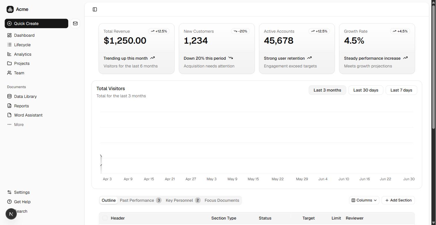
{ label: "Total Revenue", value: "$1,250.00", delta: "+12.5%", up: true, title: "Trending up this month", note: "Visitors for the last 6 months" },
{ label: "New Customers", value: "1,234", delta: "-20%", up: false, title: "Down 20% this period", note: "Acquisition needs attention" },
{ label: "Active Accounts", value: "45,678", delta: "+12.5%", up: true, title: "Strong user retention", note: "Engagement exceeds targets" },
{ label: "Growth Rate", value: "4.5%", delta: "+4.5%", up: true, title: "Steady performance increase", note: "Meets growth projections" },
]
</script>
<template>
<div class="grid grid-cols-1 gap-4 px-4 @xl/main:grid-cols-2 @5xl/main:grid-cols-4 lg:px-6">
<Card v-for="card in cards" :key="card.label" class="@container/card">
<CardHeader>
<CardDescription>{{ card.label }}</CardDescription>
<CardTitle class="text-2xl font-semibold tabular-nums @[250px]/card:text-3xl">
{{ card.value }}
</CardTitle>
<CardAction>
<Badge variant="outline">
<component :is="card.up ? TrendingUpIcon : TrendingDownIcon" />
{{ card.delta }}
</Badge>
</CardAction>
</CardHeader>
<CardFooter class="flex-col items-start gap-1.5 text-sm">
<div class="line-clamp-1 flex gap-2 font-medium">
{{ card.title }}
<component :is="card.up ? TrendingUpIcon : TrendingDownIcon" class="size-4" />
</div>
<div class="text-muted-foreground">{{ card.note }}</div>
</CardFooter>
</Card>
</div>
</template><script setup lang="ts">
import SectionCards from "@/components/section-cards.vue"
import { Badge } from "@/components/ui/badge"
import { Card, CardContent, CardHeader, CardTitle } from "@/components/ui/card"
import { Table, TableBody, TableCell, TableHead, TableHeader, TableRow } from "@/components/ui/table"
// Dashboard home. The `dashboard` layout (auth overlay) supplies the sidebar shell + gate; the
// `auth` route middleware guards client-side nav (the Nitro server middleware guards SSR/API).
definePageMeta({ layout: "dashboard", middleware: "auth" })
const invoices = [
{ id: "INV-001", customer: "Acme Corp", status: "Paid", amount: "$1,250.00" },
{ id: "INV-002", customer: "Globex", status: "Pending", amount: "$3,400.00" },
{ id: "INV-003", customer: "Initech", status: "Paid", amount: "$820.00" },
{ id: "INV-004", customer: "Umbrella", status: "Overdue", amount: "$5,600.00" },
{ id: "INV-005", customer: "Soylent", status: "Paid", amount: "$2,100.00" },
]
function statusVariant(status: string): "default" | "secondary" | "outline" {
if (status === "Paid") return "default"
if (status === "Pending") return "secondary"
return "outline"
}
</script>
<template>
<div class="flex flex-col gap-6 py-4 md:py-6">
<SectionCards />
<div class="px-4 lg:px-6">
<Card>
<CardHeader>
<CardTitle>Recent invoices</CardTitle>
</CardHeader>
<CardContent>
<Table>
<TableHeader>
<TableRow>
<TableHead>Invoice</TableHead>
<TableHead>Customer</TableHead>
<TableHead>Status</TableHead>
<TableHead class="text-right">Amount</TableHead>
</TableRow>
</TableHeader>
<TableBody>
<TableRow v-for="invoice in invoices" :key="invoice.id">
<TableCell class="font-medium">{{ invoice.id }}</TableCell>
<TableCell>{{ invoice.customer }}</TableCell>
<TableCell>
<Badge :variant="statusVariant(invoice.status)">{{ invoice.status }}</Badge>
</TableCell>
<TableCell class="text-right tabular-nums">{{ invoice.amount }}</TableCell>
</TableRow>
</TableBody>
</Table>
</CardContent>
</Card>
</div>
</div>
</template>Email — verified (Resend)
<mjml lang="en">
<mj-head>
<mj-title>Welcome aboard</mj-title>
<mj-attributes>
<mj-all font-family="-apple-system, BlinkMacSystemFont, 'Segoe UI', Helvetica, Arial, sans-serif" />
</mj-attributes>
</mj-head>
<mj-body background-color="#f4f4f5">
<mj-raw><div style="display:none;overflow:hidden;line-height:1px;opacity:0;max-height:0;max-width:0;">You're in — here's how to get started.</div></mj-raw>
<mj-section background-color="#ffffff" padding="32px" border-radius="8px">
<mj-column>
<mj-text color="#111827" font-size="22px" font-weight="700">Welcome, {{name}}!</mj-text>
<mj-text color="#374151" font-size="15px" line-height="24px">Thanks for signing up. Your account is ready to go.</mj-text>
<mj-text color="#374151" font-size="15px" line-height="24px">If you have any questions, just reply to this email — a real person reads it.</mj-text>
<mj-raw>
<table role="presentation" cellpadding="0" cellspacing="0" style="margin:24px 0;">
<tr>
<td style="border-radius:6px;background-color:#111827;" align="center">
<a href="{{ctaUrl}}" style="display:inline-block;padding:12px 20px;font-size:15px;font-weight:600;color:#ffffff;background-color:#111827;border-radius:6px;text-decoration:none;font-family:-apple-system, BlinkMacSystemFont, 'Segoe UI', Helvetica, Arial, sans-serif;">Go to your dashboard</a>
</td>
</tr>
</table>
</mj-raw>
<mj-divider border-color="#e5e7eb" />
<mj-text color="#4b5563" font-size="12px" line-height="18px">Acme Inc, 548 Market St PMB 12345, San Francisco, CA 94104</mj-text>
<mj-text color="#4b5563" font-size="12px" line-height="18px"><a href="{{unsubscribeUrl}}" style="color:#4b5563;text-decoration:underline;">Unsubscribe</a></mj-text>
</mj-column>
</mj-section>
</mj-body>
</mjml><mjml lang="en">
<mj-head>
<mj-title>You have a new notification</mj-title>
<mj-attributes>
<mj-all font-family="-apple-system, BlinkMacSystemFont, 'Segoe UI', Helvetica, Arial, sans-serif" />
</mj-attributes>
</mj-head>
<mj-body background-color="#f4f4f5">
<mj-raw><div style="display:none;overflow:hidden;line-height:1px;opacity:0;max-height:0;max-width:0;">Something happened in your account.</div></mj-raw>
<mj-section background-color="#ffffff" padding="32px" border-radius="8px">
<mj-column>
<mj-text color="#111827" font-size="22px" font-weight="700">{{title}}</mj-text>
<mj-text color="#374151" font-size="15px" line-height="24px">Hi {{name}},</mj-text>
<mj-text color="#374151" font-size="15px" line-height="24px">{{message}}</mj-text>
<mj-raw>
<table role="presentation" cellpadding="0" cellspacing="0" style="margin:24px 0;">
<tr>
<td style="border-radius:6px;background-color:#111827;" align="center">
<a href="{{ctaUrl}}" style="display:inline-block;padding:12px 20px;font-size:15px;font-weight:600;color:#ffffff;background-color:#111827;border-radius:6px;text-decoration:none;font-family:-apple-system, BlinkMacSystemFont, 'Segoe UI', Helvetica, Arial, sans-serif;">View details</a>
</td>
</tr>
</table>
</mj-raw>
<mj-divider border-color="#e5e7eb" />
<mj-text color="#4b5563" font-size="12px" line-height="18px">Acme Inc, 548 Market St PMB 12345, San Francisco, CA 94104</mj-text>
<mj-text color="#4b5563" font-size="12px" line-height="18px"><a href="{{unsubscribeUrl}}" style="color:#4b5563;text-decoration:underline;">Unsubscribe</a></mj-text>
</mj-column>
</mj-section>
</mj-body>
</mjml>import { Resend } from "resend";
import mjml2html from "mjml";
// Constructed LAZILY, on first send. `new Resend(undefined)` THROWS ("Missing API key"),
// and a module-scope client makes that throw fire at IMPORT time — which is exactly when a
// framework build imports this file to collect page data. The result is that `next build`
// fails outright on any machine without RESEND_API_KEY set (CI, a fresh clone, a preview
// deploy that only holds runtime secrets). Deferring it means importing lib/email is always
// safe and a missing key fails at the send, where it is actionable.
let client: Resend | undefined;
function resendClient(): Resend {
return (client ??= new Resend(process.env.RESEND_API_KEY));
}
const FROM = process.env.EMAIL_FROM ?? "onboarding@resend.dev";
const WELCOME_MJML = `<mjml lang="en">
<mj-head>
<mj-title>Welcome aboard</mj-title>
<mj-attributes>
<mj-all font-family="-apple-system, BlinkMacSystemFont, 'Segoe UI', Helvetica, Arial, sans-serif" />
</mj-attributes>
</mj-head>
<mj-body background-color="#f4f4f5">
<mj-raw><div style="display:none;overflow:hidden;line-height:1px;opacity:0;max-height:0;max-width:0;">You're in — here's how to get started.</div></mj-raw>
<mj-section background-color="#ffffff" padding="32px" border-radius="8px">
<mj-column>
<mj-text color="#111827" font-size="22px" font-weight="700">Welcome, {{name}}!</mj-text>
<mj-text color="#374151" font-size="15px" line-height="24px">Thanks for signing up. Your account is ready to go.</mj-text>
<mj-text color="#374151" font-size="15px" line-height="24px">If you have any questions, just reply to this email — a real person reads it.</mj-text>
<mj-raw>
<table role="presentation" cellpadding="0" cellspacing="0" style="margin:24px 0;">
<tr>
<td style="border-radius:6px;background-color:#111827;" align="center">
<a href="{{ctaUrl}}" style="display:inline-block;padding:12px 20px;font-size:15px;font-weight:600;color:#ffffff;background-color:#111827;border-radius:6px;text-decoration:none;font-family:-apple-system, BlinkMacSystemFont, 'Segoe UI', Helvetica, Arial, sans-serif;">Go to your dashboard</a>
</td>
</tr>
</table>
</mj-raw>
<mj-divider border-color="#e5e7eb" />
<mj-text color="#4b5563" font-size="12px" line-height="18px">Acme Inc, 548 Market St PMB 12345, San Francisco, CA 94104</mj-text>
<mj-text color="#4b5563" font-size="12px" line-height="18px"><a href="{{unsubscribeUrl}}" style="color:#4b5563;text-decoration:underline;">Unsubscribe</a></mj-text>
</mj-column>
</mj-section>
</mj-body>
</mjml>`;
const NOTIFICATION_MJML = `<mjml lang="en">
<mj-head>
<mj-title>You have a new notification</mj-title>
<mj-attributes>
<mj-all font-family="-apple-system, BlinkMacSystemFont, 'Segoe UI', Helvetica, Arial, sans-serif" />
</mj-attributes>
</mj-head>
<mj-body background-color="#f4f4f5">
<mj-raw><div style="display:none;overflow:hidden;line-height:1px;opacity:0;max-height:0;max-width:0;">Something happened in your account.</div></mj-raw>
<mj-section background-color="#ffffff" padding="32px" border-radius="8px">
<mj-column>
<mj-text color="#111827" font-size="22px" font-weight="700">{{title}}</mj-text>
<mj-text color="#374151" font-size="15px" line-height="24px">Hi {{name}},</mj-text>
<mj-text color="#374151" font-size="15px" line-height="24px">{{message}}</mj-text>
<mj-raw>
<table role="presentation" cellpadding="0" cellspacing="0" style="margin:24px 0;">
<tr>
<td style="border-radius:6px;background-color:#111827;" align="center">
<a href="{{ctaUrl}}" style="display:inline-block;padding:12px 20px;font-size:15px;font-weight:600;color:#ffffff;background-color:#111827;border-radius:6px;text-decoration:none;font-family:-apple-system, BlinkMacSystemFont, 'Segoe UI', Helvetica, Arial, sans-serif;">View details</a>
</td>
</tr>
</table>
</mj-raw>
<mj-divider border-color="#e5e7eb" />
<mj-text color="#4b5563" font-size="12px" line-height="18px">Acme Inc, 548 Market St PMB 12345, San Francisco, CA 94104</mj-text>
<mj-text color="#4b5563" font-size="12px" line-height="18px"><a href="{{unsubscribeUrl}}" style="color:#4b5563;text-decoration:underline;">Unsubscribe</a></mj-text>
</mj-column>
</mj-section>
</mj-body>
</mjml>`;
// MJML has no built-in variable binding — templates carry {{token}} mail-merge
// placeholders (see templates-mjml.ts); substitute before compiling.
function fill(template: string, vars: Record<string, string>): string {
return template.replace(/\{\{(\w+)\}\}/g, (_match, key: string) => vars[key] ?? "");
}
async function renderMjml(template: string, vars: Record<string, string>): Promise<string> {
const { html, errors } = await mjml2html(fill(template, vars), { validationLevel: "soft" });
// The ambient mjml.d.ts below deliberately types errors as unknown[] (no upstream .d.ts to
// pin against); mjml's real runtime error objects carry .formattedMessage, so assert it here.
if (errors.length > 0) throw new Error(`mjml: ${errors.map((e) => (e as { formattedMessage: string }).formattedMessage).join("; ")}`);
return html;
}
export async function sendWelcome(to: string, vars: { name: string; ctaUrl: string; unsubscribeUrl: string }) {
const html = await renderMjml(WELCOME_MJML, vars);
return resendClient().emails.send({ from: FROM, to, subject: "Welcome aboard", html });
}
export async function sendNotification(to: string, vars: { name: string; title: string; message: string; ctaUrl: string; unsubscribeUrl: string }) {
const html = await renderMjml(NOTIFICATION_MJML, { ...vars, title: vars.title });
return resendClient().emails.send({ from: FROM, to, subject: vars.title, html });
}// mjml@5 ships no type declarations for its default export — this ambient module fills the gap.
declare module "mjml" {
export default function mjml2html(
src: string,
opts?: { validationLevel?: "strict" | "soft" | "skip" },
): Promise<{ html: string; errors: unknown[] }>;
}Decisions and compatibility
Client/server split: the DB client, Drizzle schema, records, and webhooks are server-side (server/). The `@/` alias is the client root (app/); server code reaches shared modules via Nuxt's `~~` rootDir alias (e.g. `~~/server/db/schema`).
The API layer is Nitro, Nuxt's server engine: endpoints are server/api/*.post.ts route handlers, and auth mounts as a Nitro catch-all that delegates to the auth library's framework-agnostic web handler.
Nuxt auto-imports components and composables at runtime, but the emitted server code imports h3 helpers (defineEventHandler, toWebRequest) EXPLICITLY — the one deliberate idiom trade so the handlers type-check under standalone tsc instead of relying on the auto-import magic.
Session gating runs in a Nitro server middleware (server/middleware/), which fires on every SSR and API request — the true security boundary, and a real server-side session check rather than a cookie-existence peek.
prepare: false is mandatory — Neon's pooled endpoint is PgBouncer in transaction mode, where server-side prepared statements break across the pool.
Drizzle is paired here (not Prisma): Prisma's prepared-statement reliance is incompatible with transaction-mode pooling.
Hosted: Supabase owns identity in its managed auth.users. This stack emits a LOCAL `user` mirror (db/auth-schema.ts) so app-type schemas can foreign-key `user` directly — keep it in sync with a Supabase trigger on auth.users (insert/update → public.user). The drizzle migration only owns the mirror table's shape, not the trigger.
Sessions are cookie-based (@supabase/ssr): the proxy refreshes them on every request; Server Components read the user via supabase.auth.getUser().
Status and priority are text + CHECK (not pgEnum), so adding a new value (e.g. 'escalated') ships without an ALTER TYPE migration — consistent with the house style in packages/db/src/schema.ts.
agents carries a unique constraint on user_id (one profile per user) and sla_policies carries no unique on priority, allowing multiple named policies at the same priority tier for different customer tiers.
Recombine
Swap one axis and keep the rest. Every combination below is verified the same way.