SaaS on Nuxt 4, Postgres (Neon) and Supabase Auth
Type-checked against the real SDKs, migration applied to a live Postgres (Neon), connection clients load-tested, then tracked for upstream drift and re-verified when it moves. How we verify
session validation runs in server components and route handlers, not at the edge
What you're getting
Nuxt 4 (framework mode) — full-stack Vue SSR: client under app/ (Vite), server under server/ (Nitro), API as server/api/*.post.ts Nitro route handlers.
Postgres on Neon via Drizzle ORM and the postgres-js driver.
Supabase Auth — hosted identity (GoTrue) via the @supabase/ssr cookie client; email+password + OAuth.
Multi-tenant SaaS — organizations, role-based memberships, plans/subscriptions, and credit metering.
Setup
bun add nuxt vue drizzle-orm postgres @supabase/ssr @supabase/supabase-jsDATABASE_URLNeon pooled (-pooler) connection stringNEXT_PUBLIC_SUPABASE_URLNext: your Supabase project URL (RR: VITE_SUPABASE_URL · Nuxt: NUXT_PUBLIC_SUPABASE_URL)NEXT_PUBLIC_SUPABASE_ANON_KEYNext: the project's anon/public key (RR: VITE_SUPABASE_ANON_KEY · Nuxt: NUXT_PUBLIC_SUPABASE_ANON_KEY)SUPABASE_URLReact Router server-side (loaders): same project URL, read off process.env — never inlined into the client bundleSUPABASE_ANON_KEYReact Router server-side: same anon keyApply the schema with bunx drizzle-kit push
Initialization
Database client
import { drizzle } from "drizzle-orm/postgres-js";
import postgres from "postgres";
// Neon pooled endpoint = PgBouncer transaction mode → prepared statements off.
// ponytail: single module-level client; the serverless runtime + PgBouncer do
// the pooling, so no custom pool/globalThis singleton dance needed.
const client = postgres(process.env.DATABASE_URL!, { prepare: false });
export const db = drizzle({ client });// Supabase needs NO Nuxt module (unlike Clerk) — but it DOES need its keys declared as public
// runtimeConfig. `process.env.NUXT_PUBLIC_*` is readable server-side only; the browser bundle can
// reach these values through runtimeConfig.public and nothing else. Nuxt's env convention fills
// both from the same vars (NUXT_PUBLIC_SUPABASE_URL → runtimeConfig.public.supabaseUrl), so the
// server client below and the browser client (~~/lib/supabase-client) resolve to identical keys.
// ponytail: Nuxt provides defineNuxtConfig as a global at runtime; import it explicitly from
// "nuxt/config" so this config type-checks under standalone tsc.
import { defineNuxtConfig } from "nuxt/config";
export default defineNuxtConfig({
runtimeConfig: {
public: {
supabaseUrl: "", // ← NUXT_PUBLIC_SUPABASE_URL
supabaseAnonKey: "", // ← NUXT_PUBLIC_SUPABASE_ANON_KEY
},
},
});import { pgTable, text, timestamp } from "drizzle-orm/pg-core";
// Local mirror of Supabase identity — synced from auth.users by a Supabase trigger (see notes).
// id = the Supabase auth uid (text); the app-type user_id FKs resolve against it.
export const user = pgTable("user", {
id: text("id").primaryKey(), // = Supabase auth.users.id
email: text("email"),
fullName: text("full_name"),
avatarUrl: text("avatar_url"),
updatedAt: timestamp("updated_at", { withTimezone: true }),
createdAt: timestamp("created_at", { withTimezone: true }).notNull().defaultNow(),
});// Per-request Supabase client for Nitro (Nuxt 4). h3 carries the cookie jar on the
// event, so this is the same @supabase/ssr client as every other framework with h3 plumbing.
// ponytail: Nuxt AUTO-IMPORTS server/utils/* and the h3 helpers at runtime; both are imported
// EXPLICITLY here so the file also type-checks under standalone tsc (spec §6).
// Reads the NUXT_PUBLIC_* vars directly (server-side they are plain env) — the SAME vars Nuxt maps
// into runtimeConfig.public for the browser client, so both halves agree on one source of truth.
import { createServerClient } from "@supabase/ssr";
import { parseCookies, setCookie, type H3Event } from "h3";
export function serverSupabase(event: H3Event) {
return createServerClient(
process.env.NUXT_PUBLIC_SUPABASE_URL!,
process.env.NUXT_PUBLIC_SUPABASE_ANON_KEY!,
{
cookies: {
getAll() {
return Object.entries(parseCookies(event)).map(([name, value]) => ({ name, value }));
},
setAll(cookiesToSet) {
cookiesToSet.forEach(({ name, value, options }) => setCookie(event, name, value, options));
},
},
},
);
}// Session guard as a Nitro server middleware — the Nuxt analog of Next's proxy.ts. Runs on every
// request: getUser() revalidates the token server-side (never trust getSession() here) and any
// refreshed cookies are written straight onto the event by serverSupabase's setAll.
import { defineEventHandler, getRequestURL, sendRedirect } from "h3";
import { serverSupabase } from "../utils/supabase";
// ponytail: guard the SaaS app surface; widen the prefixes per app-type.
const PROTECTED_PREFIXES = ["/dashboard", "/settings"];
export default defineEventHandler(async (event) => {
const { pathname } = getRequestURL(event);
if (!PROTECTED_PREFIXES.some((prefix) => pathname.startsWith(prefix))) return;
const {
data: { user },
} = await serverSupabase(event).auth.getUser();
if (!user) return sendRedirect(event, "/sign-in", 302);
});Multi-tenant SaaS schema: organizations, billing & usage metering
Organizations & multi-tenancythe tenant boundary every billable and metered row hangs off
Memberships & role-based accessorg↔user join carrying owner/admin/member roles, unique per pair, plus the token-based invitations that create them
Plans & subscription billing tablesthe billable plan catalog and each org's current subscription state
API usage & credit/token meteringappend-only usage rows that drive quota checks and usage billing
// === file: server/db/schema.ts ===
import { relations, sql } from "drizzle-orm";
import {
bigint,
check,
index,
integer,
pgTable,
text,
timestamp,
unique,
uuid,
} from "drizzle-orm/pg-core";
// Better Auth owns identity; we only reference its `user` table by id. With Clerk
// the identity-sync mirror occupies this same ./auth-schema slot (src/db/auth-schema.ts).
import { user } from "./auth-schema";
export type MemberRole = "owner" | "admin" | "member";
export type InvitationStatus = "pending" | "accepted" | "revoked";
export type SubscriptionStatus =
| "trialing"
| "active"
| "past_due"
| "canceled";
/** Tenant boundary: every billable/metered row hangs off an organization. */
export const organizations = pgTable(
"organizations",
{
id: uuid("id").primaryKey().defaultRandom(),
slug: text("slug").notNull().unique(),
name: text("name").notNull(),
createdAt: timestamp("created_at", { withTimezone: true })
.notNull()
.defaultNow(),
},
(t) => [index("idx_org_slug").on(t.slug)],
);
/** org <-> user join with role. The composite unique is the membership identity. */
export const memberships = pgTable(
"memberships",
{
id: uuid("id").primaryKey().defaultRandom(),
organizationId: uuid("organization_id")
.notNull()
.references(() => organizations.id, { onDelete: "cascade" }),
// Better Auth's user.id is text — match it, don't recast.
userId: text("user_id")
.notNull()
.references(() => user.id, { onDelete: "cascade" }),
role: text("role").$type<MemberRole>().notNull().default("member"),
createdAt: timestamp("created_at", { withTimezone: true })
.notNull()
.defaultNow(),
},
(t) => [
unique("memberships_org_user_unique").on(t.organizationId, t.userId),
index("idx_membership_user").on(t.userId),
check(
"memberships_role_check",
sql`${t.role} in ('owner','admin','member')`,
),
],
);
/** Pending team invitations — how someone who does NOT yet have an account joins an org.
*
* Stores a SHA-256 of the invite token, NEVER the token itself. The raw token exists only in the
* link that was sent, so a database dump (or a stray token in a log) cannot be replayed into org
* access. The accept path hashes what it was given and looks up by that hash.
*
* Org-scoped like every other tenant table: RLS covers it on Postgres, forOrg on MySQL. It holds
* an invitee's email address BEFORE they are a member of anything, which is exactly the kind of
* row that must not be readable across tenants.
*/
export const invitations = pgTable(
"invitations",
{
id: uuid("id").primaryKey().defaultRandom(),
organizationId: uuid("organization_id")
.notNull()
.references(() => organizations.id, { onDelete: "cascade" }),
email: text("email").notNull(),
role: text("role").$type<MemberRole>().notNull().default("member"),
tokenHash: text("token_hash").notNull(),
status: text("status").$type<InvitationStatus>().notNull().default("pending"),
// Nullable + ON DELETE SET NULL: the inviter's account going away must not cascade-delete
// invitations that are still legitimately pending.
invitedByUserId: text("invited_by_user_id").references(() => user.id, {
onDelete: "set null",
}),
expiresAt: timestamp("expires_at", { withTimezone: true }).notNull(),
acceptedAt: timestamp("accepted_at", { withTimezone: true }),
createdAt: timestamp("created_at", { withTimezone: true })
.notNull()
.defaultNow(),
},
(t) => [
// The accept path's lookup key: a token must identify at most one invitation.
unique("invitations_token_hash_unique").on(t.tokenHash),
// ONE row per (org, email) — re-inviting UPDATEs it rather than accumulating dead rows, which
// also makes "resend the invite" and "invite again" the same operation instead of two.
unique("invitations_org_email_unique").on(t.organizationId, t.email),
index("idx_invitation_org").on(t.organizationId),
check(
"invitations_role_check",
sql`${t.role} in ('owner','admin','member')`,
),
check(
"invitations_status_check",
sql`${t.status} in ('pending','accepted','revoked')`,
),
],
);
/** Catalog of billable plans (seed-managed). priceCents keeps money integer. */
export const plans = pgTable("plans", {
id: uuid("id").primaryKey().defaultRandom(),
slug: text("slug").notNull().unique(), // free | pro | scale
name: text("name").notNull(),
priceCents: integer("price_cents").notNull().default(0),
// Monthly included credits; metering checks usage against this.
monthlyCredits: bigint("monthly_credits", { mode: "number" })
.notNull()
.default(0),
});
/** One active subscription per org. Mirrors the billing provider's state. */
export const subscriptions = pgTable(
"subscriptions",
{
id: uuid("id").primaryKey().defaultRandom(),
organizationId: uuid("organization_id")
.notNull()
.references(() => organizations.id, { onDelete: "cascade" }),
planId: uuid("plan_id")
.notNull()
.references(() => plans.id),
status: text("status")
.$type<SubscriptionStatus>()
.notNull()
.default("trialing"),
// The generic billing-sync contract every webhook provider (Polar/Stripe/LemonSqueezy)
// needs: the provider's subscription id as a UNIQUE idempotency key, plus the last
// event timestamp as an out-of-order/staleness guard. The billing fragment maps a
// provider's events onto these — it does NOT redeclare this table (compose, not duplicate).
providerSubId: text("provider_sub_id").unique(),
providerEventAt: timestamp("provider_event_at", { withTimezone: true }),
currentPeriodEnd: timestamp("current_period_end", { withTimezone: true }),
createdAt: timestamp("created_at", { withTimezone: true })
.notNull()
.defaultNow(),
},
(t) => [
// One live subscription per org (the metering layer reads exactly one).
unique("subscriptions_org_unique").on(t.organizationId),
index("idx_sub_status").on(t.status),
check(
"subscriptions_status_check",
sql`${t.status} in ('trialing','active','past_due','canceled')`,
),
],
);
/** Append-only credit/token meter. Roll up by org+window for quota + billing. */
export const apiUsage = pgTable(
"api_usage",
{
id: uuid("id").primaryKey().defaultRandom(),
organizationId: uuid("organization_id")
.notNull()
.references(() => organizations.id, { onDelete: "cascade" }),
// Who/what spent — opaque key id, nullable for org-level system calls.
apiKeyId: text("api_key_id"),
creditsUsed: bigint("credits_used", { mode: "number" }).notNull(),
createdAt: timestamp("created_at", { withTimezone: true })
.notNull()
.defaultNow(),
},
(t) => [
// Drives the "credits used this period" rollup query.
index("idx_usage_org_time").on(t.organizationId, t.createdAt),
],
);
export const organizationsRelations = relations(organizations, ({ many }) => ({
memberships: many(memberships),
invitations: many(invitations),
subscriptions: many(subscriptions),
usage: many(apiUsage),
}));
export const invitationsRelations = relations(invitations, ({ one }) => ({
organization: one(organizations, {
fields: [invitations.organizationId],
references: [organizations.id],
}),
invitedBy: one(user, {
fields: [invitations.invitedByUserId],
references: [user.id],
}),
}));
export const membershipsRelations = relations(memberships, ({ one }) => ({
organization: one(organizations, {
fields: [memberships.organizationId],
references: [organizations.id],
}),
user: one(user, { fields: [memberships.userId], references: [user.id] }),
}));
export const subscriptionsRelations = relations(subscriptions, ({ one }) => ({
organization: one(organizations, {
fields: [subscriptions.organizationId],
references: [organizations.id],
}),
plan: one(plans, {
fields: [subscriptions.planId],
references: [plans.id],
}),
}));
export const apiUsageRelations = relations(apiUsage, ({ one }) => ({
organization: one(organizations, {
fields: [apiUsage.organizationId],
references: [organizations.id],
}),
}));
Verified billing (Polar)
import { and, eq, isNull, lt, or } from "drizzle-orm";
import { subscriptions } from "~~/server/db/schema";
export type PolarSubscriptionEvent = {
type: string;
data: {
id: string;
status: string;
currentPeriodEnd: string | null;
modifiedAt: string;
metadata: { organizationId: string; planId: string };
};
};
const STATUS_MAP: Record<string, "trialing" | "active" | "past_due" | "canceled"> = {
trialing: "trialing",
active: "active",
past_due: "past_due",
unpaid: "past_due",
canceled: "canceled",
revoked: "canceled",
};
// Idempotent + CONCURRENCY-safe sync of a Polar subscription. The staleness guard
// lives in the UPDATE's WHERE clause, so Postgres' row lock serializes concurrent
// retries (a stale/older event matches no row); brand-new rows insert with
// onConflictDoNothing (race-safe). Returns changed=true only on a real advance, so
// callers can guard side effects (emails) against Polar's duplicate deliveries.
export async function recordPolarEvent(
// ponytail: loosely typed Drizzle client so the emitted core stays portable
// across the app's exact client type.
db: any,
event: PolarSubscriptionEvent,
): Promise<{ changed: boolean }> {
const sub = event.data;
const status = STATUS_MAP[sub.status];
if (!status) return { changed: false }; // unknown status — ignore, don't default
const eventAt = new Date(sub.modifiedAt);
const currentPeriodEnd = sub.currentPeriodEnd ? new Date(sub.currentPeriodEnd) : null;
// Guarded UPDATE: applies only when our event is strictly newer than what's stored.
// No TOCTOU — the comparison is in the WHERE, evaluated under the row lock.
const updated = await db
.update(subscriptions)
.set({ status, currentPeriodEnd, providerEventAt: eventAt })
.where(
and(
eq(subscriptions.providerSubId, sub.id),
or(isNull(subscriptions.providerEventAt), lt(subscriptions.providerEventAt, eventAt)),
),
)
.returning({ id: subscriptions.id });
if (updated.length > 0) return { changed: true };
// No row updated: the row exists but our event is stale (guard rejected it), or it
// doesn't exist yet. If it exists, this is a stale/duplicate delivery — ignore.
const [existing] = await db
.select({ id: subscriptions.id })
.from(subscriptions)
.where(eq(subscriptions.providerSubId, sub.id))
.limit(1);
if (existing) return { changed: false };
const inserted = await db
.insert(subscriptions)
.values({
organizationId: sub.metadata.organizationId,
planId: sub.metadata.planId,
status,
currentPeriodEnd,
providerSubId: sub.id,
providerEventAt: eventAt,
})
.onConflictDoNothing({ target: subscriptions.providerSubId })
.returning({ id: subscriptions.id });
return { changed: inserted.length > 0 };
}// Polar webhook for Nuxt 4 (Nitro server route). Nitro invokes this
// handler on POST; it verifies the HMAC signature, then hands the event to the idempotent
// recordPolarEvent. Returns 200 even if non-critical work fails; only a signature failure
// is rejected.
// ponytail: Nuxt auto-imports these h3 helpers; import them explicitly so the module reads
// standalone (and type-checks against the installed h3).
import { defineEventHandler, readRawBody, getHeaders } from "h3";
import { validateEvent, WebhookVerificationError } from "@polar-sh/sdk/webhooks";
import { db } from "~~/server/lib/db";
import { recordPolarEvent, type PolarSubscriptionEvent } from "~~/server/lib/billing/record";
const SUBSCRIPTION_EVENTS = new Set([
"subscription.created",
"subscription.active",
"subscription.updated",
"subscription.canceled",
"subscription.revoked",
"subscription.uncanceled",
]);
export default defineEventHandler(async (event) => {
const secret = process.env.POLAR_WEBHOOK_SECRET;
if (!secret) {
event.node.res.statusCode = 500;
return { error: "Server misconfigured" };
}
const raw = (await readRawBody(event)) ?? "";
const headers = getHeaders(event) as Record<string, string>;
let payload: { type: string; data: unknown };
try {
payload = validateEvent(raw, headers, secret);
} catch (error) {
if (error instanceof WebhookVerificationError) {
event.node.res.statusCode = 403;
return { error: "Invalid signature" };
}
throw error;
}
if (SUBSCRIPTION_EVENTS.has(payload.type)) {
await recordPolarEvent(db, payload as PolarSubscriptionEvent);
}
return { ok: true };
});Verified tenant isolation
-- IMPORTANT: RLS is bypassed by the table owner (unless FORCEd) and ALWAYS by
-- BYPASSRLS / superuser roles. Neon's default neondb_owner role has BYPASSRLS, so
-- connecting your app as neondb_owner makes RLS SILENTLY INERT. Create a dedicated
-- non-BYPASSRLS role and point your app's DATABASE_URL at it:
DO $$ BEGIN
IF NOT EXISTS (SELECT FROM pg_roles WHERE rolname = 'app_tenant') THEN
CREATE ROLE app_tenant NOLOGIN NOBYPASSRLS;
END IF;
END $$;
-- Grant LOGIN + a password OUT OF BAND (never in committed SQL), then point DATABASE_URL at it:
-- ALTER ROLE app_tenant LOGIN PASSWORD '<generated>';
GRANT USAGE ON SCHEMA public TO app_tenant;
GRANT SELECT, INSERT, UPDATE, DELETE ON ALL TABLES IN SCHEMA public TO app_tenant;
-- Future tables stay covered (the one-time GRANT above only sees today's tables):
ALTER DEFAULT PRIVILEGES IN SCHEMA public GRANT SELECT, INSERT, UPDATE, DELETE ON TABLES TO app_tenant;
-- Tenant isolation via Row-Level Security (FORCE = even the table owner is bound). The shared `plans` catalog is intentionally left open.
ALTER TABLE organizations ENABLE ROW LEVEL SECURITY;
ALTER TABLE organizations FORCE ROW LEVEL SECURITY;
CREATE POLICY organizations_tenant_isolation ON organizations
USING (id = current_setting('app.current_org_id', true)::uuid)
WITH CHECK (id = current_setting('app.current_org_id', true)::uuid);
ALTER TABLE memberships ENABLE ROW LEVEL SECURITY;
ALTER TABLE memberships FORCE ROW LEVEL SECURITY;
CREATE POLICY memberships_tenant_isolation ON memberships
USING (organization_id = current_setting('app.current_org_id', true)::uuid)
WITH CHECK (organization_id = current_setting('app.current_org_id', true)::uuid);
ALTER TABLE invitations ENABLE ROW LEVEL SECURITY;
ALTER TABLE invitations FORCE ROW LEVEL SECURITY;
CREATE POLICY invitations_tenant_isolation ON invitations
USING (organization_id = current_setting('app.current_org_id', true)::uuid)
WITH CHECK (organization_id = current_setting('app.current_org_id', true)::uuid);
ALTER TABLE subscriptions ENABLE ROW LEVEL SECURITY;
ALTER TABLE subscriptions FORCE ROW LEVEL SECURITY;
CREATE POLICY subscriptions_tenant_isolation ON subscriptions
USING (organization_id = current_setting('app.current_org_id', true)::uuid)
WITH CHECK (organization_id = current_setting('app.current_org_id', true)::uuid);
ALTER TABLE api_usage ENABLE ROW LEVEL SECURITY;
ALTER TABLE api_usage FORCE ROW LEVEL SECURITY;
CREATE POLICY api_usage_tenant_isolation ON api_usage
USING (organization_id = current_setting('app.current_org_id', true)::uuid)
WITH CHECK (organization_id = current_setting('app.current_org_id', true)::uuid);import { sql } from "drizzle-orm";
// Run queries with the tenant context set for THIS transaction. RLS policies read
// app.current_org_id; unset => fail-closed (no rows). Wrap every request's data
// access in withTenant(db, session.orgId, (tx) => ...).
export async function withTenant<T>(
db: { transaction: (fn: (tx: any) => Promise<T>) => Promise<T> },
orgId: string,
fn: (tx: any) => Promise<T>,
): Promise<T> {
return db.transaction(async (tx) => {
await tx.execute(sql`select set_config('app.current_org_id', ${orgId}, true)`);
return fn(tx);
});
}Deploy targets
import { drizzle } from "drizzle-orm/postgres-js";
import postgres from "postgres";
// Serverless: one connection per (short-lived) instance; Neon's pooler multiplexes.
export const sql = postgres(process.env.DATABASE_URL!, { prepare: false, max: 1 });
export const db = drizzle(sql);
import { drizzle } from "drizzle-orm/postgres-js";
import postgres from "postgres";
// Long-running process: a real, reused pool. Still prepare:false on the pooled endpoint.
export const sql = postgres(process.env.DATABASE_URL!, { prepare: false, max: 10, idle_timeout: 20 });
export const db = drizzle(sql);
import { neon } from "@neondatabase/serverless";
import { drizzle } from "drizzle-orm/neon-http";
// Edge/Workers have NO TCP sockets, so postgres-js cannot run here. Neon's HTTP
// driver speaks Postgres over fetch — the only client that works on Workers.
export const sql = neon(process.env.DATABASE_URL!);
export const db = drizzle(sql);
The app UI

<script setup lang="ts">
import { computed, onBeforeUnmount, onMounted, ref } from "vue"
import {
EllipsisVerticalIcon,
CircleUserRoundIcon,
CreditCardIcon,
BellIcon,
LogOutIcon,
} from "lucide-vue-next"
import type { User } from "@supabase/supabase-js"
import { Avatar, AvatarFallback, AvatarImage } from "@/components/ui/avatar"
import {
DropdownMenu,
DropdownMenuContent,
DropdownMenuGroup,
DropdownMenuItem,
DropdownMenuLabel,
DropdownMenuSeparator,
DropdownMenuTrigger,
} from "@/components/ui/dropdown-menu"
import { SidebarMenu, SidebarMenuButton, SidebarMenuItem, useSidebar } from "@/components/ui/sidebar"
import { Skeleton } from "@/components/ui/skeleton"
import { createClient } from "~~/lib/supabase-client"
// Supabase variant of the sidebar-footer user menu — the SAME shell every auth overlay reuses, wired
// to the browser Supabase client: getUser() on mount + onAuthStateChange to stay reactive across tabs,
// cookie-based sign-out.
const { isMobile } = useSidebar()
const supabase = createClient()
const user = ref<User | null>(null)
const loading = ref(true)
let unsubscribe: (() => void) | undefined
onMounted(async () => {
const { data } = await supabase.auth.getUser()
user.value = data.user
loading.value = false
const { data: listener } = supabase.auth.onAuthStateChange((_event, session) => {
user.value = session?.user ?? null
})
unsubscribe = () => listener.subscription.unsubscribe()
})
onBeforeUnmount(() => unsubscribe?.())
const email = computed(() => user.value?.email ?? "")
const initials = computed(() => email.value.slice(0, 2).toUpperCase())
const avatarUrl = computed(() => {
const url = user.value?.user_metadata?.avatar_url
return typeof url === "string" ? url : undefined
})
async function handleSignOut() {
await supabase.auth.signOut()
navigateTo("/sign-in")
}
</script>
<template>
<SidebarMenu>
<SidebarMenuItem>
<div v-if="loading" class="flex items-center gap-2 p-2">
<Skeleton class="size-8 rounded-lg" />
<Skeleton class="h-4 w-28 rounded-md" />
</div>
<DropdownMenu v-else-if="user">
<DropdownMenuTrigger as-child>
<SidebarMenuButton
size="lg"
class="data-[state=open]:bg-sidebar-accent data-[state=open]:text-sidebar-accent-foreground"
>
<Avatar class="size-8 rounded-lg grayscale">
<AvatarImage v-if="avatarUrl" :src="avatarUrl" :alt="email" />
<AvatarFallback class="rounded-lg">{{ initials }}</AvatarFallback>
</Avatar>
<div class="grid flex-1 text-left text-sm leading-tight">
<span class="truncate font-medium">{{ email }}</span>
</div>
<EllipsisVerticalIcon class="ml-auto size-4" />
</SidebarMenuButton>
</DropdownMenuTrigger>
<DropdownMenuContent
class="min-w-56 rounded-lg"
:side="isMobile ? 'bottom' : 'right'"
align="end"
:side-offset="4"
>
<DropdownMenuLabel class="p-0 font-normal">
<div class="flex items-center gap-2 px-1 py-1.5 text-left text-sm">
<Avatar class="size-8 rounded-lg">
<AvatarImage v-if="avatarUrl" :src="avatarUrl" :alt="email" />
<AvatarFallback class="rounded-lg">{{ initials }}</AvatarFallback>
</Avatar>
<div class="grid flex-1 text-left text-sm leading-tight">
<span class="truncate font-medium">{{ email }}</span>
</div>
</div>
</DropdownMenuLabel>
<DropdownMenuSeparator />
<DropdownMenuGroup>
<DropdownMenuItem>
<CircleUserRoundIcon />
Account
</DropdownMenuItem>
<DropdownMenuItem>
<CreditCardIcon />
Billing
</DropdownMenuItem>
<DropdownMenuItem>
<BellIcon />
Notifications
</DropdownMenuItem>
</DropdownMenuGroup>
<DropdownMenuSeparator />
<DropdownMenuItem @click="handleSignOut">
<LogOutIcon />
Log out
</DropdownMenuItem>
</DropdownMenuContent>
</DropdownMenu>
</SidebarMenuItem>
</SidebarMenu>
</template><script setup lang="ts">
import AppSidebar from "@/components/app-sidebar.vue"
import SiteHeader from "@/components/site-header.vue"
import { SidebarInset, SidebarProvider } from "@/components/ui/sidebar"
// Authed app shell (Supabase overlay). SidebarProvider owns the collapse state; AppSidebar +
// SiteHeader frame the routed page (<slot />). The auth gate lives in the route middleware (client) +
// the Nitro server middleware (SSR/API, session refresh) — the layout just composes the chrome.
</script>
<template>
<SidebarProvider>
<AppSidebar />
<SidebarInset>
<SiteHeader />
<div class="flex flex-1 flex-col gap-4">
<slot />
</div>
</SidebarInset>
</SidebarProvider>
</template>import { createClient } from "~~/lib/supabase-client"
// Client-side route guard for the app surface. The Nitro server middleware (init) is the true
// security boundary on SSR/API; this bounces client-side SPA navigation for logged-out users before
// the protected page renders. Pages opt in via definePageMeta({ middleware: "auth" }).
export default defineNuxtRouteMiddleware(async () => {
const supabase = createClient()
const { data } = await supabase.auth.getSession()
if (!data.session) {
return navigateTo("/sign-in")
}
})<script setup lang="ts">
import { ref } from "vue"
import Logo from "@/components/logo.vue"
import { Button } from "@/components/ui/button"
import { Card, CardContent, CardDescription, CardHeader, CardTitle } from "@/components/ui/card"
import { Input } from "@/components/ui/input"
import { Label } from "@/components/ui/label"
import { createClient } from "~~/lib/supabase-client"
// Supabase email+password sign-in. Supabase supports it natively (unlike Clerk's hosted widget), so
// this is a real form calling supabase.auth.signInWithPassword. `layout: false` opts out of the
// dashboard shell.
definePageMeta({ layout: false })
const supabase = createClient()
const email = ref("")
const password = ref("")
const error = ref("")
const loading = ref(false)
async function onSubmit() {
loading.value = true
error.value = ""
const { error: err } = await supabase.auth.signInWithPassword({ email: email.value, password: password.value })
loading.value = false
if (err) {
error.value = err.message
return
}
navigateTo("/dashboard")
}
</script>
<template>
<div class="flex min-h-svh items-center justify-center p-4">
<Card class="w-full max-w-sm">
<CardHeader>
<Logo class="mb-2" />
<CardTitle>Welcome back</CardTitle>
<CardDescription>Sign in to your account to continue.</CardDescription>
</CardHeader>
<CardContent>
<form class="flex flex-col gap-4" @submit.prevent="onSubmit">
<div class="flex flex-col gap-2">
<Label for="email">Email</Label>
<Input id="email" v-model="email" type="email" placeholder="you@example.com" required />
</div>
<div class="flex flex-col gap-2">
<Label for="password">Password</Label>
<Input id="password" v-model="password" type="password" required />
</div>
<p v-if="error" class="text-destructive text-sm">{{ error }}</p>
<Button type="submit" :disabled="loading" class="w-full">
{{ loading ? "Signing in…" : "Sign in" }}
</Button>
<p class="text-muted-foreground text-center text-sm">
No account?
<NuxtLink to="/sign-up" class="text-foreground underline underline-offset-4">Sign up</NuxtLink>
</p>
</form>
</CardContent>
</Card>
</div>
</template><script setup lang="ts">
import { ref } from "vue"
import Logo from "@/components/logo.vue"
import { Button } from "@/components/ui/button"
import { Card, CardContent, CardDescription, CardHeader, CardTitle } from "@/components/ui/card"
import { Input } from "@/components/ui/input"
import { Label } from "@/components/ui/label"
import { createClient } from "~~/lib/supabase-client"
// Supabase email+password sign-up. On success the user may need to confirm their email (a project
// setting): with confirmation off Supabase returns a session and we go straight to /dashboard;
// with it on there's no session yet, so we show a "check your email" state instead.
definePageMeta({ layout: false })
const supabase = createClient()
const email = ref("")
const password = ref("")
const error = ref("")
const loading = ref(false)
const done = ref(false)
async function onSubmit() {
loading.value = true
error.value = ""
const { data, error: err } = await supabase.auth.signUp({ email: email.value, password: password.value })
loading.value = false
if (err) {
error.value = err.message
return
}
if (data.session) {
navigateTo("/dashboard")
return
}
done.value = true
}
</script>
<template>
<div class="flex min-h-svh items-center justify-center p-4">
<Card v-if="done" class="w-full max-w-sm">
<CardHeader>
<Logo class="mb-2" />
<CardTitle>Check your email</CardTitle>
<CardDescription>We sent a confirmation link. Click it to finish creating your account.</CardDescription>
</CardHeader>
</Card>
<Card v-else class="w-full max-w-sm">
<CardHeader>
<Logo class="mb-2" />
<CardTitle>Create your account</CardTitle>
<CardDescription>Start your workspace in seconds.</CardDescription>
</CardHeader>
<CardContent>
<form class="flex flex-col gap-4" @submit.prevent="onSubmit">
<div class="flex flex-col gap-2">
<Label for="email">Email</Label>
<Input id="email" v-model="email" type="email" placeholder="you@example.com" required />
</div>
<div class="flex flex-col gap-2">
<Label for="password">Password</Label>
<Input id="password" v-model="password" type="password" required />
</div>
<p v-if="error" class="text-destructive text-sm">{{ error }}</p>
<Button type="submit" :disabled="loading" class="w-full">
{{ loading ? "Creating account…" : "Sign up" }}
</Button>
<p class="text-muted-foreground text-center text-sm">
Already have an account?
<NuxtLink to="/sign-in" class="text-foreground underline underline-offset-4">Sign in</NuxtLink>
</p>
</form>
</CardContent>
</Card>
</div>
</template><script setup lang="ts">
// Nuxt root. Renders the active layout + page. Global styles pulled in via nuxt.config `css`.
</script>
<template>
<NuxtLayout>
<NuxtPage />
</NuxtLayout>
</template>@import "tailwindcss";
@import "tw-animate-css";
@import "shadcn/tailwind.css";
@custom-variant dark (&:is(.dark *));
@theme inline {
--color-background: var(--background);
--color-foreground: var(--foreground);
--font-sans: var(--font-sans);
--font-mono: var(--font-mono);
--font-heading: var(--font-sans);
--color-sidebar-ring: var(--sidebar-ring);
--color-sidebar-border: var(--sidebar-border);
--color-sidebar-accent-foreground: var(--sidebar-accent-foreground);
--color-sidebar-accent: var(--sidebar-accent);
--color-sidebar-primary-foreground: var(--sidebar-primary-foreground);
--color-sidebar-primary: var(--sidebar-primary);
--color-sidebar-foreground: var(--sidebar-foreground);
--color-sidebar: var(--sidebar);
--color-chart-5: var(--chart-5);
--color-chart-4: var(--chart-4);
--color-chart-3: var(--chart-3);
--color-chart-2: var(--chart-2);
--color-chart-1: var(--chart-1);
--color-ring: var(--ring);
--color-input: var(--input);
--color-border: var(--border);
--color-destructive: var(--destructive);
--color-accent-foreground: var(--accent-foreground);
--color-accent: var(--accent);
--color-muted-foreground: var(--muted-foreground);
--color-muted: var(--muted);
--color-secondary-foreground: var(--secondary-foreground);
--color-secondary: var(--secondary);
--color-primary-foreground: var(--primary-foreground);
--color-primary: var(--primary);
--color-popover-foreground: var(--popover-foreground);
--color-popover: var(--popover);
--color-card-foreground: var(--card-foreground);
--color-card: var(--card);
--radius-sm: calc(var(--radius) * 0.6);
--radius-md: calc(var(--radius) * 0.8);
--radius-lg: var(--radius);
--radius-xl: calc(var(--radius) * 1.4);
--radius-2xl: calc(var(--radius) * 1.8);
--radius-3xl: calc(var(--radius) * 2.2);
--radius-4xl: calc(var(--radius) * 2.6);
}
:root {
--background: oklch(1 0 0);
--foreground: oklch(0.145 0 0);
--card: oklch(1 0 0);
--card-foreground: oklch(0.145 0 0);
--popover: oklch(1 0 0);
--popover-foreground: oklch(0.145 0 0);
--primary: oklch(0.205 0 0);
--primary-foreground: oklch(0.985 0 0);
--secondary: oklch(0.97 0 0);
--secondary-foreground: oklch(0.205 0 0);
--muted: oklch(0.97 0 0);
--muted-foreground: oklch(0.556 0 0);
--accent: oklch(0.97 0 0);
--accent-foreground: oklch(0.205 0 0);
--destructive: oklch(0.577 0.245 27.325);
--border: oklch(0.922 0 0);
--input: oklch(0.922 0 0);
--ring: oklch(0.708 0 0);
--chart-1: oklch(0.87 0 0);
--chart-2: oklch(0.556 0 0);
--chart-3: oklch(0.439 0 0);
--chart-4: oklch(0.371 0 0);
--chart-5: oklch(0.269 0 0);
--radius: 0.625rem;
--sidebar: oklch(0.985 0 0);
--sidebar-foreground: oklch(0.145 0 0);
--sidebar-primary: oklch(0.205 0 0);
--sidebar-primary-foreground: oklch(0.985 0 0);
--sidebar-accent: oklch(0.97 0 0);
--sidebar-accent-foreground: oklch(0.205 0 0);
--sidebar-border: oklch(0.922 0 0);
--sidebar-ring: oklch(0.708 0 0);
}
.dark {
--background: oklch(0.145 0 0);
--foreground: oklch(0.985 0 0);
--card: oklch(0.205 0 0);
--card-foreground: oklch(0.985 0 0);
--popover: oklch(0.205 0 0);
--popover-foreground: oklch(0.985 0 0);
--primary: oklch(0.922 0 0);
--primary-foreground: oklch(0.205 0 0);
--secondary: oklch(0.269 0 0);
--secondary-foreground: oklch(0.985 0 0);
--muted: oklch(0.269 0 0);
--muted-foreground: oklch(0.708 0 0);
--accent: oklch(0.269 0 0);
--accent-foreground: oklch(0.985 0 0);
--destructive: oklch(0.704 0.191 22.216);
--border: oklch(1 0 0 / 10%);
--input: oklch(1 0 0 / 15%);
--ring: oklch(0.556 0 0);
--chart-1: oklch(0.87 0 0);
--chart-2: oklch(0.556 0 0);
--chart-3: oklch(0.439 0 0);
--chart-4: oklch(0.371 0 0);
--chart-5: oklch(0.269 0 0);
--sidebar: oklch(0.205 0 0);
--sidebar-foreground: oklch(0.985 0 0);
--sidebar-primary: oklch(0.488 0.243 264.376);
--sidebar-primary-foreground: oklch(0.985 0 0);
--sidebar-accent: oklch(0.269 0 0);
--sidebar-accent-foreground: oklch(0.985 0 0);
--sidebar-border: oklch(1 0 0 / 10%);
--sidebar-ring: oklch(0.556 0 0);
}
@layer base {
* {
@apply border-border outline-ring/50;
}
body {
@apply bg-background text-foreground;
}
html {
@apply font-sans;
}
}<script setup lang="ts">
import { BoxesIcon } from "lucide-vue-next"
import { cn } from "@/lib/utils"
// Reusable wordmark: a token-filled icon chip + the "Acme" wordmark. One brand source for the
// marketing nav/footer and the app sidebar header.
const props = defineProps<{ class?: string }>()
</script>
<template>
<span :class="cn('inline-flex items-center gap-2 font-semibold tracking-tight', props.class)">
<span class="flex size-6 items-center justify-center rounded-md bg-primary text-primary-foreground">
<BoxesIcon class="size-4" aria-hidden="true" />
</span>
<span class="text-base">Acme</span>
</span>
</template><script setup lang="ts">
import { SidebarTrigger } from "@/components/ui/sidebar"
// Shared app-shell header — archetype-neutral. Carries only the sidebar toggle; the current section
// is conveyed by the sidebar nav, not a hardcoded title.
</script>
<template>
<header class="flex h-12 shrink-0 items-center gap-2 border-b transition-[width,height] ease-linear">
<div class="flex w-full items-center gap-1 px-4 lg:gap-2 lg:px-6">
<SidebarTrigger class="-ml-1" />
</div>
</header>
</template><script setup lang="ts">
import { AvatarRoot } from "reka-ui"
import { cn } from "@/lib/utils"
const props = defineProps<{ class?: string }>()
</script>
<template>
<AvatarRoot data-slot="avatar" :class="cn('relative flex size-8 shrink-0 overflow-hidden rounded-full', props.class)">
<slot />
</AvatarRoot>
</template><script setup lang="ts">
import { AvatarFallback } from "reka-ui"
import { cn } from "@/lib/utils"
const props = defineProps<{ class?: string }>()
</script>
<template>
<AvatarFallback data-slot="avatar-fallback" :class="cn('bg-muted flex size-full items-center justify-center rounded-full', props.class)">
<slot />
</AvatarFallback>
</template><script setup lang="ts">
import { AvatarImage, type AvatarImageProps } from "reka-ui"
import { cn } from "@/lib/utils"
const props = defineProps<AvatarImageProps & { class?: string }>()
</script>
<template>
<AvatarImage data-slot="avatar-image" :src="props.src" :class="cn('aspect-square size-full', props.class)" />
</template>export { default as Avatar } from "./Avatar.vue"
export { default as AvatarImage } from "./AvatarImage.vue"
export { default as AvatarFallback } from "./AvatarFallback.vue"<script setup lang="ts">
import { Primitive, type PrimitiveProps } from "reka-ui"
import { cn } from "@/lib/utils"
import { badgeVariants, type BadgeVariants } from "."
interface Props extends PrimitiveProps {
variant?: BadgeVariants["variant"]
class?: string
}
const props = withDefaults(defineProps<Props>(), { as: "span" })
</script>
<template>
<Primitive data-slot="badge" :as="as" :as-child="asChild" :class="cn(badgeVariants({ variant }), props.class)">
<slot />
</Primitive>
</template>import { cva, type VariantProps } from "class-variance-authority"
export { default as Badge } from "./Badge.vue"
export const badgeVariants = cva(
"inline-flex items-center justify-center rounded-md border px-2 py-0.5 text-xs font-medium w-fit whitespace-nowrap shrink-0 gap-1 [&>svg]:size-3 transition-[color,box-shadow] overflow-hidden",
{
variants: {
variant: {
default: "border-transparent bg-primary text-primary-foreground",
secondary: "border-transparent bg-secondary text-secondary-foreground",
destructive: "border-transparent bg-destructive text-white",
outline: "text-foreground",
},
},
defaultVariants: { variant: "default" },
},
)
export type BadgeVariants = VariantProps<typeof badgeVariants><script setup lang="ts">
import { Primitive, type PrimitiveProps } from "reka-ui"
import { cn } from "@/lib/utils"
import { buttonVariants, type ButtonVariants } from "."
interface Props extends PrimitiveProps {
variant?: ButtonVariants["variant"]
size?: ButtonVariants["size"]
class?: string
}
const props = withDefaults(defineProps<Props>(), { as: "button" })
</script>
<template>
<Primitive
data-slot="button"
:as="as"
:as-child="asChild"
:class="cn(buttonVariants({ variant, size }), props.class)"
>
<slot />
</Primitive>
</template>import { cva, type VariantProps } from "class-variance-authority"
export { default as Button } from "./Button.vue"
export const buttonVariants = cva(
"inline-flex items-center justify-center gap-2 whitespace-nowrap rounded-md text-sm font-medium transition-all disabled:pointer-events-none disabled:opacity-50 outline-none focus-visible:ring-[3px] focus-visible:ring-ring/50 [&_svg]:pointer-events-none [&_svg:not([class*='size-'])]:size-4 shrink-0",
{
variants: {
variant: {
default: "bg-primary text-primary-foreground shadow-xs hover:bg-primary/90",
destructive: "bg-destructive text-white shadow-xs hover:bg-destructive/90",
outline: "border bg-background shadow-xs hover:bg-accent hover:text-accent-foreground",
secondary: "bg-secondary text-secondary-foreground shadow-xs hover:bg-secondary/80",
ghost: "hover:bg-accent hover:text-accent-foreground",
link: "text-primary underline-offset-4 hover:underline",
},
size: {
default: "h-9 px-4 py-2 has-[>svg]:px-3",
sm: "h-8 rounded-md gap-1.5 px-3 has-[>svg]:px-2.5",
lg: "h-10 rounded-md px-6 has-[>svg]:px-4",
icon: "size-9",
},
},
defaultVariants: { variant: "default", size: "default" },
},
)
export type ButtonVariants = VariantProps<typeof buttonVariants><script setup lang="ts">
import { cn } from "@/lib/utils"
const props = defineProps<{ class?: string }>()
</script>
<template>
<div data-slot="card" :class="cn('bg-card text-card-foreground flex flex-col gap-6 rounded-xl border py-6 shadow-sm', props.class)">
<slot />
</div>
</template><script setup lang="ts">
import { cn } from "@/lib/utils"
const props = defineProps<{ class?: string }>()
</script>
<template>
<div data-slot="card-action" :class="cn('col-start-2 row-span-2 row-start-1 self-start justify-self-end', props.class)">
<slot />
</div>
</template><script setup lang="ts">
import { cn } from "@/lib/utils"
const props = defineProps<{ class?: string }>()
</script>
<template>
<div data-slot="card-content" :class="cn('px-6', props.class)">
<slot />
</div>
</template><script setup lang="ts">
import { cn } from "@/lib/utils"
const props = defineProps<{ class?: string }>()
</script>
<template>
<div data-slot="card-description" :class="cn('text-muted-foreground text-sm', props.class)">
<slot />
</div>
</template><script setup lang="ts">
import { cn } from "@/lib/utils"
const props = defineProps<{ class?: string }>()
</script>
<template>
<div data-slot="card-footer" :class="cn('flex items-center px-6 [.border-t]:pt-6', props.class)">
<slot />
</div>
</template><script setup lang="ts">
import { cn } from "@/lib/utils"
const props = defineProps<{ class?: string }>()
</script>
<template>
<div data-slot="card-header" :class="cn('@container/card-header grid auto-rows-min grid-rows-[auto_auto] items-start gap-1.5 px-6 has-data-[slot=card-action]:grid-cols-[1fr_auto]', props.class)">
<slot />
</div>
</template><script setup lang="ts">
import { cn } from "@/lib/utils"
const props = defineProps<{ class?: string }>()
</script>
<template>
<div data-slot="card-title" :class="cn('leading-none font-semibold', props.class)">
<slot />
</div>
</template>export { default as Card } from "./Card.vue"
export { default as CardHeader } from "./CardHeader.vue"
export { default as CardTitle } from "./CardTitle.vue"
export { default as CardDescription } from "./CardDescription.vue"
export { default as CardAction } from "./CardAction.vue"
export { default as CardContent } from "./CardContent.vue"
export { default as CardFooter } from "./CardFooter.vue"<script setup lang="ts">
import { DropdownMenuRoot, type DropdownMenuRootProps, type DropdownMenuRootEmits, useForwardPropsEmits } from "reka-ui"
const props = defineProps<DropdownMenuRootProps>()
const emits = defineEmits<DropdownMenuRootEmits>()
const forwarded = useForwardPropsEmits(props, emits)
</script>
<template>
<DropdownMenuRoot data-slot="dropdown-menu" v-bind="forwarded">
<slot />
</DropdownMenuRoot>
</template><script setup lang="ts">
import { DropdownMenuContent, DropdownMenuPortal, type DropdownMenuContentProps } from "reka-ui"
import { cn } from "@/lib/utils"
const props = withDefaults(defineProps<DropdownMenuContentProps & { class?: string }>(), { sideOffset: 4 })
</script>
<template>
<DropdownMenuPortal>
<DropdownMenuContent
data-slot="dropdown-menu-content"
:align="align"
:side="side"
:side-offset="sideOffset"
:class="cn('bg-popover text-popover-foreground z-50 max-h-(--reka-dropdown-menu-content-available-height) min-w-[8rem] origin-(--reka-dropdown-menu-content-transform-origin) overflow-x-hidden overflow-y-auto rounded-md border p-1 shadow-md', props.class)"
>
<slot />
</DropdownMenuContent>
</DropdownMenuPortal>
</template><script setup lang="ts">
import { DropdownMenuItem, type DropdownMenuItemProps } from "reka-ui"
import { cn } from "@/lib/utils"
const props = defineProps<DropdownMenuItemProps & { class?: string; inset?: boolean }>()
</script>
<template>
<DropdownMenuItem
data-slot="dropdown-menu-item"
:disabled="disabled"
:text-value="textValue"
:data-inset="inset ? '' : undefined"
:class="cn('focus:bg-accent focus:text-accent-foreground relative flex cursor-default items-center gap-2 rounded-sm px-2 py-1.5 text-sm outline-hidden select-none data-[disabled]:pointer-events-none data-[disabled]:opacity-50 data-[inset]:pl-8 [&_svg]:pointer-events-none [&_svg]:shrink-0 [&_svg:not([class*=size-])]:size-4', props.class)"
>
<slot />
</DropdownMenuItem>
</template><script setup lang="ts">
import { DropdownMenuLabel, type DropdownMenuLabelProps } from "reka-ui"
import { cn } from "@/lib/utils"
const props = defineProps<DropdownMenuLabelProps & { class?: string; inset?: boolean }>()
</script>
<template>
<DropdownMenuLabel
data-slot="dropdown-menu-label"
:data-inset="inset ? '' : undefined"
:class="cn('px-2 py-1.5 text-sm font-medium data-[inset]:pl-8', props.class)"
>
<slot />
</DropdownMenuLabel>
</template><script setup lang="ts">
import { DropdownMenuSeparator } from "reka-ui"
import { cn } from "@/lib/utils"
const props = defineProps<{ class?: string }>()
</script>
<template>
<DropdownMenuSeparator data-slot="dropdown-menu-separator" :class="cn('bg-border -mx-1 my-1 h-px', props.class)" />
</template>export { default as DropdownMenu } from "./DropdownMenu.vue"
export { default as DropdownMenuContent } from "./DropdownMenuContent.vue"
export { default as DropdownMenuItem } from "./DropdownMenuItem.vue"
export { default as DropdownMenuLabel } from "./DropdownMenuLabel.vue"
export { default as DropdownMenuSeparator } from "./DropdownMenuSeparator.vue"
export { DropdownMenuTrigger, DropdownMenuGroup, DropdownMenuPortal } from "reka-ui"<script setup lang="ts">
import { cn } from "@/lib/utils"
const props = defineProps<{ class?: string; type?: string }>()
const model = defineModel<string>()
</script>
<template>
<input
v-model="model"
data-slot="input"
:type="type"
:class="cn(
'file:text-foreground placeholder:text-muted-foreground selection:bg-primary selection:text-primary-foreground border-input flex h-9 w-full min-w-0 rounded-md border bg-transparent px-3 py-1 text-base shadow-xs transition-[color,box-shadow] outline-none disabled:pointer-events-none disabled:cursor-not-allowed disabled:opacity-50 md:text-sm',
'focus-visible:border-ring focus-visible:ring-ring/50 focus-visible:ring-[3px]',
'aria-invalid:ring-destructive/20 aria-invalid:border-destructive',
props.class,
)"
>
</template>export { default as Input } from "./Input.vue"<script setup lang="ts">
import { Label, type LabelProps } from "reka-ui"
import { cn } from "@/lib/utils"
const props = defineProps<LabelProps & { class?: string }>()
</script>
<template>
<Label
data-slot="label"
:for="props.for"
:class="cn('flex items-center gap-2 text-sm leading-none font-medium select-none group-data-[disabled=true]:pointer-events-none group-data-[disabled=true]:opacity-50 peer-disabled:cursor-not-allowed peer-disabled:opacity-50', props.class)"
>
<slot />
</Label>
</template>export { default as Label } from "./Label.vue"<script setup lang="ts">
import { Separator, type SeparatorProps } from "reka-ui"
import { cn } from "@/lib/utils"
const props = withDefaults(defineProps<SeparatorProps & { class?: string }>(), {
orientation: "horizontal",
decorative: true,
})
</script>
<template>
<Separator
data-slot="separator"
:orientation="orientation"
:decorative="decorative"
:class="cn('bg-border shrink-0 data-[orientation=horizontal]:h-px data-[orientation=horizontal]:w-full data-[orientation=vertical]:h-full data-[orientation=vertical]:w-px', props.class)"
/>
</template>export { default as Separator } from "./Separator.vue"<script setup lang="ts">
import { cn } from "@/lib/utils"
import { useSidebar } from "."
const props = defineProps<{ class?: string }>()
const { open } = useSidebar()
</script>
<template>
<aside
data-slot="sidebar"
:data-state="open ? 'expanded' : 'collapsed'"
:class="cn(
'bg-sidebar text-sidebar-foreground flex h-svh flex-col border-r transition-[width] duration-200 ease-linear',
open ? 'w-64' : 'w-0 overflow-hidden border-r-0',
props.class,
)"
>
<slot />
</aside>
</template><script setup lang="ts">
import { cn } from "@/lib/utils"
const props = defineProps<{ class?: string }>()
</script>
<template>
<div data-slot="sidebar-content" :class="cn('flex min-h-0 flex-1 flex-col gap-2 overflow-auto', props.class)">
<slot />
</div>
</template><script setup lang="ts">
import { cn } from "@/lib/utils"
const props = defineProps<{ class?: string }>()
</script>
<template>
<div data-slot="sidebar-footer" :class="cn('flex flex-col gap-2 p-2', props.class)">
<slot />
</div>
</template><script setup lang="ts">
import { cn } from "@/lib/utils"
const props = defineProps<{ class?: string }>()
</script>
<template>
<div data-slot="sidebar-group" :class="cn('relative flex w-full min-w-0 flex-col p-2', props.class)">
<slot />
</div>
</template><script setup lang="ts">
import { cn } from "@/lib/utils"
const props = defineProps<{ class?: string }>()
</script>
<template>
<div data-slot="sidebar-group-content" :class="cn('w-full text-sm', props.class)">
<slot />
</div>
</template><script setup lang="ts">
import { cn } from "@/lib/utils"
const props = defineProps<{ class?: string }>()
</script>
<template>
<div data-slot="sidebar-group-label" :class="cn('text-sidebar-foreground/70 flex h-8 shrink-0 items-center rounded-md px-2 text-xs font-medium', props.class)">
<slot />
</div>
</template><script setup lang="ts">
import { cn } from "@/lib/utils"
const props = defineProps<{ class?: string }>()
</script>
<template>
<div data-slot="sidebar-header" :class="cn('flex flex-col gap-2 p-2', props.class)">
<slot />
</div>
</template><script setup lang="ts">
import { cn } from "@/lib/utils"
const props = defineProps<{ class?: string }>()
</script>
<template>
<main data-slot="sidebar-inset" :class="cn('bg-background relative flex w-full flex-1 flex-col', props.class)">
<slot />
</main>
</template><script setup lang="ts">
import { cn } from "@/lib/utils"
const props = defineProps<{ class?: string }>()
</script>
<template>
<ul data-slot="sidebar-menu" :class="cn('flex w-full min-w-0 flex-col gap-1', props.class)">
<slot />
</ul>
</template><script setup lang="ts">
import { Primitive, type PrimitiveProps } from "reka-ui"
import { cn } from "@/lib/utils"
import { sidebarMenuButtonVariants, type SidebarMenuButtonVariants } from "."
interface Props extends PrimitiveProps {
variant?: SidebarMenuButtonVariants["variant"]
size?: SidebarMenuButtonVariants["size"]
isActive?: boolean
class?: string
}
const props = withDefaults(defineProps<Props>(), { as: "button" })
</script>
<template>
<Primitive
data-slot="sidebar-menu-button"
:as="as"
:as-child="asChild"
:data-active="isActive"
:class="cn(sidebarMenuButtonVariants({ variant, size }), props.class)"
>
<slot />
</Primitive>
</template><script setup lang="ts">
import { cn } from "@/lib/utils"
const props = defineProps<{ class?: string }>()
</script>
<template>
<li data-slot="sidebar-menu-item" :class="cn('group/menu-item relative', props.class)">
<slot />
</li>
</template><script setup lang="ts">
import { provide, ref } from "vue"
import { cn } from "@/lib/utils"
import { SIDEBAR_INJECTION_KEY } from "."
const props = withDefaults(defineProps<{ class?: string; defaultOpen?: boolean }>(), { defaultOpen: true })
const open = ref(props.defaultOpen)
const isMobile = ref(false)
function toggle() {
open.value = !open.value
}
provide(SIDEBAR_INJECTION_KEY, { open, isMobile, toggle })
</script>
<template>
<div
data-slot="sidebar-wrapper"
:data-state="open ? 'expanded' : 'collapsed'"
:class="cn('group/sidebar-wrapper flex min-h-svh w-full', props.class)"
>
<slot />
</div>
</template><script setup lang="ts">
import { PanelLeftIcon } from "lucide-vue-next"
import { Button } from "@/components/ui/button"
import { cn } from "@/lib/utils"
import { useSidebar } from "."
const props = defineProps<{ class?: string }>()
const { toggle } = useSidebar()
</script>
<template>
<Button
data-slot="sidebar-trigger"
variant="ghost"
size="icon"
:class="cn('size-7', props.class)"
@click="toggle"
>
<PanelLeftIcon />
<span class="sr-only">Toggle Sidebar</span>
</Button>
</template>import { inject, type InjectionKey, type Ref } from "vue"
import { cva, type VariantProps } from "class-variance-authority"
export { default as SidebarProvider } from "./SidebarProvider.vue"
export { default as Sidebar } from "./Sidebar.vue"
export { default as SidebarInset } from "./SidebarInset.vue"
export { default as SidebarTrigger } from "./SidebarTrigger.vue"
export { default as SidebarHeader } from "./SidebarHeader.vue"
export { default as SidebarContent } from "./SidebarContent.vue"
export { default as SidebarFooter } from "./SidebarFooter.vue"
export { default as SidebarGroup } from "./SidebarGroup.vue"
export { default as SidebarGroupLabel } from "./SidebarGroupLabel.vue"
export { default as SidebarGroupContent } from "./SidebarGroupContent.vue"
export { default as SidebarMenu } from "./SidebarMenu.vue"
export { default as SidebarMenuItem } from "./SidebarMenuItem.vue"
export { default as SidebarMenuButton } from "./SidebarMenuButton.vue"
// Sidebar state shared via provide/inject. ponytail: a desktop-first expand/collapse toggle — the
// working subset. No cookie persistence, no mobile Sheet, no collapsible-icon rail on this pass;
// add them (with the sheet/tooltip primitives) when an archetype needs them.
export interface SidebarContext {
open: Ref<boolean>
isMobile: Ref<boolean>
toggle: () => void
}
export const SIDEBAR_INJECTION_KEY: InjectionKey<SidebarContext> = Symbol("sidebar")
export function useSidebar(): SidebarContext {
const context = inject(SIDEBAR_INJECTION_KEY)
if (!context) throw new Error("useSidebar must be used within a <SidebarProvider>.")
return context
}
export const sidebarMenuButtonVariants = cva(
"peer/menu-button flex w-full items-center gap-2 overflow-hidden rounded-md p-2 text-left text-sm outline-hidden transition-[width,height,padding] hover:bg-sidebar-accent hover:text-sidebar-accent-foreground focus-visible:ring-2 active:bg-sidebar-accent active:text-sidebar-accent-foreground disabled:pointer-events-none disabled:opacity-50 data-[active=true]:bg-sidebar-accent data-[active=true]:font-medium data-[active=true]:text-sidebar-accent-foreground [&>svg]:size-4 [&>svg]:shrink-0",
{
variants: {
variant: {
default: "hover:bg-sidebar-accent hover:text-sidebar-accent-foreground",
outline: "bg-background shadow-[0_0_0_1px_hsl(var(--sidebar-border))]",
},
size: {
default: "h-8 text-sm",
lg: "h-12 text-sm group-data-[collapsible=icon]:p-0!",
},
},
defaultVariants: { variant: "default", size: "default" },
},
)
export type SidebarMenuButtonVariants = VariantProps<typeof sidebarMenuButtonVariants><script setup lang="ts">
import { cn } from "@/lib/utils"
const props = defineProps<{ class?: string }>()
</script>
<template>
<div data-slot="skeleton" :class="cn('bg-accent animate-pulse rounded-md', props.class)" />
</template>export { default as Skeleton } from "./Skeleton.vue"<script setup lang="ts">
import { cn } from "@/lib/utils"
const props = defineProps<{ class?: string }>()
</script>
<template>
<div data-slot="table-container" class="relative w-full overflow-x-auto">
<table data-slot="table" :class="cn('w-full caption-bottom text-sm', props.class)">
<slot />
</table>
</div>
</template><script setup lang="ts">
import { cn } from "@/lib/utils"
const props = defineProps<{ class?: string }>()
</script>
<template>
<tbody data-slot="table-body" :class="cn('[&_tr:last-child]:border-0', props.class)">
<slot />
</tbody>
</template><script setup lang="ts">
import { cn } from "@/lib/utils"
const props = defineProps<{ class?: string }>()
</script>
<template>
<td data-slot="table-cell" :class="cn('p-2 align-middle whitespace-nowrap [&:has([role=checkbox])]:pr-0', props.class)">
<slot />
</td>
</template><script setup lang="ts">
import { cn } from "@/lib/utils"
const props = defineProps<{ class?: string }>()
</script>
<template>
<th data-slot="table-head" :class="cn('text-muted-foreground h-10 px-2 text-left align-middle font-medium whitespace-nowrap [&:has([role=checkbox])]:pr-0', props.class)">
<slot />
</th>
</template><script setup lang="ts">
import { cn } from "@/lib/utils"
const props = defineProps<{ class?: string }>()
</script>
<template>
<thead data-slot="table-header" :class="cn('[&_tr]:border-b', props.class)">
<slot />
</thead>
</template><script setup lang="ts">
import { cn } from "@/lib/utils"
const props = defineProps<{ class?: string }>()
</script>
<template>
<tr data-slot="table-row" :class="cn('hover:bg-muted/50 data-[state=selected]:bg-muted border-b transition-colors', props.class)">
<slot />
</tr>
</template>export { default as Table } from "./Table.vue"
export { default as TableHeader } from "./TableHeader.vue"
export { default as TableBody } from "./TableBody.vue"
export { default as TableRow } from "./TableRow.vue"
export { default as TableHead } from "./TableHead.vue"
export { default as TableCell } from "./TableCell.vue"<script setup lang="ts">
import { cn } from "@/lib/utils"
const props = defineProps<{ class?: string }>()
const model = defineModel<string>()
</script>
<template>
<textarea
v-model="model"
data-slot="textarea"
:class="cn(
'border-input placeholder:text-muted-foreground focus-visible:border-ring focus-visible:ring-ring/50 aria-invalid:ring-destructive/20 aria-invalid:border-destructive flex field-sizing-content min-h-16 w-full rounded-md border bg-transparent px-3 py-2 text-base shadow-xs transition-[color,box-shadow] outline-none focus-visible:ring-[3px] disabled:cursor-not-allowed disabled:opacity-50 md:text-sm',
props.class,
)"
/>
</template>export { default as Textarea } from "./Textarea.vue"import { type ClassValue, clsx } from "clsx"
import { twMerge } from "tailwind-merge"
export function cn(...inputs: ClassValue[]) {
return twMerge(clsx(inputs))
}<script setup lang="ts">
import { ZapIcon, ShieldCheckIcon, BarChart3Icon } from "lucide-vue-next"
import Logo from "@/components/logo.vue"
import { Button } from "@/components/ui/button"
import { Card, CardContent, CardDescription, CardHeader, CardTitle } from "@/components/ui/card"
// Public landing. Self-contained marketing chrome (nav + hero + features + CTA + footer) so the
// dashboard archetype ships a real front door. ponytail: inline sections over a marketing-component
// tree on this pass — extract shared marketing/* if a second archetype needs the same chrome.
const features = [
{ icon: ZapIcon, title: "Ship faster", body: "Projects, analytics and access control wired together out of the box." },
{ icon: ShieldCheckIcon, title: "Secure by default", body: "Session-guarded routes and a real server-side auth boundary from line one." },
{ icon: BarChart3Icon, title: "See everything", body: "A dashboard that surfaces the metrics your team actually acts on." },
]
</script>
<template>
<div class="flex min-h-svh flex-col">
<header class="flex h-16 items-center justify-between border-b px-4 lg:px-8">
<Logo />
<nav class="flex items-center gap-2">
<Button as-child variant="ghost" size="sm">
<NuxtLink to="/sign-in">Sign in</NuxtLink>
</Button>
<Button as-child size="sm">
<NuxtLink to="/sign-up">Get started</NuxtLink>
</Button>
</nav>
</header>
<main class="flex-1">
<section class="mx-auto flex max-w-3xl flex-col items-center gap-6 px-4 py-24 text-center">
<h1 class="text-4xl font-semibold tracking-tight text-balance md:text-6xl">
One workspace for your team
</h1>
<p class="text-muted-foreground max-w-xl text-lg text-pretty">
Projects, analytics, and access control wired together so your team ships faster.
</p>
<div class="flex gap-3">
<Button as-child size="lg">
<NuxtLink to="/sign-up">Start for free</NuxtLink>
</Button>
<Button as-child size="lg" variant="outline">
<NuxtLink to="/sign-in">Sign in</NuxtLink>
</Button>
</div>
</section>
<section class="mx-auto grid max-w-5xl grid-cols-1 gap-4 px-4 pb-24 md:grid-cols-3">
<Card v-for="feature in features" :key="feature.title">
<CardHeader>
<component :is="feature.icon" class="text-primary size-6" />
<CardTitle class="mt-2">{{ feature.title }}</CardTitle>
<CardDescription>{{ feature.body }}</CardDescription>
</CardHeader>
<CardContent />
</Card>
</section>
</main>
<footer class="text-muted-foreground border-t px-4 py-8 text-center text-sm">
© 2026 Acme. All rights reserved.
</footer>
</div>
</template>import { createBrowserClient } from "@supabase/ssr"
// Browser-side Supabase client — the browser binding every screen in this overlay imports (sign-in,
// sign-up, nav-user). Mirrors server/utils/supabase.ts (the adapter's server client) but reads the
// PUBLIC half of runtime config, safe to ship in the client bundle. A factory, not a module-level
// singleton, so it's always constructed inside a component's setup() where Nuxt's app context is live;
// @supabase/ssr dedupes browser clients by URL internally, so calling this from many components is safe.
//
// Nuxt AUTO-IMPORTS useRuntimeConfig at runtime, and there is no import specifier for it that resolves
// standalone — `#app` is a virtual module Nuxt generates during its own build, so importing it reds the
// cell under the harness's plain tsc. Declaring the shape instead is types-only (erased at build), which
// keeps the emitted code type-checkable on its own — the same "must verify standalone" rule that makes
// server/*.ts import h3 explicitly rather than lean on Nitro's auto-imports.
//
// The keys come from nuxt.config.ts's runtimeConfig.public (emitted by the supabase adapter), populated
// by Nuxt from NUXT_PUBLIC_SUPABASE_URL / NUXT_PUBLIC_SUPABASE_ANON_KEY — the SAME values
// server/utils/supabase.ts reads, so both halves resolve to one source of truth.
declare function useRuntimeConfig(): {
public: { supabaseUrl: string; supabaseAnonKey: string }
}
export function createClient() {
const { public: config } = useRuntimeConfig()
return createBrowserClient(config.supabaseUrl, config.supabaseAnonKey)
}<script setup lang="ts">
import { LayoutDashboardIcon, FolderIcon, UsersIcon, Settings2Icon } from "lucide-vue-next"
import NavMain from "@/components/nav-main.vue"
import NavUser from "@/components/nav-user.vue"
import Logo from "@/components/logo.vue"
import {
Sidebar,
SidebarContent,
SidebarFooter,
SidebarHeader,
SidebarMenu,
SidebarMenuButton,
SidebarMenuItem,
} from "@/components/ui/sidebar"
// Dashboard-archetype sidebar: brand header, primary nav, and the auth-wired user menu in the
// footer (NavUser rides the _auth overlay, so this same shell works for any auth provider).
const items = [
{ title: "Dashboard", url: "/dashboard", icon: LayoutDashboardIcon },
{ title: "Projects", url: "/dashboard/projects", icon: FolderIcon },
{ title: "Team", url: "/dashboard/team", icon: UsersIcon },
{ title: "Settings", url: "/dashboard/settings", icon: Settings2Icon },
]
</script>
<template>
<Sidebar>
<SidebarHeader>
<SidebarMenu>
<SidebarMenuItem>
<SidebarMenuButton as-child size="lg">
<NuxtLink to="/dashboard">
<Logo />
</NuxtLink>
</SidebarMenuButton>
</SidebarMenuItem>
</SidebarMenu>
</SidebarHeader>
<SidebarContent>
<NavMain :items="items" />
</SidebarContent>
<SidebarFooter>
<NavUser />
</SidebarFooter>
</Sidebar>
</template><script setup lang="ts">
import type { Component } from "vue"
import { CirclePlusIcon, MailIcon } from "lucide-vue-next"
import { Button } from "@/components/ui/button"
import {
SidebarGroup,
SidebarGroupContent,
SidebarMenu,
SidebarMenuButton,
SidebarMenuItem,
} from "@/components/ui/sidebar"
defineProps<{ items: { title: string; url: string; icon?: Component }[] }>()
</script>
<template>
<SidebarGroup>
<SidebarGroupContent class="flex flex-col gap-2">
<SidebarMenu>
<SidebarMenuItem class="flex items-center gap-2">
<SidebarMenuButton class="min-w-8 bg-primary text-primary-foreground duration-200 ease-linear hover:bg-primary/90 hover:text-primary-foreground active:bg-primary/90 active:text-primary-foreground">
<CirclePlusIcon />
<span>Quick Create</span>
</SidebarMenuButton>
<Button size="icon" variant="outline" class="size-8">
<MailIcon />
<span class="sr-only">Inbox</span>
</Button>
</SidebarMenuItem>
</SidebarMenu>
<SidebarMenu>
<SidebarMenuItem v-for="item in items" :key="item.title">
<SidebarMenuButton as-child>
<NuxtLink :to="item.url">
<component :is="item.icon" v-if="item.icon" />
<span>{{ item.title }}</span>
</NuxtLink>
</SidebarMenuButton>
</SidebarMenuItem>
</SidebarMenu>
</SidebarGroupContent>
</SidebarGroup>
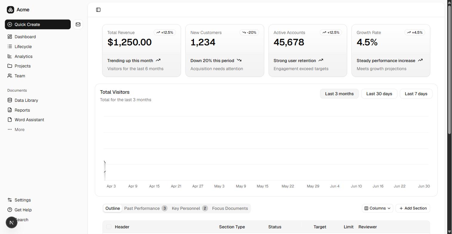
</template><script setup lang="ts">
import { TrendingUpIcon, TrendingDownIcon } from "lucide-vue-next"
import { Badge } from "@/components/ui/badge"
import { Card, CardAction, CardDescription, CardFooter, CardHeader, CardTitle } from "@/components/ui/card"
// Four KPI cards — the dashboard archetype's headline metrics. Static placeholder figures; wire to
// real queries in the page loader. Same content as the Next/RR dashboard tree.
const cards = [
{ label: "Total Revenue", value: "$1,250.00", delta: "+12.5%", up: true, title: "Trending up this month", note: "Visitors for the last 6 months" },
{ label: "New Customers", value: "1,234", delta: "-20%", up: false, title: "Down 20% this period", note: "Acquisition needs attention" },
{ label: "Active Accounts", value: "45,678", delta: "+12.5%", up: true, title: "Strong user retention", note: "Engagement exceeds targets" },
{ label: "Growth Rate", value: "4.5%", delta: "+4.5%", up: true, title: "Steady performance increase", note: "Meets growth projections" },
]
</script>
<template>
<div class="grid grid-cols-1 gap-4 px-4 @xl/main:grid-cols-2 @5xl/main:grid-cols-4 lg:px-6">
<Card v-for="card in cards" :key="card.label" class="@container/card">
<CardHeader>
<CardDescription>{{ card.label }}</CardDescription>
<CardTitle class="text-2xl font-semibold tabular-nums @[250px]/card:text-3xl">
{{ card.value }}
</CardTitle>
<CardAction>
<Badge variant="outline">
<component :is="card.up ? TrendingUpIcon : TrendingDownIcon" />
{{ card.delta }}
</Badge>
</CardAction>
</CardHeader>
<CardFooter class="flex-col items-start gap-1.5 text-sm">
<div class="line-clamp-1 flex gap-2 font-medium">
{{ card.title }}
<component :is="card.up ? TrendingUpIcon : TrendingDownIcon" class="size-4" />
</div>
<div class="text-muted-foreground">{{ card.note }}</div>
</CardFooter>
</Card>
</div>
</template><script setup lang="ts">
import SectionCards from "@/components/section-cards.vue"
import { Badge } from "@/components/ui/badge"
import { Card, CardContent, CardHeader, CardTitle } from "@/components/ui/card"
import { Table, TableBody, TableCell, TableHead, TableHeader, TableRow } from "@/components/ui/table"
// Dashboard home. The `dashboard` layout (auth overlay) supplies the sidebar shell + gate; the
// `auth` route middleware guards client-side nav (the Nitro server middleware guards SSR/API).
definePageMeta({ layout: "dashboard", middleware: "auth" })
const invoices = [
{ id: "INV-001", customer: "Acme Corp", status: "Paid", amount: "$1,250.00" },
{ id: "INV-002", customer: "Globex", status: "Pending", amount: "$3,400.00" },
{ id: "INV-003", customer: "Initech", status: "Paid", amount: "$820.00" },
{ id: "INV-004", customer: "Umbrella", status: "Overdue", amount: "$5,600.00" },
{ id: "INV-005", customer: "Soylent", status: "Paid", amount: "$2,100.00" },
]
function statusVariant(status: string): "default" | "secondary" | "outline" {
if (status === "Paid") return "default"
if (status === "Pending") return "secondary"
return "outline"
}
</script>
<template>
<div class="flex flex-col gap-6 py-4 md:py-6">
<SectionCards />
<div class="px-4 lg:px-6">
<Card>
<CardHeader>
<CardTitle>Recent invoices</CardTitle>
</CardHeader>
<CardContent>
<Table>
<TableHeader>
<TableRow>
<TableHead>Invoice</TableHead>
<TableHead>Customer</TableHead>
<TableHead>Status</TableHead>
<TableHead class="text-right">Amount</TableHead>
</TableRow>
</TableHeader>
<TableBody>
<TableRow v-for="invoice in invoices" :key="invoice.id">
<TableCell class="font-medium">{{ invoice.id }}</TableCell>
<TableCell>{{ invoice.customer }}</TableCell>
<TableCell>
<Badge :variant="statusVariant(invoice.status)">{{ invoice.status }}</Badge>
</TableCell>
<TableCell class="text-right tabular-nums">{{ invoice.amount }}</TableCell>
</TableRow>
</TableBody>
</Table>
</CardContent>
</Card>
</div>
</div>
</template>Decisions and compatibility
Client/server split: the DB client, Drizzle schema, records, and webhooks are server-side (server/). The `@/` alias is the client root (app/); server code reaches shared modules via Nuxt's `~~` rootDir alias (e.g. `~~/server/db/schema`).
The API layer is Nitro, Nuxt's server engine: endpoints are server/api/*.post.ts route handlers, and auth mounts as a Nitro catch-all that delegates to the auth library's framework-agnostic web handler.
Nuxt auto-imports components and composables at runtime, but the emitted server code imports h3 helpers (defineEventHandler, toWebRequest) EXPLICITLY — the one deliberate idiom trade so the handlers type-check under standalone tsc instead of relying on the auto-import magic.
Session gating runs in a Nitro server middleware (server/middleware/), which fires on every SSR and API request — the true security boundary, and a real server-side session check rather than a cookie-existence peek.
prepare: false is mandatory — Neon's pooled endpoint is PgBouncer in transaction mode, where server-side prepared statements break across the pool.
Drizzle is paired here (not Prisma): Prisma's prepared-statement reliance is incompatible with transaction-mode pooling.
Hosted: Supabase owns identity in its managed auth.users. This stack emits a LOCAL `user` mirror (db/auth-schema.ts) so app-type schemas can foreign-key `user` directly — keep it in sync with a Supabase trigger on auth.users (insert/update → public.user). The drizzle migration only owns the mirror table's shape, not the trigger.
Sessions are cookie-based (@supabase/ssr): the proxy refreshes them on every request; Server Components read the user via supabase.auth.getUser().
One active subscription per organization (unique on organization_id) — the metering layer reads exactly one.
Usage is an append-only meter (api_usage): roll up by organization + time window for quota and billing rather than mutating a running total.
Invitations store a SHA-256 of the invite token, never the token itself — a database dump cannot be replayed into org access. One row per (organization, email), so re-inviting updates the pending row instead of accumulating dead ones.
Recombine
Swap one axis and keep the rest. Every combination below is verified the same way.